Less Is More
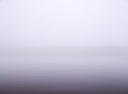
Condensation II, Rockland, Maine, 2001
Were it not for the massive stones of the breakwater that cuts into the ocean for fully one mile before ending at a lighthouse that guards the entrance to the harbor of Rockland, Maine, you’d feel like you were walking on water as you make your way across it. At sunrise and sunset, you’re surrounded on all sides by aqueous color, unless there’s fog and then you can hardly see. Then, as you walk the stones out into the sea, there comes a point when you can’t see where you’ve come from or where you’re going to. It’s disorienting – and magical. You could be anywhere. You could be nowhere. You could end up in either place.
Sometimes the less you can see, the more interesting it becomes. Then, imagination takes over. It’s clinically proven that when people are subjected to minimal sensory input (such as floating in an isolation chamber) for long periods of time, they begin hallucinating – the inside comes out. Creatives often ask how they can leave room for the viewer, encouraging interactivity and participation, rather than spelling it all out, breeding passivity and detachment, knowing that doing so often creates more powerful and personal experiences for them. There is such a thing as ‘too much’. You want to give people enough to enchant them, but not enough to dispel the magic. This leads to the question, “How much room can you leave for the viewer without losing your message?”
Simplicity works for so many reasons. With fewer elements in play attention is concentrated on what remains. There’s more is riding on what’s left. There are no distractions. Ordinarily, this leaves fewer doubts as to what to focus on. Here, in this image, as there is only vapor and water and the suggestion of a horizon, what is taken for granted and often goes unseen comes forward – light and how it fills the air. Strip things down far enough and you can see what ordinarily is invisible.
This image takes my impulse to strip things down to their essentials to its extreme. It presents an experience of space and light, simultaneously empty and full, that is profoundly simple but not simplistic. It asks more questions than it answers. It takes questions like, “How much can you do with how little?” and “How distilled can you make an experience?” and goes further to “How little does it take to make a representational image?” and “What are the foundations for our understanding of reality?” A chain reaction is started and more questions arise.
In so many ways, not just because of the frames they put on the world, images are always leaving things out. They work best when they do this with purpose. They work best when they leave only the essentials and leave out the rest. Sometimes, more can be said with less. Sometimes some things can only be said with less.
Questions
When is more less?
When is less more?
How can you do the most with the least?
When does simple become simplistic?
Find out more about this image here.
View more related images here.
Read more The Stories Behind The Images here.


No Comments