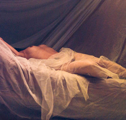
Kevin Ames found that perfect wasn’t and imperfect was, while he was a special guest during a special session of my Fine Digital Print workshops this week. After years of doing top notch commercial photography, to get the most expressive results from a developing body of work, he first had to follow the lead of a very happy accident. Replicating the look and feel of a color crossed, soft focus, grainy original from pristine originals challenged him to be clear about every move he made. Ultimately, he found that rather than going back to lesser tools to distress his images he had much more flexibility and freedom when simulating the look using high quality originals. The results became perfectly imperfect. In the end, given the subject matter and his treatment of it, a perfectly lit, perfectly processed original was just too perfect – and far less emotive. It wasn’t easy to go in the opposite direction years of good habits had taken him. He had to give himself permission to do so – and was encouraged unanimously by the other participants to pursue his unconventional results. Even then, it took repeating the results with several images to get the final confirmation he needed. The results were undeniably strong.
Here’s what Kevin shared about his experience. “Breaking rules is part of being artistic. This odalisk was made during the very early days of digital portraiture with a three chip camera the when given enough light was really quite good. I broke the flash sync socket at the beginning of the shoot forcing me to use the
modeling lights in the soft box as the sole and dim source of illumination. That camera shot at ISO 40 and the exposures were quite long adding a lot of noise to the image. During portfolio reviews at
John Paul’s Digital Print II workshop last spring it was the pick of my work by the group. I added it to my print portfolio for last week’s workshop and again it was the unanimous favorite of my submissions.
Understand that at the beginning of the workshop it was not the direction that I thought I wanted to follow. The breakthrough came when it was printed out to a large scale–forty by forty inches. Up
close it looks impressionistic. From ten feet it becomes painterly. Using the odalisque as a touchstone I am adding grain, noise and color washes to current high resolution work that is very sharp and well
lit. Printed larger than life the figures take on a whole new aspect. I can control the size of the grain in the subsequent photographs as part of the visual vocabulary. When the body of work is finished this
touchstone image will be the one that doesn’t truly fit. Breaking the rule of “noise free is better” has led me to seeing my work in a whole new way–all due to collaborating with the participants of the
workshop and of course John Paul’s guidance.”
Tell him what you think! Comment here!
Check out Kevin’s website here.
Check out my Fine Digital Print workshops here.


No Comments