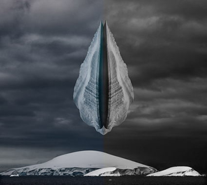
Why Black & White And Color Images Don’t Mix
Can you effectively present a project or body of work that contains both black-and-white and color images? It rarely works, but in rare cases it can.
The problem is that color and black-and-white images appear to be from different times or even different worlds and sometimes both. They’re so different from one another that presenting them together breaks the continuity of the larger story being told (Even a collection of separate poems creates a larger story, albeit with a much looser narrative and context than an essay.) and it undermines the suspension of disbelief required to imagine that a small two-dimensional image accurately represents our much larger three-dimensional world. Viewers end up paying more attention to the way the images are presented and our attention is deflected away from their content. We spend time and effort trying to figure out a pattern between images that are color and images that are black-and-white and the reasons why they’re different from one another, which is wasted if there aren’t any. “It looks better.” isn’t a strong enough reason to break continuity and suspension of disbelief. If there is no reason that contributes to the content of the series, then it’s a few small wins for individuals but a big loss for the team, and we leave the work feeling confused and frustrated. (“I don’t get. Is it me?”) For these reasons it’s best not to mix color and black-and-white images. Instead, present them separately.


No Comments