How Does Lightroom’s New Texture Slider Compare To Clarity and Sharpness ?
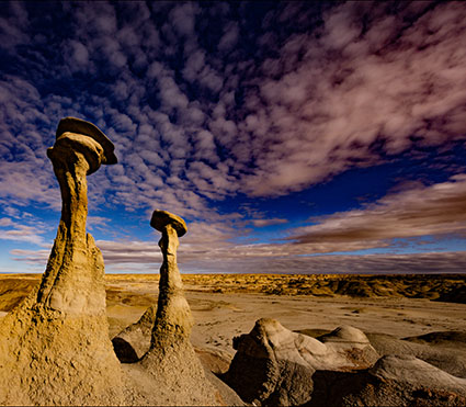
Maximum Dehaze
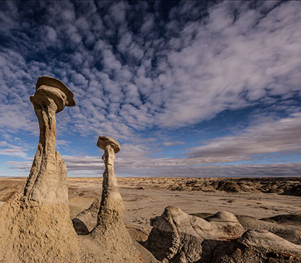
Maximum Clarity
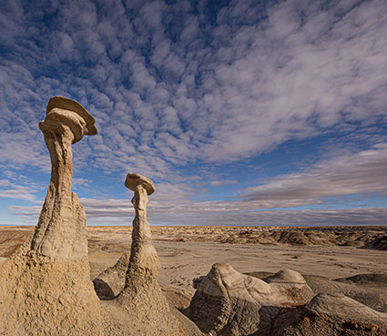
Maximum Texture
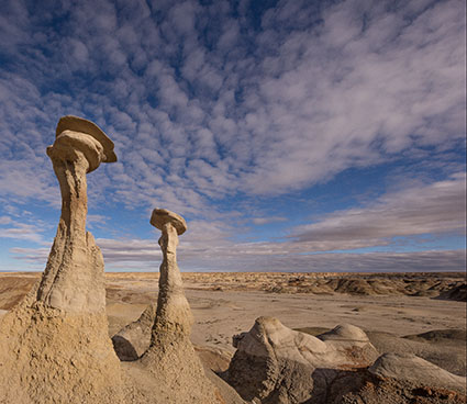
Maximum Sharpening
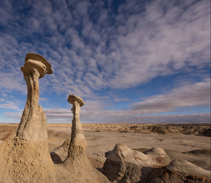
Negative Texture
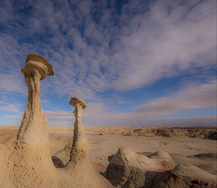
Negative Clarity
Think of Adobe Lightroom Classic and Camera Raw’s new Texture slider as producing an effect that lies somewhere between the Clarity and Sharpness sliders.
It’s closer to Sharpness so when you apply it, rather than looking at the full image, zoom in to 100% to evaluate the detail accentuation it produces. So, use it more for detail enhancement than contrast.


Cemal Ekin
07.06.2019 at 19:52The texture slider is over due. The original clarity slider used to work similar to the current texture slider and in many comments I wrote on the Adobe forums I urged them to either introduce a new slider or allow the users modify its behavior between the old and the new clarity sliders. Here is one of my posts on the matter, this goes back to LR 4!
https://www.keptlight.com/lightroom-4-clarity-slider/
This is a much belated but decidedly welcome addition. Now, if they can name these functions a little better than dehaze and clarity we will all benefit from that too.
Take care,
Cemal