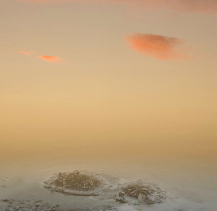
Developing Your Sensitivity to Gradation

The engine that drives color dynamics, contrast, is a measure of the difference between colors. Contrast can be measured by both the amount and kind of difference between colors.
You can discuss contrast in terms of amount. There can be a lot or a little. You can move between two very different colors (i.e. from black to white) or two similar colors (i.e. from dark gray to light gray).
You can discuss contrast in terms of how transitions between colors are made. There can be many (fine) or few (coarse) steps in-between colors. (Having many steps in between contrasting values is an essential criterion for continuous-tone imagery.)
You can discuss contrast in terms of how transitions progress. The steps in between can be made in a regular (even) or irregular (uneven) manner.
If contrast brings variety and energy, ask yourself what kind of energy you seek. Just as each color often elicits a set of associations, so to does each type of contrast.
High contrast images are often thought of as dramatic, while low contrast images are often thought of as quiet. Images, where transitions are made with many steps, are considered smooth, while those with only a few are considered abrupt. When gradations transition evenly they seem calm, graceful, and can be navigated quickly, while when they transition unevenly they seem dynamic, syncopated, and take more time to navigate. There are many subtle distinctions that can be made within these broad generalizations. This is an area that rewards continued exploration.
Sharpen your eye, by developing the ability to identify both the amount and quality of contrast between colors. You’ll find this to be an extremely valuable skill. You’ll increase your sensitivity to color, expand the range of color choices available to you, and add strategies for meeting color challenges. Color will become more intense and pleasurable for you.
![]()
Luminosity intervals of one hue. Hues achieve maximum saturation at specific luminosities.
![]()
Saturation intervals of one hue – luminosity and hue stable. Achievable only for mid-level luminosities.
![]()
Hue intervals – maximum saturation, luminosity shifts. Hues achieve maximum saturation at different luminosities.
![]()
Hue intervals – luminosity stable, saturation shifts.
![]()
Hue intervals between two complementary hues passing through the color wheel.
![]()
Hue intervals between two complementary hues passing around the color wheel.

Try These Exercises.
1 Create a set of equal luminosity intervals of one hue.
Optionally, repeat for all hues – ROYGBIV.
2 As above, create equal intervals of hue.
Optionally, repeat for all hues – ROYGBIV.
Optionally, repeat for all hues at different luminosity levels.
3 As above, create equal intervals of saturation.
Optionally, repeat for all hues – ROYGBIV.
Optionally, repeat for all hues at different luminosity levels.
4 Match the intervals (luminosity, hue, and saturation) between two color progressions.
Because it’s difficult to separate other forms of image content from color, color exercises are best performed abstractly. While it’s useful to check numerical values for colors and color relationships, because these exercises are perceptual (often incorporating physiological and psychological responses that are not physically measurable), determine your answers visually. Train and trust your eye.
Read more Color Theory.
Learn more in my digital photography and digital printing workshops.


No Comments