13 Go To Fonts, 7 Fonts to Avoid
Whether you’re designing for a book or a presentation choosing the right type face is important. The font you choose helps shape the tone of what you create. As with any endeavor, it helps to have a trusted resources you can always turn to.
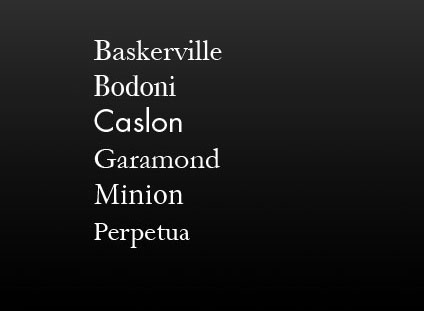
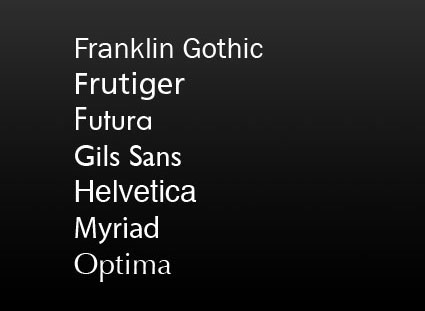
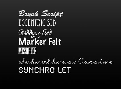
Here are my go to serif and sans serif fonts … and a few I steer clear of.


Serif and san serif and the most common kinds of fonts. Serif fonts have a classic feel. Sans serif fonts set a contemporary tone. Decorative or display fonts have a great deal more flair and are generally best used for signage; it takes the right project and a great designer to use them well in other applications. Design is typically best used as a support for content, not a distraction from it or a substitute for it.
Find books on design I recommend here.
Learn more in my Fine Art Digital Printing Workshops.


danecreekphotography
13.05.2010 at 16:58My go-to font for book publishing is Adobe Arno Pro. It is similar to Garamond, and comes in optical weights that are designed specifically for the various sizes needed to put together beautiful content. It also has a wide range of ligatures, alternate forms, and lowercase numerals that look absolutely beautiful.
I used it for my Antarctica book and couldn’t be happier!