What To Do With Photoshop’s Color Management Dialogs
Knowing what to do with the color management dialog boxes you encounter while you’re editing your digital images in Photoshop is the key to making sure that the rich, saturated, wide-gamut color you choose to master your files in stays wide-gamut and doesn’t change – unless you want it to.
When you set Color Settings in Photoshop (Edit : Color Settings), you not only choose Working Spaces (RGB, CMYK, Gray, and Spot) to create new files in (Choose ProPhoto RGB for the widest-gamut color space.), you also set Color Management Policies that determine what happens when you’re dealing with files that are not created or edited in the same color spaces.
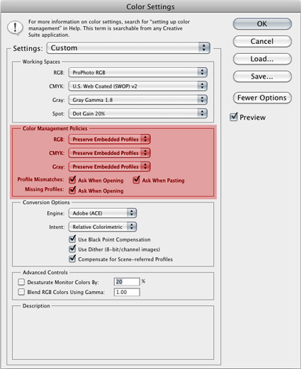
For RGB, CMYK and Grayscale files you can choose to turn Color Management Off, to Preserve the Embedded Profiles, or to Convert to Working color spaces. You rarely, if ever, want to turn color management off; you only do this when you want to ensure that no color space conversions take place, for example when opening target files for creating printer profiles. Similarly, you typically don’t want files automatically converted to a default working color space without your knowing that it’s happening, as they are when you set the policy to Convert to Working; you’d only want this to happen when you’re batch converting a number of files to quickly bypass color management dialog boxes. In the vast majority of cases, you’re better off served leaving the default settings at Preserve Embedded Profiles. This way, any time a color management operation is about to take place, you’ll get one of three dialog boxes that not only alert you but also give you control over how the operation is handled.
So what do you do when you encounter these three dialog boxes – Missing Profile, Profile Mismatch, and Paste Profile Mismatch?
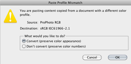
The Paste Profile Mismatch dialog box makes it all very clear. You encounter it when you’re pasting information from a file in one color space into a file in another color space. (Photoshop can open many files in many color spaces at one time, but a single file can have only one color space at one time.) The parenthetical remarks in the Paste Profile Mismatch dialog box say it all. If you Convert you “preserve color appearance”; Photoshop does this by referencing the ICC profiles of the source and destination color spaces and precisely changing the numbers in the file so that they produce the closest possible match to the original appearance; only the appearance of very saturated colors will change if you convert a file to a smaller gamut color space. If, on the other hand, you Don’t Convert but “preserve color numbers”, the appearance of a file will change, sometimes dramatically, because a new color profile has been assigned but the numbers in the file have not been converted at the same time.
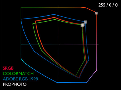
Wait! Am I saying you have to change to stay the same? Yes. You have to change the numbers, or convert them, to preserve their color appearance. Why? Because the same numbers in two different color spaces, like ProPhoto RGB and sRGB, mean different things. The same values in a file (0 to 255) are spread out over a much greater distance (a wider gamut) in ProPhoto RGB, producing more saturation. So, the appearance of the same numbers (100,100,50) vary significantly in saturation in ProPhoto RGB and in sRGB because their gamuts are so different. Only the appearances of equal or neutral values (i.e. 10,10,10 or 128,128,128) remains the same in all RGB device neutral color spaces (sRGB, Colormatch, Adobe RGB (1998), ProPhoto RGB).
With this in mind, you rarely want files without profiles. Files without profiles vary wildly in appearance based on the device displaying them. Untagged files indiscriminately toss their unchanged numbers into different color spaces, editing/working color spaces or a device’s color spaces and so their appearance constantly changes. Untagged files are unpredictable and unstable. The only time you want files like this is when you’re profiling a device, like a printer. Then, not knowing what the color space of the device is, you send known numbers to it and measure what appearance they generate. With this information you can create an ICC profile that describes the devices behavior.
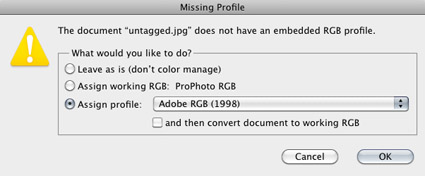
So, if you encounter a file that’s missing a profile assign one. Just don’t do it with the Missing Profile dialog box; with it you can’t preview the results while you’re choosing a profile. Instead, when you encounter the Missing Profile dialog box, check Leave as is (don’t color manage) and OK, opening the Untagged file. With the file open, go to Edit : Assign Profile, check Profile and select a profile that generates a pleasing appearance. If you’re lucky enough to know the profile that’s been removed from a file (the right answer) assign that profile but in most cases you won’t know, so just choose a profile that makes the file look as close to what you want as possible (the best answer). Then save the file with the profile attached to it. (Once it’s converted, leave it in that color space; don’t convert it to a wider gamut space thinking you’ll get more saturation – you won’t.) You may note that though the appearance of an image changes dramatically when a profile is assigned, the numbers it contains don’t change. (There is a very advanced method of adjusting color by assigning a synthetically created profile to an image to generate a pleasing appearance without changing the numbers, hence you can make dramatic changes to an image virtually non-destructively. But it’s prohibitively complex and unintuitive to make it useful in most situations.)
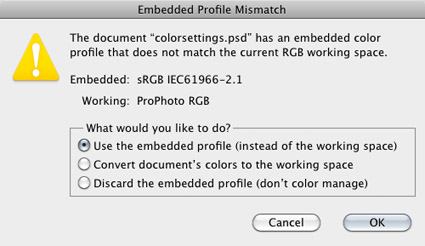
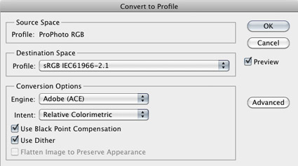
With a clear understanding of the difference between assigning a profile and converting to a profile, the Embedded Profile Mismatch dialog box, the one you’ll encounter most often, becomes straightforward. In a majority of cases, simply check “Use the embedded profile (instead of the working color space)”. Don’t check “Discard the embedded profile (don’t color manage)”, unless you know the file has been assigned an incorrect profile. “Convert the document’s colors to the working space” only during batch conversions, for instance when you’re converting a number of copies of files to sRGB for the web. (Do this with copies only. If you convert your originals from wider gamut color spaces, you’ll lose the greater saturation they contain permanently.) Minimize the number of color space conversions a file goes through. They’re cumulatively destructive. Making only two color space conversions is ideal: first from source to a device neutral editing color space; second to a device-specific output/display color space.
If you haven’t been using wide-gamut editing spaces like ProPhoto RGB don’t think that you can improve your legacy files by simply converting them to a larger gamut editing space. All this does is give you the potential for more saturation. To actually get more saturation you also have to enhance your files with software after conversion; even then the saturation you get will tend to lack variety in luminosity and hue. The best way to get the extra saturation with rich variation in luminosity and hue is to return to the source, your original file (Raw file or scan), and convert it into a wider gamut editing space.
Information converted from sRGB into ProPhoto RGB does not get more saturated. The editing space becomes wider gamut but the potential for increased saturation can’t be accessed unless values in the file are enhanced with software. The best way to get saturated color is to convert it from it’s source into a wide-gamut editing space like ProPhoto RGB.
Understanding the difference between assigning and converting to a profile is one of the most conceptually challenging things about color management in digital imaging. It’s counterintuitive to think that by changing numbers the appearance of colors will stay the same or that if you don’t they won’t. But, once you understand why this is happening, how to set up your color management environment in Photoshop, and what to do when you encounter these color management dialog boxes things will become much simpler. If you adopt a consistent workflow and always convert into and create new files in the same color space you often won’t encounter these dialog boxes. You’ll quickly find you won’t have to think about it anymore. You’ll simply take appropriate action with confidence when you need to. And you’ll rest assured that the images you’re creating are the very best that can be created.
Read more on Color Management here.
Learn more in my digital photography and digital printing workshops.




No Comments