Choose A Wide Gamut Editing Space
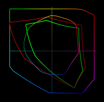
Today’s inksets can exceed the gamut of even the best monitors in yellows, oranges, and blues. Epson UltraChrome HDR ink on Epson Exhibition Fiber is plotted against sRGB, Adobe RGB (1998) and ProPhoto.
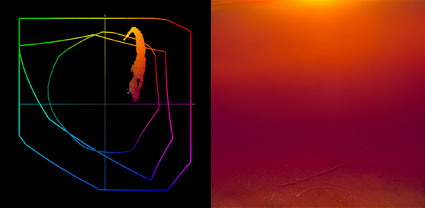
The gamut of this image and the print made from it exceeds the gamut of Adobe RGB (1998) and the monitor. You have to make a print to see the most saturated color possible.
Choose a wide gamut editing space to make the best prints possible. If a file’s color space is smaller than the printer’s color space, you won’t be able to realize the full saturation your printer is capable of.
Today’s inksets exceed the gamut of all but one of the standard editing spaces (sRGB, Colormatch, and Adobe RGB (1998)), making ProPhoto the best choice for creating files in. Since ProPhoto exceeds the gamut of human vision, it’s unlikely that you’ll ever need a wider gamut editing space than ProPhoto. If you create your files in ProPhoto you’ll be well-positioned to take advantage of future advances in printer and media technology. So, choose ProPhoto.
How do you do this?
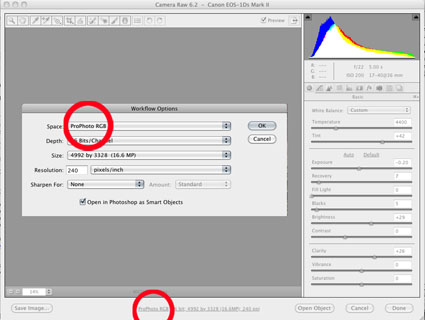
1 If you’re converting a Raw file, choose ProPhoto in the Raw converter’s interface.
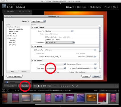
2 If you’re exporting a file from Lightroom, choose ProPhoto.
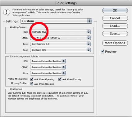
3 If you’re creating a new file in Photoshop, set ProPhoto as your default color space.
4 If you’re scanning an image, choose ProPhoto in the scanner’s interface.
ProPhoto is so wide that when you use it, you need to edit 16 bit mode. Basically, the steps between individual values is much larger than smaller gamut editing spaces, so without enough shades of gray, significant edits may produce posterization or banding. In contrast to the 256 shades of gray in 8 bit files, 16 bit files provide 65,536 shades of gray – more than enough to eliminate this problem.
When you use ProPhoto, be careful when increasing saturation. ProPhoto exceeds the gamut of even the most sophisticated monitors, so it’s possible to oversaturate values in files without seeing it. In a majority of cases you won’t be able to display or print these values, but in some cases you may be able to, and in the future you most certainly will. So, in general, when you use Saturation or Vibrance sliders stop at the point where you don’t see changes. More often than not, saturation that exceeds the gamut of monitors is best optically captured by devices like cameras and scanners, rather than synthetically produced.
You may not want to use ProPhoto files for specific applications. While today’s inkjet printers can put ProPhoto’s saturated colors to good use, not all devices can or do. For instance, many offset presses prefer CMYK files and some web browsers disregard ICC profiles making ProPhoto files look oversaturated. In cases like this, convert copies of your ProPhoto files to smaller color spaces for specific uses.
If you’ve already created files in color spaces other than ProPhoto, don’t convert them into ProPhoto. You won’t get more saturated colors. All you’ll get is the possibility of having more saturated colors. It’s better to know that the gamut of a file has been compressed to a smaller color space. If you convert files like these to ProPhoto, you may be able to add synthetically created colors or increase the saturation of colors with software, but these colors never have the complexity of optically captured colors. To take full advantage of ProPhoto in these instances, recreate a file by reconverting or rescanning them. Do this only with files that will benefit by using ProPhoto. Only images with highly saturated colors will benefit; images with low saturation will not.
ProPhoto is your best choice of editing spaces for making the best prints possible now and in the future. Position yourself well to take advantage of the latest advances in printer technology by taking a few simple steps when you first create your image files. It’s as simple as setting it up once and using it consistently ever after.
Read more on Color Management here.
Learn more in my digital photography and digital printing workshops.


Bill_Sawalich
20.06.2011 at 16:27This is interesting, and particularly timely for me. I recently had a new client complain that finished image files I’ve been delivering him look darker, and much worse, than the proofs of the same images that he’s looking at on the same monitor. I couldn’t figure out what in the world was happening, because everything looked good and was well managed on my end.
Finally it occurred to me that I’ve recently started using the ProPhoto profile when opening images in Photoshop, and the finals that I was delivering are in that color space. (The proofs, however, are sRGB straight from Lightroom.) I’ve been thinking that was the problem, and now I’m fairly certain of it.
Thanks for the great color management posts–this one in particular.