The Weight Of Color
1
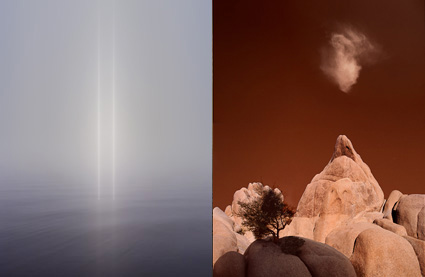
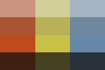
Images with lighter palettes tend to be brighter and less saturated (though driving colors towards white desaturates them), while those with heavy palettes tend to be darker and more saturated (though driving colors towards black desaturates them).
2
Brighter less saturated colors seem lighter, while darker more saturated colors seem heavier.
3
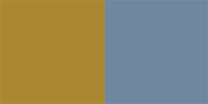
Colors can be matched or contrasted by weight to control visual dynamics. Here yellow and blue are matched in weight.
Many psychological attributes have been assigned to color, such as temperature. It’s so natural to think of color having temperature that we often don’t think about how this is an associative meaning rather than a physical fact. Physically a blue fire is much hotter than a red fire. Nonetheless, red is universally (in all cultures and periods of history) considered the warmest color and blue the coolest color. It’s quite likely that this comes from our experiences with fire (generally red, orange, and yellow) and water (typically blue in large quantities). You might think the ascription of temperature to color is particularly strong for photographers who assign white balances to their images based on the color temperature of the light a photograph was made from to reproduce color accurately. But, it’s equally strong with painters and designers who use temperature associations to create expressive color schemes.
One other useful psychological attribution to color is weight. Does yellow feel lighter than green? Does purple feel heavier than orange? Most people would say yes. Of course, our response depends on the specific variation of each broad color family. You can make a green seem lighter than yellow if you make it brighter, either with luminosity or saturation or both.
So how can you use this information? Here are four ways.
1 You can strengthen comparisons or contrasts between two image areas by making their relative weights appear more or less similar.
2 You can also set the tone for an entire image. Set a brighter airier tone by using lighter colors. Set a darker earthier tone by using heavier colors.
3 You can attract the eye more strongly to specific areas. Once a predominantly light or heavy palette has been set, you can accent it dramatically with smaller accents of contrastingly weighty colors.
4 You can create comparatively lighter and heavier palettes for specific areas of an image, such as a lighter color scheme for higher areas and a heavier color scheme for lower areas.
It’s useful to note that weight is also associated with gravity and thus vertical location.
That the word ‘light’ can be used to describe both the appearance and the mass of an image speaks volumes. Psychologically, color has weight. With only a little practice and more sensitivity, you can use this to make your images more effective.
Exercise
Sensitize yourself to the weight of color by matching the weight of colors.
1 Create two or more colors. Match the weight of two colors from the same color family, such as blue.
2 Create two or more colors. Match the weight of two colors from different color families, such as blue and yellow.
Read more Color Theory.
Learn more in my digital photography and digital printing workshops.


No Comments