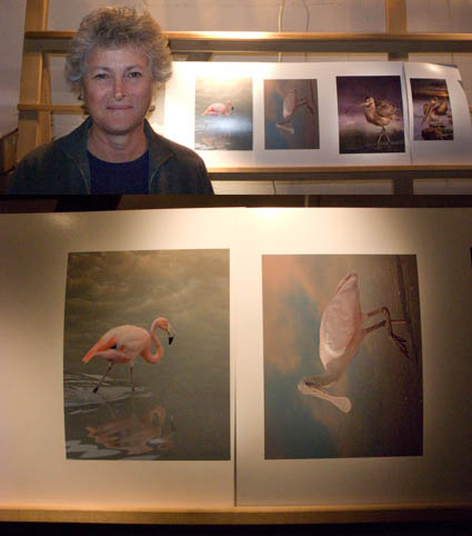
Cheryl Medow creates wildlife composites. She’s attending the Fine Art of Digital Printing workshop (Caponigro and Holbert at Brooks sponsored by Epson). Yesterday, some of them looked like photocomposites (surreal) and some looked like paintings (graphic). Today, after a long discussion about the most successful components in separate images and the intent she wants to communicate, they all look like they’re made by the same person who has a cohesive message. Some of the keys to unlocking her style included keeping shadow and highlight detail extremely full (none of them pure black or white, sometimes with significant color). In addition to keeping luminosity contrast low, she did the same with hue contrast, glazing the different colors in her images with a single color. Both create a more softly modulated color palette. Cheryl had to reconsider what she had learned about traditional photographs to find her own personal style. Her first step was to find the words to describe the new qualities she found through exploration (trial and error) and now wanted to repeat. The next step is to ask why. She’s got a lot of ideas, but she’s still working on it. That’s great. That’s when work starts to get really interesting.
Check out Cheryl Medow’s work here.
Check out the Fine Art of Digital Printing workshops here.
Check out my Fine Digital Print workshop series here.


No Comments