Graphing Color

Graphing color can help you identify colors more specifically and understand relationships between color better. One way to graph color is to use the Color Sampler Tool in Photoshop in combination with the Apple color picker.
To access the Apple color picker choose Photoshop: General Preferences and change Color Picker from Adobe to Apple and click OK. To see the new the color picker click on Set Foreground Color or Set Background Color icon in the Tool bar.
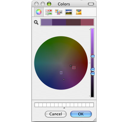
Unlike the Adobe color picker, the Apple color picker is a color wheel. Creating and using color wheels to describe color and plot color relationships is a time honored tradition dating back to Leonardo DaVinci. Some of the most famous color wheels were created by Newton, Goethe, and Munsell. The Apple color picker is an additive color wheel where complements are defined as red and cyan, green and magenta, and blue and yellow.
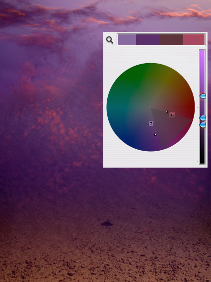
You can sample any color in an image and find its position on the Apple color wheel. Using the Eyedropper Tool, sample a color in a composition. Then click on the Set Foreground Color icon. The Apple color wheel will appear and a small circle will plot the sampled color. You can make a record of this chart by taking a screenshot of the color wheel (caps lock, Shift, Command, 4). This will create a PDF document on your desktop, which can be opened in Photoshop.
You can combine multiple sample points into a single chart by taking multiple screenshots, opening them in Photoshop, and combining them. Drag the Background layer from one document into another and give it a meaningful title. Make sure the two layers are registered with one another. Then, mask off everything on the top layer except the circle identifying the color on the color wheel, the triangle identifying it’s luminosity on the slider to the right of the color wheel, and a portion of the color bar above the color wheel. You’ve just graphed the two colors on the Apple color wheel. You can do this with as many colors as you desire.
Once colors have been graphed you will be able to identify a variety of relationships between colors, both colors that exist in a composition and colors that do not.

You can identify luminosity values with the slider to the right of the wheel. By sampling colors from an image and noting their position on the slider you can determine whether an image is light (high key), medium, or dark (low key) and whether it contains low, medium, or high contrast, and how gradual or abrupt the transitions between them are, by comparing the distance between sampled points (the greater the distance the greater the contrast).

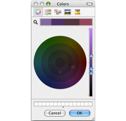
You can draw concentric circles with varying radii on the wheel. This will help define the saturation level of an image – neutral, semi-neutral, saturated, or supersaturated.
You can divide the color wheel in triangular slices of varying widths. This will help define hue relationships within an image – monochromatic (single family hues)(within 30 degrees), analogous (closely related hues)(within 60 degrees), complementary (opposite hues)(separated by 180 degrees), or split complementary colors (three colors where two are found between 150 – 210 degrees from the third).

You can draw a straight and/or a curved line between two hues. This will help identify all the other hues between the two, useful in creating gradations or smoother transitions between two colors.

You can draw geometric shapes inside the color wheel – triangles, squares, rectangles, pentagons, hexagons, octagons. This will help identify hues that may be used to create a logical color structure – diads, triads, quadrads, etc.
A little exploration and mapping of color will help you make many new discoveries about the color dynamics in any image, both of how they work and how they can be improved.

Here are a few observations about the color dynamic revealed by graphing it.
1 The composition has four significant colors.
2 The luminosity has only moderate contrast, constrained to the midtones, weighted low.
3 The palette is reasonably saturated, but not supersaturated. The most saturated hue is dark purple, the second most saturated color is pink.
4 A 60 degree slice reveals that there are two reds and two purples – analogous (closely related) hues. The brown is actually a dark red with relatively low saturation. The reds are closely related in hue; so are the purples. There is a light set and a dark set of reds and purples. The hues are at the boundaries of analogous relationships, providing maximum variety within that color dynamic. Contrast is derived based on luminosity first, hue second, and saturation third.
5 While one hue, red, is the warmest color, the other hue, purple, lies close to the boundary between warm and cool colors. There isn’t a strong contrast between warm and cool, but there is a great deal of variety within a predominantly warm composition.
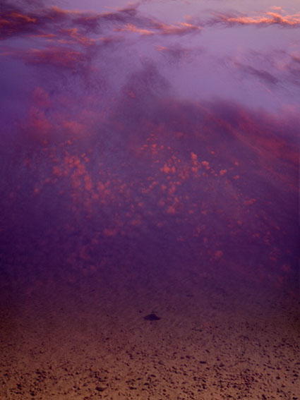
6 Gradation (smooth transitions) can be accentuated by including hues in between the sampled points either along a straight or curved line. The background color for the sky seems continuous and smooth because it contains many small steps between the lighter hue at the top and the darker hue at the bottom; this has a calm effect. The pink accents in the highlights appear warmer and more lighter because they are surrounded by cool dark colors, without substantial gradation between them; this has an energetic effect.
Read more with my color theory ebooks.
View more in my DVDs on color.
Learn more in my digital photography and digital printing workshops.


No Comments