Where Good Ideas Come From – Steven Johnson


With Where Good Ideas Come From, Steven Johnson pairs the insight of his bestselling Everything Bad Is Good for You and the dazzling erudition of The Ghost Map and The Invention of Air to address an urgent and universal question: What sparks the flash of brilliance? How does groundbreaking innovation happen? Answering in his infectious, culturally omnivorous style, using his fluency in fields from neurobiology to popular culture, Johnson provides the complete, exciting, and encouraging story of how we generate the ideas that push our careers, our lives, our society, and our culture forward.
View more creativity videos here.
Read more in my creativity ebooks.
Learn more in my creativity workshops.

Create An Oasis of Creativity For Yourself


Try setting half an hour a day for your creative life. If you did this everyday for one year, you’d give yourself 182.5 hours, roughly the equivalent of 4.6 work weeks. As you can see, it really adds up.
Many find it helps to pay yourself first in the morning. Get up early and get more time for yourself. One advantage to setting time aside in the evening is that the amount of time you spend can often be extended. Try both. Monitor your energy, Strike a balance between what’s practical and what’s ideal for you.
Set up a space that’s ready for you to be creative (even if this is a User setting on a portable computer) and keep it organized, so you’re ready to go when you get your time and you don’t waste it organizing.
Finally, when you’re able, take a trip for a long weekend or week of total immersion. Trips can add many more valuable hours to your creative life, as well as new stimulation, new material, and a fresh perspective.
The biggest challenges are starting and sticking to a plan. Start now. You’re sure to miss a day here and there, just don’t make it a habit. Instead, make a habit of taking some time for yourself.
Listen to more creativity tips here.
Learn more in my creativity workshops.

Share Experience / Share Vision


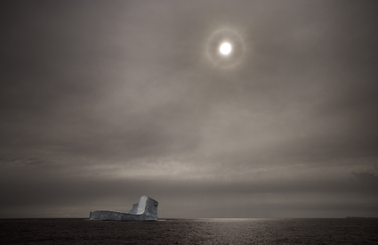
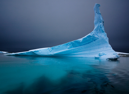
It was December 2005. We had just made the long crossing of the Drake Passage to Antarctica. On the horizon were enormous icebergs. It was our first view of big ice. We all rushed to deck and began to photograph. I found myself standing shoulder to shoulder with Seth Resnick. He was using a long 300mm lens. I was using a wide 28mm lens. We both looked at each other and then looked again. Our approach was so different we were astonished. “Let me see your camera!” we both said simultaneously and quickly traded cameras. We laughed out loud. With one quick glance, we realized we were seeing in entirely different ways.
It was February 2007. We found ourselves in the very same situation. Again, we had crossed the Drake Passage to Antarctica. Again, there was big ice. Again, we hurried to deck. Only this time, Seth appeared with a wide 14mm lens and I showed up with a long 100-400mm lens. We grinned big grins. We had influenced each other.
It was January 2010. Once more, we had crossed the Drake Passage to Antarctica. There was more big ice. Again we raced to deck. This time we both carried two cameras, one with a wide lens and the other with a long lens. We smiled and nodded knowingly at one another. As a result of sharing the same experiences and the results we produced from them, we had learned to become more versatile and see in more varied ways.
Sharing experiences with other visual artists can be extremely stimulating and rewarding. The resulting growth comes in unexpected ways at unexpected moments. In situations like these, I’ve come to expect the unexpected. Especially with Seth!
What opportunities can you make to share experience and vision with other artists?
Read Seth Resnick’s images and version of our story here.
Find out about our Digital Photography Destinations workshops here.

Color Analysis


To better see color within an image it can help to abstract it. By de-emphasizing an image’s representational qualities you can more easily direct your attention to the color relationships within it. In short, you can see them better because you’re not distracted by other concerns.
Using Photoshop, there are many ways to modify an image in order to better reveal it’s color structure.

You can blur an image. Blurring an image reduces detail so that you can more easily see the basic composition and the color relationships within it, without getting hung up on the details. (Duplicate the background layer and apply the filter Gaussian Blur.)
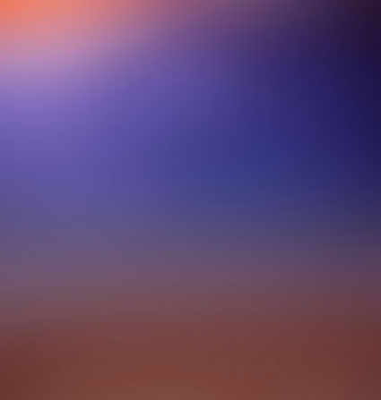
Blur an image substantially and you can reduce an image to a field of color. Compositional elements are significantly downplayed, leaving pure color. (Duplicate the background layer and apply the filter Gaussian Blur with a stronger setting.)
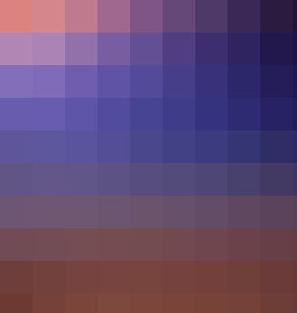
Pixellate an image and you can reduce an image to blocks of color. Composition is eliminated while contrast between colors is more pronounced than in a flat field of color. (Try Filter: Pixellate: Mosaic. This works best for lower resolution files or copies of files.)

Average an image and you can reduce all the colors in an image to one. (Duplicate the Background Layer and apply the filter Average – found under Blur.) This often confirms the dominant color in a composition. Well balanced color photographs containing a variety of hues tend to average towards gray.)
While accents and other important colors can also be used, the dominant color is an excellent choice to further analyze color relationships in an image using Blend Modes. With this technique you can see the variety found in the separate components of color within an image – Luminosity, Saturation, Color, and Hue. (Change the Blend Mode of the averaged layer to the desired color component.)
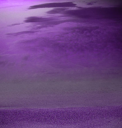
With a Blend Mode of Hue, all values in an image will be driven to the same hue. This will help you see variety in luminosity and saturation more clearly.
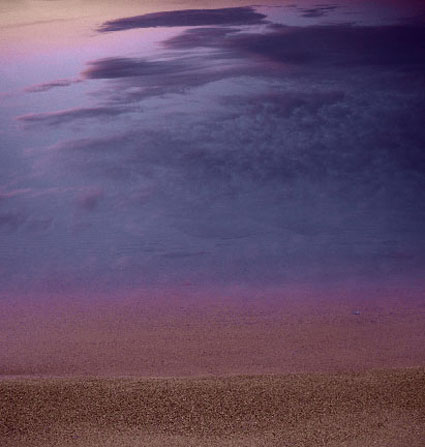
With a Blend Mode of Saturation, all values in an image will be driven to the same saturation. This will help you see variety in luminosity and hue more clearly.
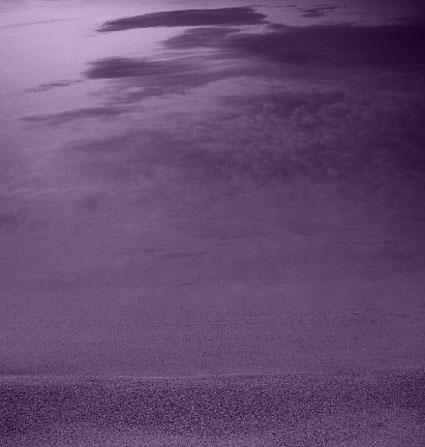
With a Blend Mode of Color, all values in an image will be driven to the same hue and saturation. This will help you see variety in luminosity (the tonal structure) more clearly. (This variant is often the most useful as it is the easiest to interpret. With repeated analysis of many different images, you’re likely to note that images with less variety in hue and saturation (particularly neutral ones) will require more luminosity contrast to have impact. By the same token, images with a great deal of variety in hue and saturation will often appear overly harsh with excessive contrast.)
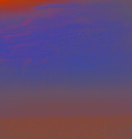
With a Blend Mode of Luminosity, all values in an image will be driven to the same luminosity. You’ll eliminate contrasts in value which will help you see variety in hue and saturation more clearly.
This type of analysis will better reveal the color relationships at work within an image. You can use the information you’ve gathered by analyzing color relationships in an image not only to better understand it but also to make predictions about how you might improve them.
Increasing contrast in one or more of the elements of color (hue, saturation, luminosity) will increase separation in a composition; conversely, decreasing contrast will create greater unity.
Typically, well structured images use a large amount of contrast in one color component, a medium amount of contrast in a second component, and a small amount of contrast in a third component.
Read more with my color theory ebooks.
View more in my color DVDS.
Learn more in my digital photography and digital printing workshops.