Masterworks In My Collection – Paul Caponigro – Apple, New York City, 1964
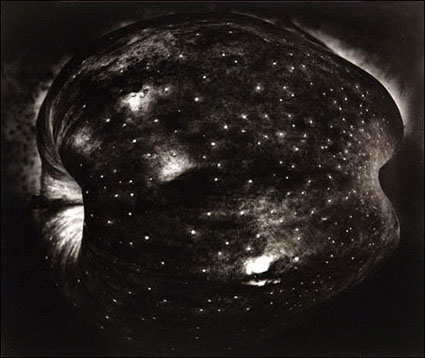

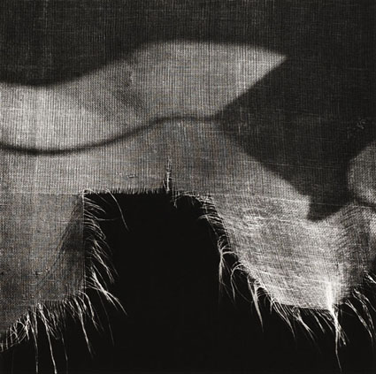
While this image is officially titled Apple, New York City, 1964, it’s often referred to in my father’s studio as ‘The Galaxy Apple’. Countless people’s first impression of this image is that they’re looking at a galaxy.  Even after you see the apple, the impression of a galaxy persists.

This is one of the photographs that got me fascinated by photography. I love that a literal transcription can also describe something more than itself. The power of metaphor is more powerfully expressed in this photograph than in any other I can think of. What’s more, the way the metaphor unites both the terrestrial and the celestial – the macrocosm and the microcosm are seen as one. (I don’t think it’s an accident that my father’s first retrospective was titled The Wise Silence, a line borrowed from Ralph Waldo Emerson.)

The printing of this image reinforces the metaphor. It’s dark. It is so dark, in fact, that in some places, you can’t visually separate the contour of the apple from the dark background. Dad found the solution while printing the image; one of the proofs came out darker than anticipated. Other printers might have held all the details there were to hold in this negative. Unexpectedly and wisely, Dad didn’t. I have always appreciated my father’s consummate ability to transcend his technique and follow the call of his intuition. Rather than offering expected results, he consistently delivers unexpected solutions, not for the sake of novelty or surprise, but because he was called to serve a more powerful inner poetry.

(There’s a lot to be learned from looking at originals, which is why we look at masterworks from my collection in all of my digital printing workshops.)

Find my comments on other Masterworks In My Collection here.
Learn more in my digital printing workshops.

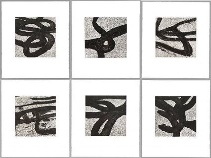
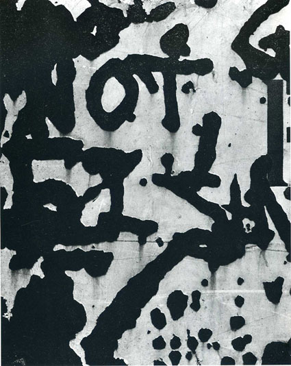
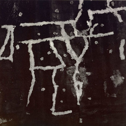
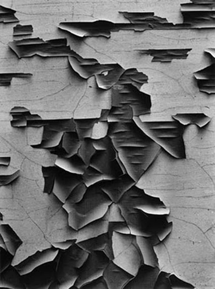
Aaron Siskind – Literally Abstract


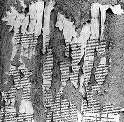
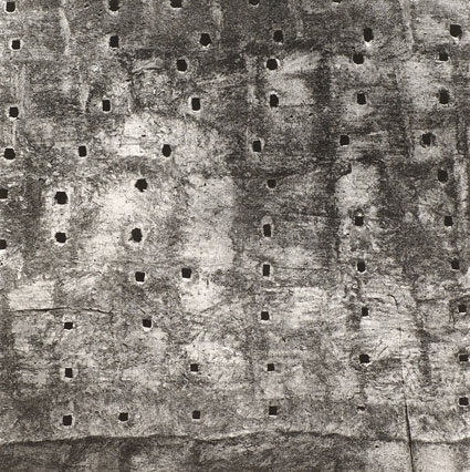
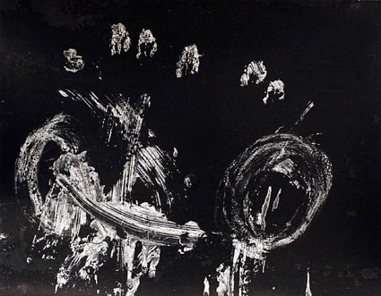
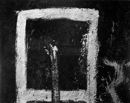
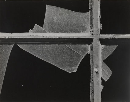
If he wasn’t the first, Aaron Siskind was certainly the preeminent abstract expressionist photographer. The abstract details he presents as new hyper-flat surfaces stand independent of their original subjects.

Abstraction in non-representational art celebrated in the modernist movement early 20th century has taken many forms; Kandinsky’s expressionism, Picasso’s Cubism, Malevich’s a Constructivism, Stella’s Minimalism, Vasarely’s Op Art, etc) While photography quickly became the gold-standard of realism and consequently it took it longer than painting to embrace abstraction. (It’s arguable that the invention of photography forced painting to embrace abstraction.) Siskind’s images helped establish photography’s credibility as abstract art.

But what kind of abstraction is Siskind’s abstraction? And what is the function of abstraction in Siskind’s work? Coming late to the game his work aggregates many previous sensibilities and ideas.
Like so many modernists he emphasized that what he made was not a representation of something else but “the thing itself” – an idea that has metamorphosed chimera-like since the Greeks and been repurposed by nonrepresentational artists and realists alike. But, while most modernists took pains to avoid including elements that suggest figurative images, Siskind’s images are peppered with them and because of their photographic nature they always reference something else, no matter how covertly. Like Jackson Pollock, Siskind prized directness and immediacy of expression but the personal authenticity derived from this becomes ironic given the essentially appropriative nature of photography. Like Franz Kline, Siskind’s images are riddled with poetic gestures, but none of the gestures in his images are made by hand or by him. Like Wassily Kandinsky, Siskind drew an analogy between his images and musical scores or performances, never mind that he worked without color or purely with tone.

Siskind’s abstraction defies resolution. Perhaps the most interesting thing about Siskind’s abstraction is that so many forms of abstraction and the ideas behind them coalesce into a single arena, the photographic frame.

Siskind’s work fascinated me instantly because in representing so little it demonstrated so much. A literal recording can be supremely abstract. Sometimes a photograph looks nothing like the thing photographed. To photograph is to transform. (And there are many ways to bring about transformation and many kinds of transformations.) A photograph is never the thing it represents and never just a photograph.

Find out more about my influences here.


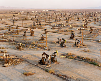
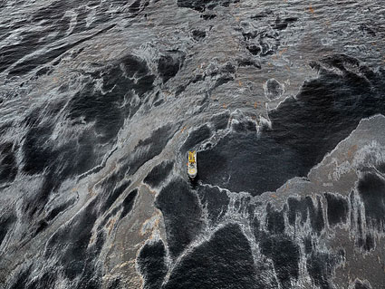
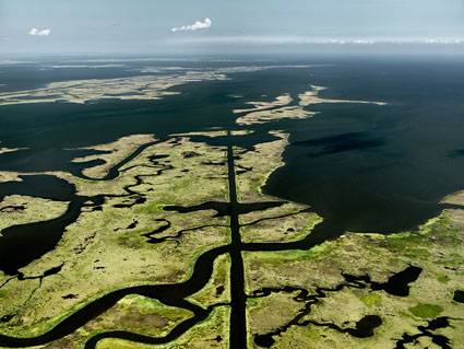
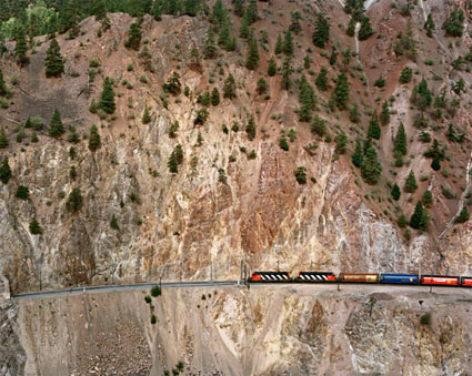
Edward Burtynsky – Manufactured Landscapes


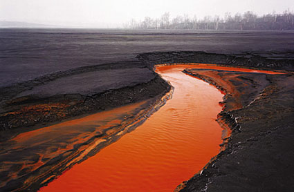
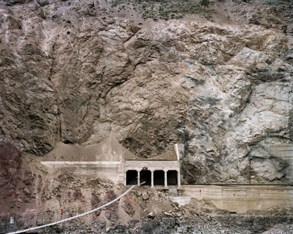
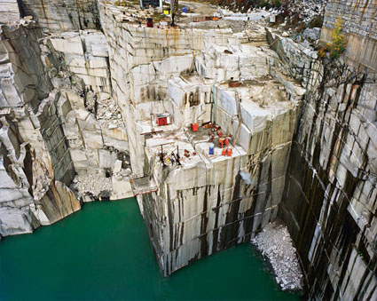
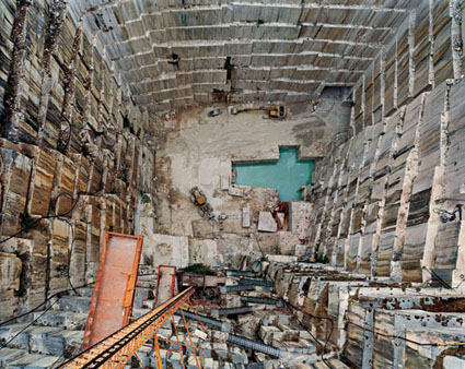
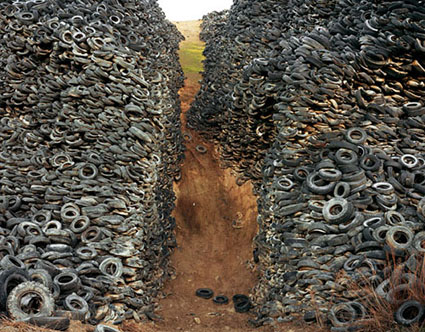
Edward Burtynsky’s photographs deftly weave together aspects of a well-researched documentary expose and a beautifully constructed formal artistic statement, but it’s unclear which is more dominant, or if they’re something else entirely.

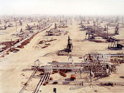
Burtynsky let’s the things he photographs speak for themselves. Yet he photographs specific kinds of things, related things; oil fields, mines, railways, highways, manufacturing plants, dumps and salvage yards, etc. More than the specific things he photographs it may be these relationships that he’s ultimately photographing. And like the effects of the global industrial complex his work has a cumulative effect.
Despite the restrained yet shocking quality of his images, Burtynsky claims not to be critical of industry and presents himself simply as a witness to the monumental changes man makes to land. At first his stance seems simple but the more one considers it the more complex it becomes, almost to the point of becoming enigmatic.

“I’d say, actually, that I’ve been careful not to frame the work in an activist or political kind of way. That would be too restrictive in terms of how the work can be used in society and how it can be interpreted. I see the work as being a bit like a Rorschach test. If you see an oil field and you see industrial heroism, then perhaps you’re some kind of entrepreneur in the oil business and you’re thinking, “That’s great! That’s money being made there!” But, if you’re somebody from Greenpeace or whatever, you’re going to see it very differently. Humans can really reveal themselves through what they choose to see as the most important or meaningful detail in an image.”

It might be easier to draw a clear line between us (the consumers) and them (the manufacturers), but Burtynsky doesn’t because there isn’t one. Because of his approach, his work is richer, more layered, more nuanced, and perhaps more relevant. Perhaps.
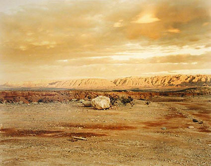
It can be tempting to think of advocacy for a cause as a matter of making a social statement for one thing and against another. But the issues and the approaches needed are much more complex. I appreciate that Burtynsky doesn’t take a simplistic cliched antagonistic stance towards the industry. There can be no ecological solution without a related economic solution. I relate to his emphasis of a Rorschach-like quality of seeing, which involves and in the best of cases encourages self-reflection. Individual responsibility/action and connection/interaction is highlighted. Since I was a young man I’ve felt the standard ways of using photography for environmental advocacy, though they fulfill an important function, were not effective enough on their own and that new approaches are needed. Burtynsky offers one alternative and encourages me to think of others.
View Edward Burtynsky’s TED talk here.
Find out more about my influences here.


Read More

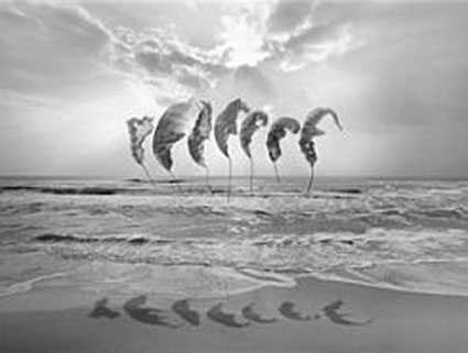
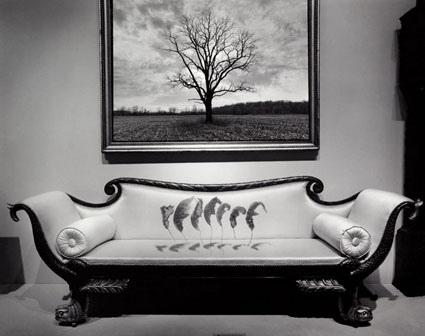
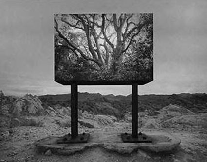
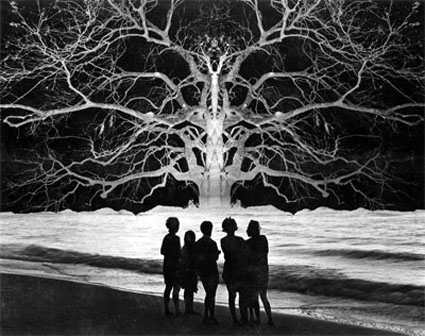
Jerry Uelsmann – Visions From The Mind’s Eye


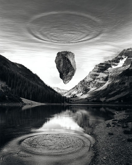
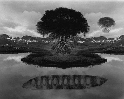
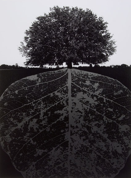
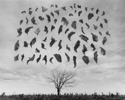
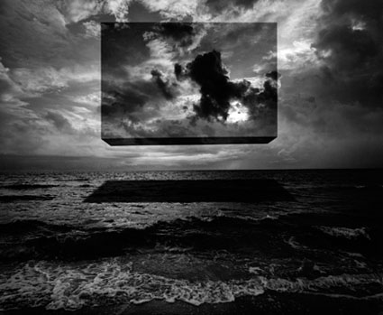
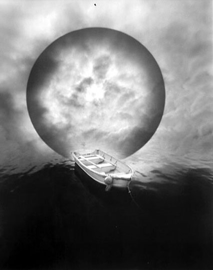
Since the 1950’s Jerry Uelsmann has created his surreal photographs entirely in the traditional black-and-white darkroom combining multiple negatives seamlessly into new visual realities, ones that didn’t exist before the camera eye at one moment in time but were found in the mind’s eye over a lifetime.

Many view his images as a continuance of the surreal photography pioneered by avante-garde photographers in the 1930s. While influenced by this movement, he feels his work has a kinship with a larger visionary sensibility that has risen and fallen cyclically throughout the history of art or which could perhaps better be characterized as the history of consciousness.

Absurd only to the conscious mind, more inquisitive than critical, his work is neither automatic nor entirely random, but rather driven by felt connections as opposed to ones that are intellectually prefigured. Though punctuated with moments of humor and horror, the dominant tendency in his body of work is towards encountering and collecting moments of sublimity.

Freely mixing archetypal images drawn from the natural world and architectural images (with a particular emphasis on museums and libraries both repositories of information, surrogate minds if you will) his work suggests a continual exchange between our insides and outsides. Transference, projection, repression, fixation, conflict; the contents and processes of the soul are laid out on the surfaces of his images for all to see. Occasionally Uelsmann recycles the same images creating multiple compositions from them, revealing additional connections and suggesting the continual internal stirring necessary for psychological metamorphosis.

For me, as much today as when I was a child, long before Photoshop, Jerry Uelsmann was a shining example of possibilities. He used a relatively young medium with a developing tradition in a different way. He created his own visual language to build a very personal visual world one image at a time – and then shared it with us. His is a different kind of work. He does the soul’s work through poetry rather than the mind’s work through non-fiction.

Read my extended conversation with Jerry Uelsmann here.
Find out more about my influences here.


Read More

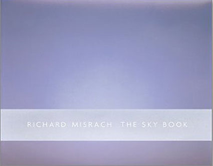
Richard Misrach – A Life’s Work


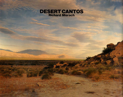
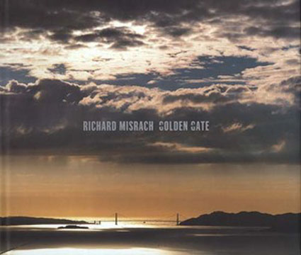
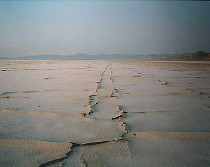
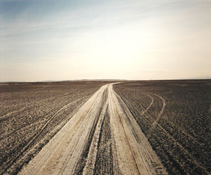
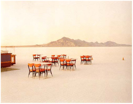
Richard Misrach has dedicated himself to a single project for a lifetime – the Desert Cantos. Begun in 1979, the Desert Cantos is a series of series that takes its name from its location, the American desert southwest, and the structural term for a subsection of a long song or poem. Each canto varies in subject matter, the amount of time it spans, and the number of works included. Numbered as each canto is completed, the first fourteen cantos, in order, are The Terrain, The Event, The Flood, The Fires, The War (Bravo 20), The Pit, Desert Seas, The Event II, Project W-47 (The Secret), The Test Site, The Playboys, Clouds, The Inhabitants, and The Visitors. Stranded Rowboat, Salton Sea is from the third canto, The Flood. Stylistically ranging in sensibility between minimalism, realism, romanticism, impressionism, and expressionism, Misrach’s work is sometimes challenging aesthetically and always subtly steeped in the social issues that surround land use, ultimately becoming an extended meditation on how man (particularly the American psyche) and nature (specifically the American southwest) define one another.

Misrach thinks of all his desert pictures as part of a single great work, divided by smaller themes and stylistic treatments. When collected together, they become a monumental study constructed by wide-ranging explorations of many aspects of a complex subject with a long history and ultimately a rumination on self and identity. The American west is the landscape that defined the American psyche as we know it. Through his work, we come to understand that both may be stranger than we think.

Richard Misrach’s work reminds me of how each work an artist produces is connected to all other works, in one way or another, and that creative development and presentation of that work can highlight those connections, not just for the public but for the artist as well. Even more importantly, he demonstrates the depth and breadth that can be achieved through dedication to a single subject for an extended period of time.

Read my extended conversation with Richard Misrach here.
Find out more about my influences here.


Read More

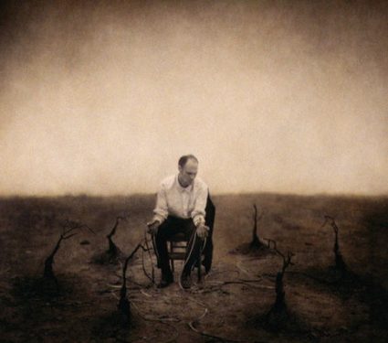
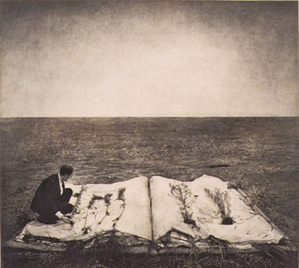
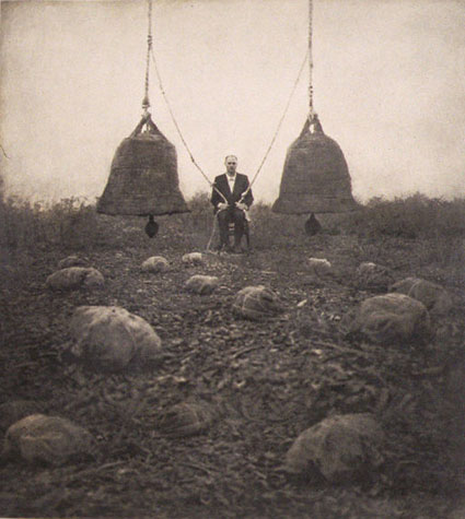
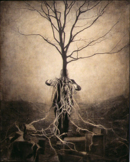
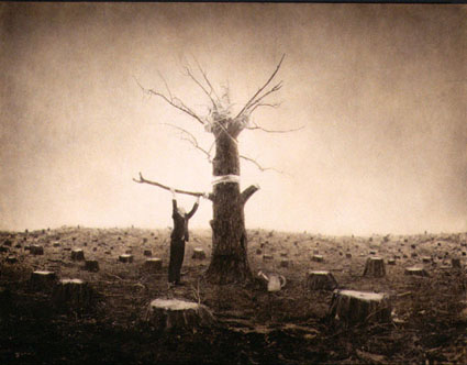
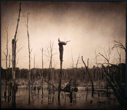
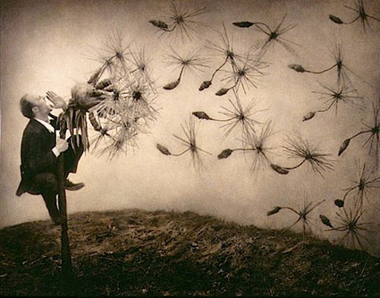
Robert and Shana ParkeHarrison – Environmental Metaphors

Robert and Shana ParkeHarrison collaborate to produce an apocalyptic vision of our future that contains a wake-up call for us all – for our own health, we must tend to the health of our environment.

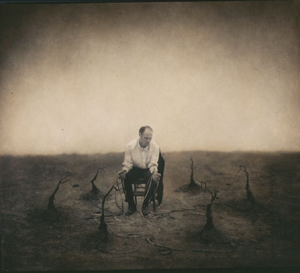
The primary model, Robert poses as an isolated anonymous everyman struggling to survive a future ecotastrophe, hoping for restoration and redemption through bizarre ritualistic behavior. Not strictly self-portraiture, the self-referential quality of these images invites us to imagine ourselves in similar situations.
Their multi-media approach includes painting, sculpture, and performance art. The final product, sometimes digital, appears to be made with historic photographic processes, making the future look alternately dreamlike and old, which combined with the construction of absurd cobbled-together machines implies a partial loss of technology, adding one more loss to the mix.

Poetically, these images evoke powerful emotional reactions that swing pendulum-like between hope and despair, joy and grief, idealism and nihilism. Rife with ambiguity, contradiction, and paradox, the specific and complete meaning of these images eludes us. Their unfinished quality begs us to continue our inquiries, speculations, and projections about them, as well as to look towards the new works for more clues to help us solve this mystery – or at least deepen it. Perhaps these are the feverish hallucinations of the paranoid or perhaps they are divinely inspired prophecies of our future.

Robert and Shana ParkeHarrison’s evocative imagery suggests to me that we need personal emotional appeals as much as objective factual appeals to produce change. After all, a change of heart always precedes a change of action.

Find out more about my influences here.


Read More

Joel-Peter Witkin – Looking Into Darkness


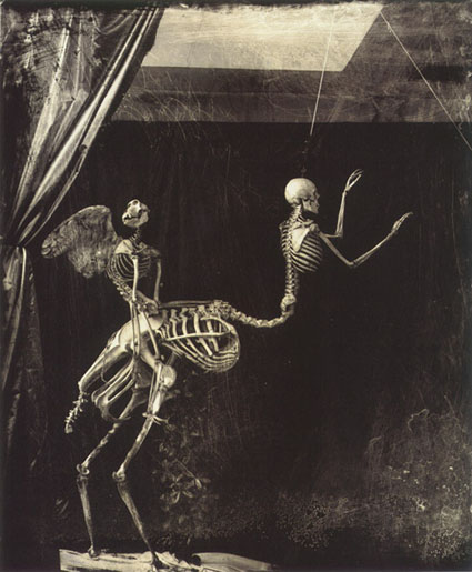
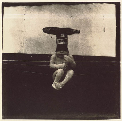
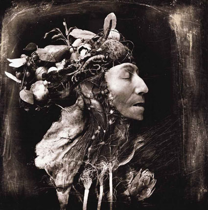
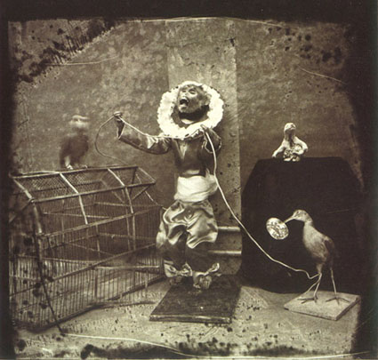
I find Joel-Peter Witkin’s photography supremely challenging. It would be easy to write his work off as sensational (His images are so shocking they make headlines.), perverse (His models are, if alive, unusual body types including dwarves and hermaphrodites, if dead, cadavers, amputations, skeletons, and carrion, while his props often include sado-masochistic paraphernalia and torture devices.), and contrived (He reproduces historic masterworks in his own dark way.). But that would be too easy.

Witkin’s work challenges me to look at things I turn away from and my own denial. There’s an unusual beauty in his work. This beauty is drawn from much more than exceptional print quality, which though chaotically distressed and painted is nonetheless crafted masterfully. In his best work Witkin transcends the fleeting beauty found on the surfaces of things and penetrates deeper to find a more enduring beauty that lies below the surface – in the most unexpected places and sometimes in the most unexpected ways. I think it takes wisdom to see beauty (especially unconventional beauty) and that beauty imparts wisdom.
Witkin doesn’t consider the things he’s photographing taboo or ugly. He claims to simply acknowledge their existence and to have found beauty within them. Thus he doesn’t think his work aestheticizes negativity, perversion, or violence.  For this to be absolutely true he would need the unerring powers of a saint. Sometimes he misses the mark, either from aiming at the wrong target, a misdirection born out of a calculation designed to impress rather than a passion designed to transform, or from not penetrating deeply enough, perhaps he is not as unflinching as he would lead us to believe. But, he is always courageous and dares to explore in depth what few ever dare to glimpse.

The true task of looking at Witkin’s work is found in differentiating which of Witkin’s images transcends cleverness – not all of them do – to achieve true insight – those that do offer a most unusual substance. The true reward of looking at Witkin’s work is … The shock his best work produces is not the kind of shock that quickly passes leaving me looking for the next big rush. The shock his best work produces haunts me long after I’ve seen his work, sometimes never passing. Appreciating Witkin’s images leaves me more aware, perhaps more alive, potentially wiser, and never unchanged.

Witkin challenges me to flinch less, or if I flinch, to find the courage to continue looking and moving forward. He reminds me that the apprehension of beauty and the wisdom derived from it is made stronger by acknowledging and perhaps coming to a better understanding of the darker aspects of existence.

Find out more about my influences here.


The following images contain nudity. The choice to continue looking is yours.
Read More

Eliot Porter – Environmental Advocacy Through The Arts


No other photographer is more influential to me than Eliot Porter – save my father. I knew Eliot through my mother’s long collaboration with him designing and overseeing the production of over twelve of his books during my formative years. His influences on me are too numerous and wide-ranging to list them all here. A few stand out from the rest.

Eliot was a pioneer who elevated the use of, appreciation of, and collectability of color within the medium of photography, aligning his distinctive style with the subtle and complex palette of nature.

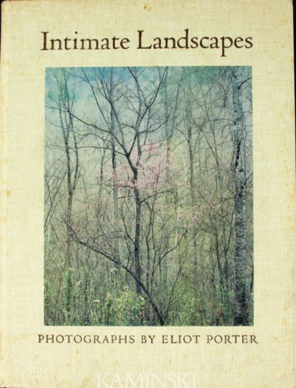
Eliot was probably the most widely published fine art photographer of his day. He was at the forefront of a handful of photographers that defined a style that would later characterize an entire genre of photographic environmental advocacy. It was during the production of Eliot’s book Intimate Landscapes where I was first introduced to digital imaging. When I saw the Scitex machines used in the 1970s I instantly wanted to use them for artistic rather than commercial purposes, but thought it might be a lifetime before I could afford what my mother called a “million dollar coloring book” until I got my own copy of the first version of Adobe Photoshop, which was a dream come true. The posters my mother designed to promote the book and exhibit ultimately became some of the Metropolitan Museum’s most successful, far exceeding the reach of the originals. I learned that an artist’s effectiveness could be dramatically extended beyond rare original works of art through publications made available to large audiences.

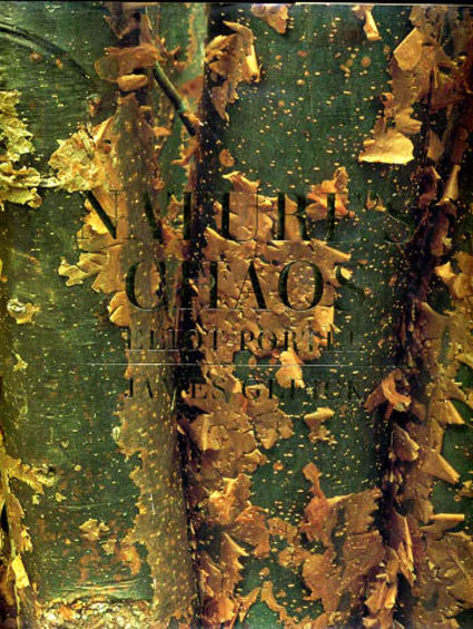
James Gleick’s (the author who popularized complexity sciences and fractal geometry in his best-selling book Chaos) choice to join forces with Eliot on their book Nature’s Chaos confirmed my opinion that Eliot had intuitively sensed a deeper order in nature than was conventionally seen and portrayed this in his images. Eliot’s background and continuing interest in the sciences informed his art.

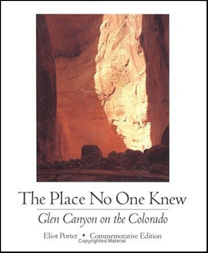
Eliot described his book The Place No One Knew, a portrait of Glen Canyon before it was flooded by a dam, as a eulogy because it was released after the floodwaters began rising and affected public opinion too late to stop the destruction of the canyon’s destruction. Hearing about both the successes and failures of advocacy through the arts, I decided that while I wanted to make my own contributions in this area, there were plenty of other artists contributing in similar ways and new ways were also needed. He knew this when he threw down the gauntlet one day and said to me, “You know, it’s going to be your generation that decides whether we will hand down a habitable environment to future generations.”

Even more influential to me than his photographs was the man. In his 70’s and 80’s, Eliot was physically fit (walking 5 miles a day), adventurous (traveling to remote locations like Iceland and Antarctica), mentally sharp as a tack (loving intelligent respectful debates with anyone of any age or background and often playing the devil’s advocate just to see where the conversation and the other person would go), and actively socially conscientious (continuing his long-standing participation in organizations like the Sierra Club. He was a shining example in so many ways.

Find out more about my influences here.

Adam Fuss – Visible Traces


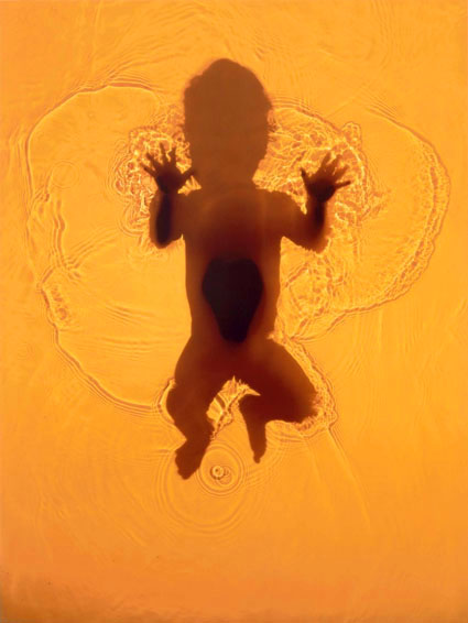
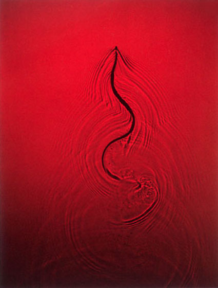
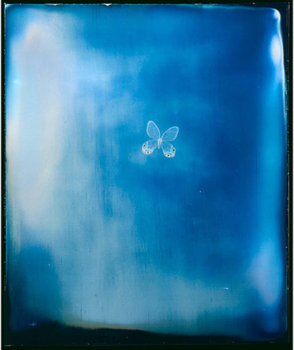
Adam Fuss’ photograms encourage you to think about photography, in different ways and much more broadly. His life-sized camera-less photograms represent one man’s attempt to work with, explore, and see subjects, media, and perception more directly. By making camera-less images, Fuss eliminates many distortions inherent in optical systems that employ lenses.

The turning point in Adam Fuss’ work came when he accidentally processed a piece of film that recorded only a grain of dust and its shadow. He had the sensitivity to see something extraordinary in this ordinary moment. Since then, he’s explored many ways of making photograms, including producing images from the chemical reactions created by photosensitive materials coming in contact with viscera and decaying objects.

Fuss’ photograms highlight the idea of the photograph as a trace made by light that has come in direct contact with the thing recorded. Fuss takes this one step further in his photograms, as the objects, not just the light reflected from them, literally make contact with the recording device, which becomes the final art object. Akin to abstract painting, the thing made represents itself more than the subject.

In Fuss’ work, the absence of light reveals as much or more as the presence of light, reversing our conventional expectations of photographs (‘light drawings). This is more than just ironic – it’s insightful.
Like Plato’s The Allegory Of The Cave, where men raised in a cave are bound in such a way that they only see shadows and mistake them for the real things not just reflections of reality, Fuss’ photograms ask us to consider the limited nature of our perceptions and not to confuse the recordings we make with the things themselves.

Read my extended conversation with Adam Fuss here.
Find out more about my influences here.

Read More

Walter Chapelle – More Than Material


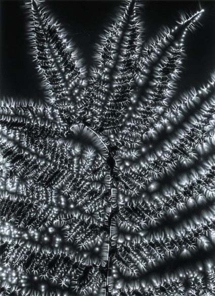
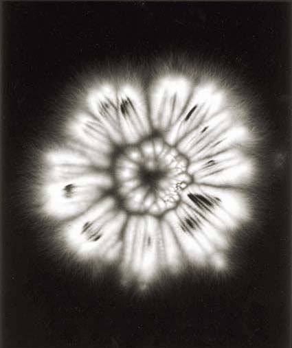
Walter Chapelle’s Metaflora series is the kind of photography that fascinates me most. Rather than portraying things as we see them, it uses photography to extend our senses, providing new windows into the universe.

Chapelle uses Kirlian photography to look deeply into the world of plants. Kirlian photography (named after the Russian inventor Semyon Kirlian) is a form of camera-less form of photography, akin to a photogram, that records the effects of high voltages of electricity applied to objects in contact with light-sensitive material. An electric current separates the electrons from atoms and objects become ionized and glow, albeit faintly. Typically, nothing is seen by the observer during exposure, but an image appears when developed. The size and shape of the energy field are related to the amount of water, a prerequisite for life, in the object as well as the surrounding atmosphere. Plantlife loses moisture after it is harvested so the length of time between picking and exposure affects the intensity of the effect. Electromagnetic radiation penetrates beyond the typically opaque surfaces revealed by reflected light, itself one manifestation of a broader spectrum of electromagnetic radiation, and renders both the interiors and the immediate exteriors surrounding objects.

This glimpse into the invisible electro-magnetic fields that surround all objects, including our own bodies, generates visual effects that are reminiscent of the age-old idea of auras or the spiritual bodies of living things. Part science and part poetry, Chapelle uses this unusual perspective to speak metaphorically about seeing into the hidden dimensions of ourselves.

Find out more about my influences here.


Read More