High Pass Sharpening

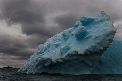
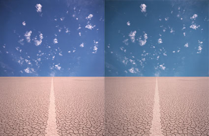
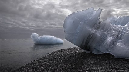
No High Pass sharpening

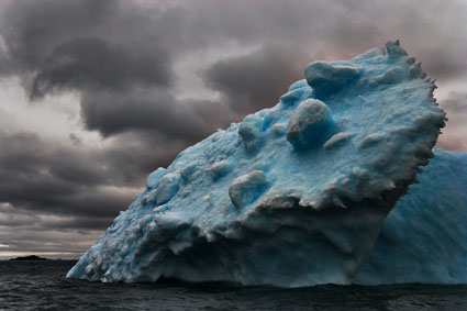
Low Radius High Pass sharpening

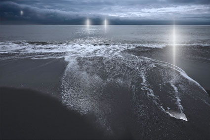
High Radius High Pass sharpening

There are three methods of sharpening in Photoshop that we should all be aware of: Luminance, Edge and High Pass sharpening. In this order, the three methods become progressively more complex and go to greater lengths to reduce the accentuation of noise.


Insights Members can login to read the full article.
Email:
or Sign up

Sharpening With Layers


There are many reasons to use layers when sharpening your digital images.
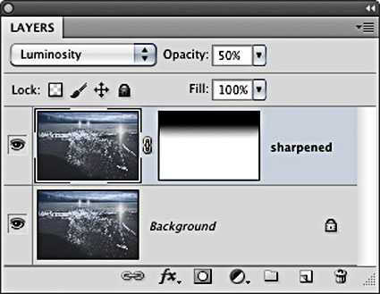
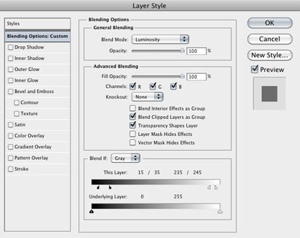
Layers can be used to eliminate saturation shifts. Change the Blend Mode of a sharpening layer from Normal to Luminosity. Color noise will be reduced this way.


Insights Members can login to read the full article.
Email:
or Sign up

Softproofing


As a rule, always softproof an image to determine a rendering intent and make printer/substrate specific adjustments to a image file before printing it.

You can get Photoshop to display an image the way it will appear when it’s printed, before you print it, by softproofing an image. If you softproof before you print, you’ll get your best first proof or maybe even a finished print.  Not to be confused with a hard proof or physically printed piece, a softproof uses an ICC profile to create an onscreen simulation of an image as it will appear when printed.
Wait. Haven’t you already done this by calibrating and characterizing your monitor with a colorimeter, choosing an editing space along with color management policies in Photoshop, and specifying the right profile for a printer/paper combination with your printer driver? Almost. Doing these things ensures that all of the different color behaviors of the devices you’re using are accurately described and that color conversions are handled precisely, but it doesn’t ensure that you will see exactly how an image will look when printed. Without softproofing, you see how an image looks on a monitor. To see an image on a monitor with the appearance of how it will look when printed, before you print it, you need to take the final step of softproofing the image. This simulation won’t change your file, just it’s appearance. Once softproofed, if you choose to, you can make output specific adjustments to your file before printing to get a better first print. Read More

Benefits of Editing Images In 16 Bit Mode

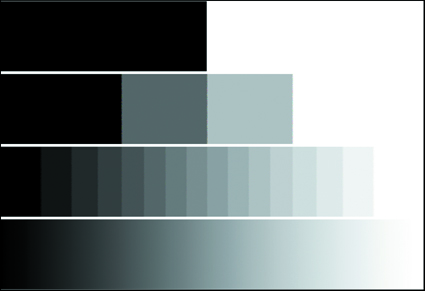
More bits of data make more shades of gray.


What’s the difference between 8-bit and 16 bit? The number of shades of gray. 256 versus 65,536 to be exact. With more shades of gray, gradation becomes smoother.

How do you get at these numbers? Digital files are binary. 2 to the 8th power is 256. 2 to the 16th power is 65,536.

2 1 = 2
2 2 = 4
2 3 = 8
2 4 = 16
2 5 = 32
2 6 = 64
2 7 = 128
2 8 = 256
2 9 = 512
2 10 = 1024
2 11 = 2048
2 12 = 4096
2 13 = 8192
2 14 = 16,384
2 15 = 32,768
2 16 = 65,536

16-bit files take twice as much memory to store all those shades of gray. It’s worth it. For an arithmetic increase in file size you get a logarithmic increase in the number of shades of gray.

256 shades of gray are just enough shades of gray to do reasonably well for most imaging applications. The human eye can see approximately 1,000 shades of gray. With 65,536 shades of gray, 16-bit files contain tens of thousands of shades of gray more than you can see.

So what are all those extra shades of gray good for? Editing your files to get the best results possible. When a digital file is edited, it loses some shades of gray. If a digital file contains too few shades of gray, it begins to posterize. You may see signs of posterization if an image’s histogram displays combing or gaps and spikes. Before you panic, examine smooth areas of an image to make sure there’s visible posterization. Do this at 100% screen magnification; many times the posterization you see on a monitor is a result of a monitor not being able to display the data as smooth as it is at other screen magnifications. 16-bit files contain so many shades of gray, it’s very difficult for posterization to occur with normal editing – unless you deliberately posterize it with digital filtration.

16-bit doesn’t extend color gamut; 16-bit files can be either small or wide gamut. 16-bit is recommended for files created in wide-gamut color spaces, like Pro Photo RGB, because the steps between tonal values are spread out over a larger distance to achieve greater saturation and so tend to posterize more quickly.
16-bit doesn’t extend dynamic range; it doesn’t generate a blacker black or a whiter white. 16-bit source files are recommended for high dynamic range because HDR images are heavily processed when tone-mapped and would posterize without higher bit depths. In HDR processing, multiple bracketed 16-bit files are combined into a single file with a 32-bit mode used to hold the varied data they contain over a dynamic range that is wider than the device that created them. A 32-bit file is subsequently tone-mapped and rendered down to a 16-bit file with an improved dynamic range.

With the exception of 32-bit files used for HDR tone-mapping, files in Adobe Photoshop can either be either 8-bit or 16-bit.

To get true 16-bit data, you need to generate it when you create a digital file – and preserve it during image editing. JPEG files can’t contain 16-bit data; they’re cooked down to 8-bit. Raw files can. (So can scanned images.)
Not all Raw files contain a true 16-bits of data. While many DSLRs can only generate 10-bits, 12-bits, or 14-bits data, all DSLR Raw files contain more than 8-bits of data, which can only be preserved in Photoshop if edited in 16-bit mode.

You can change a digital file’s mode from 8-bit to 16-bit, but doing this won’t magically add shades of gray to the old 8-bit data; all this does is create the possibility of adding new 16-bit data information on top of the old 8-bit data; and it doubles a file’s size.

Editing files in 16-bit mode limits some of Photoshop’s functionality; many filters don’t work in 16-bit mode.
You can apply a filter to an 8-bit copy of a 16-bit file and drop and drag the filtered file into the original 16-bit file as a layer. Again, the layer won’t have 16-bits of data and may be adversely affected by subsequent edits if they are aggressive. If edited minimally, the results can be quite acceptable.

Editing your images in 16-bit mode is worth the time and effort. You’ll generate fewer imaging artifacts during editing and so create better-finished files.

Right now, creating 16-bit files is largely about generating the best 8-bit data. (Most monitors can only display 8-bits of data. Improved results in print can only be discerned by the very discriminating eye in select files.) In the future, when monitors and printers make better use of more than 8-bit data, you’ll begin to see visible improvements in gradation when your images are viewed in both display and print.
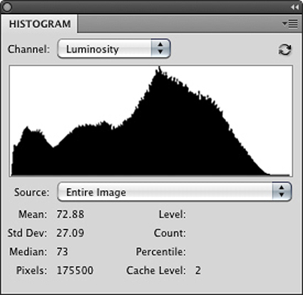
A smooth histogram.

A posterized histogram.

Gaps happen when contrast is increased; tones that were close together are spread apart. Spikes happen when contrast is reduced; tones that were close together become the same.

Avoid this by editing in 16-bit.


Read more in my Color Management resources.
Learn more in my digital printing and digital photography workshops.

Top 5 Ways To Add Color To B&W


Colorless black-and-white images are beautiful, but sometimes it’s nice to add a little bit of tone. By adding color to your b&w photos, you can enhance their expressive qualities.

These days, you can add color to your black-and-white digital images in virtually unlimited ways. Sure, the choices before you can be dizzying. Fortunately the techniques are simple, and the experimentation process for determining which tone qualities work with specific images is easy and fun. Here are five go-to ways for bringing color back into monochrome images in Adobe Photoshop.

1 Colorize With Hue/Saturation

2 Split Tone With Curves

3 Restore A Percentage Of Original Color

4 Add Color By Hand

5 Selectively Tone With Masks


For all the details visit PopPhoto.com.

Read more in my Black & White lessons.
Learn more in my digital photography and digital printing workshops.

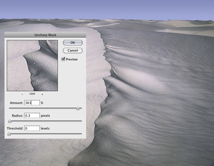
Unsharp Mask


Precise sharpening can improve almost any image. It helps to know when to apply it, what type of sharpening to apply, how to apply it and where to apply it. Forget the filters Sharpen, Sharpen More and Sharpen Edges. They're just default settings of Unsharp Mask. Even Smart Sharpen offers few advantages over Unsharp Mask; it's particularly useful for compensating for trace, but not substantial, amounts of motion blur. My advice? Start with the classic and master it.
Why is a filter that makes images appear sharper called Unsharp Mask? In silver-halide-based photography, unsharp masks are made with out-of-focus negatives that are registered with an original positive image. During exposure, the blurring adds contrast around contours, making images appear sharper. Digital unsharp mask works the same way; it uses blurring algorithms to add contrast to contours, again making images appear sharper.


Insights Members can login to read the full article.
Email:
or Sign up

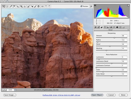
Capture Sharpening


Optimal image sharpening is best done in three stages— capture (do it during RAW conversion), creative (do it in Photoshop) and output (automate it).
Capture sharpening benefits all images. It compensates for inherent deficiencies in optical and capture systems. All lenses and sensors have specific characteristics and deficiencies. They don't all have the same characteristics or deficiencies.
To speed your workflow, default settings for a best starting point for capture sharpening can be determined for all images created with the same lens/chip combination and saved for subsequent use. To optimally sharpen an image, you'll need to modify these settings to factor in additional considerations—variances in noise (ISO, exposure duration, temperature), noise-reduction settings and the frequencies of detail (low/smooth to high/fine texture) in an image.


Insights Members can login to read the full article.
Email:
or Sign up

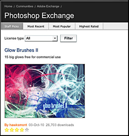
Photoshop Exchange


“Where do you go to access over 10,000 unique Photoshop presets, templates, tutorials, plug-ins and more? Visit Photoshop Exchange, the Adobe hosted website for customers who want to discover and share Photoshop content with each other. They recently crossed the 10,000th item milestone, adding 600 new submissions since January. The majority of the content is free, and those few paid pieces of content average about $4.
If you’re looking for inspiration, or just want to try out some new styles, effects or practically anything else that can be customized in Photoshop, you will find Actions (51% of Exchange’s content), followed by Styles (15%) and Brushes (10%), as well as shapes, tutorials and patterns, and many elaborate and useful Templates (.PSD files, ranging from Web components and complete site designs, brochures, flyers, 3D presentation graphics, print ads and the like), which can save you time and even help you explore how advanced users build complex and beautiful files.”

Visit Photoshop Exchange here.