Softproofing


As a rule, always softproof an image to determine a rendering intent and make printer/substrate specific adjustments to a image file before printing it.

You can get Photoshop to display an image the way it will appear when it’s printed, before you print it, by softproofing an image. If you softproof before you print, you’ll get your best first proof or maybe even a finished print.  Not to be confused with a hard proof or physically printed piece, a softproof uses an ICC profile to create an onscreen simulation of an image as it will appear when printed.
Wait. Haven’t you already done this by calibrating and characterizing your monitor with a colorimeter, choosing an editing space along with color management policies in Photoshop, and specifying the right profile for a printer/paper combination with your printer driver? Almost. Doing these things ensures that all of the different color behaviors of the devices you’re using are accurately described and that color conversions are handled precisely, but it doesn’t ensure that you will see exactly how an image will look when printed. Without softproofing, you see how an image looks on a monitor. To see an image on a monitor with the appearance of how it will look when printed, before you print it, you need to take the final step of softproofing the image. This simulation won’t change your file, just it’s appearance. Once softproofed, if you choose to, you can make output specific adjustments to your file before printing to get a better first print. Read More

Use Screenshots For Complex Notes In Photoshop


Adopt a non-destructive workflow. When you can’t, take notes.

Non-destructive Photoshop workflows do more than let you change edits to a file in perpetuity, they also create a record of what you’ve done to an image. For instance, when you reopen a Smart Object, you can simply check the interface to see any and all of the Adobe Camera Raw settings currently being applied. So, if you’re not sure whether the latest detail rendering and noise reduction algorithms are being used for a given file, all you have to do is open the Smart Object to verify this. Or, when you click on an adjustment layer you can see those settings in the Adjustments panel. So, if you’re not sure whether an adjustment layer caused clipping, you can toggle it on and off to verify this; if it is you reset the values; if it’s not you find the real source for the clipping.

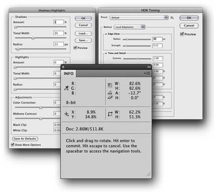
Despite Photoshop’s increasingly flexible interface, there are still many times when you need to work destructively. Not all edits can be applied as Smart Objects, Smart Filters, or adjustment layers. Many filters still can’t be applied as Smart Filters. HDR merge settings can’t be applied non-destructively. Adjustments from third-party plug-ins, such as noise reduction with Noiseware or Tonal Contrast from NIK’s Viveza can’t be applied non-destructively. But you can create records of the settings you use with destructive edits, making it easier to see what you did later and helping make future refinements faster and more precisely.

How? Take notes in Photoshop. There are many ways to take notes in Photoshop. There’s the Note tool. You can use a Text layer. You can record information in the title of a layer. For complex settings, all of these can be more abstract and time-consuming than necessary, reducing the likelihood that you’ll actually make them.
There is an easy way to make notes of complex interfaces. Use screenshots. A screenshot takes a picture of your screen, either entirely or partially. Store images of the destructive edit settings inside the file you used them on and you’ll have excellent notes for future reference. Doing this only takes a few seconds. Read More

Epson R3000 Photo Printer


Epson recently announced a new addition to it’s line of photo printers.
It’s a smaller version of the Epson R3880.
Epson Ultrachrome K3 with Vivid Magenta Ink Technology
13″ wide
It lists for $849.99.
Find it at B&H for $834.95 here.
Industry-leading pigment ink technology
Epson UltraChrome K3 with Vivid Magenta Ink Technology for stunning color and black-and-white prints with intense blues and violets and improved skin tones
Individual high-capacity ink cartridges
Change cartridges less often with nine 25.9 ml individual ink cartridges
Advanced Media Handling
Offers consistent, reliable performance with front-in, front-out paper path; accommodates cut-sheet and roll paper in sizes up to 13″ wide; supports photographic and fine art paper, canvas, art boards and CD/DVDs
Unparalleled connectivity
Hi-Speed USB 2.0, wireless 802.11n and 100 Mbit Ethernet support
Auto-switching Black inks
achieve the highest black density and superior contrast on glossy, matte or fine art papers from either Matte or Photo Black ink
Leading-edge image-quality architecture
Smoother color transitions and outstanding highlight and shadow detail with AccuPhoto™ HD2 imaging technology
Precision 9-color, 8-channel print head technology
Innovative MicroPiezo® AMC™, one-inch wide print head with ink-repelling coating for more accurate dot placement and reduced maintenance
Professional control
Advanced Black-and-White Photo Mode to easily create neutral or toned black-and-white prints from color or monochrome images
Learn more about the Epson R3000 here.
Find the tools I use here.
Read more in my digital printing lessons.
Learn more in my digital printing workshops.

Viewing Light – SoLux


Good light makes your prints appear even more beautiful. Get good light. It’s one of the most essential elements in any photographic image, at the point of capture, during processing, and at the point of display.

SoLux (www.solux.net) makes good light. SoLux bulbs’ Color Rendering Indexes (rating used to describe the quality of light) are 99 on a scale of 100. All SoLux bulbs are full smooth spectrum and ultra low UV and IR. SoLux bulbs come in a variety of color temperatures – 3500K, 4100K, 4700K, and 5000K. SoLux bulbs come in a variety of beam angles – 10-36 degrees. Low voltage (12 volt), SoLux bulbs fit in standard MR-16 2 pin socket fixtures and adaptors are available for regular screw in fixtures.

While light has many important qualities, two are particularly significant; temperature and spectral power distribution.

Most prints are viewed under light temperatures warmer than 5000K, typically a mix of tungsten (2800K) and daylight (variable). Galleries and museums favor halogen (2900K). Studies suggest that more people prefer viewing artwork under higher color temperatures (3500K).

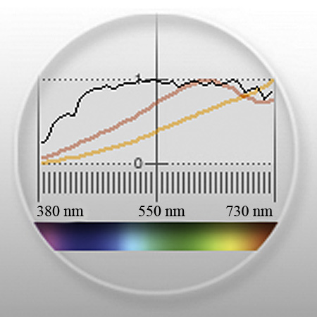
A majority of artificial light sources, including fluorescent, metal halide, and LEDs, have an uneven distribution of colors. Graphs of light sources with uneven spectral distributions display spikes in specific regions of the spectrum. Spikes limit the number of available colors in a spectrum to discern an object’s color. Due to missing colors in between spikes, objects may look dull or gray. When a spectrum is uneven, hues that are found in elevated levels appear brighter while hues that are found in low levels appear duller. Spikes create an imbalance in the relationships between hues. When possible, avoid lights that have them.

Incandescent light contains large amounts of yellow, orange, and red light. Though not as extreme, halogen suffers from the same tendencies. Cool white fluorescent light may produce a white that is cooler in appearance, but all fluorescent lights have uneven spectral distributions.

How important is viewing light? Very. To many, at first glance, the differences may seem subtle. To truly appreciate the differences you need a side-by-side comparison of the same or identical objects in spikey and smooth spectrum light sources.

The curators of the Van Gogh Museum (Netherlands) visited their traveling collection while it was on display at the National Gallery of Art (US). “What have you done with our paintings?” they exclaimed. They thought they had been cleaned. “Nothing.” was the reply. The real answer was in the light – SoLux. Under full-spectrum light sources the paintings appeared significantly brighter, clearer, and more saturated. The Van Gogh Museum now uses SoLux bulbs. More and more museums are beginning to use SoLux bulbs as well.

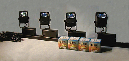
I use SoLux 3500K bulbs for my studio and gallery. I evaluate and display prints under the same light, one that most closely approximates the display conditions prints are most likely to be viewed under. I use four SoLux Gooseneck fixtures for portable light sources; two with 3500K bulbs to evaluate display conditions and two with 5000K bulbs to evaluate color management issues (calibration, softproofing, and profiles).

I recommend to owners of my prints that they strongly consider using 3500K SoLux bulbs for display and viewing.
To see, you need light. So it stands to reason that the light you view your prints in is extremely important. All lights are not created equally. For the best results, choose a high-quality light source.
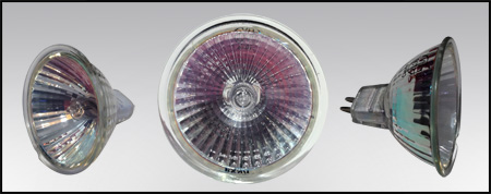

SoLux bulb

Spectral curves comparing 3500K halogen (yellow) and SoLux (red)
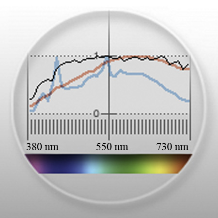
Spectral curves for 5000K fluorescent gti lightbox (blue) and SoLux (red)
Visit www.solux.net to find out more about their products and light (there are excellent resources there on the science of light).
Contact Phil Bradfield – phil@solux.net or 800-254-4487.

Read more on Color Management here.

Read more on digital Printing here.

Learn more in my digital photography and digital printing workshops.
Print Shield – Protective Print Spray

There’s a print spray that anyone making inkjet prints needs to know about – Premier Art’s Print Shield. It’s a UV water resistant lacquer that comes in a variety of finishes – matte, semi-gloss, and glossy. It offers protection from light, water, moisture, airborne contaminants, and fingerprints. It doesn’t produce any visible changes in the print, either in color or density or surface.  It dries fast and doesn’t have a strong odor. It reduces burnishing and scuffing somewhat. Most importantly, it greatly increases longevity, in some cases by as much as 200%
Each $15 400ml can covers approximately 75 8×10” prints.
Henry Wilhelm has tested prints sprayed with Print Shield. Visit wilhelm_research.com for his most current data on longevity.
I spray all of my prints with Print Shield now.
Just like spraying a pastel, apply the fixative carefully. If the substrate gets soaked the surface may darken permanently. Instead of spraying the print directly, spray the air above the print and let the mist fall onto the print surface. Let the print dry for a few minutes. Then reapply.
Find PrintShield here.
Read more about the tools I use here.
Learn more in my digital photography and digital printing workshops here.

Epson Advanced B&W Photo

Black and white printing presents several significant challenges; the ability to produce a neutral color, the ability to maintain that neutral appearance under different light sources (reduced metamerism), the ability to attain graybalance (consistent color throughout the entire tonal scale); the ability to achieve a very dark black (high Dmax) without sacrificing shadow detail (low dot gain), and longevity. All of these things are now easily attainable.

Black and white inkjet printing has come of age. In past years, there have been many compelling solutions for making black and white prints with inkjet technology; some have been fraught with problems (third party quadtone ink sets clog easily) and others have been expensive (ColorByte's ImagePrint RIP). Today, superior quality inkjet printing is both affordable and easily achieved.


Insights Members can login to read the full article.
Email:
or Sign up

Navigating The Epson Printer Driver With Photoshop


Successfully managing color for digital printing requires that the color in an image file be converted from its device-neutral color space to a device-specific color space. (Typically this occurs by converting from Adobe RGB 1998 or Pro Photo RGB  to a device-specific color space defined by an ICC profile characterizing a specific combination of printer, ink, paper, and driver.)

Using Photoshop, you can either convert color in an image before you send it to a printer driver or after you send it to a printer driver.

Choose one method of color management – not two. Easily made, a classic mistake is using both. Double color management typically results in a print that is too light and magenta.

The Epson printer driver provides many ways to manage color conversions and get reasonably good color. Two methods offer the best results; the Photoshop route and the Epson route.
How do you choose either of these methods?

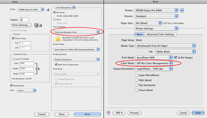
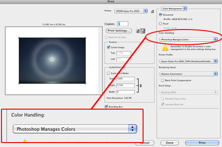
Let Photoshop’s Print window (under Color Handling) guide you – Let Photoshop Determine Colors and Let Printer Determine Colors. (While the principle is the same for most printers, interfaces will vary. Here’s information for the most current Epson interface.)

If you choose Let Photoshop Determine Colors under Color Handling, select a profile for Photoshop to make the conversion with (a paper/ink/driver specific profile not the interface default of Working RGB) under Printer Profile, choose a Rendering Intent of either Relative Colorimetric or Perceptual, and then click Print Settings. In the Print window choose the correct Printer and then change Copies and Pages to Print Settings. Select the correct Media Type, uncheck High Speed, and choose the highest printer resolution available. Finally, change Print Settings to Color Management and select Off (No Color Adjustment). The Photoshop route turns Photoshop’s color conversion on and turns the printer’s color conversion off.

The Photoshop route tends to hold slightly more saturation but it’s rendition of neutral colors and gray balance is usually not as good as the Epson route. The Photoshop route is the route to take when you want to use a custom profile. Use it if you are printing with either third-party inks or papers which require the use a custom profile to accurately describe the behavior of the alternate media.

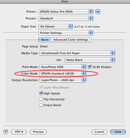
If you choose Let Printer Determine Colors under Color Handling, choose a Rendering Intent of either Relative Colorimetric or Perceptual, and then click Print Settings. In the Print window choose the correct Printer. Change Copies and Pages to Print Settings to select the correct Media Type, uncheck High Speed, and choose the highest printer resolution available. Finally, change Print Settings to Color Management, choose EPSON Standard (sRGB) under Mode, and select Color Controls. The Epson route turns Photoshop’s color conversion off and turns the printer’s color conversion on.

The Epson route tends to deliver a significantly improved rendition of neutral colors and gray balance with slightly less saturation. Try it when printing neutral colors. Use the Epson driver’s Advanced B&W Photo feature for black and white images.

Each route works well. Each route yields slightly different results. Test them to see the differences. (Note that you cannot see the differences between printing routes when softproofing; you have to make physical proofs to see these differences. They can significant.)
Read More

How To Avoid Double Color Management – Epson Printers


Get This – Correct Color Management
Avoid This Double Color Managed
Is your print too light and magenta? Double color management. It’s a classic mistake. I sometimes make it myself when I’m working too fast. So that you know what to look for, I recommend that you make the mistake deliberately, once, and only once, if possible.
Don’t do this …

And this …

What’s the right solution?
Check your software (Photoshop or Lightroom) and printer software (Epson driver) settings, reset them, and print again. Choose one method of color management – not two.
Read more in my online resources.
Learn more in my digital printing workshops.
Firefly Invisible Ink


Jon Cone’s Inkjet Mall recently introduced Firefly Invisible Ink, an inkiest designed for viewing prints under black light only.
“Firefly™ ink is a sophisticated encapsulated dye ink that is invisible in ordinary daylight. Turn off the lights and expose with a black light and the color is vibrant and life-like. We make Firefly inks in cyan, lt cyan, magenta, lt magenta, yellow and white. Because the inks are invisible and require UV light in order to be seen, images must be printed in a false color in order to appear normal under black light. We produced Firefly™ ink Image Converter software so you do not need to experiment. You can open an image, convert it and save it as jpg or png file to print in any software of your choosing. We also put in some expert tools for those who wish to experiment.”
Kudos for innovation.
All bets are off on longevity.
Learn more about Firefly Invisible Ink here.
Learn more with my online digital printing resources.
Learn more in my digital printing workshops.