My Top 5 Photographic Influences Revealed On The Crit House’s myFive
I talked with Jeff Larason (The Crit House) about my top five photographic influences.
Find out who they are and why in this video
I talked with Jeff Larason (The Crit House) about my top five photographic influences.
Find out who they are and why in this video
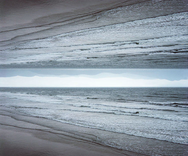
As atmosphere builds up, contrast and detail are diminished, while colors grow cooler and less saturated.
Whites are an exception; they get darker and yellower.
Atmospheric perspective can be applied to neutral or black-and-white images using luminosity only.
In the foreground, increase contrast. In the background lighten blacks and darken whites.
Because compositionally, skies are quickly read as separate spaces, they can generally hold more saturation and still seem far away… but don’t overdo it if you want your photographs to be believable.
Used in Western art since the Renaissance, the principle of atmospheric perspective can be stated simply. Some colors rise forward, while others fall back. Lighter, warmer, saturated colors, with more contrast, appear closer, and darker, cooler, desaturated colors, with less contrast, appear farther away. You can use atmospheric perspective to control the illusion of three-dimensional depth in your two-dimensional images. When you do this, the scenes you present will become more believable, eye-catching, and compelling.
Adjust Color Selectively
The key to using atmospheric to enhance your images is to adjust color selectively.
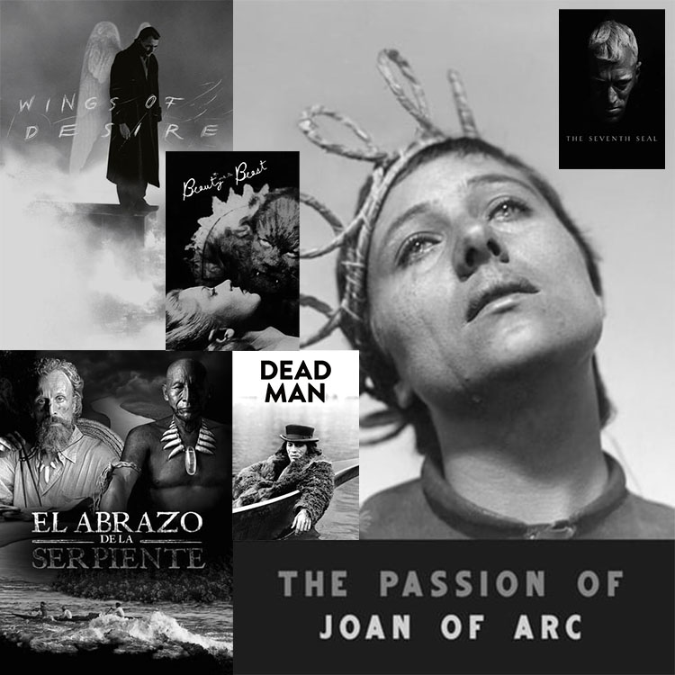
Wings Of Desire, Beauty And The Beast, Embrace Of The Serpent, Dead Man, Seven Samurai, The Seventh Seal, The Passion Of Joan Of Arc …
We’ve all got our favorite black-and-white films. Any top 10 or 25 list will surely leave some of our favorites out and start a debate – that’s well worth having. Doing the hard work of picking our tops and supporting our choices helps us be clearer about what we most appreciate, inspiring ideas for how we might incorporate those qualities in our own images and be better able to celebrate it with others. Preparing for this task is a pure pleasure. Consider immersing yourself in the wonderful world of black and white with classic movies.
Here are 5 lists of the most beautiful black-and-white movies. Enjoy!
Taste Of Cinema – The 25 Most Visually Stunning Black-and-White Movies of All Time
List Challenges – The 25 Most Visually Stunning Black-And-White Movies of All Time
IMDB – Most Beautiful Black And White Films (Post 1965)
Listal – The Most Beautiful Black And White Films
New York Film Academy – The Best Black & White Films In Cinematography
What are your favorite black-and-white movies?
Leave your recommendations in the comments.
Find more Color Theory inspiration from the movies here.
Explore my Black & White resources here.
Learn more in my digital photography and digital printing workshops.
Julianne Kost demonstrates how to use the Object Selection tool, Generative Fill, and Camera Raw as a smart filter to remove distracting bright areas in the image and put more emphasis on the subject.
For more check out Julieanne’s blog.
Learn more with my Composition resources.
Learn more in my digital photography and digital printing workshops.
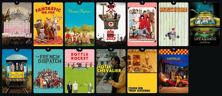
Color Theory and Wes Anderson’s Style — Sad Characters in a Colorful World
Few directors use color as masterfully and idiosyncratically as Wes Anderson. In each movie and scene of individual movies, color sets the mood and tells you about the plot and character. Though he clearly understands and uses classic color theory, his use of color transcends aesthetic formulas and encodes content with complexity and nuance.
Watching his movies is both an education and an inspiration.
Read a detailed analysis of 10 movies here.
The Wes Anderson Color Palette: Bright Colors Meet Dark Subjects
How To Take Accidentally Wes Anderson Photos
Follow Wes Anderson on Instagram here.
Follow accidentallywesanderson on Instagram here.
Find more Color Theory inspiration from the movies here.
Learn more in my digital photography and digital printing workshops.
“Julieanne Kost demonstrates tips and techniques for using Lightroom Classic and Photoshop to crop, transform, and expand a photograph using Generative Fill to make a more balanced composition.”
For more check out Julieanne’s blog
Learn more with my Composition resources.
Learn more in my digital photography and digital printing workshops.
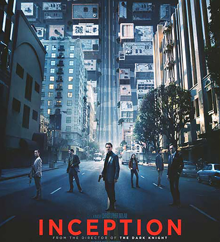
Consider how you can use color as a code to move viewers between images and/or sets of images. Christopher Nolan’s masterful use of color in his movie Inception will inspire you to new heights.
Inception moves between five levels of reality; waking, three levels of dream, and limbo, a plane of infinite subconscious that can be entered by traveling through the deepest dream level. The differences between each dream level’s color palette help viewers distinguish where characters are as they move between layers. Color becomes more than pleasing; it becomes content, a code to be decoded.
In the highest waking and lowest dreaming layers there is no consistent color palette; they have not been designed by the dream architect Ariadne. The three dream layers that have been designed have consistent palettes.
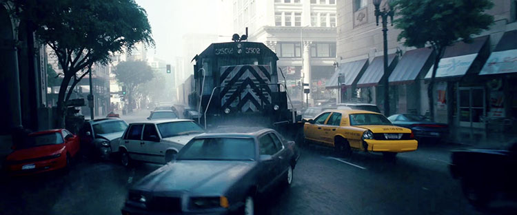 Dream layer one’s rainy exteriors are dominated by grays, dark blues, and blacks.
 Dream layer two’s urban interiors are composed of warm oranges and browns.
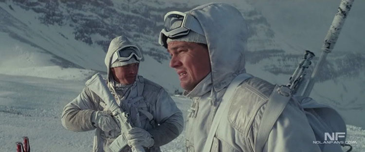 Dream layer three’s snowy exteriors are rendered with bright whites and grays.
Understanding the use of color in Inception helps viewers orient and better understand this complex movie.
How many ways could you apply this principle in your images?
Find more Color Theory inspiration from the movies here.
Learn more in my digital photography and digital printing workshops.
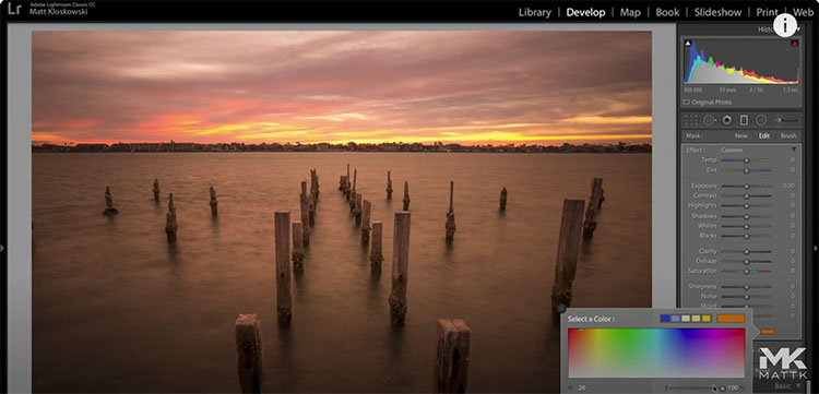
“In this video we’ll look at a little-known/used tool with the selective adjustments in Lightroom and Photoshop Camera Raw. It’s the Color tool and we’ll really dive in to how it’s different than just the normal white balance settings for changing or adding color to your photos.”
Watch more from Matt Kloskowski here.
Learn more with my Color Adjustment resources.
Learn more in my digital photography and digital printing workshops.
Whether in painting, photography, or motion pictures, color theory is one of the most important elements in art theory. Learn what colors mean and why and investigate the power of colour as this video answers the question “How can color tell a story?”
Find more Color Theory inspiration from the movies here.
Learn more in my digital photography and digital printing workshops.

“Discover the brand new “Adjustment Presets” with a new update to create and export your own color grading presets! This is game-changing as it allows you to create presets that are insanely customizable in every aspect since they are just a group of Adjustment Layers. In this tutorial, we will learn what Adjustment Presets are, how to create them from scratch, how to export and import different color grading styles, and finally, understand the limitations of the tool.”
Find more of Unmesh Dinda’s content here.
Learn more in my Color Adjusment resources.
Learn more in my digital photography and digital printing workshops.