.

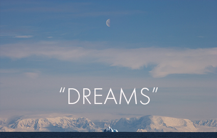
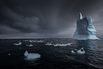
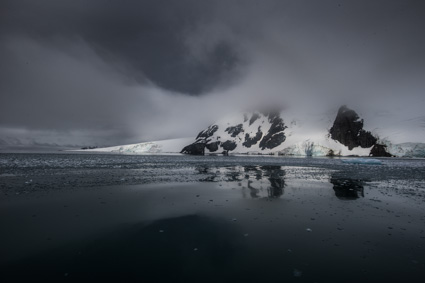
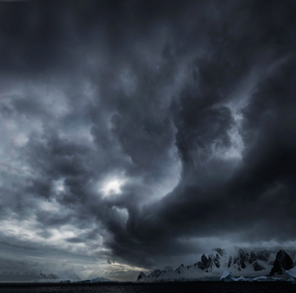
Edward Burtynsky – Manufactured Landscapes


Edward Burtynsky’s photographs deftly weave together aspects of a well-researched documentary expose and a beautifully constructed formal artistic statement, but it’s unclear which is more dominant, or if they’re something else entirely.

Burtynsky let’s the things he photographs speak for themselves. Yet he photographs specific kinds of things, related things; oil fields, mines, railways, highways, manufacturing plants, dumps and salvage yards, etc. More than the specific things he photographs it may be these relationships that he’s ultimately photographing. And like the effects of the global industrial complex his work has a cumulative effect.
Despite the restrained yet shocking quality of his images, Burtynsky claims not to be critical of industry and presents himself simply as a witness to the monumental changes man makes to land. At first his stance seems simple but the more one considers it the more complex it becomes, almost to the point of becoming enigmatic.

“I’d say, actually, that I’ve been careful not to frame the work in an activist or political kind of way. That would be too restrictive in terms of how the work can be used in society and how it can be interpreted. I see the work as being a bit like a Rorschach test. If you see an oil field and you see industrial heroism, then perhaps you’re some kind of entrepreneur in the oil business and you’re thinking, “That’s great! That’s money being made there!” But, if you’re somebody from Greenpeace or whatever, you’re going to see it very differently. Humans can really reveal themselves through what they choose to see as the most important or meaningful detail in an image.”

It might be easier to draw a clear line between us (the consumers) and them (the manufacturers), but Burtynsky doesn’t because there isn’t one. Because of his approach, his work is richer, more layered, more nuanced, and perhaps more relevant. Perhaps.

It can be tempting to think of advocacy for a cause as a matter of making a social statement for one thing and against another. But the issues and the approaches needed are much more complex. I appreciate that Burtynsky doesn’t take a simplistic cliched antagonistic stance towards the industry. There can be no ecological solution without a related economic solution. I relate to his emphasis of a Rorschach-like quality of seeing, which involves and in the best of cases encourages self-reflection. Individual responsibility/action and connection/interaction is highlighted. Since I was a young man I’ve felt the standard ways of using photography for environmental advocacy, though they fulfill an important function, were not effective enough on their own and that new approaches are needed. Burtynsky offers one alternative and encourages me to think of others.

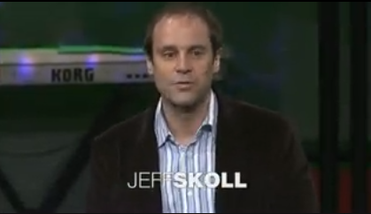
View Edward Burtynsky’s TED talk here.
Find out more about my influences here.


Read More

BBC's Explorations – Vision & Photography – Parts 1-4


This is a great series on how photography changes the ways we see!
“In Vision & Photography BBC’s Explorations charts the advances in science and technology that have revealed hidden worlds and astonishing images. Well see how remarkable innovations in medicine, photography and astronomy have enhanced and altered our understanding. This is the story of how Mankind is driven to acquire these seemingly impossible visions; it is a journey through the images that have revolutionised how we understand our world.”

Vision & Photography – BBC Explorations – Part 4


“One of the pioneers in the use of strobe lighting in photography was Professor Harold Edgerton. Developing the technology to look at our world in different and startling ways has been one of the greatest achievements of human endeavour. The latest development in photography is also one of the most amazing. Its called Time Slice.”

Vision & Photography – BBC Explorations – Part 3


“So much of our world is invisible to us. Its secrets locked in time and space. But alter that time and space and the once invisible world suddenly becomes visible. ??Using a fast flashing artificial light or a strobe light, its possible to freeze minute moments of time, and even the fastest moving objects. ??One of the pioneers in the use of strobe lighting in photography was Professor Harold Edgerton. Developing the technology to look at our world in different and startling ways has been one of the greatest achievements of human endeavour. The latest development in photography is also one of the most amazing. Its called Time Slice. ??Time slice, invented by Tim Macmillan, freezes a single moment in time and lets us view it in three dimensions.”

Using Props


Most images can be compared to a stage. There’s an environment, a central character (often with a secondary character), an action performed, a prop (or two or three or four, maybe more), and light. Props are thought of as so secondary that we often overlook them and their contributions to great dramas. At a minimum, props make an environment richer and more interesting. Sometimes props do more, providing a catalyst for action or a stimulus for interaction.

Try using props in your images to stimulate many creative ideas.

When it comes to props, you’ve got options. Props can be single or multiple, repeated or varied, found or purchased either on site or offsite, old or new, manufactured, handmade, or natural … just keep going. The possibilities are seemingly limitless. Almost anything can be a prop.

Finding the limits of what makes a prop may be one of the most insightful things you’ll learn during your explorations.

There are some fine lines to explore when using props.

Props can make or break images. The right prop animates an image making it stronger. The wrong prop confuses and disrupts an image’s integrity. Appropriate really isn’t an appropriate word to use when selecting a prop. Sometimes an inappropriate or absurd addition is what adds meaningful ambiguity, tension, or complexity. Useful is a better word to use. When choosing a prop, ask yourself. “Does it contribute and reinforce or does it distract and detract from a statement?”

The story and character props bring with them can add interest and energy to almost any image. Props can turn ordinary images into extraordinary ones. Props can also clutter or overload picture-perfect pictures. There is much to be gained by exploring the differences between placing props in already strong compositions and deliberately weakening the graphic impact of a composition, making it perfectly imperfect, to emphasize the storied quality a prop contributes.

Using props raises a lot of questions. In fact, it may be the questions props raise that make them so full of potential and possibilities.

Is an object a prop if you find it rather than select it? Props are usually deliberately chosen rather than incidentally found (except in existential dramas or French films) because rather than dumbly filling space they comment, whether directly or obliquely, on the place, person, or events at hand. Props are relevant.

Is it a prop if you don’t move it? There’s an interesting distinction to be drawn between photographing found objects that haven’t been moved and those that have. Whether the distance is long or short, if you transport an object to a new location it becomes a prop.

Does repetition of the same prop change its function or status as a prop? If a repeated prop is not placed in context carefully it can become the central subject. Used strategically repeated props can provide continuity between two or more images. Firearms are not the only smoking guns found in mysteries.

Is it a prop if it’s the central subject? An object photographed with a minimal background is a study. A found set of objects is a still life, though many still lifes are selected, moved, and constructed.

At what point does an object become a prop? It’s useful to remember that, rather than stealing the show, props prop something else up. Props are supporting actors in a larger drama. Props are used for accent, counterpoint, and interaction but they are rarely the central focus, at least not the sole focus. Admittedly, the line drawn between a prop (a secondary element) and a subject (a primary element) can be very fine, at times almost indistinguishable.

There may be no definitive conclusions to these questions, save the images you make.

What is undeniable is that each move you make has consequences,

You’ll learn a lot by looking at how other people use props in their images. Here are a few examples of great uses of props in photography.

Joyce Tenneson often asks the subjects she makes portraits of to hold objects that contribute something elusively poetic to the picture.

Horst Wackerbarth has made a career of transporting a red couch around the world and photographing it in all manner of locations.

Sean Duggan’s series Artifacts Of An Uncertain Origin, places man-made objects in an unlikely way into natural scenes as if by magic.

Albert Lamorisse’s  movie The Red Balloon, which was later adapted as a book of stills, takes its title from a prop that becomes more than a prop or a central character in the drama.

Keep looking for other good examples and you’ll find there’s more to learn every day.

With just a little more thought, you can go even further. Physicist Richard Feynman championed the thought experiment. Just imagine what you can do with props.

If William Shakespeare is right and “all the world’s a stage … “ then how you accessorize your images, and perhaps even your life, with props, will speak volumes.

Find more resources on Creativity here.
Learn more in my digital photography workshops.

Here’s a selection of my iPhone experiments with props.


Read more on iPhone photography here.

Jerry Uelsmann – Visions From The Mind’s Eye


Since the 1950’s Jerry Uelsmann has created his surreal photographs entirely in the traditional black-and-white darkroom combining multiple negatives seamlessly into new visual realities, ones that didn’t exist before the camera eye at one moment in time but were found in the mind’s eye over a lifetime.

Many view his images as a continuance of the surreal photography pioneered by avante-garde photographers in the 1930s. While influenced by this movement, he feels his work has a kinship with a larger visionary sensibility that has risen and fallen cyclically throughout the history of art or which could perhaps better be characterized as the history of consciousness.

Absurd only to the conscious mind, more inquisitive than critical, his work is neither automatic nor entirely random, but rather driven by felt connections as opposed to ones that are intellectually prefigured. Though punctuated with moments of humor and horror, the dominant tendency in his body of work is towards encountering and collecting moments of sublimity.

Freely mixing archetypal images drawn from the natural world and architectural images (with a particular emphasis on museums and libraries both repositories of information, surrogate minds if you will) his work suggests a continual exchange between our insides and outsides. Transference, projection, repression, fixation, conflict; the contents and processes of the soul are laid out on the surfaces of his images for all to see. Occasionally Uelsmann recycles the same images creating multiple compositions from them, revealing additional connections and suggesting the continual internal stirring necessary for psychological metamorphosis.

For me, as much today as when I was a child, long before Photoshop, Jerry Uelsmann was a shining example of possibilities. He used a relatively young medium with a developing tradition in a different way. He created his own visual language to build a very personal visual world one image at a time – and then shared it with us. His is a different kind of work. He does the soul’s work through poetry rather than the mind’s work through non-fiction.

Read my extended conversation with Jerry Uelsmann here.
Find out more about my influences here.


Read More

Richard Misrach – A Life’s Work


Richard Misrach has dedicated himself to a single project for a lifetime – the Desert Cantos. Begun in 1979, the Desert Cantos is a series of series that takes its name from its location, the American desert southwest, and the structural term for a subsection of a long song or poem. Each canto varies in subject matter, the amount of time it spans, and the number of works included. Numbered as each canto is completed, the first fourteen cantos, in order, are The Terrain, The Event, The Flood, The Fires, The War (Bravo 20), The Pit, Desert Seas, The Event II, Project W-47 (The Secret), The Test Site, The Playboys, Clouds, The Inhabitants, and The Visitors. Stranded Rowboat, Salton Sea is from the third canto, The Flood. Stylistically ranging in sensibility between minimalism, realism, romanticism, impressionism, and expressionism, Misrach’s work is sometimes challenging aesthetically and always subtly steeped in the social issues that surround land use, ultimately becoming an extended meditation on how man (particularly the American psyche) and nature (specifically the American southwest) define one another.

Misrach thinks of all his desert pictures as part of a single great work, divided by smaller themes and stylistic treatments. When collected together, they become a monumental study constructed by wide-ranging explorations of many aspects of a complex subject with a long history and ultimately a rumination on self and identity. The American west is the landscape that defined the American psyche as we know it. Through his work, we come to understand that both may be stranger than we think.

Richard Misrach’s work reminds me of how each work an artist produces is connected to all other works, in one way or another, and that creative development and presentation of that work can highlight those connections, not just for the public but for the artist as well. Even more importantly, he demonstrates the depth and breadth that can be achieved through dedication to a single subject for an extended period of time.

Read my extended conversation with Richard Misrach here.
Find out more about my influences here.


Read More

Robert and Shana ParkeHarrison – Environmental Metaphors

Robert and Shana ParkeHarrison collaborate to produce an apocalyptic vision of our future that contains a wake-up call for us all – for our own health, we must tend to the health of our environment.

The primary model, Robert poses as an isolated anonymous everyman struggling to survive a future ecotastrophe, hoping for restoration and redemption through bizarre ritualistic behavior. Not strictly self-portraiture, the self-referential quality of these images invites us to imagine ourselves in similar situations.
Their multi-media approach includes painting, sculpture, and performance art. The final product, sometimes digital, appears to be made with historic photographic processes, making the future look alternately dreamlike and old, which combined with the construction of absurd cobbled-together machines implies a partial loss of technology, adding one more loss to the mix.

Poetically, these images evoke powerful emotional reactions that swing pendulum-like between hope and despair, joy and grief, idealism and nihilism. Rife with ambiguity, contradiction, and paradox, the specific and complete meaning of these images eludes us. Their unfinished quality begs us to continue our inquiries, speculations, and projections about them, as well as to look towards the new works for more clues to help us solve this mystery – or at least deepen it. Perhaps these are the feverish hallucinations of the paranoid or perhaps they are divinely inspired prophecies of our future.

Robert and Shana ParkeHarrison’s evocative imagery suggests to me that we need personal emotional appeals as much as objective factual appeals to produce change. After all, a change of heart always precedes a change of action.

Find out more about my influences here.


Read More

Joel-Peter Witkin – Looking Into Darkness


I find Joel-Peter Witkin’s photography supremely challenging. It would be easy to write his work off as sensational (His images are so shocking they make headlines.), perverse (His models are, if alive, unusual body types including dwarves and hermaphrodites, if dead, cadavers, amputations, skeletons, and carrion, while his props often include sado-masochistic paraphernalia and torture devices.), and contrived (He reproduces historic masterworks in his own dark way.). But that would be too easy.

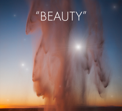
Witkin’s work challenges me to look at things I turn away from and my own denial. There’s an unusual beauty in his work. This beauty is drawn from much more than exceptional print quality, which though chaotically distressed and painted is nonetheless crafted masterfully. In his best work Witkin transcends the fleeting beauty found on the surfaces of things and penetrates deeper to find a more enduring beauty that lies below the surface – in the most unexpected places and sometimes in the most unexpected ways. I think it takes wisdom to see beauty (especially unconventional beauty) and that beauty imparts wisdom.
Witkin doesn’t consider the things he’s photographing taboo or ugly. He claims to simply acknowledge their existence and to have found beauty within them. Thus he doesn’t think his work aestheticizes negativity, perversion, or violence.  For this to be absolutely true he would need the unerring powers of a saint. Sometimes he misses the mark, either from aiming at the wrong target, a misdirection born out of a calculation designed to impress rather than a passion designed to transform, or from not penetrating deeply enough, perhaps he is not as unflinching as he would lead us to believe. But, he is always courageous and dares to explore in depth what few ever dare to glimpse.

The true task of looking at Witkin’s work is found in differentiating which of Witkin’s images transcends cleverness – not all of them do – to achieve true insight – those that do offer a most unusual substance. The true reward of looking at Witkin’s work is … The shock his best work produces is not the kind of shock that quickly passes leaving me looking for the next big rush. The shock his best work produces haunts me long after I’ve seen his work, sometimes never passing. Appreciating Witkin’s images leaves me more aware, perhaps more alive, potentially wiser, and never unchanged.

Witkin challenges me to flinch less, or if I flinch, to find the courage to continue looking and moving forward. He reminds me that the apprehension of beauty and the wisdom derived from it is made stronger by acknowledging and perhaps coming to a better understanding of the darker aspects of existence.

Find out more about my influences here.


The following images contain nudity. The choice to continue looking is yours.
Read More

Vision & Photography – BBC Explorations – Part 2


“Our eyes play tricks on us. And all around us there exist in the natural world some of the most extraordinary optical illusions. One creature resembles its background so closely its been given the same name, the stick insect. Scientists have learnt a lot from natures optical illusions. Soldiers regularly use camouflage to blend into their background and now human ingenuity has taken camouflage to its logical next step. Soon well be able to make a man completely invisible. Electrically conducting cloth covered in light sensitive sensors sees what’s behind the soldier and projects it onto the front of a suit. Will the invisible man of science fiction soon become science fact?”