The physical exhibit is closed now …
… but the online experience continues.
Sign up for my newsletter Mindful Of Nature,
and receive a virtual tour guide.
I’ll send you the issue you missed within a week.
March 21 – May 14
Landscapes Within Landscapes & Process
Sordoni Art Gallery, Wilkes University, Wilkes Barre, Pennsylvania
The gallery is currently open by appointment only.
Email email melissa.carestia@wilkes.edu
Landscapes Within Landscapes
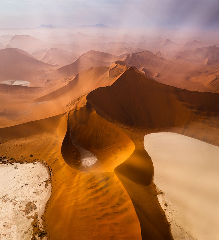
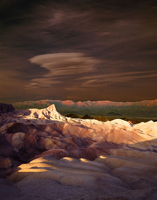
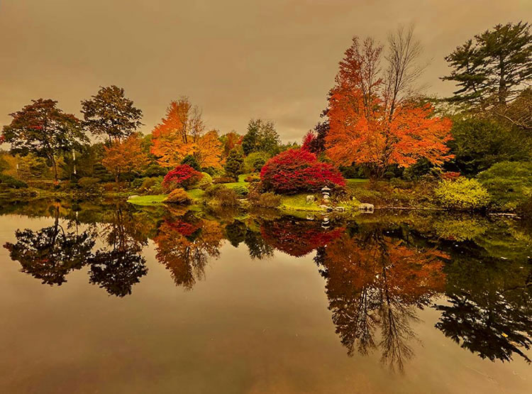
50 large prints survey the artist’s career; this exhibit illuminates how the perception of nature and the nature of perception are deeply intertwined. How we see the land changes how we see ourselves. The artist suggests we are land, not apart from nature but a part of Nature.
Process
25 small prints unveil the artist’s practices in detail, showing how process influences perception.
Enhanced with audio, video, and hybrid texts, the two exhibits combined offer a unique look into contemporary visions of land and changes in photographic practice.
Catalog
A catalog expanding upon the exhibit will be available.
.
Sordoni Art Gallery – Wilkes University, Wilkes Barre, PA
Sign up for Collector’s Alert for more news.
Events
Monday, March 20
3:15 PM – Interview with Erika Funke, WVIA NPR
Tuesday, March 21
11:15-12:45 – How To Be More Creative
5-6 pm – Lecture / Meditations In Nature
6-7 pm – Reception
Wednesday, March 22
1-2:15 – Ekphrastic Writing Workshop
.
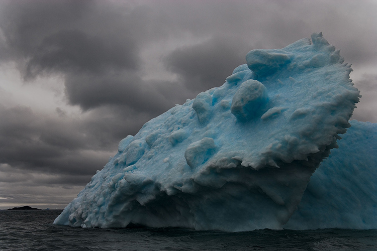
Clouds roll in.
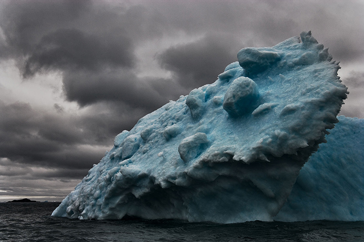
The sky clears.
Sequence can enhance images and may even change the stories they tell.
Sequence
How you present your images can be as important as which ones you select. It’s the art of sequencing (and it is an art), which involves specific techniques that you can learn. What are some of the guiding principles involved? Here are a few.
Quality
Start strong. Finish strong. Make getting there interesting. Whether a symphony, a novel, or an exhibit, it’s good advice for arranging any creative project.
Identifying your strongest image is essential. It sets the highest level of quality, against which all others will be measured. It alone may help you create an appropriate structure for the rest of your work. This singular image is often used to lead a body of work (in the announcement of your project and possibly as the first images seen in the sequence), becoming the most frequently viewed image.
While you may want to arrange your images from strongest to weakest for your own information, you certainly don’t want to present them to other people this way. Instead, you want to tease out your strongest images along the way, sustaining attention toward a strong finish.
While not every image you include in a project needs to be equally strong, a majority of images included should be representative of your best work. The rest should be almost as good. Use lesser images only when they help illustrate essential points that would otherwise be overlooked or add complexity and dimension.
No amount of arranging will make up for the lack of high-quality work. It may be easier to build mass into a project by including lesser amid stronger works; this is rarely an effective strategy. Quality makes the primary impact. Volume is secondary. Even if taken to an extreme, a large dose of average work is far less impressive than a small dose of high-quality work.
To sequence a project, you can use the metaphor of building a fence. The strongest pieces can be thought of as posts. The less strong pieces can be thought of as rails. You want to start and end with the very strongest pieces to create a strong structure. You want to periodically reinforce runs of less strong units with one or more stronger units. You don’t want long runs of rails without posts, or the structure may fail. A fence made only of posts becomes something else entirely, a wall with no variation or grace. The number of strong pieces you include determines how long your fence can be before it gets weak or falls apart.
Story
It’s helpful to identify the story you’re telling. This will impact not only your selection of images but also your presentation of them. Think of each individual picture as a chapter in a book. Simple phrases and sentences can help you. You can logline the entire story, and you can also logline single images (if not every image, then key images that mark transitions) to better understand the function they serve.
“Have you noticed how all photographers have favourite stories that tell of being in a certain place at a certain time and making a photograph that really excited them? People love to hear these stories.”
Recently I had a wide-ranging conversation with Peter Eastway, a great Australian photographer and the publisher of Better Photography magazine. We talked about visualization, the creative process, and how words can be useful for photographers.
Here’s an excerpt …
Words Can Help
John suggests that writing is far better at describing intangibles than photography. Sure, we can make photographs that represent love or freedom, but the language we’re using can be ambiguous. Not every viewer will pick up on what we’re doing. Many will have their own interpretations, so perhaps our own use of words in association with our photographs can make things clearer. “I think it depends on the kind of journey you want to create for your viewers. I was just looking at Eliot Porter’s Antarctica book, and I was surprised by how heavy the captions were and how dense the text that separated different sections in the book was. It’s not right or wrong; it’s just one kind of experience. However, a problem with words is that they can limit the viewers’ experience by not leaving enough room for the viewer. But words that are open, generative, and don’t close things down can be very engaging. “I think a lot of artists are uncomfortable with words because it’s not a skill they’ve developed. But good words have helped me understand art much better. They didn’t destroy the mystery; they enhanced it.”
Think of an artist giving a talk at an exhibition or presenting a slide show of images. Would you expect the artist to just sit there and say nothing? Or would you want to hear what’s going on inside the artist’s mind, inside their heart? John has a slide show about Antarctica on his website, and his voice-over provides an added dimension to the presentation. With the words, I felt I knew a lot more about John, his personality, and his approach to photography. There was a synergy.
But if you have never written about anything in your life, how do you start to write about something that can be as personal as photography? It can already be challenging enough to show our photographs to others; now we’re supposed to write about them as well? John has some practical suggestions, beginning with telling a story. “Have you noticed how all photographers have favourite stories that tell of being in a certain place at a certain time and making a photograph that really excited them? People love to hear these stories. What it was like to be there? What were you thinking? What were you feeling? What did you learn? You don’t have to say or write big fancy words or even have it all perfectly composed. You can keep your language really simple, just like you talk. One of the things you can try is to imagine you’re having a conversation with a mate and tell them the story. Transcribe what you say and maybe clean up the ‘umms’ and the ‘ahhs,’ but it doesn’t have to be fancy language. In fact, simple direct language will communicate with other people better. Most people get turned off by ‘art speak’, and most people do not want to read a 3000-word essay. But we love short stories. In fact, the human brain is hooked on them. So, telling one of your stories is a great starting point, and having hung out with some of the ‘greats’ of photography, you don’t need a lot of them. They were constantly telling the same stories. Dad had half a dozen stories he’d tell time and time again. How many celebrities did Arnold Newman photograph, yet he generally used the same small number of stories.” A short story can be used as a caption or an introduction. It allows you to position the viewer closer to you so they better understand what your photograph is about, but, as John emphasises, without making things so tight, there isn’t room for your viewers to use their own imagination.
Read the full article. Visit Better Photography Issue 111.
Learn how to change the perspective of anything using the Perspective Warp.
00:00 – Introduction
00:15 – Perspective Warp in Photoshop Guide
04:30 – Perspective Warp and Compositing
06:05 – Change The Perspective of a Room in Photoshop
08:20 – Change The Perspective of a Building in Photoshop
09:25 – Apply a Logo in Perspective in Photoshop
10:28 – Apply a Graphic in Perspective to Multiple Planes
Find more from Jesus Ramirez’s Photoshop Training Channel.
Learn more in my digital photography and digital printing workshops.
“Look at three ways to adjust your skies in Lightroom and Photoshop. Each works a little differently, and some make automatic selections – which works well sometimes. While others require a little more work but can give better results.”
“Adobe added Curves to the masking tool in Adobe Camera Raw, but has yet to add the same feature to Lightroom Classic. Here’s how to cheat and apply Curves using the masking feature in Lightroom Classic.”