.

Suffusion XXII – The Making Of The Print


I’m having a great time printing this series of images!
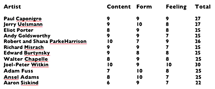
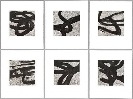
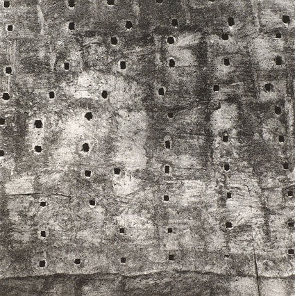
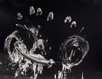
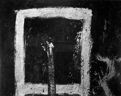
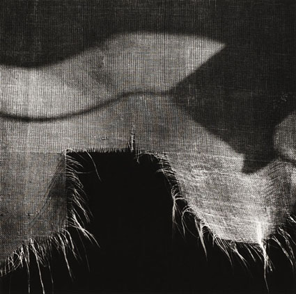
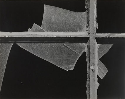
At first glance, they look like classic black and white images. In reality, they’re full color captures of a near neutral subject, processed and printed as color images. The trace amounts of color from the original subject make a very subtle but meaningful addition to the final image and print.
The trace amounts of color in the image are so subtle, I wasn’t sure which color management options would yield the best printed results; shadow detail, gradation, neutrality and graybalance all play major roles.
To get the final prints today, I tested multiple printer color management routes (Photoshop, Printer, Printer Adv B&W)(my ImagePrint tests are pending). Using Printer color management  for color offered the results I was looking for – not Photoshop, which clipped deep shadow detail and not Printer Adv B&W which rendered warm grays by default and cool toning solutions added more cool toning to the highlights than the shadows making the prints look like they carried a faint color cross).
They’re really touchy images. I found out how touchy when I went from 4×6 proofs to 11×14 prints, which when enlarged looked slightly lighter and lower contrast. A contrast curve for enlargement solved this.
At larger scale the noise became an issue, which I’m sleeping on. On the one hand, the subject is made of particles of water, which you can see when you are there. On the other hand it looks distracting to people who don’t know this. Water blurs with motion but the motion is frozen in these very fast exposures. I polled other people around me (including my father). Then I settled on an unexpected solution. I let some of the noise come through only in the areas of greatest focus, drawing slightly more attention to them. (Some noise can makes images appear sharper.)
There was a another surprise. I tested the images on glossy paper (Epson Exhibition Fine Art Paper). The extra depth in the blacks made another improvement in the image, so much so that it was worth the trade off for the soft surface of the matte paper. I made a similar test with a related series, Fumo, and didn’t make this choice. But here it was clear. This is the first time I’ve made my final prints on glossy paper.
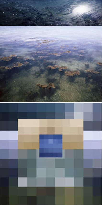
I made these images while scouting my 2011 Focus On Nature workshop with Ragnar Th Sigurdsson and Arthur Meyerson. Arthur and I, two colorists who love the colors black gray and white and talk about them as colors.
I’m looking forward to returning to Iceland (and this waterfall) this August to lead a workshops again for Focus On Nature with +Einar Erlendsson , +Ragnar Th. Sigurdsson and +seth resnick .  +Arthur Meyerson Arthur Meyerson will join us at the end of our Iceland workshop for our Arctic Voyage workshop/cruise from Longyearben to Greenland and finally back to Iceland.
We have a few more spaces left our Iceland workshop.
There’s one space left in our Greenland workshop.
There are a two more spaces in my Fine Digital Print Advanced workshop.
Learn more in my digital photography and digital printing workshops.

20 Questions With Photographer Joyce Tenneson

Tenneson_Q&A

Joyce Tenneson provides quick candid answers to 20 questions
What’s the best thing about photography? 
Meeting new and interesting people.

What’s the worst thing about photography?
People always ask about equipment first!
What’s the thing that interests you most about your own photographs? 
It’s like looking at a diary…I can see who I was 10, 20 and 30 years ago!
What’s the thing that interests you most about other people’s photographs?
Seeing how other photographers problem solve, particularly with the content of their portraits.
Read the rest here.
Read other photographer’s answers to the same questions here.
Find out more about Joyce Tenneson here.

Creative Sharpening With HDR Software


HDR software is most typically used to render shadow and highlight detail, but it also can be used to enhance tonal separation and detail in any range of tones, even in images with extremely low contrast. The very same tools that are used to compensate for HDR side effects can be used to sharpen any image.
When multiple bracketed exposures are merged into a single processed file, shadows and highlights that exceed the dynamic range of a camera’s sensor are compressed into the dynamic range of a digital file, taking the midtones with them. Depending on the HDR software used, a variety of tools are available to restore contrast and separation in midtones. If used aggressively, these tools produce the telltale signs of contemporary or grunge HDR artifacts: halos and texture accentuation. These are the very same artifacts that digital sharpening routines use more conservatively to make images appear sharper—only they look different.
Unlike the hard halo and line produced by the filter Unsharp Mask and more like the soft line produced by the filter High Pass, HDR sliders can give you still more points of control over line and texture, each with a slightly different flavor.
Find details on using Adobe Photoshop and NIK’s HDR Efex Pro.
Read the full article on Digital Photo Pro.
Find more sharpening resources here.
Learn more in my digital photography and digital printing workshops.

PhotoShelter's Free The Photography Blog Handbook


PhotoShelter’s new free guide The Photography Blog Handbook covers all the basics and offers real world case studies.
Topics covered include …
– Blog to promote your brand, increase your SEO, and generate sales.
– Create a blog workflow.
– Expand your reach through social media.
– Be inspired by a list of recommended blog topics.
– Get tips direct from photographers having success with blogging.
If you’re new to blogging, it’s a must read.
If you’re a veteran blogger, it’s still worth skimming.
Download it here.

Andy Goldsworthy – Ephemeral Collaborations With Nature


Andy Goldsworthy considers his sculptures collaborations with nature.

It’s Goldsworthy’s pieces that don’t persist that impress me most. Why? It’s not because they reverse traditional expectations, that through art an individual and culture achieves extended longevity if not immortality. It’s because Goldsworthy is free to interact with and interpret the landscape without removing this possibility for us. In many ways, his work is an invitation for all of us to participate with land in a similar spirit on our own terms.

I appreciate the irony that a majority of us see most of his work through photographs. In this respect an argument can be made that his primary medium is photography. Even if we have had direct experience with his work, our photographic experience of his work is more persistent. Over time, does the second-hand experience supersede the primary one? He’s managed to use two mediums to complement and comment on each other, while shedding light on our relationships to land and our own identities.

All of these are sentiments I resonate with strongly. What’s more, I might have framed my self-identity more narrowly as a photographer only were it not for the inspiration of artists like Andy Goldsworthy.

Find out more about my influences here.

Correct Perspective With the App Front View


How many times have you wished you could quickly straighten lines in an image that have been distorted by perspective? Being able to control perspective is particularly important for architectural photography and it can be used to make stronger compositions in all images.
How many times have you wished you could control the aspect ratio of an image? Making an image more horizontal, square, or vertical or changing an image from one to another can be a powerful tool for creating more expressive images.
One app will do both — FrontView.
Read more at The Huffington Post.