.

PhotoShelter's Free The Photography Blog Handbook


PhotoShelter’s new free guide The Photography Blog Handbook covers all the basics and offers real world case studies.
Topics covered include …
– Blog to promote your brand, increase your SEO, and generate sales.
– Create a blog workflow.
– Expand your reach through social media.
– Be inspired by a list of recommended blog topics.
– Get tips direct from photographers having success with blogging.
If you’re new to blogging, it’s a must read.
If you’re a veteran blogger, it’s still worth skimming.
Download it here.

Andy Goldsworthy – Ephemeral Collaborations With Nature


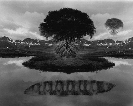
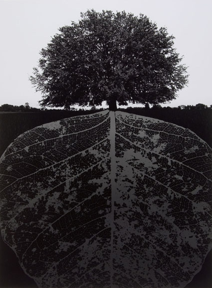
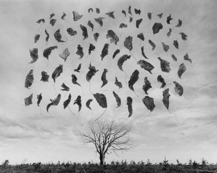
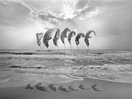
Andy Goldsworthy considers his sculptures collaborations with nature.

It’s Goldsworthy’s pieces that don’t persist that impress me most. Why? It’s not because they reverse traditional expectations, that through art an individual and culture achieves extended longevity if not immortality. It’s because Goldsworthy is free to interact with and interpret the landscape without removing this possibility for us. In many ways, his work is an invitation for all of us to participate with land in a similar spirit on our own terms.

I appreciate the irony that a majority of us see most of his work through photographs. In this respect an argument can be made that his primary medium is photography. Even if we have had direct experience with his work, our photographic experience of his work is more persistent. Over time, does the second-hand experience supersede the primary one? He’s managed to use two mediums to complement and comment on each other, while shedding light on our relationships to land and our own identities.

All of these are sentiments I resonate with strongly. What’s more, I might have framed my self-identity more narrowly as a photographer only were it not for the inspiration of artists like Andy Goldsworthy.

Find out more about my influences here.

Correct Perspective With the App Front View


How many times have you wished you could quickly straighten lines in an image that have been distorted by perspective? Being able to control perspective is particularly important for architectural photography and it can be used to make stronger compositions in all images.
How many times have you wished you could control the aspect ratio of an image? Making an image more horizontal, square, or vertical or changing an image from one to another can be a powerful tool for creating more expressive images.
One app will do both — FrontView.
Read more at The Huffington Post.

Free Screensaver – Antarctica

 
My new free screensaver features images and facts on Antarctica.
Download it here.
Antarctica is stunningly beautiful! Explorer Roald Amundsen said, “The land looks like a fairytale.” The coldest, windiest, driest, highest, most isolated continent contains 90% of earth’s ice and 70% of its fresh water, regulating global climate and sea levels.
Learn more about Antarctica here.
Preview my book Antarctica here.
View my Antarctica alumni’s work here.
Find out about my 2013 Antarctica workshop in the Wedell Sea.

Masterworks In My Collection – Joyce Tenneson – Kristin, Hands In The Air


Artist’s often use consistent palettes for separate bodies of work, some use a consistent palette for a lifetime. This not only makes their work more readily identifiable, it also clarifies the nature of the statements they make. When an artist does this color becomes more than attractive, it becomes a message.
Joyce Tenneson has done this masterfully. Her typically airy palette both light and desaturated give her nude or near nude portraits a distinctive look. The delicacy of her palette not only makes a statement about the more sensitive nature of her subjects but also reveals her own sensitive approach and relationships with her subjects. Her high key palette suggests a concern with spirituality, perhaps more strongly than her occasional inclusions of painted light.

Tenneson often portrays figures in ways that defy conventional representations of the body, selecting alternate body types or ages, posing them in uncharacteristic ways that create expressively complex distortions, and including unusual props.

In Kristin Hands In The Air, the woman’s lack of hair gives this image an edgy undercurrent. Viewers would not be wrong to guess that the woman is struggling with illness. As with so many of Tenneson’s portraits, this image strips away the daily concerns of persona and fashion to show a deeper character in her subjects, tenderly but unflinchingly revealing both their fragility and an uncommon strength in these fleeting moments of grace made more durable by the act of photographing them.

(There’s a lot to be learned from looking at originals, which is why we look at masterworks from my collection in all of my  digital printing workshops.)

Find my comments on other Masterworks In My Collection here.
Learn more in my digital printing workshops.


Outliers – What They Are And How To Make Them Fit


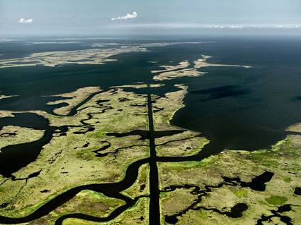
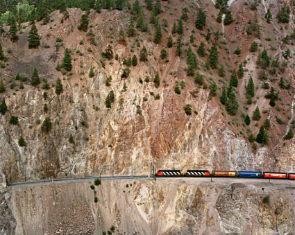
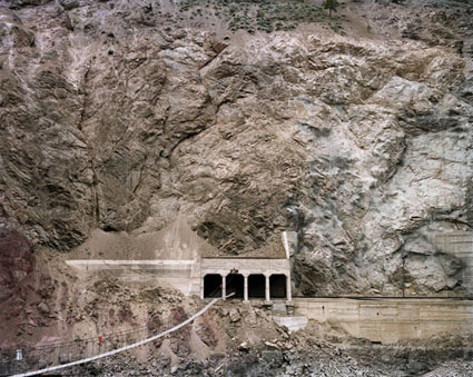
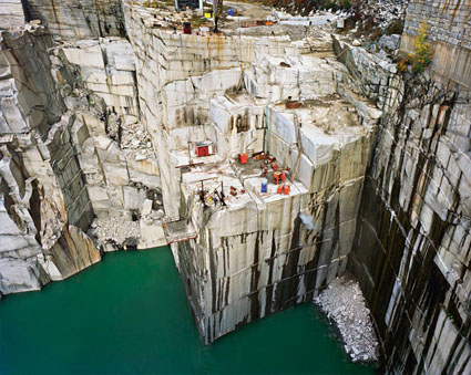
The single ground-level image above is an outlier in this series of aerial images.
Read the article to find out more.
See the solution at the end.


Outliers are the images that don’t fit neatly, testing the code of a body of work. Images can be outliers for many reasons. They don’t share the same ____ as other images in a body of work. (possible words to insert in the blank include subject, location, time, orientation, distance, angle of view, compositional device, stylistic treatment …)

If outliers are included for the wrong reasons (like you can’t put the image aside or find another context for it), they disrupt the tone and continuity of a collection of images, creating a mixed message and leading viewers down unproductive rabbit holes (like a smoking gun in a mystery that never gets explained). This weakens the effect of all of the images as a whole. And it leads viewers to question your artistry.

If outliers are included for the right reasons (they display a different but related way of seeing the same subject and provide new avenues for going deeper with your subject and your relationship to it), they strengthen both other specific images within a set and the group as a whole. This is particularly true if just one thing is changed from the characteristics of the larger set (angle of view, range, duration, etc), as what changes calls attention to itself, and questions are asked about how this change expands our understanding of the subject or artist’s intent. This requires careful placement in sequences. If a second or third outlier with the same characteristics is included, this move seems even more deliberate.

On occasion, one outlier can work within a body of work when presented as a prolog (beginning), turning point (middle), or epilog (end) to suggest other (often not fully resolved) dimensions within a body of work. On rare occasions, multiple outliers with shared characteristics can be grouped to create extended preludes, interludes, or coda, which also controls pace. Use these strategies carefully, as outliers draw a lot of attention to themselves. They set up inevitable comparisons and contrasts, so make sure they’re on point.

If outliers are great, they may represent a breakthrough, either as a way of expanding an existing body of work meaningfully or as a valuable area for discovery in a new body of work.

Pay attention to outliers. They’re your worst enemies. They’re your best friends.


What do you do with an outlier?

1 – Remove it from the body of work and try to forget about it.

2 – Place it in another body of work. Start a new one if you need to.

3 – Modify it so that it shares enough characteristics to fit.

4 – Find or make enough images like it that the series seems relatively balanced.


Read more in my Storytelling resources.

Learn more in my creativity and digital photography workshops.


The single images above is no longer an outlier when many more ground-level shots are added.

This expands the set and creates a comparison and contrast between ground and aerial viewpoints.


This final image represents a new idea found along the way, which is also expanded upon.

See 10 Benefits Of Building Bodies Of Work here.

The Weight Of Color


1

Images with lighter palettes tend to be brighter and less saturated (though driving colors towards white desaturates them), while those with heavy palettes tend to be darker and more saturated (though driving colors towards black desaturates them).


2

Brighter less saturated colors seem lighter, while darker more saturated colors seem heavier.


3

Colors can be matched or contrasted by weight to control visual dynamics. Here yellow and blue are matched in weight.


Many psychological attributes have been assigned to color, such as temperature. It’s so natural to think of color having temperature that we often don’t think about how this is an associative meaning rather than a physical fact. Physically a blue fire is much hotter than a red fire. Nonetheless, red is universally (in all cultures and periods of history) considered the warmest color and blue the coolest color. It’s quite likely that this comes from our experiences with fire (generally red, orange, and yellow) and water (typically blue in large quantities). You might think the ascription of temperature to color is particularly strong for photographers who assign white balances to their images based on the color temperature of the light a photograph was made from to reproduce color accurately. But, it’s equally strong with painters and designers who use temperature associations to create expressive color schemes.
One other useful psychological attribution to color is weight. Does yellow feel lighter than green? Does purple feel heavier than orange? Most people would say yes. Of course, our response depends on the specific variation of each broad color family. You can make a green seem lighter than yellow if you make it brighter, either with luminosity or saturation or both.

So how can you use this information? Here are four ways.

1            You can strengthen comparisons or contrasts between two image areas by making their relative weights appear more or less similar.

2            You can also set the tone for an entire image. Set a brighter airier tone by using lighter colors. Set a darker earthier tone by using heavier colors.

3            You can attract the eye more strongly to specific areas. Once a predominantly light or heavy palette has been set, you can accent it dramatically with smaller accents of contrastingly weighty colors.

4            You can create comparatively lighter and heavier palettes for specific areas of an image, such as a lighter color scheme for higher areas and a heavier color scheme for lower areas.

It’s useful to note that weight is also associated with gravity and thus vertical location.

That the word ‘light’ can be used to describe both the appearance and the mass of an image speaks volumes. Psychologically, color has weight. With only a little practice and more sensitivity, you can use this to make your images more effective.

Exercise
Sensitize yourself to the weight of color by matching the weight of colors.
1               Create two or more colors. Match the weight of two colors from the same color family, such as blue.
2               Create two or more colors. Match the weight of two colors from different color families, such as blue and yellow.

Read more Color Theory.
Learn more in my digital photography and digital printing workshops.