Julieanne Kost – LR4 Beta – Develop Module Advancements
Julieanne Kost covers new features in LR4’s Develop Module and Basic Panel.
View more Lightroom videos here.?
??Learn more in my digital photography and digital printing workshops here.?
Julieanne Kost covers new features in LR4’s Develop Module and Basic Panel.
View more Lightroom videos here.?
??Learn more in my digital photography and digital printing workshops here.?
If you know what to look for, you’ll know what path to choose and how far down it to go.
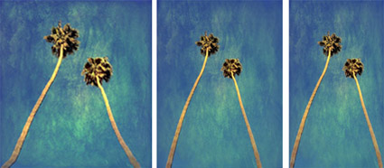
Identifying and developing a sensitivity for the artifacts digital sharpening produces will help you choose a sharpening method and what settings to use during any stage of your sharpening workflow.
You can easily see the artifacts digital sharpening produces by overdoing it.
Here are the seven most common digital sharpening artifacts.
1 Noise
2 Exaggerated Texture
3 Visible Light Halos
4 Visible Dark Lines
5 Loss of Highlight Detail
6 Loss of Shadow Detail
7 Increased Saturation
Each of these artifacts can be reduced in one or more ways.
Here’s a list of options.
Photoshop Free Brushes offers high quality Photoshop brushes.
They offer so many free brushes! Where do you start?
Try these six collections.
1 Spatter Brushes
2 Gore Brushes
3 Vintage Paper Brushes
4 Water Brushes
5 Cloud Brushes
6 Star Brushes
Find more free brushes at Naldz Graphics.
Read more on Photoshop painting techniques here.
Learn more in my digital photography and digital printing workshops.
Understanding the difference between assigning and converting to a profile is one of the most conceptually challenging things about color management in digital imaging. It’s counterintuitive to think that by changing numbers the appearance of colors will stay the same or that if you don’t they won’t. But, once you understand why this is happening, how to set up your color management environment and what to do when you encounter color management dialog boxes will become much clearer.
In color management you “change to stay the same”. Why? Take the values for the most saturated red in any RGB color space – 255/0/0. If you graph this in sRGB (a small color space) and ProPhoto RGB (a large color space), you can quickly see that one will produce a much less saturated red than the other. Similarly, all the other numerical combinations produce different appearances in different color spaces too, with the exception of absolutely neutral colors whose values are equal – i.e. 128/128/128. To maintain the appearance of colors when you move them from one color space to another (for instance from a monitor to a printer), you have to change the numbers very precisely, using ICC profiles or maps for each color space and recipes for mixing colors in them.
The parenthetical remarks in Photoshop’s Paste Profile Mismatch dialog box say it clearly.
If you Don’t Convert but “preserve color numbers”, the appearance of a file will change, sometimes dramatically, because the numbers in the file have not been converted but a new color profile has been assigned, changing the meaning of the numbers.
If you Convert you “preserve color appearance”; Photoshop does this by referencing the ICC profiles of the source and destination color spaces and precisely changing the numbers in the file so that they produce the closest possible match to the original appearance; only the appearance of very saturated colors will change if you convert a file to a smaller gamut color space.
Note that information converted from sRGB into ProPhoto RGB does not get more saturated. The editing space becomes wider gamut, but the potential for increased saturation can’t be accessed unless values in the file are further enhanced with software. The best way to get the most saturated color possible is to convert the source file (Raw) into ProPhoto RGB.
If you adopt a consistent workflow and always convert into and create new files in the same color space, you’ll encounter these dialog boxes infrequently. You’ll quickly find you won’t have to think about it anymore. And when you do, you’ll simply take appropriate action with confidence when you need to, confident that the images you’re creating are the very best that can be created.
Remember, color management isn’t about ensuring that color doesn’t change, it’s about ensuring it changes as little as possible and is changed as precisely as possible.
Read more on Color Management here.
Learn more in my digital photography and digital printing workshops.
Daughter Doon Arbus introduces this four part video series where Diane Arbus’ photographs are complemented by readings of her writings.
View more photographer’s videos here.
Chris Orwig provides quick candid answers to 20 questions.
What’s the best thing about photography?
Life is short and time moves too fast. Yet, photography has provided me with the way to try to stop, slow and savor moments that otherwise would have been lost. Even more, good photographs seem to be a concentration of life, a distillation like evaporated sea water where only the salt remains. And photography has become a means and a passport to get out into the world and to live life with more focus, intensity and passion. In a sense, what’s best about photography is that it has saved me. It’s saved me from myself and helped me to focus on others and on the grand mystery of life. And in doing so, photography has given me a new way to see and live.
What’s the thing that interests you most about photography?
The idea that the camera can help you dig more deeply, see more clearly and live life more fully.
What’s the thing that interests you most about your own photographs?
In my own photographs I am always struck by the autobiographical nature of them. In a sense, I can look at a photograph and remember who I was when I took it and how I changed because of it. And collectively, these photographs help me appreciate, remember and make sense of my own life story.
How do you know when an image doesn’t work?
When an image is too obvious, too straightforward or too cliché I know that it isn’t going to work. Often, it’s these images that first catch my eye, yet the eye can easily be deceived. As one of my mentors once said, “Learning how to look and then look again, is as important as learning how to capture a frame.”
How do you know when an image is good?
I’m interested in capturing photographs that are authentic, alive and real. I like pictures that don’t feel staged but get beneath the surface of things. I like pictures that are simple, strong and can’t quite be placed in a particular time. What makes one of these photographs good is when I still feel it has these qualities a number of weeks after the fact. An image is good when it stands the test of time.
How do you know when an image is great?
An image is great when it can’t quite be explained. Rather than being “clear” these images have a poetic element of mystery that draws you in and deepens who you are and how you see the world. These images are timeless, they captivate and compel.
What’s the most useful photographic mantra?
As Marc Riboud said, “Photography is savoring life at 1/100th of second.”
Read more of this Q&A with Chris here.
Find a collection of Chris’ favorite quotes here.
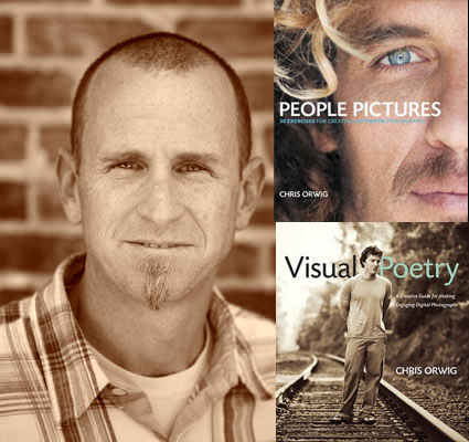
Browse Chris books Visual Poetry and People Pictures here.
Watch Chris’ TEDx video here.
Find out more about Chris Orwig here.
Digital sharpening produces its affects by accentuating contrast, both of texture and of contour. The accentuation of contrast along contours is produced by creating both a dark line and a light halo. While the filters used to sharpen images, such as Unsharp Mask or High Pass, don’t offer independent control of the light and dark components of a contour, you can control them separately using layers. It will take two layers to separate halo from line; one for the halo and one for the line. Filter the two layers differently to produce different thicknesses (Radius) and intensities (Amount) of halos/lines. Then, you can use the Blend If sliders of layers to specifically target either high or low values by moving either the shadows (black triangle) or highlights (white triangle) sliders of This Layer, making those values no longer visible. Some people like to set the Opacity of these two layers to 50% before filtration, so that they can conveniently readjust the intensity of the affect, moving the opacity slider up to make it stronger or down to make it weaker. If you do this too, remember that only the filter’s Radius setting can adjust the thickness of the contours it produces.
PROTECT IP / SOPA Breaks The Internet from Fight for the Future on Vimeo.
In the largest online protest in history, more than 7000 websites including Google, Wikipedia, and WordPress are protesting PIPA / SOPA today.
1 Find out more and sign the SOPA strike petition here.
2 Visit FightForThe Future.org to email your representative in congress.
3 Make your voice heard by signing the Google online petition
“PROTECT-IP is a bill that has been introduced in the Senate and the House and is moving quickly through Congress. It gives the government and corporations the ability to censor the net, in the name of protecting “creativity”. The law would let the government or corporations censor entire sites– they just have to convince a judge that the site is “dedicated to copyright infringement.”
The government has already wrongly shut down sites without any recourse to the site owner. Under this bill, sharing a video with anything copyrighted in it, or what sites like Youtube and Twitter do, would be considered illegal behavior according to this bill.
According to the Congressional Budget Office, this bill would cost us $47 million tax dollars a year — that’s for a fix that won’t work, disrupts the internet, stifles innovation, shuts out diverse voices, and censors the internet. This bill is bad for creativity and does not protect your rights.”
Edge masks target only the contours in an image. (Think of edge masks in Photoshop as the creative sharpening equivalent to the Masking slider in ACR or Lightroom’s capture sharpening.) They keep smooth areas smooth, while accentuating the contrast/sharpness of contours. They can be particularly useful for images that contain moderate to significant amounts of noise. In many cases, they allow the use of more aggressive applications of sharpening effects. Edge masks can help you take all of the creative sharpening effects you design up a notch – or two.