.

7 Simple Steps To Good Color Management


Color management is rocket science. But you don’t have to be a rocket scientist to drive the rocket. Instead, be an astronaut. With a few simple steps you can achieve consistent, high-quality color with your images every time.

These are the seven simple steps to good color management.

1 – Make Profiled Conversions
Assign an ICC profile to all image files either during Raw conversion or scanning. Use appropriate profiles to make conversions into other color spaces with derivative files only. Minimize the number of conversions made.

You won’t be doing this that often, once you standardize your workflow (creating all files in one color space)

2 – Use Hardware To Calibrate Your Monitor
Once a month, use a colorimeter to build an ICC profile for your monitor. Minimize the influence of other light sources during characterization. Use the colorimeter’s software to help you set monitor brightness between 90 and 100 and choose White Point D65 and Gamma 2.2. Check the results with know target images afterward.

Do this roughly once a month.

3 – Set Better Photoshop Color Settings
In Photoshop’s Color Settings (in the Edit Menu) Set Color Management Policies to Preserve Embedded Profiles and Ask When Opening / Pasting. And, choose a wide gamut device neutral editing space. Start with North American Prepress Defaults and then change RGB to ProPhoto RGB.

Do this once … and check it whenever Photoshop is updated.

4 – Profile Your Paper
Using a high-quality device make an ICC profile of your ink and paper combination. Or, have someone make a profile for you. Then make your prints with your custom profile. You’ll need different profiles for different papers. Consider profiles you download from websites suspect, sometimes ok but rarely great. (Skip this step if you’re printing on Epson paper with Epson printers. Their profiles are excellent.)

Do this once. Do it again when you change your paper type or printer ink.

5 – Softproof Before You Proof
Simulate the appearance of a print before printing. Go to View : Proof Setup : Custom and choose the profile you intend to print with. Check Simulate Paper Color and choose a rendering intent of either Perceptual or Relative Colorimetric. Make output-specific adjustments before printing. Use these adjustments only when printing these media.

Do this before you print individual image, but not multiples of the same image.

6 – Check The Correct Boxes In Your Printer Driver
Use Photoshop / Lightroom or your printer driver to manage color – not both. In general, favor using Photoshop/Lightroom as this is the most versatile allowing you to use custom output profiles.

Do this every time you print. Save custom settings so you can check multiple boxes with one click.

7 – Control Your Viewing Environment
Edit and evaluate your images in neutral surroundings. Minimize the effect of extraneous light sources, such as glare on monitors or backlighting. Evaluate proofs and prints in appropriate lighting.

Do this once.

There’s much more that can be said about each of these topics – but, not much more to do. Take these steps and you’ll be well on your way to achieving consistent, high-quality results with your images.


Read more on Color Management here.

Learn more in my digital photography and digital printing workshops.
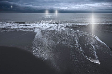
Simultaneous Contrast

How red is red? That depends in part on its context. We see colors in relationship to other colors in our field of vision. The appearance of any one color is modified by the presence of other colors. (This is a perceptual effect, not a physical effect; while we experience it, we cannot measure it physically.)

Once you identify the elements in play, you can predict the effect. Simultaneous contrast can occur between any one or multiple components of the three elements of color – luminosity, hue, or saturation.

Place dark colors next to light colors and the dark colors will appear darker and the light colors will appear lighter.
Place cool colors next to warm colors and the cool colors will appear cooler while the warm colors will appear warmer. (Additionally, complementary hues increase each other’s saturation.)

Place saturated colors next to less saturated colors and the desaturated colors will appear less saturated while the saturated colors will appear more saturated. (Additionally, the desaturated color will appear to contain a cast of the saturated hue’s complement.)

Want to make a color appear lighter? Make it lighter or make surrounding colors darker or both. Want to make a color appear warmer? Make it warmer or make surrounding colors cooler or both. Want to make a color appear more saturated? Make it more saturated or make surrounding colors less saturated or both.

Contrast (or lack thereof) is the engine that drives color dynamics. To intensify a visual effect, increase the contrast in the appropriate components of color. This effect is intensified between adjacent colors. It is further intensified if one color surrounds another, partially or entirely. (If a color dynamic is particularly intense it may create the visual appearance of a line separating the two fields of color. Op artists often use these effects to create highly dynamic visual effects that appear to pulsate or move.)

Color management doesn’t yet accommodate these kinds of perceptual effects. Standard color correction strategies don’t tend to address them. But you can incorporate them into your color adjustment methods for greater precision and/or expression. All you need to do is take note of them and make appropriate compensations to achieve the result you desire.

Read More

Create An Oasis of Creativity For Yourself


Try setting half an hour a day for your creative life. If you did this everyday for one year, you’d give yourself 182.5 hours, roughly the equivalent of 4.6 work weeks. As you can see, it really adds up.
Many find it helps to pay yourself first in the morning. Get up early and get more time for yourself. One advantage to setting time aside in the evening is that the amount of time you spend can often be extended. Try both. Monitor your energy, Strike a balance between what’s practical and what’s ideal for you.
Set up a space that’s ready for you to be creative (even if this is a User setting on a portable computer) and keep it organized, so you’re ready to go when you get your time and you don’t waste it organizing.
Finally, when you’re able, take a trip for a long weekend or week of total immersion. Trips can add many more valuable hours to your creative life, as well as new stimulation, new material, and a fresh perspective.
The biggest challenges are starting and sticking to a plan. Start now. You’re sure to miss a day here and there, just don’t make it a habit. Instead, make a habit of taking some time for yourself.
Listen to more creativity tips here.
Learn more in my creativity workshops.

Saturation


One of the most distinctive features of a visual artist’s use of color is their use of saturation.
Many photographers are often asked, “Are you a black and white or color photographer?”  (Curiously other visual artist’s are rarely asked this question.) While many people who ask it don’t mean it to be, it’s a loaded question. There’s often a latent assumption that you can’t do both well. In fact, work with one can strengthen work with another. Moreover,  the question suggests that black and white (and shades of gray) are not colors, when in fact they are very specific colors – neutral colors. And, the question does not address with any specificity how a photographer uses more saturated color. Curiously, this question is rarely asked of painters and filmmakers. A more useful question might be, “How saturated is your palette?”
There are essentially six distinct levels of saturation – neutral, semi-neutral, reduced saturation, fully saturated, highly saturated, and super-saturated.
Read More

Share Experience / Share Vision


It was December 2005. We had just made the long crossing of the Drake Passage to Antarctica. On the horizon were enormous icebergs. It was our first view of big ice. We all rushed to deck and began to photograph. I found myself standing shoulder to shoulder with Seth Resnick. He was using a long 300mm lens. I was using a wide 28mm lens. We both looked at each other and then looked again. Our approach was so different we were astonished. “Let me see your camera!” we both said simultaneously and quickly traded cameras. We laughed out loud. With one quick glance, we realized we were seeing in entirely different ways.
It was February 2007. We found ourselves in the very same situation. Again, we had crossed the Drake Passage to Antarctica. Again, there was big ice. Again, we hurried to deck. Only this time, Seth appeared with a wide 14mm lens and I showed up with a long 100-400mm lens. We grinned big grins. We had influenced each other.
It was January 2010. Once more, we had crossed the Drake Passage to Antarctica. There was more big ice. Again we raced to deck. This time we both carried two cameras, one with a wide lens and the other with a long lens. We smiled and nodded knowingly at one another. As a result of sharing the same experiences and the results we produced from them, we had learned to become more versatile and see in more varied ways.
Sharing experiences with other visual artists can be extremely stimulating and rewarding. The resulting growth comes in unexpected ways at unexpected moments. In situations like these, I’ve come to expect the unexpected. Especially with Seth!
What opportunities can you make to share experience and vision with other artists?
Read Seth Resnick’s images and version of our story here.
Find out about our Digital Photography Destinations workshops here.

Using Photoshop Stacks To Remove People – Deke McClelland


Deke McClelland shows you how to use stacks to remove moving objects in a scene.
This is a game changing technique I emphasize in all of my field workshops.
It will open up new possibilities for you, change the way you shoot, and raise your success rate.
Learn more from Deke McClelland here.

Read more in my digital photography and digital printing ebooks.

Learn more in my digital photography and digital printing workshops.
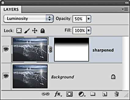
Color Analysis


To better see color within an image it can help to abstract it. By de-emphasizing an image’s representational qualities you can more easily direct your attention to the color relationships within it. In short, you can see them better because you’re not distracted by other concerns.
Using Photoshop, there are many ways to modify an image in order to better reveal it’s color structure.

You can blur an image. Blurring an image reduces detail so that you can more easily see the basic composition and the color relationships within it, without getting hung up on the details. (Duplicate the background layer and apply the filter Gaussian Blur.)

Blur an image substantially and you can reduce an image to a field of color. Compositional elements are significantly downplayed, leaving pure color. (Duplicate the background layer and apply the filter Gaussian Blur with a stronger setting.)

Pixellate an image and you can reduce an image to blocks of color. Composition is eliminated while contrast between colors is more pronounced than in a flat field of color. (Try Filter: Pixellate: Mosaic. This works best for lower resolution files or copies of files.)

Average an image and you can reduce all the colors in an image to one. (Duplicate the Background Layer and apply the filter Average – found under Blur.) This often confirms the dominant color in a composition. Well balanced color photographs containing a variety of hues tend to average towards gray.)
While accents and other important colors can also be used, the dominant color is an excellent choice to further analyze color relationships in an image using Blend Modes. With this technique you can see the variety found in the separate components of color within an image – Luminosity, Saturation, Color, and Hue. (Change the Blend Mode of the averaged layer to the desired color component.)

With a Blend Mode of Hue, all values in an image will be driven to the same hue. This will help you see variety in luminosity and saturation more clearly.

With a Blend Mode of Saturation, all values in an image will be driven to the same saturation. This will help you see variety in luminosity and hue more clearly.

With a Blend Mode of Color, all values in an image will be driven to the same hue and saturation. This will help you see variety in luminosity (the tonal structure) more clearly. (This variant is often the most useful as it is the easiest to interpret. With repeated analysis of many different images, you’re likely to note that images with less variety in hue and saturation (particularly neutral ones) will require more luminosity contrast to have impact. By the same token, images with a great deal of variety in hue and saturation will often appear overly harsh with excessive contrast.)

With a Blend Mode of Luminosity, all values in an image will be driven to the same luminosity. You’ll eliminate contrasts in value which will help you see variety in hue and saturation more clearly.
This type of analysis will better reveal the color relationships at work within an image. You can use the information you’ve gathered by analyzing color relationships in an image not only to better understand it but also to make predictions about how you might improve them.
Increasing contrast in one or more of the elements of color (hue, saturation, luminosity) will increase separation in a composition; conversely, decreasing contrast will create greater unity.
Typically, well structured images use a large amount of contrast in one color component, a medium amount of contrast in a second component, and a small amount of contrast in a third component.
Read more with my color theory ebooks.
View more in my color DVDS.
Learn more in my digital photography and digital printing workshops.