.

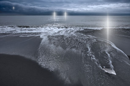
New Image – Refraction LXXVII


I issue quantum editions of select images from my series Refraction; the viewer can choose how many and which versions they would like created for them.
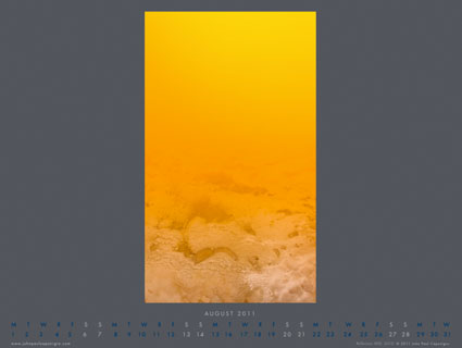
To date most of these editions offer variations in the number and position of the lights within them. In this image, variations in states of the background are presented.
Changing states and different rates of change are important themes in all of my work.
I find reversal to be the most rewarding creative strategy. Whether it succeeds or fails, I always learn something valuable from trying it.
Read my ebooks Reversal and Breaking the Rules.
See more new 2011 images here, here, here, and here.
The exposures for this image were made in Iceland.
Learn about my Iceland digital photography workshops here.

Fine Art Digital Printing Seminar – ASMP Boston 3/8/11


This one day seminar is one of the best values in the industry!
Thousands of dollars of free giveaways are provided by Adobe, X-Rite, NIK, OnOne, HDRSoft, Imagenomic, Chromix and more!
Find out about the latest advances in digital printing. You’ll learn to evaluate printers, inks, media, RIPs, and profiles. See the latest Epson printers and media in action. Take the results home!
Discover what’s unique about a fine art workflow designed to maximize quality. See it in action. See it detailed step-by-step. See the results. John Paul and Mac will build a file from the ground up and show you the final results in print.
You’ll learn to seamlessly integrate Adobe software Lightroom, Bridge, Camera Raw, and Photoshop. You’ll learn a variety of tools and techniques that will help improve and refine both your digital files and prints. We’ve heard time and time again, “That one tip was worth the price of admission.” And there are dozens of these!
You’ll leave with the knowledge you need to get the results you’re looking for and the confidence that it’s the very best.
Topics include:

  • Evaluating printers
  • Comparing media
  • Quick color management
  • How to analyze images to determine an optimum strategy
  • Raw conversion
  • Sophisticated color adjustment strategies
  • Selections and masking
  • Upsampling
  • Noise reduction
  • Sharpening — input, creative, and output
  • Softproofing and proofing
  • Equipment maintenance and fine-tuning
  • Print finishing and handling
  • Fine art market practices

Preview our DVDs Fine Art Digital Printing and Fine Art Digital Workflow.
Learn more in our Fine Art of Digital Printing Workshop.

New Image – Refraction 56


My series Refraction has challenged the way I think in so many ways from the moment the first image appeared.
The series is informed by modern physics and the nature of light. An observer influences what’s observed. The questions they ask and the way they ask them influences the answers they get. The universe is similar to a holograph in that information in one location can be found in another simultaneously. Two people in different positions can see the same rainbow as existing in different locations. Perception is relative, to some degree.
In this series, I found that multiple compositions that worked were possible and that it seemed appropriate for the first time to present them simultaneously. So I produce ‘quantum editions’ for this series. People purchasing a given print can choose both which and how many variations they want produced for them.
I’ve never seen this done before –  but that’s doesn’t dissuade me.
I like to innovate!
See more new 2011 images here, here, and here.
The exposures for this image were made in Iceland.
Learn about my Iceland digital photography workshops here.

Visible Dust Sensor Cleaning System


Let’s face it, dust happens.
The first step is to use an ounce of prevention. Minimize your equipment’s exposure to dust during storage and use, as much as practical. (I store and transport all my gear in Ziploc plastic bags.)
The second step is to remove dust from your camera’s sensor.
To protect themselves against carelessness of a minority of their clients, camera manufacturers claim to void warranties if you use third party cleaning solutions and recommend instead that you send the camera to them to be professionally cleaned. Even if you are not on a tight deadline or traveling in remote locations, this is often impractical. Initially, I was concerned about my ability to clean my camera’s sensor without damaging it. Then I found that cleaning your camera’s sensor is surprisingly easy and that you have to go to some length to actually damage a sensor. A little care and forethought is all that’s required. (See cleaningdigitalcameras.com for more information.)
Visible Dust’s (visibledust.com) Arctic Butterfly is my preferred sensor cleaning solution. Unlike many other solutions the Arctic Butterfly doesn’t use fluids that may produce streaking on your sensor; instead, they use static electricity to attract the dust. Visible Dust has been making electrostatically charged brushes that won’t damage your camera’s sensor when you use them. The first brush solutions from Visible Dust used compressed air to create a static charge, which could be difficult to store and transport (impossible on airlines). The Artic Butterfly uses motion to create a static charge; the brush rotates at high speed. (The new units and their cases are far more durable than previous models.)
How easy is it to use? Extremely. Simply remove the top of the Arctic Butterfly and press the button to spin the brush. Turn your camera (without a lens) to sensor clean mode. Sweep the sensor a few times. Turn the camera off and put a lens back on it. Done! It takes less than a minute. It will save you hours of retouching. I recommend making this a regular practice whenever you change lenses – the time when most dust enters and moves.
Keep the brush clean; free of dust and oil (typically picked up from your hands or the chamber of your camera). If a brush becomes soiled, you can replace the ferules instead of the entire unit.
For difficult to remove dirt on sensors that can’t be swept away, Visible Dust’s Sensor Cleaning Swabs may be your final solution. Swabs and Sensor Clean or Vdust Plus liquid can be used to remove water and oil stains, providing even coverage without streaking and creating a light static barrier to help repel dust.
Optionally, a Sensor Loupe can be used to view the sensor under illumination at high magnification to ensure that the sensor is clean.
Whenever practical, confirm that your camera’s sensor has been successfully cleaned, by making an exposure of a flat field of color (such as a sky) at a small aperture (to better resolve the dust). Thoroughly check the file in Photoshop (or the image editor of your choice) at 100% magnification.
The Visible Dust sensor cleaning system hasn’t failed me yet. It goes everywhere I go. It’s easy to store, transport, and use. It’s saved me countless hours of time in image processing. It will save you valuable time too.
Arctic Butterfly SL700 ($70.95)
Sensor Loupe ($79.95)
Ultra MXD-100 Sensor Cleaning Swab ($37.95)
Sensor Clean ($35.90) and VDust Plus ($19.95)


Find more about visibledust here.
Read more about the tools I use here.
Learn more in my digital photography and digital printing workshops here.

Save Up To 20% On Chromix’s ColorThink Software


They say “A picture is worth a thousand words.” In some cases, it’s worth far more. That’s certainly true of the images generated by CHROMiX’s ColorThink. The folks at CHROMiX say, “You can’t manage your color if you don’t understand it. Nothing gets the idea across faster than the graph of a printer gamut.” They’re right.

CHROMiX ColorThink is the award-winning color management toolset that helps you understand your color more than ever before, primarily (but not exclusively) by graphing it. The ColorThink toolset is an application for managing, repairing, evaluating and graphing ICC profiles, composed of nine modules that are proven to “keep your brain on color”.

Profile Manager
Organize your profiles individually or in sets

Profile Inspector
Open all types of ICC Profiles and inspect their color data and other details. Change default settings to fit your workflow. Display neutral rendering curves.

2D Graphing
2D graphing gives you both general and specific views, allowing the overlay of multiple profiles and data sets.

3D Graphing
3D graphing gives you the whole picture. Analyze your devices and workflow. See the cause of proofing and printing problems. Graph measurement files and image colors to compare with device gamuts.

Image Inspector
Open images and see the embedded profile. Export, change(mac only) or delete(mac only) it at will. Learn to handle the files your customers are sending.

Profile Renamer
Profiles have two names; internal and external. Confused by what appears in menus? Change the internal and external names with this tool.

Profile Linker
Some RIPs allow linked profiles to be loaded for proofing purposes. Profile Linker will build those profiles for you, quickly and easily.

Profile Medic
Multi-point integrity checks can be performed on one or all the profiles in your system. If Profile Medic finds fixable problems with a single click it will get you back to work.

Color Lists
Open measurement files from most profiling applications. View them in list form with rendered colors. Apply profiles to the lists for testing and graphing.

ColorThink is a very robust color management software. Only a few advanced users will use its full toolset. But almost everyone can benefit from using a few of its most essential features.

For me, graphing color is the core utility of this tool. Graphs are useful abstractions. When you’re dealing with a lot of information, graphs can condense and focus information from specific perspectives revealing useful information. This is certainly true of color. Because color has three dimensions (luminosity, hue, and saturation), graphs of color in 2D always leave something out, while graphs of color in 3D give you a more complete picture and more useful perspectives.

ColorThink gives you powerful tools for graphing color in both 2D and 3D. You can graph ICC profiles (input, display, output), color, color lists, or images. You can graph multiple profiles simultaneously for comparison. You can graph profiles and images simultaneously for comparison. You can view graphs in multiple formats such as shaded objects, wireframes, points, and vectors. You can change color and transparency to make comparison easier. And you can rotate, pan, and zoom your viewpoint dynamically.
Every time I lecture on color, I use ColorThink. Every time I evaluate a new inkset or substrate or printing profile, I use ColorThink. While I don’t graph every image before I print it, I do graph particularly challenging images to print and ColorThink always reveals useful information. I recommend it highly.

This utility not only expanded my understanding of color and color management but it has also helped me refine an advanced perspective on color theory (the conceptual tools artist’s often use to help structure color palettes and make color choices). It’s my hope that in the 21st-century 2D color wheels (such as Leonardo’s, Goethe’s, and Itten’s) will be replaced with 3D color volumes.


1    An image.


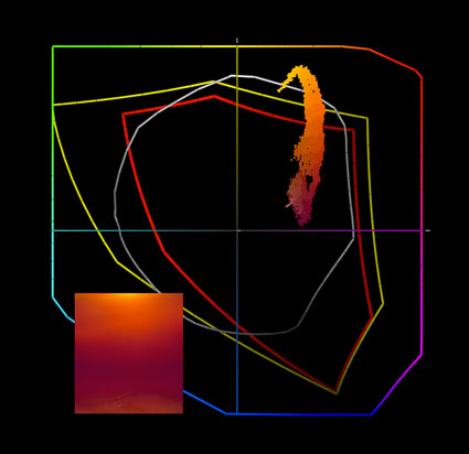
2    A 2D graph (two profiles and an image) tells only part of the story. The gamut of semi-gloss papers seem moderately extended when compared to matte papers; the image appears in gamut for both.


3    A 3D graph of two profiles tells you more. Semi-gloss papers have greatly extended dmax and gamut in dark values but reduced gamut in lighter hues; warm highlights are out of gamut for both (better highlight saturation is found in matte) and cool shadows are out of gamut for matte.


4    Gamut can be sliced at specific luminosity values.


5    Display the effects of profiles on colors in images with vectors.


Visit the ColorThink product pages at www.chromix.com to learn more.


Read more on Color Management here.

Learn more in my digital photography and digital printing workshops.

Viewing Light – SoLux


Good light makes your prints appear even more beautiful. Get good light. It’s one of the most essential elements in any photographic image, at the point of capture, during processing, and at the point of display.

SoLux (www.solux.net) makes good light. SoLux bulbs’ Color Rendering Indexes (rating used to describe the quality of light) are 99 on a scale of 100. All SoLux bulbs are full smooth spectrum and ultra low UV and IR. SoLux bulbs come in a variety of color temperatures – 3500K, 4100K, 4700K, and 5000K. SoLux bulbs come in a variety of beam angles – 10-36 degrees. Low voltage (12 volt), SoLux bulbs fit in standard MR-16 2 pin socket fixtures and adaptors are available for regular screw in fixtures.

While light has many important qualities, two are particularly significant; temperature and spectral power distribution.

Most prints are viewed under light temperatures warmer than 5000K, typically a mix of tungsten (2800K) and daylight (variable). Galleries and museums favor halogen (2900K). Studies suggest that more people prefer viewing artwork under higher color temperatures (3500K).

A majority of artificial light sources, including fluorescent, metal halide, and LEDs, have an uneven distribution of colors. Graphs of light sources with uneven spectral distributions display spikes in specific regions of the spectrum. Spikes limit the number of available colors in a spectrum to discern an object’s color. Due to missing colors in between spikes, objects may look dull or gray. When a spectrum is uneven, hues that are found in elevated levels appear brighter while hues that are found in low levels appear duller. Spikes create an imbalance in the relationships between hues. When possible, avoid lights that have them.

Incandescent light contains large amounts of yellow, orange, and red light. Though not as extreme, halogen suffers from the same tendencies. Cool white fluorescent light may produce a white that is cooler in appearance, but all fluorescent lights have uneven spectral distributions.

How important is viewing light? Very. To many, at first glance, the differences may seem subtle. To truly appreciate the differences you need a side-by-side comparison of the same or identical objects in spikey and smooth spectrum light sources.

The curators of the Van Gogh Museum (Netherlands) visited their traveling collection while it was on display at the National Gallery of Art (US). “What have you done with our paintings?” they exclaimed. They thought they had been cleaned. “Nothing.” was the reply. The real answer was in the light – SoLux. Under full-spectrum light sources the paintings appeared significantly brighter, clearer, and more saturated. The Van Gogh Museum now uses SoLux bulbs. More and more museums are beginning to use SoLux bulbs as well.

I use SoLux 3500K bulbs for my studio and gallery. I evaluate and display prints under the same light, one that most closely approximates the display conditions prints are most likely to be viewed under. I use four SoLux Gooseneck fixtures for portable light sources; two with 3500K bulbs to evaluate display conditions and two with 5000K bulbs to evaluate color management issues (calibration, softproofing, and profiles).

I recommend to owners of my prints that they strongly consider using 3500K SoLux bulbs for display and viewing.
To see, you need light. So it stands to reason that the light you view your prints in is extremely important. All lights are not created equally. For the best results, choose a high-quality light source.


SoLux bulb

Spectral curves comparing 3500K halogen (yellow) and SoLux (red)

Spectral curves for 5000K fluorescent gti lightbox (blue) and SoLux (red)
Visit www.solux.net to find out more about their products and light (there are excellent resources there on the science of light).
Contact Phil Bradfield – phil@solux.net or 800-254-4487.

Read more on Color Management here.

Read more on digital Printing here.

Learn more in my digital photography and digital printing workshops.