Extreme Painting Using Photoshop CS5 – Russell Brown?
Russell Brown innovates again!
Find more great Photoshop CS5 videos here.
Russell Brown innovates again!
Find more great Photoshop CS5 videos here.
 ?
?
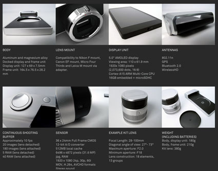
The WVIL concept camera. Part smartphone and part 32 MP full-frame CMOS digital camera. The lens detaches from the camera but still works and can be remotely triggered and then the files can be instantly uploaded to the web.
Find out more about WVIL here.
Cheryl Dunn has completed a powerful documentary on the elusive spirit of New York photography. Cheryl was commissioned by The Seaport Museum, New York, to make a documentary about photographers who have used New York City street life as a common thread in their work. Produced by ALLDAYEVERYDAY, Everybody Street premiered at the museum in part with the exhibit Alfred Stieglitz New York, and was released in segments by The New Yorker magazine.
In order of appearance, photographer vignettes were Clayton Patterson, Joel Meyerowitz, Martha Cooper, Mary Ellen Mark, Bruce Gilden, Luc Sante, Bruce Davidson, and Rebecca Lepkoff. The film also features Tim Barber, Jeff Mermelstein, Ricky Powell, Jamel Shabazz, and Bonnie Yochelson. Dunn shot the street footage in New York City on a 16-mm. Beaulieu.
Find out more about the project here.
Find out more about Mary Ellen Mark here.
Find more photographer’s videos here.
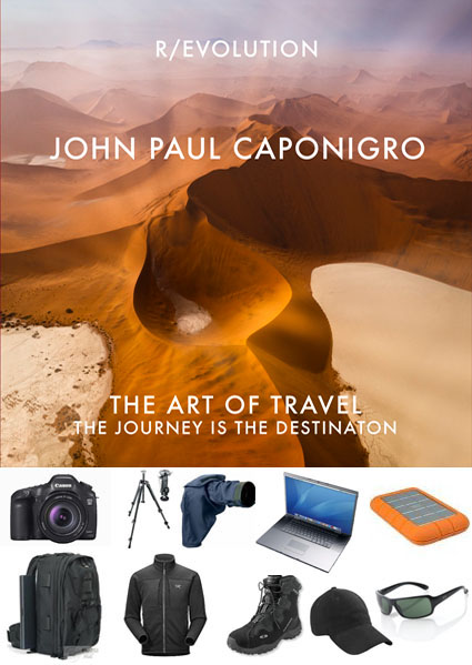
There’s an art to packing. Practice it with care. You’ll get better every time you do it. Learning this art will help you make the most of any photographic expedition and enjoy it more.
Do pack the essentials. Don’t pack too much. Traveling with too much is hard to handle, tiring, and can be costly. Less is more – up to a point.
Clothing
It’s tempting to bring too much clothing. Bring only versatile essentials. Find light, washable, quick-drying, versatile clothing you can walk or go to a casual dinner in. Find out ahead of time what kinds of laundry services will be available during your trip and plan to use them – frequently. Bring a good pair of light waterproof hiking boots. Dress shoes don’t work when you’re walking in the wilderness. Bring sun protection; sunscreen, hat, and sunglasses. Unless you’re traveling in a desert, bring waterproof rain shells (jacket and pants). If you’re likely to be in cold situations (early mornings or snow), bring light gloves, hat, long underwear, and a warm light sweater or pullover. If you’re going to be in an arctic or alpine environment bring two pairs; staying dry is key. Leave the big ski parkas and pants home. Layers rule.
Bags
The right bags can make journeys easier. Wheels save you an enormous amount of wear and tear. Make sure your camera and/or computer bag fits under an airplane seat or in overhead compartments. (I use LowePro MiniTrekker and Roadrunner bags.) If you’re flying on small airplanes to more remote regions, check weight limits and take them seriously. Check your clothes; carry your gear. Avoid checking your gear; it can get damaged or stolen. If you’re ever forced to check your gear, carry on one camera and lens around your neck. I travel with one larger camera bag and one small backpack. I carry on the camera bag and pack the backpack in my checked baggage. Once I’m in the field, I walk with my small backpack carrying only the things I need for that location – camera, cards, extra battery, two lenses, water, power bar. (I always pack power bars, for morning when breakfast is light or late or mid afternoon when my fuel reserves can get low.) I also pack an extra duffle bag, just in case I need to check an extra bag – it comes in handy for laundry too.
Cameras and Lenses
Always carry a backup camera. If one is damaged or stolen, you’ll still be able to shoot with the other. It’s convenient (but not necessary) if the two cameras you carry are the same. That way you’ll only need to carry one set of accessories, like batteries, chargers, cords, etc.
Your choice of lenses is important. Lenses help you make the most of many situations. I travel with lenses for three ranges – wide, medium, and long. I rarely walk with all three lenses. To decide which lenses to take, I first look at the location and decide whether I’m most likely to work wide (close environments) or long (wide open spaces), take the appropriate lens, and a medium lens for versatility. All of my lenses are zooms, providing extra versatility. (Canon 16-35mm, 28-135mm, and 100-400mm) Lens shades are important. Polarizing filters are the most useful filters.
Dust and Moisture
Protecting your equipment from moisture and dust is a significant concern. I pack all of my lenses and cameras in sealable plastic bags. (I use Ziplocs.) I store them in them, whenever I’m not using them. I never put my gear away wet. Pack a small cloth to wipe down equipment that does get damp. If you’re likely to shoot in rain or snow consider using a rain cover for your camera. (I use Aquatech’s.) Bring a sensor cleaning system. (I use Visible Dust products.) Dust happens. It’s a lot more efficient to remove it in the field than in post-processing.
Storage
Having the right media to store your images is important. It’s worth investing in a few large media cards so you don’t run out of storage to shoot with in the field. (I use SanDisk 32GB CF cards). At the end of each day, I download onto one portable hard drive and backup to a second.. (I use LaCie 1TB Rugged drives.) When I fly, I pack one in my suitcase and carry one with me at all times. You might also consider carrying a large capacity thumb (32GB plus) drive with you at all times. Put your 5 star images on it. What if your hard drives were lost or stolen? You can replace equipment, but you’ll never be able to replace your images.
Customs
Getting all your gear through security and customs is rarely a problem. That said, in any security situation where my equipment is being screened I take as many precautions as practical to ensure equipment doesn’t fall out of a bag or bin and isn’t dropped when it’s handled. Clearing customs can be more problematic in some countries than others. Do a little research on the web and determine if a carnet (an official government document proving ownership) is recommended. Even if it’s not, I always travel with a copy of my insurance policy that lists my equipment and the serial numbers of each piece.
Before you travel, take the time to get organized and be prepared. You’ll make better photographs and enjoy traveling more too.
Learn more in my digital photography workshops.
View my webinar The Art Of Travel here.
View my Equipment Packing List here.

I store this packing list in my bag to make packing efficient. I modify it if a trip has special considerations. Please feel free to copy this list and modify it for your unique needs or to share this link with your friends.
Camera Bag
Store cameras and lenses in plastic bags …
2 Cameras – Canon 5DSR
2 Camera – Battery Charger With Extra Battery
1 Universal Power Strip
1 Universal Electrical Adaptor
1 Lens – 11-24mm
1 Lens – 24-170mm
1 Lens – 70-200mm
1 2X Extender
1 Camera Rain Cover
4 Memory – CF Cards
4 Memory – SD Cards
1 Sensor Cleaner Dry Brush
2 Sensor Cleaner Wet Swab
1 Lens Cloth
1 Tripod and Tripod Head (store with clothing)
1 Gorillapod
1 iPhone Tripod Adaptor
Computer Bag
Store hard drives and pens in plastic bags …
1 Computer – Mac Book Pro
1 Computer – Mac Book Pro – Power Supply With Adaptors
1 Harddrive – Bootable Copy of Portable Computer
2 Harddrives – Raw Files and Raw Files Backup
1 Card Reader and Cable
1 Microphone and adaptor
1 iPad Power Supply and Cord
1 iPad to VGA Adaptor
1 Miniport to VGA Adaptor
1 iPad and Cable
1 Earbuds
1 Apple Pencil
1 Mechanical Pencil
3 Pens Varying Thickness
1 Pack of Paper (emergency contact info, copy of insurance, copy of passport, notes, blank)
1 Screencleaner
1 Hand Sanitizer
1 Eyedrops
1 Benadryl
1 Powerbar
If International Add
1 Passport
1 Carnet (or paper of insurance policy above)
1 Global Entry
Learn more in my digital photography workshops.
View my webinar The Art Of Travel here.
View my Equipment Packing List here.

I store this packing list in my bag to make packing efficient. I modify it if a trip has special considerations. Please feel free to copy this list and modify it for your unique needs or to share this link with your friends.
Wear
1 Wallet
1 Notecards
1 Pen
1 Business Cards
1 Watch
1 iPhone
Select these from below lists …
1 Shell
1 Soft Shell Jacket
1 Shirt
1 Belt
1 Pants
1 Underpants
1 Socks
1 Boots
1 Sunglasses
Field Work
Consider increasing numbers only if no laundry …
1 Duffle Bag Waterproof
1 Shell Jacket Waterproof
1 Shell Pants Waterproof
1 Soft Shell Jacket Water Resistant
1 Light Gloves
1 Ear muffs
1 Gators
1 Baseball Cap
3 Socks Quick Dry
3 Underpants Quick Dry
2 Shirts Short Sleeve Quick Dry
2 Shirts Long Sleeve Quick Dry
2 Pants (Zip To Shorts) Quick Dry
1 Belt
1 Light Hiking Boots Waterproof
1 Light Sport Shoes
1 Pajamas Silk
If Cold Add
3 Socks Wool
1 Long Under Wear Thin Silk
1 Long Under Wear Mid Synthetic
1 Cold Weather Hat
1 Heavy Waterproof Gloves
If Business Add
1 Leather Jacket
1 Dress shirt
1 Jeans
1 Dress Boots (optional)
Optional
1 Sweatpants
1 Bathing Suit
Toilette
1 Toothbrush
1 Toothpaste
1 Mouthwash
1 Deodorant
1 Cologne
1 Shampoo/Conditioner
1 Hairbrush
1 Hairspray
3 Hairbands
1 Nail Clipper
1 Sunscreen
1 Aleve
1 Pepcid
1 Imodium
1 Drixoral
1 Scopalamine (If seasickness)
Powerbars 1 per day
Learn more in my digital photography workshops.
View my webinar The Art Of Travel here.
View my Equipment Packing List here.
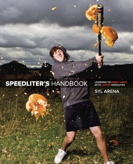
“Getting your Canon Speedlite to produce the light you need can be a real challenge. For those new to flash photography—or for anyone who has previously given up out of frustration—Speedliter’s Handbook is a revelation. Photographer Syl Arena takes you on a journey that begins with an exploration of light and color, moves through a comprehensive discussion of the Canon Speedlite family and all of the accessories and equipment available to the Speedliter, then settles down to crafting great light in one photo shoot after another. Whether you want to create a classical portrait, shoot an event, or simply add a little fill light to a product shot, Speedliter’s Handbook shows you how.
Illustrated with over 500 images, Speedliter’s Handbook covers:
• how your camera sees versus how you see light
• all the buttons and dials of the entire Canon Speedlite family
• the basics of on-camera flash…and getting your flash off the camera
• how to beautifully balance flash with the existing ambient light
• all the equipment necessary for great Speedlite shots
• how to get amazing shots with just one Speedlite
• how and when to use E-TTL versus manual flash
• the use of color gels to balance color, as well as create dramatic effects
• how to tame the sun—or any really bright light—with hi-speed sync
• and much, much more
Whether you’re shooting portraits, events, or sports, Speedliter’s Handbook is an essential resource that teaches you how to craft the light you need for any type of shot you want.”
Find out more about Syl’s lighting seminar and workshop series.
Get the book here.
Learn more at Speedliting.com.
Read More
I don’t make new year’s resolutions. I make those kinds of commitments at any time of year, whenever it becomes clear they’re useful. But I do review my plans at the beginning of every year because plans can change. The point of a plan is to empower you not to lock you in. I review my mission, goals, projects, and actions lists. The first time was the hardest because I had to create them from scratch; now all I have to do is update them. Doing this helps me clarify where I want to go, make sure I’m on my path, taking the steps I need to make get there.
Whether you’re engaged in your creative life professionally or simply as a vehicle for personal growth (That’s an important distinction to make.), I recommend you make a plan for your success and that you define what success is for yourself.
Write down your …
Mission – why you’re doing it
Goals – what outcomes you want from what you made
Projects – the things you make that accomplish your goals
Actions – the small steps you take to get your projects done
Think of this as a matter of close or from what altitude you’re looking at your creative life.
What you write will get more detailed or longer as you get lower on this hierarchy.
At 10,000 feet, your mission can be stated in a single sentence.
At 3,000 feet, you might see many goals, each with a single sentence.
At 1,000 feet, you may see more than one project for a single goal.
On the runway, you’ll have a list of many actions you need to take to finish a single project.
Here are a few tips to make doing this important work easier.
Avoid the tendency to put too much on your final list. It’s good to get it all out in a first draft, but then pare it down to the essentials. What can’t you let go of? What’s the minimum you need to feel fulfilled? Making these decisions doesn’t limit you to doing more (including surprises as you make your creative journey), rather they provide clarity and direction to make sure you get your most important things done.
Think long term – 1 year, 2 year, 3 year, and end of life. When you know your ultimate goal it’s easier to reverse engineer your way to get to the successes you defined for yourself rather than just letting it happen and hoping you’ll be satisfied with what you get.
Break important projects down into smaller actionable items and place them in chronological order so you know what to do next and don’t run into delays in your progress.
Review your plans every year and also when major changes happen. I review my past year’s progress before I set a new year’s projects and action lists. Over time, I’ve found I’ve become more realistic about how much to take on and how long it will take to get things done. (But don’t be afraid to dream big! Blue sky thinking is important for connecting with your deepest values.) I always find a few things on my list that have been postponed (and I ask why) and a few get dropped altogether – because I decided to prioritize even better opportunities along the way. I also find that things get added to my past year’s list that weren’t on it at the beginning of that year. It’s important to be open to new opportunities along the way. For that reason, I recommend you review your lists periodically, especially when new major projects are considered. You’ll find this process gets easier every time you do it. The first time you do it is always the hardest; it requires a lot of soul-searching and some setting up; once you find your answers and you set up your system it’s much easier to do the next time. A plan is a work in progress. The best plans can be flexible.
Making a plan for your creative life makes it easier to decide when to say yes or no to new opportunities. Does the new thing help you achieve your longer-term goals? If yes, do it. If no, pass.
The plans you make are there to further your progress. But if you don’t make plans, life just happens and you may not make the time for the things that matter to you most. Make that time.
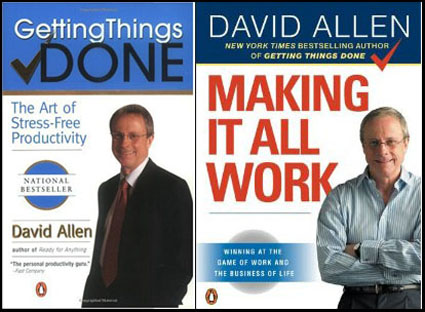
David Allen does an excellent job of describing this process in his books Getting Things Done and Making It All Work. I highly recommend them. They changed the way I live my life. And they’ve helped me be even more effective and fulfilled. But don’t wait to read his books to get started! Just get started!
Looking for information on how to price licensing and assignment work?
PhotoQuote Pro is the software I use.
“When someone wants to use one of your photos, you don’t need a number pulled out of a hat, you need help to get paid fairly for your work. You need fotoQuote, the industry standard photo pricing guide for stock and assignment photography.
FotoQuote is the only source of photo pricing information for photographers that includes powerful coaching help for every category. FotoQuote not only helps you come up with a fair price for your image license, but it also gives you the negotiation information you need to help you close the sale.
FotoQuote Pro 6 has just been released and it’s our biggest upgrade in the almost twenty years since the original version of our photo pricing calculator was written. We’ve added 86 new categories bringing the total to 304. The new version now includes both still and video stock footage categories, assignment pricing, thumbnails, international currency and much more.”
Learn more about PhotoQuote here.
Find more business resources here.
Learn more in my Digital Printing and Pro Portfolio workshops.

