.

Quickly And Easily Change White To Any Color With Photoshop

.

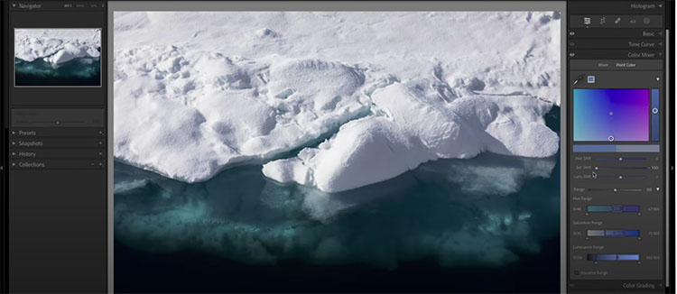
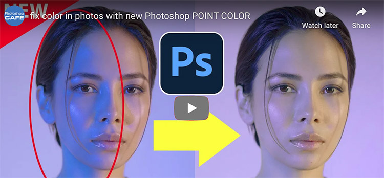
Learn three methods for adding color to white objects. The first two are the most common approaches, which to my eye do not look professional, so I’ll show you how to improve their results. The third approach is the highest quality and least common method and is the only one that involves zero guesswork to produce very professional-looking results.

Check out more of Ben Wilmore’s Digital Mastery here.

Learn more in my digital photography and digital printing workshops.

4 Reasons To Use Abstraction In Photography Plus 20 Experiments To Try

1 Structure Clarified

2 Process Detailed 

3 Concept Visualized

4 Pattern Created

5 Extreme Simplification


Abstraction

To one degree or another, every photograph is abstract. At a minimum, photographs are flat rather than three-dimensional. Some photographs are more graphic than others. And the origins of a few photographs are virtually unrecognizable. Answering to what degree a photograph is abstract, how it is abstract, and why it’s abstract will help you understand more about it and its creator’s intentions – this might be you.

Definitions

So what does abstract mean? First used in the 14th century the word abstract comes from the Latin abstrahere meaning to draw away (ab = away + trahere = to pull) and was used to mean “withdrawn or separated from materials objects or practical matters.” As a noun abstract means a condensed piece of writing. As an adjective or adverb the meanings of abstract are widely divergent; general, summarized, distilled, not specific, qualitative, disassociated, nonmaterial, theoretical, geometric, formal, non-representational, not applied, unreal, transcendent, abstruse … The list goes on until the meaning of abstract becomes diffuse to the point of being more suggestive than specific. Long used in fields as diverse as religion, philosophy, and science, surprisingly, the word abstract wasn’t widely used in the arts until the early 1900s during the modernist movement, when painters and sculptors departed from realism and even representation, which was in part a reaction to photography.

How Abstract Is It?

When looking at images it’s useful to ask a number of questions. Beginning to answer these questions will tell you a great deal about both individual images and their relationships to other images, even if the answers you arrive at are neither definitive nor complete. Sometimes the toughest questions are the most rewarding. They keep giving and giving, for a long time, perhaps even a lifetime.

Regarding abstraction, try these questions.

 “On a scale of 1-10, how abstract is it?” It may be only a little or it may be a lot.

“What’s abstract about it?” While some images are entirely abstract, in other images only certain aspects may be abstract and this may be partial or complete. What’s done and how it’s done can direct attention in specific ways, describe particular graphic qualities, and display interpretation.

“What kind of abstraction is it?” Though they may all coexist in a single image, conceptual, minimal, and non-representational, are three very different qualities, which often identify intent.

 Intent brings us to the most important and often most difficult question to answer. “What purpose does abstraction serve?” This is essential to answer before asking “Is the means appropriate for the end?” and “How well is it done?”

How long visual attention is sustained depends on whether the stylization has purpose, how well it serves the message, and how well it’s done.

The Many Uses Of Abstraction

Abstraction can serve many functions; it can stimulate, structure, inform, and express.


Insights Members can login to read the full article.
Email:
or Sign up

Use LAB Numbers To Match Color of Two Areas in Adobe Lightroom Classic

.

How To Use RGB and LAB Numbers in Adobe Lightroom Classic

Just below the histogram in Lightroom Classic’s Develop module are a set of three numbers that can be useful when optimizing your images. Let’s explore how I use those numbers when evaluating images before processing, when color correcting images and when I need to match the color between two areas. I’ll also attempt to explain the difference between RGB and LAB settings, how to switch between them, and when one option is more useful than the other.

.

.
Use LAB Numbers To Match Color of Two Areas in Adobe Lightroom Classic

.

Learn to take the guesswork out of matching colors by using the numbers that appear below the histogram in Lightroom Classic. In this case, I’ll match two different colored bricks on a building, but you could just as easily use this for all sorts of other purposes.

.

Check out more of Ben Wilmore’s Digital Mastery here.

Learn more in my digital photography and digital printing workshops.

Three Keys To Analyzing Images – Content, Form & Feeling

1 Realistic images emphasize content.

2 Graphic images emphasize form.

3 Expressionistic images emphasize feeling.

4 Impressionistic images may evoke content, form, and/or feeling.


Making verbal statements about visual images can be challenging. But, it’s also very useful. Learning to make useful statements about images can help you clarify the type of work you’re looking at or making. It can help you identify an artist’s intentions, including your own. It can help give you direction. It can help you improve your images. It can help you develop projects and predict outcomes. It can help you more effectively communicate with others. When it comes to appreciating and making images, words can be very useful. You don’t need to have a degree or be a professional writer to use words well. Sometimes, a few simple words can end up being the most useful – especially if they’re the right words.

One useful way to comment on images is to discuss three important and related aspects of images - content, form, and feeling. While all images have these dimensions, you can describe the kind of image a work of art is based on how it weights these three concerns. 

Here are several types of images that weigh these concerns differently.


Insights Members can login to read the full article.
Email:
or Sign up

The Best Ways To Use Multi-Colored Histograms In Adobe Lightroom & Camera Raw

.

The colors that appear in Lightroom, ACR, and Photoshop’s histograms can be useful to detect color casts, determine if detail is being lost, and know more about the colors that make up an image. I start by blindly interpreting a bunch of histograms while I cannot see the image that it represents (but you can). I then explain how basic color works and how that relates to the colors that appear in the histogram.

Check out more of Ben Wilmore’s Digital Mastery here.

Learn more in my digital photography and digital printing workshops.

How To Use An Image’s Frame Effectively & Expressively

The four most important lines of any image are the ones that are often least recognized consciously – the frame. Part of learning to make successful compositions is learning to become more conscious of the frame and how to use the forces it exerts on your images for desired effects. 

Watch The Movement of the Eyes Within the Frame

Whether visible or invisible, every line creates vectors of force that encourage the eyes first to move along it and second to bounce off it. The eyes search the frame in a consistent fashion and these tendencies influence our experiences of all compositions, no matter how diverse. The general tendency is for the eyes to move within the frame from left to right and top to bottom and then to return and repeat this process. The eyes quickly scan the frame itself (determining the limits of what’s included and by extension what’s not) before they scan what’s within the frame. On their first pass, rather than scanning each line of the frame precisely, the eyes quickly average the competing forces of the four vectors in a single sweeping gesture. Afterward, given time for a more careful examination of an image, the eyes may trace and retrace each line of the frame more precisely, until their quest for information is better fulfilled by other paths.

When it comes to motion one must always consider momentum, gravity, and resistance. Some motions, like falling (within the frame think top to bottom and left to right), are easier to get started and harder to stop than others, such as climbing (within the frame think bottom to top and right to left). Once a motion is started it tends to persist until stronger forces modify it. Place one or more barriers in the path of motion and it will shift and sometimes even reverse. Individual compositions work with these tendencies, whether subtly or dramatically, reinforcing, modifying, or working against them.

The motion of the eye within the frame

Powerpoints on and in the frame


Scan the Frame Consciously

Always be conscious of the frame. Scan it. Consciously move your eyes around the entire frame. Anything that touches the frame exerts a stronger influence on a composition. (This is particularly true if it touches a power point, like a corner or the middle of a border.) If information that is not important touches the frame it becomes even more distracting. To make a composition stronger, frame it in a way that only important information touches the frame.

By emphasizing more important elements and deemphasizing less important elements (or eliminating them entirely) you make images stronger. Before exposure, you have an opportunity to make the composition stronger through reframing. After exposure, you have an opportunity to make a composition stronger through cropping (this eliminates other image information that may or may not be significant) and/or retouching (this includes the image information surrounding the flaws).

Use Proximity to the Frame

Frame loose or tight? How you place elements relative to the border of the frame can have a profound impact on any composition. 


Insights Members can login to read the full article.
Email:
or Sign up

What’s New in Lightroom’s Big June 2022 Update

.
.
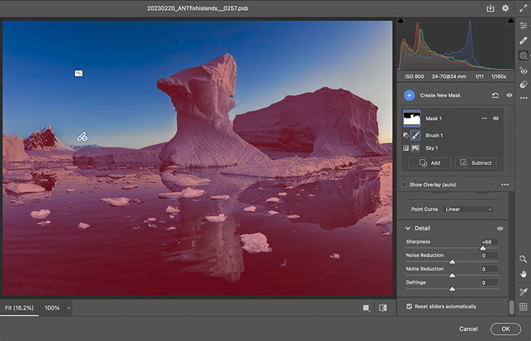
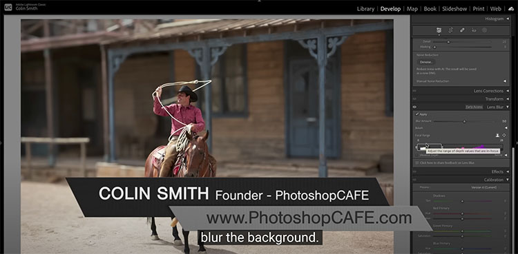
Adobe just packed many useful features into a new June 2022 update to Lightroom and Adobe Camera Raw. Two updates make Masking faster and easier. Plus, there is a great new feature for presets.
.

Find out more from Colin Smith at Photoshop Cafe.

Learn more in my digital photography and digital printing workshops.

12 Things To Look For In Great Prints & Common Problems To Avoid


Most people evaluate a combination of elements to assess print quality. Find out what they are, how to get them, and how to avoid common mistakes in this new video.

7 Things To Look For In Great Prints & Great Artists Who Make Exceptions

Get The Digital Printing Quick Start Guide here.

9 Ways To Tell If Your Photographs Are Over Cooked

9 Ways To Tell If Your Photographs Are Over Cooked

Have you ever taken an image so far it gets completely out of control? I know that feeling well.  It happens to all of us. It’s not all bad. We have to step over the line to find it. It is better to work hot and then to cool down than play it so safe we never get where we really want to go. 

If you find yourself in so deep that you’re not sure where you got off track and you don’t know what to do, use this check list to identify the issue. Then fix it. Even one thing can make a big difference.

Here are some common pitfalls to avoid. (Most of these moves help images; this is just a matter of taking them too far.)

Highlights clipped

You want your highlights to glow, right? But you want them to have detail too. That’s the limit. Paper white is for poets not photographers.

Too Bright

Have you ever felt like viewing an image would be easier with sunglasses on? It’s common to make images brighter while trying to get them to glow. The key lies in midtone contrast. Place it in the most important image areas and darken and/or reduce the contrast of surrounding areas to support it further.

Shadows Clipped

Unless you’re going for gothic or graphic, hold that shadow detail. Areas of dark do make midtones and highlights appear brighter. Better still, handled sensitively these dark areas can hold a unique light at the same time.

Too Much Contrast

Contrast glows, until it makes you squint. More’s not always better.  Think of Goldilocks; one of them was just right.

Over-Sharpened

Yes, we tend to think of focussed sharp images as signs of good equipment and good technique. Blurry photographs are a real drag unless the blur in them is intentional. Nevertheless, it’s easy to overcompensate and make images too sharp, completely forgetting about the sensual possibilities of texture. Let those be your guide as to how far to go and not go. (Remember, angels have halos, not horizons.)

Noise 

A little bit of noise is not the end of the world. But try not to add more during processing. Guard against it when applying extreme contrast like Clarity and Dehaze as well as when sharpening. It’s not hard to reduce during post-processing but here again don’t overdo it; don’t make your subjects look like they’re made out of plastic wrap.

Posterization

Posterization is nobody’s friend except Andy Warhol. Not working in high-bit color modes and applying strong contrast and/or saturation adjustments quickly causes posterization. Use extra care when you’re working on JPEGs. (Don’t confuse this with a graphics card being challenged to display an image when zoomed in or out; if you don’t see posterization at 100% screen magnification it’s not in your file and won’t print.)

Unnatural Saturation

Don’t fool yourself. If you don’t believe it, neither will anyone else. Often just one or two colors will seem off. When this happens adjust them separately from the others. There’s no reason to limit one color because of another.

Vignetting

Vignetting can be a great way to strengthen the frame and to direct and keep attention in it. As with all things, it can be overdone, calling attention to itself and reducing the contrast of the areas it affects adversely. Monitor lens corrections as the ant-vignetting they apply often goes too far and you end up with corners that are so light they become distracting.

Using preflight checklists is a standard practice for pilots and doctors. Though the stakes aren’t as high, they’re a good idea for photographers too. Use this checklist before you share or print images and you’ll completely eliminate Homer Simpson moments. (Doh!) Checking these things will quickly become second nature for you, but don’t let that lead to sloppiness; be thorough. There are enough items to check that it’s easy to forget one or two. But there are so few that you can count them off with your fingers. It’s probably taken you longer to read this than it will to do it on your next image or print. Just scan the bullet points.

7 Things To Look For In Great Prints & Great Artists Who Make Exceptions

Get The Digital Printing Quick Start Guide here.