Cell Phones' Radiation Report Card

Which cell phones emit the most and least radiation?
Find out here.
Read more in this week’s issue of Time magazine.

Which cell phones emit the most and least radiation?
Find out here.
Read more in this week’s issue of Time magazine.
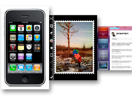
Here’s an excerpt from my first post on Huffington Post.
“Photography’s constant move towards ease, speed, economy, and ubiquity continues today and it has recently reached a new critical apex.
In the first decade of the 21st century, Apple released the iPhone (2007) and a host of independent applications followed, designed to preview, make, process, enhance, and distribute photographs in seconds. Photography just got easier, faster, less expensive, and more ubiquitious …
When did you discover you can do this?
5-15 seconds Make and save image
15-30 seconds Process an image
15-30 seconds Comment on an image and transmit it to others
15-30 seconds Find other people’s images
15-30 seconds Comment on other people’s images or put them to other uses
In about a minute you can make, process, comment on, and distribute an image. It can take you a similar amount of time to do the same with someone else’s image.
If you haven’t done it yet, try it now. I just did. Doing this will change the way you experience and think about photography …”
Read the full post here.
I share useful links to posts on the history of photography, camera, and camera phone too.
Find iPhone Apps and Accessories I use here.

I’ve started writing for the Huffington Post. Initially, I’ll be focussing on cell phone photography. It is a game changer. Did you know people win Pulitzer prizes and sell fine art prints with cell phone photographs? But they did this with traditional cameras too. What excites me most about cell phone photography are the many different things you can do with cell phone photographs – get a quick diagnosis, find out where you are, see someplace you want to visit before you get there, find the nearest store for items, compare prices, make 3D immersive images, help enrich 3D models on Google maps … the list goes on and on and keeps expanding everyday. Cell phone photography has really gotten my head thinking in new exciting ways! I’ll share my insights on Huffington Post.
The first is live now. More are scheduled for this week. Stay tuned!
You can find all my posts here.
Find iPhone Apps and Accessories I use here.
Apple released it’s iPad ad during the Oscars last night.
Steve Jobs attended the awards event in black tie.
Find more on the iPad here.
Why It’s ‘Ahead of Its Time’
13 Things You Need to Know
9 Worst Things About the Apple Tablet
Pee Wee Herman Gets an iPad
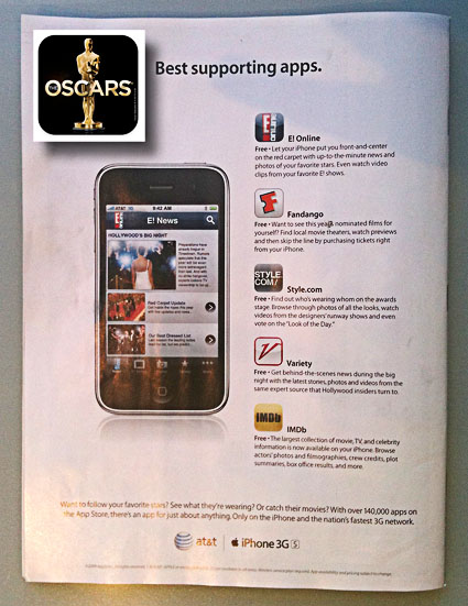
Enhance your Oscars experience tonight with free iPhone Apps.
Entertainment magazine has a great add for Oscar related iPhone apps on the back of this week’s cover. They recommend E! Online, Fandango, Style.com, Variety, and IMDb. They forgot one – the official Oscars app.
You can find them all on iTunes.
Find the iPhone photography apps and accessories I use here.
James Cameron talks about how childhood fascinations became lifetime obsessions and ultimately the primary sources for his greatest successes.
Color doesn’t exist out there. Color is produced inside us. Color is the human response to vibrations in a narrow part of the electromagnetic spectrum.
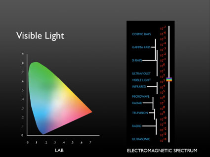
Color is an event. In any color event you need a light source and an observer – and often an object that reflects the light perceived. There is no color without an observer – just energetic vibrations.
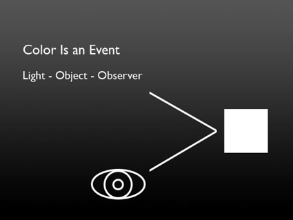
Our perception of color is complex; part physical, part biological, part psychological. Understanding more about our different responses to color and how they interact helps visual artists be more visually sensitive observers and more effective communicators.
Read more Color Theory.
Learn more in my digital photography and digital printing workshops.
There are essentially three kinds of color.

Ideal
Ideal color (often thought of as accurate color) is produced when the color of objects is unmodified by temporal or atmospheric effects or enhancement. Forensics and product photographers favor this type of color.
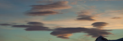
Ambient
Ambient color is produced when the color of objects is modified by time of day or atmospheric effects, like dust or fog. Landscape photographers often favor this type of color.
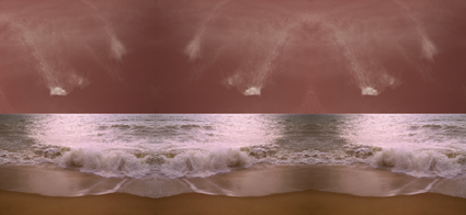
Synthetic
Synthetic color is produced when the color of objects is transformed from its original color to another color. You can produce synthetic color before photographic color or afterward with digital enhancement. Graphic artists often favor this type of color.
It’s useful to distinguish between these three types of color. Doing this provides insights into how (what tools to use and how to use them) to adjust color in your images. It also provides insights into your color preferences and visual voice.
Read more Color Theory.
Learn more in my digital photography and digital printing workshops.
Color has 3 elements – luminosity, hue, and saturation. All colors can be described as some combination of these three values. While we see all three elements simultaneously in a single color, learning to distinguish these three elements from one another is an important perceptual skill.
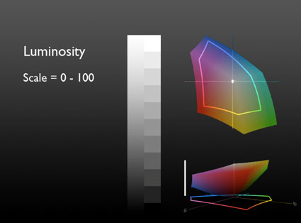
Luminosity, the light and dark of color, can be describe on a scale of 0-100. 0 is pure black. 100 is pure white. (It’s the zone system’s 0-10 times 10.)
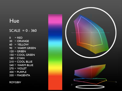
Hue, the color temperature of color, can be described on a scale of 0-360. (There are 360 degrees in a circle. Every 30 degrees transitions into a new family of color – i.e. 0 is red, 30 is orange, 60 is yellow, etc.)
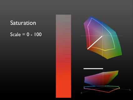
Saturation, the degree of neutrality of color, can be described on a scale of 0-100. 0 is absolutely neutral. 100 is maximum saturation.
LHS (luminosity, hue, saturation) is an excellent language for describing color perceptually (though not necessarily the best for editing and printing). Instead of memorizing RGB values for all the colors in all the standard color spaces, or CMYK values for all devices, or a Pantone swatchbook, you can simply observe color and translate that into 3 values.
LHS is an easy language to learn. Luminosity and Saturation are described on a 0-100 scale, essentially a 1-10 scale with more granularity. Easy. Learning numerical values for Hue is more challenging, but if you memorize a few values you can easily figure out the others. Think of the color wheel as a clock. 0 degrees, red, starts at 3 o’clock. Count back 1 hour, 2 o’clock, to the next color, orange, or 30 degrees. Keep counting back in 1 hour increments to the next color, (i.e. 1 o’clock or 60 degrees is yellow). (An easy mnemonic for remembering the progression of hues is ROYGBIV – red, orange, yellow, green, blue, indigo, violet. You’ll need twelve words to make it all the way around the clock – red, orange, yellow, warm green, green, cool green, cyan, blue, warm blue, purple, violet, magenta.)
Consider LHS a ‘zone system’ for color. It’s a simple sophisticated language that can be used to describe color with greater clarity. You’ll find learning it will lead to better communication. Once you learn it, you’ll be able to communicate more precisely with others who know it – you can even teach it to others quickly.
You’ll also find that once you learn the language of LHS, you’ll see color more clearly, remember it better, understand more about how colors work together, and find ways to adjust colors to reproduce them more accurately or enhance their capacity for expression.
Learning LHS is time well spent.
Exercise
Identify colors with LHS numbers.
Here are three examples.
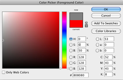
50/0/0
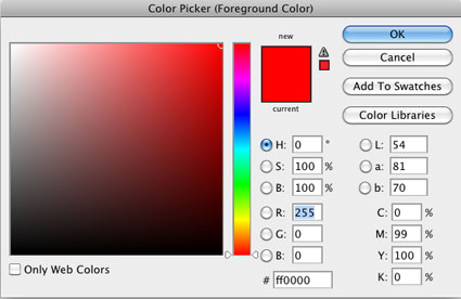
100/0/100
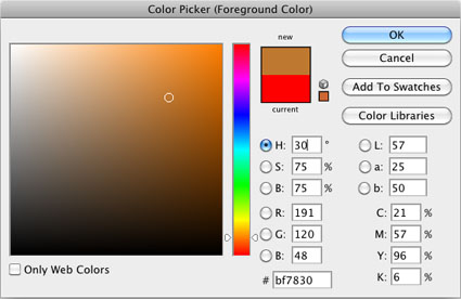
50/30/50
Now, call out numbers for more of the colors you see.
Make this a habit and you’ll develop razor sharp color perception.
Read more Color Theory.
Learn more in my digital photography and digital printing workshops.
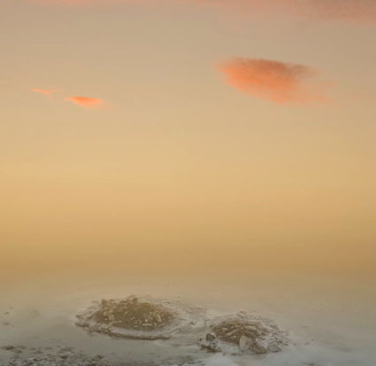
The engine that drives color dynamics, contrast, is a measure of the difference between colors. Contrast can be measured by both the amount and kind of difference between colors.
You can discuss contrast in terms of amount. There can be a lot or a little. You can move between two very different colors (i.e. from black to white) or two similar colors (i.e. from dark gray to light gray).
You can discuss contrast in terms of how transitions between colors are made. There can be many (fine) or few (coarse) steps in-between colors. (Having many steps in between contrasting values is an essential criterion for continuous-tone imagery.)
You can discuss contrast in terms of how transitions progress. The steps in between can be made in a regular (even) or irregular (uneven) manner.
If contrast brings variety and energy, ask yourself what kind of energy you seek. Just as each color often elicits a set of associations, so to does each type of contrast.
High contrast images are often thought of as dramatic, while low contrast images are often thought of as quiet. Images, where transitions are made with many steps, are considered smooth, while those with only a few are considered abrupt. When gradations transition evenly they seem calm, graceful, and can be navigated quickly, while when they transition unevenly they seem dynamic, syncopated, and take more time to navigate. There are many subtle distinctions that can be made within these broad generalizations. This is an area that rewards continued exploration.
Sharpen your eye, by developing the ability to identify both the amount and quality of contrast between colors. You’ll find this to be an extremely valuable skill. You’ll increase your sensitivity to color, expand the range of color choices available to you, and add strategies for meeting color challenges. Color will become more intense and pleasurable for you.
![]()
Luminosity intervals of one hue. Hues achieve maximum saturation at specific luminosities.
![]()
Saturation intervals of one hue – luminosity and hue stable. Achievable only for mid-level luminosities.
![]()
Hue intervals – maximum saturation, luminosity shifts. Hues achieve maximum saturation at different luminosities.
![]()
Hue intervals – luminosity stable, saturation shifts.
![]()
Hue intervals between two complementary hues passing through the color wheel.
![]()
Hue intervals between two complementary hues passing around the color wheel.
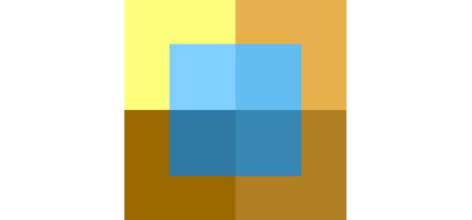
Try These Exercises.
1 Create a set of equal luminosity intervals of one hue.
Optionally, repeat for all hues – ROYGBIV.
2 As above, create equal intervals of hue.
Optionally, repeat for all hues – ROYGBIV.
Optionally, repeat for all hues at different luminosity levels.
3 As above, create equal intervals of saturation.
Optionally, repeat for all hues – ROYGBIV.
Optionally, repeat for all hues at different luminosity levels.
4 Match the intervals (luminosity, hue, and saturation) between two color progressions.
Because it’s difficult to separate other forms of image content from color, color exercises are best performed abstractly. While it’s useful to check numerical values for colors and color relationships, because these exercises are perceptual (often incorporating physiological and psychological responses that are not physically measurable), determine your answers visually. Train and trust your eye.
Read more Color Theory.
Learn more in my digital photography and digital printing workshops.

