X-Rite's Show Us Your Munki Contest
X-Rite will award up to $2500 for the funniest ColorMunki video.
It could be you.
Find details here.
X-Rite will award up to $2500 for the funniest ColorMunki video.
It could be you.
Find details here.
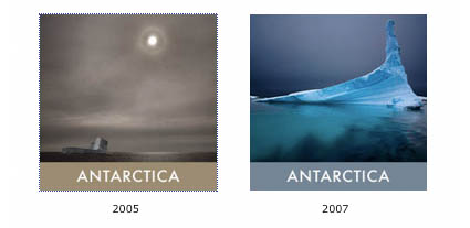
Take these two portable exhibits home and share them with others at johnpaulcaponigro-antarctica.com.
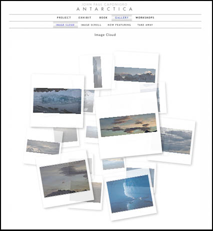
Experience a different way of viewing/interacting images in this image cloud on johnpaulcaponigro-antarctica.com.
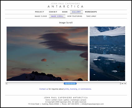
Scroll through a dozen new images in this new online gallery at johnpaulcaponigro-antarctica.com.
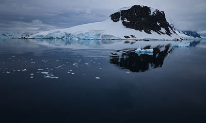
A new online gallery at johnpaulcaponigro-antarctica.com features my comments on a recent image.
“I was on the Ocean Nova with four other teachers and about 75 students. We were coming up through the Neumayer Channel, a little more than halfway through our trip south of the Antarctic Circle. A whale moved past us …”
See them both here.

Last night during an inspiring evening at Photoshop World’s Fine Art of Digital panel I announced my new website johnpaulcaponigro-antarctica.com. It’s got information on my project including …
an upcoming workshop
a traveling exhibit
a book
4 different galleries.
There’s much more to come!
A blog.
Important facts on the region
Google maps
An Antarctica alumni group exhibit
Stay tuned to my blog and my free enews Insights for new announcements.
Get a full list of Photoshop World cobloggers here …
Read More

The best book on sharpening in the industry just got better.
Bruce Fraser’s Real World Sharpening was seminal.
Now the second edition is even better thanks to Jeff Schewe’s contributions.
The session at PSW this morning was … well … sharp!
Get the book!
Get a full list of Photoshop World cobloggers here …
Read More

H.E.L.P.
During the keynote of NAPP announced a new free resource to members. H.E.L.P. – 60 second online video tutorials. Need to know how to do something in Photoshop quick? Log on. Go to NAPP. Select and watch a video tutorial. 60 seconds later, you’ve got answers. It’s very powerful. It’s another great reason to be an NAPP member.
Find out more about NAPP here.
Find H.E.L.P. here.
I covered this morning’s keynote highlights live in real time with Twitter and my iPhone.
Read/see my live tweets of the keynote highlights here.
Coblogging Photoshop World
We’re coblogging again. That is we’re all making posts about highlights of Photoshop World. Some of us will do it daily.
Here’s a list of possible participants.
Corey Barker
John Paul Caponigro
RC Concepcion
Dave Cross
Jim Divitale
Laurie Excell
Richard Harrington
Scott Kelby
Matt Koslowski
Deke McClelland
Joe McNally
John Nack
Moose Peterson
Jeff Schewe
Colin Smith
Ben Willmore
David Ziser

Dave McDonell, cofounder of Imagenomic, the company that makes Noiseware, my favorite noise reduction software weighs in on noise.
JPC Where does noise come from?
DM There are several factors in a digital camera capture process that contribute to noise. The most prevelant are temperature, the actual capture circuitry, sensor size, and the process of sub-sampling which induces errors between adjacent pixels.
JPC Why is chrominance noise so much easier to reduce than luminance noise?
DM It’s really not in application. It’s just that you perceive changes in luminosity or brightness much easier than you do in color.
JPC Fine color noise is easier to reduce than coarse color noise, like the color patterns created by demosaicing bayer patterns. When are you most likely to encounter this type of noise? How should you treat it differently? How far can you go?
DM There are no hard and fast rules for any of the above questions as all are dependent on the capture situation and subsequent output medium.

