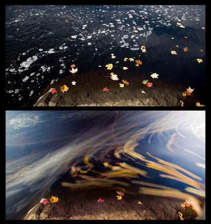
.

Photoshop World 2008 – $100 Discount Until 8/1

Photoshop World is coming to he Mandalay Bay Resort & Casino Convention Center in Las Vegas, NV, September 4-6, 2008.
Held annually on the east and west coasts, Photoshop World is the official convention of the National Association of Photoshop Professionals. NAPP is the largest digital imaging and design association worldwide with more than 70,000 members in 105 countries. It’s the leading resource for Adobe Photoshop training, education and news. Now in its 10th year, Photoshop World is the largest Photoshop educational event in the world. There’s something for every type and skill level of Photoshop user. If you want to get up to speed on the latest developments in a short time, there’s no better place to do it. Dont’ miss the opening keynote session – there are always special announcements and previews of exciting upcoming developments.
The cost of this amazing event is $599 for members and $699 for nonmembers. (I highly recommend you become a member, even if you aren’t able to attend PhotoshopWorld.) You can get a $100 discount by registering before August 1.
It’s three days of world-class training by the best in the creative industry lead by Scott Kelby, NAPP president and the world’s bestselling computer and technology book author. This year’s conference offers the biggest and most comprehensive conference schedule. Attendees will choose from 100 classes taught by 40 of the best and most creative industry experts and instructors, including Jack Davis, Julieanne Kost, Jay Maisel, Joe McNally, Dan Margulis, Vincent Versace, Jeff Schewe, Ben Wilmore and many, many more.
I’ll be presenting in four sessions – the pre-con Epson Print Academy (Wednesday pm), The Fine Art of Digital (Friday pm), The Power of Color (Saturday am) and Drawing With Light(Saturday am).
You can see video highlights here.
You can see the complete list of instructors and their sessions here.
Find out more about all of my seminars here.

Jane Davenport – Alumni Success Story


Australian artist Jane Davenport returned this week for a second workshop with me – The Fine Digital Print Expert. I love to hear success stories from my alumni. Jane’s is exceptional. “In 2001 I took my first workshop with John Paul and decided to follow my bliss. Since then I’ve published 4 books, had 30 solo exhibits, and over 4,000,000 people have attended my large scale outdoor art installations. I know how incredibly lucky I am to be doing this. I also know that you create your own luck.” Jane’s passionate, committed, works hard and smart. It’s a winning combination. She’s gone very far in a relatively short time.
“Workshops make me reassess what I’m doing and why I’m doing it. If you don’t stop and take the time to discover new tools you could miss out on something amazing, something that adds a new dimension to your work. Getting feedback from peers is extremely helpful, particularly people who don’t know you and your work.”
Jane’s created a unique niche focussing on insects. She works with zoos and environmental organization to raise awareness of and promote affection for her subjects. She also licenses her images in interesting merchandising opportunities giving here cause a broader reach.
This week she explored a new developing theme – kites.
Find out more about Jane Davenport here.
Find out about my workshops here.

Test Your Palette – Fine Digital Print Expert Workshop


One of the exercises we do in my Fine Digital Print Expert workshop is to test our palettes. Take your signature image, or the strongest image in a body of work, and make many variations of it. Neutral, semi-neutral, low saturation, average saturation, high saturation, super saturation. Ideal color, ambient color, synthetic color. Etc. Compare the results side-by-side. By process of elimination choose the best solution. Then take your second strongest related image and see if the same palette is equally strong for it. If it is, you’ve found your zone for a body of work.
Many students are astonished at how much potential their images have. Consider John Myer’s image here. He’s torn between the fully saturated and semi-neutral versions. So he’s testing those two palettes on several other related images. With a just little more exploration, he’ll soon have his answers. Too often we commit to a solution before we explore our options. Sometimes we’re too timid with the kinds of explorations we allow ourselves. Take these steps at the beginning of every new body of work. The time you take to explore your options is well spent. It’s extremely rewarding.
Find out about my Fine Digital Print Workshop series here.
Find out about The Fine Digital Print Expert workshop here.

Color Management & Proofing – Workshops, DVDs, Radio


We go into the ins and outs of advanced color management in my workshop series The Fine Digital Print. No matter what their level, it helps everyone participating. In my workshop The Fine Digital Print Advanced we take it step by step from concept to practice. In my even more advanced printing workshops The Fine Digital Print Expert and the Fine Digital Print Master we assume a higher level of knowledge and go into what doesn’t work perfectly. Here are a few examples. 1 – LCD monitors are too bright for precise prediction to print. 2 – Photoshop’s softproofing Simulate Paper Color is too aggressive.  3 – Printer drivers overink prints delivering slightly dark prints, typically losing subtle shadow detail. 4 – A majority of users don’t view their proofs and prints in ideal light. The cumulative effect leads many to think they’re doing something wrong (They might or might not be.) or that color management doesn’t work. It does. It just doesn’t work perfectly. And it’s important to know what the limitations are.
In my workshops, seminars, and DVDS, I cover what you can do to overcome these imperfections through proofing and then move on to other issues you can only address through proofing. Traditional photographic printing master John Sexton saw my demonstrations during the Epson Print Academy and remarked that watching them felt like deja vu because while the tools have changed the core concepts remain the same.
It’s been my mission to make color management relatively easy to understand and implement without dumbing it down. It can be done. No one else I know takes a more systematic and thorough an approach to proofing as I do.
I sat down several weeks ago with Scott Sheppard of Digital Photo Radio to talk about key Color Management and Proofing. Scott’s a great guy. Easy to talk with. Asks all the right questions. Scott’s one of the little guys doing big things. Digital Photo Radio is done entirely by one man. But the product is so good it seems like it’s created by an entire media team. I love to see individual entreprenuers go for it and succeed big. Scott’s done that.
Check out the audio cast and find out more about Digital Photo Radio here.
Check out my DVD 6 Simple Steps to Good Color Management here.
Check out my DVD The Art of Proofing here.
Check out free Color Management and Proofing resources on my website here.
Sign up for Insights enews to find out when new content is available here.

Appropriate Scale – Fine Digital Print Expert Workshop


One of the many things that it’s valuable to test is optimum scale. Images affect us differently at different scales. Small prints draw you close to them providing an intimate experience. Large prints envelope you in an immersive experience requiring a greater distance to see the entire image. One of the things my workshop students do is find optimum scales for their images. While there are many practical considerations that may modify their final choices (like final presentation space), determining an optimum scale reveals an artist’s intention and the nature of their work more clearly. How do you determine optimum scale? Test it! There’s no substitute for fully experiencing the effects of changing scale. Make different sized prints and compare them side by side. Alternately, projecting an image on a wall at different scales can be similarly revealing. Here, again, side by side comparison reveals more. Then, put your impressions into words – verbally or in writing.
Here veteran professional landscape and garden photographer Roger Foley shows two prints of the same image at different scales. While he feels a larger scale is ideal for his imagery, he’ll sometimes make smaller prints to accommodate smaller presentation spaces and client requests.
Find out more about Roger Foley here.
Look for my upcoming article on Scale in Photoshop User magazine. Find out about PSU here.
Find out about my Fine Digital Print Workshop series here.
Find out about The Fine Digital Print Expert workshop here.

Reviewing Images – Fine Digital Print Expert Workshop


We started my Fine Digital Print Expert workshop today with extensive group portfolio reviews. The reviews are useful for unveiling issues that need resolution and for helping frame how to apply techniques in ways that are appropriate for and sensitive to an individual’s vision (rather than applying technique formulaically, which tends to make everyone’s images look the same). My workshop participants not only get my feedback, and the feedback from other participants, but they also learn a lot of ways to approach looking, commenting on images. The right questions can be just as important as the answers. Sometimes they’re best left open for future revisitation because more can come to light. And activating collective intelligence in group sessions can be very helpful. You get to see when you do and don’t have consensus and many more ideas come to light.
You can’t take a one size fits all approach. You have to take into account the experience level of the person and their artistic goals. Rather than criticism, I prefer to offer useful feedback. The new field of Appreciative Inquiry (born out of the science of qualitative analysis) has a lot to offer when it comes to making valuable statement about quality. It opens dialogs by first identifying core strengths and then discusses how to make them stronger.
How participants present their work alters the type of feedback they get. You can present work without commentary and get spontaneous responses or you can speak about your work and get more focused commentary. You can present your images one at a time (this often highlights singular images, linear progressions of thought, and reveals memorable images – it’s best for more resolved work and when you want comments on broader issues and general thematic concerns) or many all at once (this makes it easier to see more subtle and complex connections between images, either formally or thematically, that might otherwise remain sensed but unseen – it’s best for more specific feedback). One isn’t better than another. They’re just different. The point is it’s important to decide what kind of feedback you’re looking for and to present your work in a way that encourages that type of feedback. Either way, you’ll often be surprised by the feedback you receive. That’s one of the great things about getting feedback from other people. You get exposed to new perspectives on your work.
Here, Claudia Rippee presented two bodies of work – a smaller set sequentially and a larger set contextually. She got very different kinds of feedback. At the end, she discovered that when the viewers understood that the two very different bodies of work were created by one artist that knowledge modified the responses of viewers to both bodies of work. Your images may be seen in reference to other artist’s images, but most importantly your images are seen in reference to all the other images you create.
Whether an individual’s goals are professional or purely personal I emphasize the development of an authentic voice and personally relevant themes. Signature Styles, Singular images and Bodies of Work are all core concepts that I reinforce. You can find out more about these keys to artistic fulfillment in my free Creativity Downloads.
See my PDF Portfolio Reviews and Artist’s palette here.
See my PDF Singular Images and Body of Work here.
Check out my column in AfterCapture magazine to read more.
Sign up for Insights to receive alerts when new free resources are posted.
Find out about my Fine Digital Print Workshop series here.
Find out about The Fine Digital Print Expert workshop here.

Pilobolus Dance Theatre


I just saw Pilobolus Dance Theatre’s Lanterna Magica this weekend. It was an inspiring performance! Two hours evaporated!
Honestly, as interesting as the video clips here are, they don’t do a full performance justice. (In two hours you get to know each dancer. Each experience builds on the previous one generating a big final effect.) But don’t let this stop you from watching more. They’re great!
You can see more Pilobolus on YouTube.
Find out more about Pilobolus here.
I’ve been intrigued with dance since I was very young. The Nutcracker and Firebird ballets captivated me at the age of 4. Mumenshantz modern dance / mime at 5. The Whirling Dervishes at 6. At 7, I moved to New Mexico and began attending native american ceremonial dances. Martha Graham’s Rites of Spring at 19. Cirque du Soleil at 40. And recently Alison Chase (former creative director of Pilobolus) was a guest instructor during a weeklong workshop on creativity led by Sean Kernan. (See my posts between June 9-13, 2008.)
I enjoy seeing anyone do anything really well. But watching other creative people engaged in different disciplines is particularly interesting to me. I learn about creativity. I learn about communication. I learn about myself. Often, I’m asked what does work in other fields offer me directly for my own work. Ideas. Ideas that I can apply to my own work? Yes. I find that if you don’t get stuck on specifics but make more generalized or abstracted statements about quality and perception that these become vital wellsprings for new ways of thinking. Here’s an example. Dance and sculpture have been increasingly influential to me with respect to representations, expressions, and experiences of two essential elements in my work – time and space. The stimulus in these two other disciplines has led me to develop many new images (For just one example, see my series Allies here.)
The other question that often arises is once you’re inspired by another discipline, should you engage it professionally. Yes. No. Maybe. You have to weigh many things before making this leap – talent, passion, means, etc. My recommendation is to sleep on it long and hard. Personally, take a little time to be stimulated and energized by a wide range of experiences, free of professional pressures. Professionally, stay focused on your core passions. I don’t plan to do dance or yoga professionally. Sculpture on the other hand … well stay tuned. It’s a long standing desire of mine to work with sculpture that goes way back to early childhood and simply won’t go away. That impulse is about to bear fruit this summer. It may well become a very strong current in my work for the foreseeable future.
Stay tuned here this summer.
Sign up for my enews Insights for alerts here.
My wife made the comment that we should all make it a habit to spend a little time each year getting out and experiencing new things that will inspire and motivate us. I agree!
What was the last or most inspiring creative event you’ve attended? Comment here!

A Vision of Students Today


Feel like it’s hard to keep up with the R/Evolution? You’re not the only one! We’re going through a major global paradigm shift – technologically, environmentally, culturally.
Education isn’t keeping up. This video on YouTube highlights many aspects of the issue. (It’s hit a nerve and has been viewed almost 2.5 million times.) Here are some stunning statements you can find in it. “My average class size is 115. My neighbor paid for this class but she never comes. I buy $100 text books that I never open. I will read 8 books this year. 2300 web pages. 1281 Facebook profiles.” And the list goes on. It’s 4 minutes and 44 seconds well spent.
I felt education was falling behind when I went to college – and that was before the web.  Now? Well, I can do more than imagine. I lecture a lot at universities. I know the issues. I see the problems. I sympathize with both administrators and teachers, but mostly with students. Bold moves are necessary.
My contribution? Share knowledge. Teach well. I’m constantly educating – website, publication, dvds, lectures, seminars, and workshops. It’s one of many ways I can make a difference.
We all have different resources and strengths. Think about what you can do to contribute.
Make suggestions here. Comment.
Check my calendar for upcoming dates.

Color Management in Firefox 3 Browser


A majority of browsers have not been color managed. That’s starting to change. Apple’s Safari has been color managed for some time now. Firefox 3, Mozilla’s most recent browser version is now color managed. Color management is not on by default. Here’s how to turn it on.
1    In the address bar type in about:config.
2    Ignore the warning and click “I’ll be careful, I promise!”
3    Scroll to gfx.color_management enabled. (The default is false.)
4    Double click on this to change it to true.
5    Restart Firefox.
These new features help ensure that color management savvy users can see color as it is intended to be seen online.
I look forward to a day when all software is color managed by default.
And to a day when monitors are self-calibrating/profiling.
(And printers.)
Check out my DVDs 6 Simple Steps to Good Color Management and The Art of Proofing. Check out free color management resources in my Downloads.
How important do you think color managed monitors and browsers are? Comment here.

William Neil – Landscapes of the Spirit


Landscapes of the Spirit is one of my favorite landscape books. It’s out of print. But now it’s available in a digital edition. You can download a PDF version of the book for $15.
Its 120 pages offer 72 images arranged in portfolios introduced by texts from writers such as Wendell Berry, Rachel Carson, Annie Dillard, Ralph Waldo Emerson, Terry Tempest Williams, and many others.
It’s pure inspiration.
Find out more about William Neill here.