.

Photoshop’s Amazing Colorize Filter Offers Many More Features

.

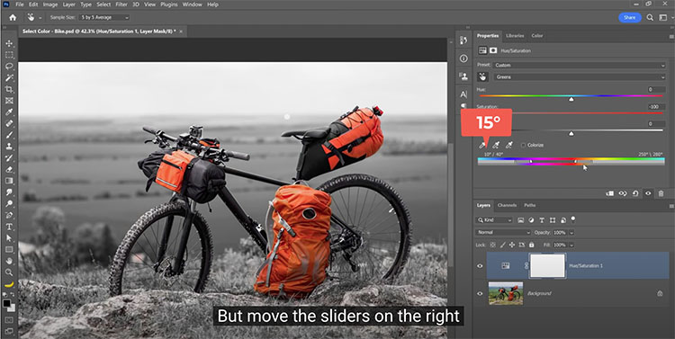
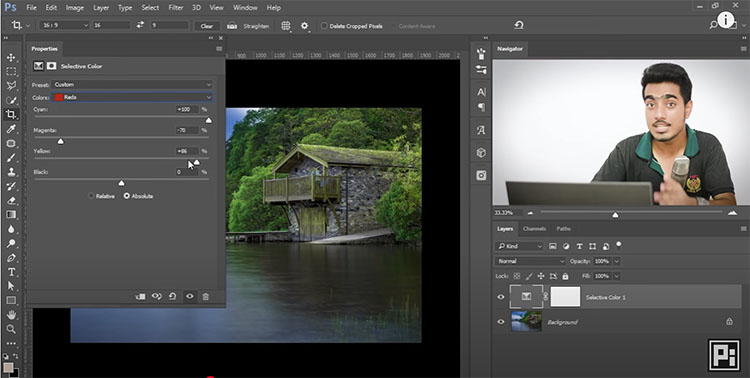
Colin Smith shows often overlooked additional controls in the Photoshop Neural Filter Colorize. Convert black and white photos to color instantly and then learn these tools to perfect results.

Find out more from Colin Smith at Photoshop Cafe.
Learn more in my digital photography and digital printing workshops.

The Big Overview – The Key Reasons Why Your Tools Matter When Printing

Prints are produced by not one but many things – a system.  You can make better prints if you understand how each of the tools you use to make them influences quality. In addition, you’ll be able to identify and come up with solutions for problems you run into, now or in the future.

I’ve written whole articles on each one of these components (Follow this article with the individual ones you’d like more clarity on.), nevertheless, rather than having to piece all of that information together, I find it’s also useful to have a broad overview of how the whole system works.

Here’s a quick survey of why each element of a printing system matters.


Camera                        resolution – dynamic range – bit depth

Lens                              sharpness – low distortion – few artifacts

Editing Space             saturation

Bit Depth                     gradation

Software                      color – detail – composition

Monitor                        accurate preview – saturation – brightness of white

Printer                          ink – size

Ink                                 black – saturation – longevity

Paper                            whites – materials

Printer Profile           accurate color – graybalance

Light                              how well you can see


I’m currently testing the Fuji GFX 100

100 mp / 14 bit / ISO 12,800 expandable to 102,400

Camera

resolution – dynamic range – bit depth

A camera’s chip determines how much detail it can render with three primary characteristics – resolution (sharpness), dynamic range (shadows and highlights), and bit depth (gradation). More is better. It’s easier to throw away what you don’t need than create it.

Among several lenses, I favor the Fuji 32-64mm

Lens

sharpness – low distortion – few artifacts

Good lenses are sharper, better lenses maintain that sharpness edge to edge, while the best lenses also produce beautiful bokeh (depth of field blur). Good lenses are also free of distortion and artifacts like chromatic aberration. Fixing these things in post-production can sometimes be arduous and at a certain point impossible.

Prophoto is bigger than Adobe RGB and sRGB

I edit in ProPhoto RGB

Editing Space

saturation

Pro-Photo RGB can hold all of the saturation your camera can capture while other standard editing spaces cannot. If you use one of the smaller spaces (like Adobe RGB or sRGB) you may lose and not be able to produce that saturation.

Read more here.

I edit in 16-bit

Bit Depth

gradation

16 bit’s thousands of shades of gray don’t give you more separation in prints. Printers can take 16-bit data but they can only print 256 shades of gray. Editing in16-bit eliminates the possibility of producing posterization (which can produce harsh graphic transitions and/or noise).

Read more here.

I use Adobe Lightroom Classic and Photoshop together.

Software

color – detail – composition

You can pretty much change anything about the way your images look … for better or worse.

Good software lets you be more precise and go further. Better software does it more easily without cutting corners.

For traditionalists, it’s shadow and highlight detail, midtone contrast, color clarity, sharpness and reduced noise.

For non-traditionalists, it’s the ability to produce unique color palettes, special effects, and composites.

Read more on color here.

Read more on detail here.

Read more on composition here.

I use an NEC PA311D

Monitor

accurate preview – saturation – brightness of white

What could be more important than seeing your images accurately while you’re editing them? Good monitors can be calibrated to a device neutral standard that shows you what your images truly look like now and in the future (when you replace your current monitor). 

Better monitors render more saturation. (Currently, the best monitors can show you almost all of the values in Adobe RGB.) 

The best monitors can be tuned to show you the white of your print more accurately.

Read more here.

I use Epson’s P900 and 9000

Printer

ink – size

A printers manufacturer determines which ink set you’ll use. 

A printer’s series determines which of the manufacturer’s inkset you’ll use.

A printer’s model determines how big you can print.

Additionally, a printer’s head also impacts speed.


I use Epson’s Ultrachrome HDX ink

Ink

black – saturation – longevity

The ink you use has a huge impact on print quality and longevity … but to see what it can do you need paper.

Read more here.

Ink & Paper

black – saturation – longevity

Together, ink and paper determine … 

Black

The black of the ink and the white of the paper set the limits of a print’s contrast ratio. 

No matter how much ink you put down on some substrates you won’t get a blacker black and each substrate has an ink limit, which is the maximum amount of ink that can be put down before detail starts being lost.

Saturation

Good inks and paper coatings produce more saturation in all colors.

Longevity & Durability

Some are more archival than others. (Visit Wilhelm Research for reliable data.)

I use Epson’s Legacy Fibre and Legacy Platine papers

Paper or Substrate

whites – materials

Substrates determine an image’s white (where the ink doesn’t go) and so contrast ratio. A brighter, bluer white is more versatile, but may or may not be as archival.

Only paper (or substrate if it’s canvas, plastic, metal, wood, etc) can give your images a look and feel. It’s first and foremost about the physical characteristics of materials including things like reflectivity and texture.

Read more here.

Photo papers have greater gamuts than matte because of their blacker blacks.

I use Epson’s profiles

Printer Profile

accurate color – graybalance – gradation – shadow and highlight detail

A good profile can be more than getting a good match with your screen. But it can be more. Poor profiles can cause color shifts, reduce saturation, produce posterization, and even lose shadow and highlight detail.

If you’re using Epson profiles for Epson papers, you’re in good shape. Epson makes great profiles for their papers. But if you’re using a third-party or hand-made substrate you need a good profile. Don’t assume that the profiles you download from websites are good. Test them. If they’re not great, get a professional to build one for you. Or, build your own.

Read more here.

I use Solux 3500K lights

Light

how well you can see good results

Event the best print can’t be seen in the dark. To be seen well, good prints need good light. 

Think about three things …

1 Use a generous amount of light. Not so much light that it creates eye strain but use a lot. Good prints glow when they reflect light but they need enough light to create that glow.

2 Use the right color temperature. If you can’t control the light people view your prints in, assume it’s warmer than 5000K (most people prefer warmer light, like 3500K) and make your prints look good in a similar light.

3 If you really want to dial in the color for your exhibits (or your clients) recommend a full spectrum light source (like Solux) that doesn’t make one color look more saturated than another and so preserves the color relationships you produced in your prints.

Read more here.

It takes some initial research and testing to find the tools that are best for you but once you settle on a system of your own you only occasionally have to repeat this and only for specific components. It gets easier because you have a baseline. All you have to do is ask how much better can the new gear do and is it worth the cost and effort?

Meanwhile, if you run into issues (like my blacks aren’t black enough or my colors aren’t saturated enough or I’m losing detail) you’ll know which pieces of your system to tweak to get better results.


Read more on Color Management here.

Read more on digital Printing here.

Learn more in my digital photography and digital printing workshops.

Paul Caponigro – Zoom 11/20 + 11/27 Book Launch

Zoom Webinar
Obscura Gallery, New Mexico
NOVEMBER 20, 2021 – Saturday 10:00am MST

Paul Caponigro will be in discussion with Jennifer Schlesinger, the owner of Obscura Gallery, about his tenure with the Polaroid Corporation in the 1960’s. 

Register here.


Exhibit + Book Launch
Studio 162, Rockport, Maine
November 27, 2021 – Saturday 3-6 pm  EST
“Visual Memories and Hidden Places”
Join Veritas Editions as they release 3 beautiful editions of Paul’s work.


How To Make Advanced Masks in Adobe Camera RAW & Lightroom

.
.
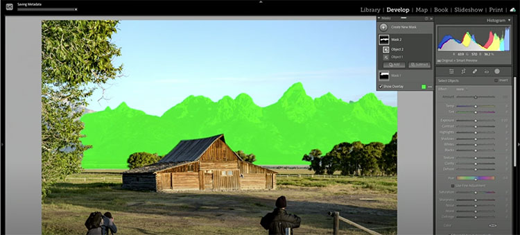
Masks in Camera Raw and Lightroom are new. Colin Smith shows you beyond the basics, how to combine masks for more complex selections, such as selecting the foreground, adding, subtracting, and intersecting masks. Learn how to use combination and complex masks.
.

How To Hack Photoshop’s AI To Get Astonishing Color Grading In Your Images

.
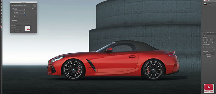
Add spectacular color to photographs using this amazing trick Colin Smith discovered by hacking Color transfer in Photoshop 2022. This quick tip will help you color grade photos like a pro, but its so easy and quick. Every photographer will love this.
.

Why Indigenous Cultures Matter So Much To Environmental Solutions – Chris Rainier @ COP21

.
Chris Rainier and Olivia McKendrick (founders and directors of Cultural Sanctuaries) offer an inspiring presentation about the crucial roles indigenous communities play in crafting environmental solutions.
.
.
Chris and Olivia pick highlights from COP in the links below.
.

What’s New in Lightroom Classic 11 For Photographers – Plus More On New Easy Masking Features

.

Adobe released the October 2021 Update to Lightroom Classic. This video will walk you through what’s new.

.
Plus, take a deep dive into Lightroom’s new masking features.
.
0:00 Intro
1:48 Don’t Freak Out
3:00 Mask Basics
4:46 Brush and Gradient Masks
6:35 Subtract with Select Sky
8:32 Brush and Gradient Presets
9:38 Using the Linear Gradient
11:41 Luminance Range Masking
14:41 Color Range Masking
16:40 Select Subject
19:12 Select Sky
20:38 Advanced Portrait Example
.
.

The New Masking Tools In Lightroom & Camera Raw


“Discover how easy it is to make local adjustments to your photographs using Lightroom and Adobe Camera Raw’s new Masking panel and tools including: Select Subject, Select Sky, Radial and Linear Gradients, Brush, Color and Luminance Range Masking and more!”

View more on Julianne Kost’s blog.

Learn more in my digital photography and digital printing workshops.

What’s New in Photoshop 2022 For Photographers

.
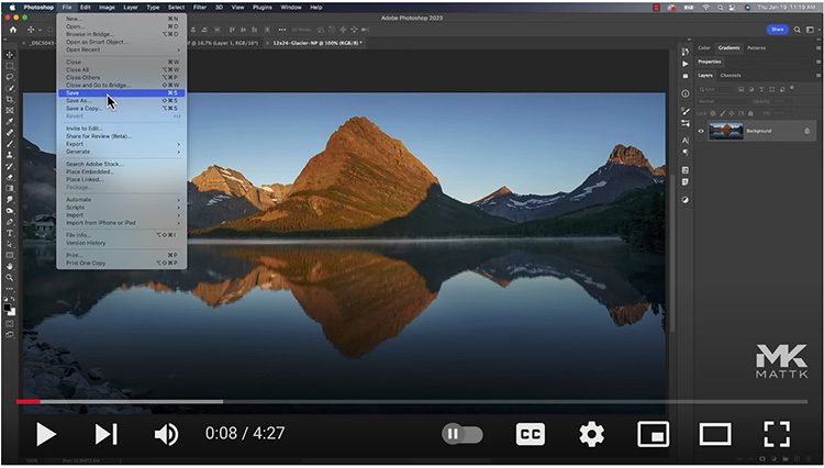
Matt Koslowski gives us a tour of Photoshop 2022’s new features for photographers.
.

Adobe Photoshop 2022 Top New Features in 9 Minutes!

.
“This video will cover the top 5 new features and updates in Photoshop version 23.0.0! In this video, we will look at some of the most significant new features like the Object Finder, Neural Filters, Mask All Objects, and so much more!”
.
00:00 – Introduction
00:20 – Object Finder
02:10 – Mask All Objects
02:45 – Harmonization Neural Filter
05:12 – Landscape Mixer Neural Filter
05:48 – Commenting on Cloud Documents
07:14 – Paste Vectors from Adobe Illustrator
08:45 – In-App Tutorials 09:72 – Final Thoughts
.