.

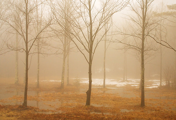
6 Ways To Get Better Shadow & Highlight Detail In Your Photographs

You want your photographs to glow - right? So what’s better than one kind of glow? How about three?

You can get there by not succumbing to the classic temptations to clip shadows and/or highlights to produce a more obviously dramatic but a less lively, nuanced, and expressive tonal scale. Instead, hold the full dynamic range with a real black and white and also create gorgeous separation in the values nearest to them.

So many times we give the lion’s share of the contrast to the midtones. Midtone contrast is really important. But that doesn’t mean we have to sacrifice the light in highlights by making them too hot to look at comfortably or in shadows making them so dark they turn to murky mud. You can hold separation in these extreme ends of the tonal scale and produce beautiful qualities of light that complement not just contrast. Here’s how.


Insights Members can login to read the full article.
Email:
or Sign up

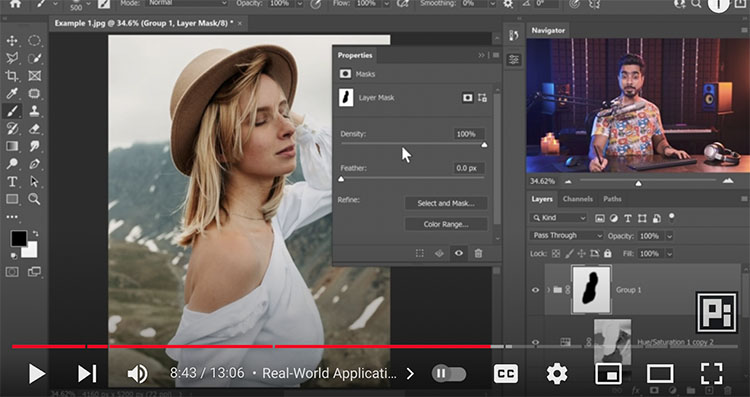
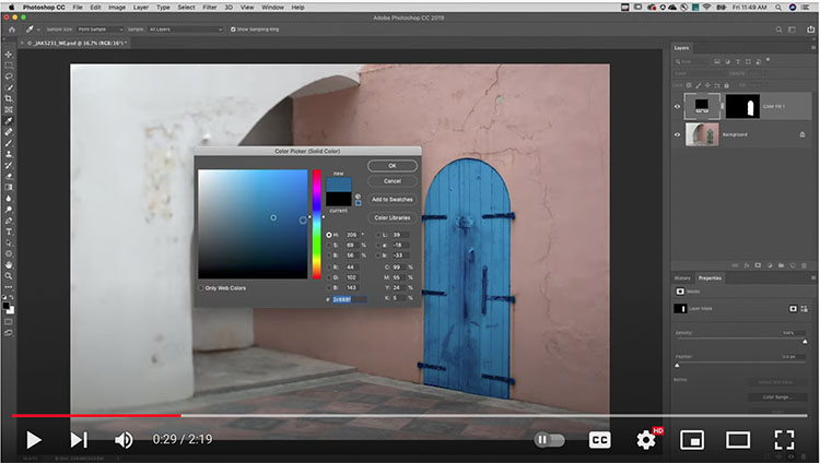
One Filter To Quickly Remove Most Halos In Photoshop

.
“Learn how to easily fix and remove halos easily and fast using a hidden Photoshop slider.”
.

Sarah Kay On The Power Of Spoken Words

.
“If I should have a daughter, instead of Mom, she’s gonna call me Point B … ” began spoken word poet Sarah Kay, in a talk that inspired two standing ovations at TED2011. She tells the story of her metamorphosis — from a wide-eyed teenager soaking in verse at New York’s Bowery Poetry Club to a teacher connecting kids with the power of self-expression through Project V.O.I.C.E. — and gives two breathtaking performances of “B” and “Hiroshima.” Sarah is also the host of TED’s podcast “Sincerely, X.”

Photoshop’s New Filter Depth Blur Helps You Control Depth Of Field

.
“Just one slider to Add Background Blur & Shallow Depth of Field! Besides, you can also control where to focus! All of this, in a brand new feature called “Depth Blur” which is a part of Neural Filters in Photoshop. In this video, we will be testing this new feature against a variety of images; from simple single-subject ones to images with random objects or a group photo. In this lesson, we will also learn and discover in what scenario this feature can be useful and how you can make the best out of it, along with some best practices and advanced techniques. We’ll also learn how to use depth maps for better results.”
.

12 Classic Mistakes We’ve All Made Trying To Make Better Prints

Plus 7 Extra Go To Printing Resources To Help You


Face it, we’ve all done it, that is overdone it, when we’re trying to make great prints.  As important as it is to learn what you can do and how far you can go, it’s also important to learn how far not to go and why. You learn what to look for as well as what to look out for.  These trials of error can be beneficial. You’re sure to learn a lot when you make mistakes. And we can learn from each other’s mistakes as well as our own. One of the many benefits of teaching printing for over twenty-five years is that I get to learn from my mistakes and from many other people’s too. There are some classic printing mistakes I see made time and time again because the approach is correct but the practice has just gone too far. If you’ve never made some of these mistakes, I recommend you make them – once.

Here are some classic mistakes I see so many people make when they’re printing – and the cures.

It’s Too Light

You want your print to be more luminous so brighter’s better right? But your image ends up looking washed out. The solution is to lighten the highlights more than the midtones and shadows. It’s a specific kind of contrast you won’t get with a Contrast slider but you will get with a Highlights slider or even better with Curves. You might also darkens shadows slightly. It’s the apparent contrast between highlights and shadows and in the midtones that will make your images glow. Most prints on average are weighted darker than middle gray so that their highlights will pop.

Whites Without Detail

So once again you’re chasing lightness and you push your highlights too far eliminating detail. There is a limit to how far you want to go and you just stepped over the line. Pull back. You can move in that general direction just don’t go so far. Don’t push the Whites slider so hard and pull your Highlights slider down a little, plus remember that you can get a second pass of Highlights and their neighbors Lights with Curves. You want highlights to have full detail and to be bright but not so bright you feel like you have to squint to see the picture better.

Whites Touch The Frame

Sometimes you have exposure that don’t have much (or any) detail in very bright areas. This is particularly problematic when they touch and break the rectangle of the frame. If you’re not going to clone detail into those areas, go old school and “fog” those areas, that is print them slightly gray. Using a brush lower the Whites slider (maybe the Highlights too) to build up some density without texture and restore the frame. You don’t need a lot, just enough to make the frame coherent, keeping the eye from wandering out of it and minimizing the distraction. Alternately, in Photoshop you can use a Curves adjustment layer and lower the white point slightly, then readjust the rest of the Curve to keep all the other tones glowing; paint on the mask to isolate this effect.


Insights Members can login to read the full article.
Email:
or Sign up

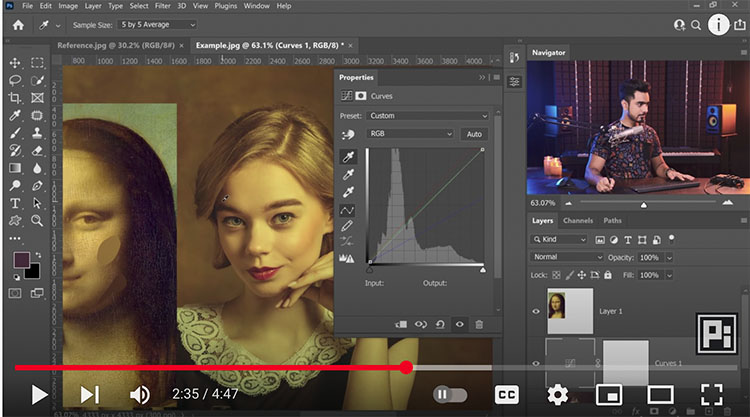
A Fast Way To Create Flares In Photoshop | Unmesh Dinda

.
“See how you can easily add flares to your photos using Photoshop in this quick tip from Unmesh Dinda of PiXimperfect.”
.

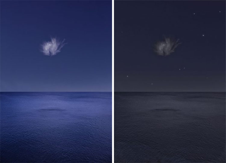
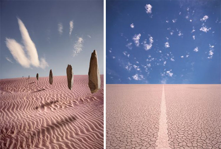
4 Reasons Photographers Should Draw More Often

This drawing is beautifully rendered but drawing like this is an inefficient way to capture an idea.


Think of the difference between notes and finished pieces of writing. Both kinds of writing are useful. One kind of writing might even lead to the other. You don’t spend as much time choosing the words you put on a post-it note as you do the words in a job application. One kind of writing might even lead to the other. Because they take less time and skill, you make a lot more notes than you do finished pieces of writing.

Can you draw? Note that I didn’t ask you can you make drawings that look pretty. So if little kids can draw, then so can you! Think of these types of drawing (sketches, doodles, cartoons) as notes that require very little drawing skill. They’re most useful when you keep them simple. Their value is not as aesthetic objects but in the quality of thought they contain. But why would you want to? Let me count the ways.

1

Imagine The Possibilities

Draw when you can’t get there from here or you can only imagine it.

(I could have recorded the idea with words but this simple image is much more specific.)


2

Capture The Idea In What’s Picture Imperfect

Draw when what you see isn’t picture perfect but you want to remember the idea.

(I saw this type of image many times before I encountered it with calm water and unbroken reflections.)


3

Identify Possible Variations

Draw when you want to figure out new variations of the same idea.

(Drawing helped me find the idea of not just one but two spirals.)


4

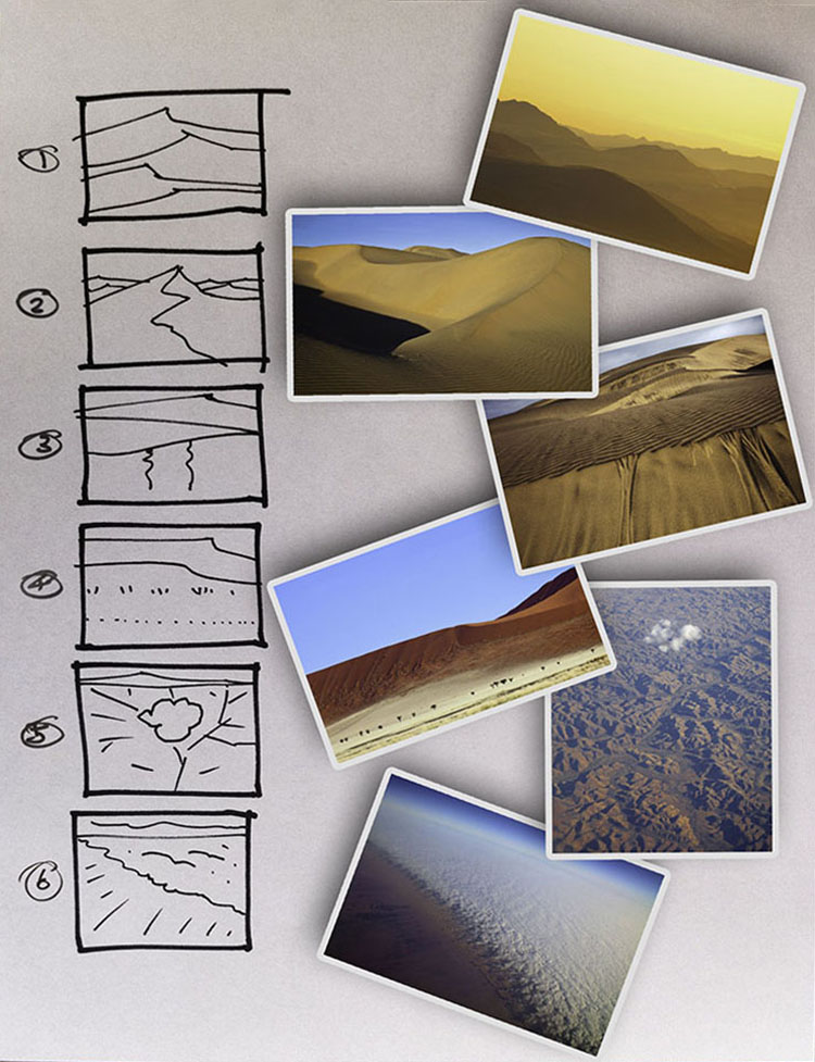
Structure Stories With Storyboards

Draw when you start a project and you want to figure out which shots you need to complete it.

(Storyboards are what great movie directors like Hitchcock and Spielberg use.)


Read more on Drawing here.

Learn more in my photography and creativity workshops.

Let Why You Draw Determine How You Draw

If I’m trying to make a drawing that looks good or one that is good to look at then the hour I spent making this is well spent but if drawing requires that much time I won’t draw often.

If I’m drawing to record ideas, this is a much more efficient way to draw and so I’ll draw more.

“Make things as simple as possible – but not simpler.” – Albert Einstein


In their wonderful book Art & Fear Ted Orland and David Bayles share a story.

A daughter asks her father, “What did you do today?”

“I taught my students how to draw,’ he responded matter of factly.

She gasped in amazement, “When did they forget?”

I find that when I ask people if they can draw the number of affirmative responses is directly related to age. The younger you are the more you know you can draw. So what happens when we grow up? We are taught a terribly limiting understanding of the many things drawings can be and do.

With a unidimensional vision of what drawing is, we are trapped by someone else’s limited vision of perfection that is further complicated by comparison to others.

We can all draw. Note that I didn’t say we can or should all draw like Michaelangelo. It takes more time to develop the skills necessary to draw in some ways than others. And you probably draw a little differently than your friends who also think they can’t draw. But if you can read this (possibly even if you can’t), then chances are you already know more than one way to draw.

Drawing is many different things to many different people – and it can do many things for you. For Thomas Edison drawing was a way to visualize what didn’t exist – yet. He handed his team a very simple sketch to help them invent the phonograph. (As a draftsman he was no Leonardo but his limited drawing skills helped him be an even better inventor.) Words weren’t enough and he needed a way to visualize what they had never seen before but soon would in part because he helped his team visualize it with a drawing.

So once we understand that even doodles are just one of many kinds of drawings, we might start to reframe what makes a drawing good based on the purpose we intend it to serve. If all you’re looking for is a way to find and capture ideas, then the time it takes to render them realistically is wasted. (And who wants to waste time?) Moreover, for some purposes, the extra detail added may be distracting or, worse, confusing. (If I ask you where the bathroom is, and you start spouting extended passages of flowery verse, one or both of us might get wet.)

The kind of drawing I want to encourage you to practice as part of your creative toolkit is not about making good-looking drawings; it’s about making useful drawings. Drawing can be useful in many, many ways.


1. Imagine The Possibilities

2. Capture The Idea In What’s Picture Imperfect

3. Identify Possible Variations

4. Structure Stories With Storyboards


Read 4 Reasons Photographers Should Draw More Often.

Learn more in my photography and creativity workshops.

4 Good Books That Will Help You Make Faster Smarter Drawings

Want to up your drawing game? Want to just get some game – fast? Check out these books. These books are first and foremost about making drawings to find, refine, and record ideas; they’re about making useful drawings, not drawings that are meant to look good.

Rapid Viz – Kurt Hands

This book shows you how to draw quickly and effectively, as well as many different uses for drawing.

Drawing Ideas – Mark Baskinger + Willam Bardel

This book is much more than you need, but it’s still useful because it offers a number of reasons why to draw and how to draw based on those reasons.

Setting Up Your Shots – Jose Cruz

This isn’t officially a drawing book (and the drawings in them are … eh) but it offers a great clear survey of the different camera moves filmmakers use to tell stories. This knowledge will help you vary the way you compose your drawings for effect and with purpose. Think storyboards.

Visual Grammar – Christian Leborg

This composition book uses nothing more than simple shapes and lines to demonstrate the fundamentals of composition, which you can use to understand the dynamics of any image, generate new ideas, and make many variations on them.

Enjoy drawing!

Learn more in my photography and creativity workshops.