.

Alumni Beal & Hartford Collaborate On Big Successes

April_Kathy_02

This summer, two of John Paul Caponigro’s Next Step AlumniKathy Beal  and April Hartford completed cornerstone projects in Santa Fe, and their success was enhanced by their support of each other.

The second week in June, Kathy Beal debuted her new active wear line, “Embodywear Fashions – Fit For Your Inner Goddess”, on the runways of Santa Fe Fashion Week. Her assistant for the event – April Hartford. Kathy reflected “it was getting close to show time, and I’d been so focused on getting the

Kathy reflected “it was getting close to show time, and I’d been so focused on getting the new product in and the website launched, that I neglected to look for an assistant to help me out during the three-day show. So I sent a last minute text to April, and she replied almost immediately – absolutely, I’ll be there! Really, I couldn’t have pulled it off without her help.” One benefit for April – she got to be one of the first to try on Kathy’s new fashions! Here

Kathy_SFFW_group

April_Kathy_01

In mid-July, April Hartford was busy preparing for her opening “Transgender, One Person’s Journey” an exhibition of not only her incredible photographs portraying her journey, but some of the best educational materials available today for the transgender community. Shortly before her opening, she went to Kathy’s studio to put together a few outfits to wear during the exhibition and Embodywear Fashions quickly became a sponsor for April’s exhibit.

April shared, “Kathy has been instrumental in both feedback of my images and exhibition set up. One issue I face with such a personal story being laid out for all to see is a sense of protection. Wearing outfits designed by such a special friend helps ground me when at my studio. Though our work is so different, we come together through shared experiences and friends helping each other move past any obstacles or stumbling blocks in our paths.”

April_IMG_7186

April_Kathy_03

Magic really does happen when artist’s get together!

If you’re in Santa Fe, New Mexico …

Experience April’s exhibit thru October 7, 2017.

Transgender, One Person’s Journey

April Hartford Studio

539 Old Santa Fe Trail

Santa Fe, NM

Open for public viewing Tuesday’s, Friday’s, and Saturday’s from 1-6pm through October 7, 2017

April@aprilhartford.me

Tour the studio virtually here.

Follow April on Facebook.

Learn more about April Hartford here.

Contact Kathy for a tour of her studio and an expert fitting for your own at Embodywear Fashions!

Kathy@kathybeal.com

Visit Embodywear Fashions by Kathy Beal.

View the runway show here.

Like Embodywear Fashions on Facebook.

Learn more about Kathy Beal here. 

Photographer Charles Sheeler – American Precisionist – Video


“Charles Sheeler was a key figure in the American Precisionist Movement in the early 20th Century. He had careers as both a successful painter and as a photographer.” – Ted Forbes

Manhatta a short movie by Charles Sheeler and Paul Strand.
Explore 12 Great Photographs By Great Photographers
Explore The Essential Collection Of Quotes By Photographers.
Explore The Essential Collection Of Documentaries On Photographers.

13 Great Quotes By Photography Charles Sheeler

 
Enjoy this collection of quotes by photographer Charles Sheeler.
“I have come to value photography more and more for those things which it alone can accomplish rather than to discredit it for the things which it alone can accomplish rather than to discredit it for the thing which can only be achieved through another medium.” – Charles Sheeler
“Photography is nature seen from the eyes outward, painting from the eyes inward. Photography records inalterably the single image, while painting records a plurality of images willfully directed by the artist.” – Charles Sheeler
“My interest in photography, paralleling that in painting, has been based on admiration for its possibility of accounting for the visual world with an exactitude not equaled by any other medium. The difference in the manner of arrival at their destination—the painting being a result of composite image and the photograph being a result of a single image—prevents these media from being competitive.” – Charles Sheeler
“I favor a picture which arrives at its destination without the evidence of a trying journey rather than one which shows the marks of battle.” – Charles Sheeler
“I just don’t want to see any more than is absolutely necessary of the materials, physical material that goes into a picture.” – Charles Steeler
“Every age manifests itself by some external evidence. In a period such as ours when only a comparatively few individuals seem to be given to religion, some form other than the Gothic cathedral must be found. Industry concerns the greatest numbers-it may be true, as has been said, that our factories are our substitute for religious expression.” – Charles Sheeler
 

“You don’t build the house first and then make a blueprint after wards.” – Charles Steeler

“When we look at the next thing in sequence to the first object that we have gazed at, there’s still an overtone carried over of what the retina has just previously recorded.” – Charles Steeler

“There’s a large element of symbolism in O’Keeffe’s work, as you can readily see, and none whatever in mine. It’s purely a visual thing, and what you see is what you intend to see and no overtones of symbolism.” – Charles Steeler

“Photography is only visual, thank God! The lens is an unpsychological piece of glass whether formulated by Zeiss or Bausch and Lomb or whomever.” – Charles Sheeler
“When one goes back to our early photography whose mechanics was extremely simple and from our modern point of view often crude, it’s easy to see that the present immense elaboration of means isn’t very important.” – Charles Sheeler

“I feel that when photography became in general use I felt that it eliminated the points of those paintings which were immediately preceding photography. I don’t know of anything they added. In fact, I think photography in the same vein added a lot more than those paintings.” – Charles Steeler

“Isn’t it amazing how photography has advanced without improving.” – Charles Sheeler

Explore 12 Great Photographs By Great Photographers
Explore The Essential Collection Of Quotes By Photographers.
Explore The Essential Collection Of Documentaries On Photographers.

The Best Books On Color Theory

lessons_reading2-1

What is color theory? It’s a language and set of concepts that’s useful for describing and creating color relationships.

Color management helps you get consistent colors. Color adjustment helps you change colors. Color theory helps you choose colors.

I’ve studied color all of my life – and it’s always rewarding.

Here’s a roundup of the best books I’ve found on color theory.

Reid

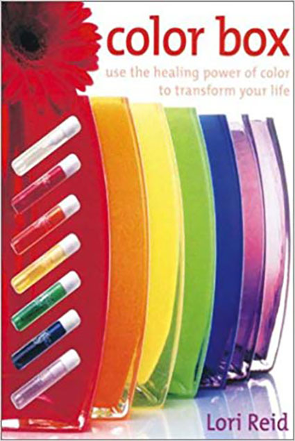
Lori Reid’s The Color Box is a great place to start with color theory. It’s neither definitive nor deep but it does a great job of surveying many approaches to understanding color.

Albers

Josef Albers’s Theory and Interaction of Color is the definitive work for creating a hands-on understanding of essential optical effects.

Itten

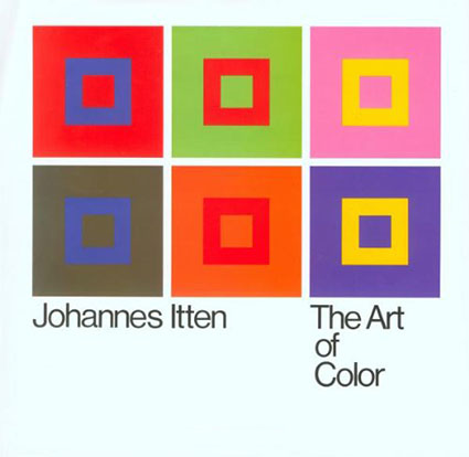
Johannes Itten’s Art Of Color (an expansion of his The Elements Of Color) is clearer and wider-ranging than Albers’ similar book.

Birren

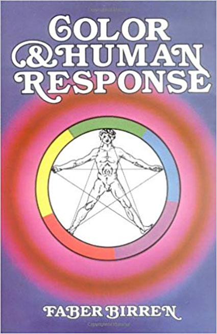
Faber Birren’s Creative Color discusses ways of creating effects (like iridescence and pearlescence) that few other resources touch on.

Wong

Wucius Wong’s Principles Of Color Design shows the links between color and other compositional devices.

Livingstone

Margaret Livingstone’s Vision And Art details the biology behind the effects artists create.

Find more recommended Color Reading here.

Learn more with these Color Theory here.

Learn more in my digital printing and digital photography workshops.

The Temperature Of Color – Warm Or Cool ?

2_wake4

An essential quality of color is temperature. Temperature can be used to attain a color balance. Temperature can be used to enhance spatial relationships within an image. Temperature can be used to elicit psychological responses within the viewer. Understanding and exploring the dynamics of temperature in color can benefit any visual artist.

There are physical characteristics of color linked to temperature. The color temperature of light (Kelvin degrees) is determined by measuring a black body radiator (an object heated so that it emits light). As the physical temperature of the object rises, color transitions from red (long wavelengths – low energy) to blue (short wavelengths – high energy) through ROYGBIV (red, orange, yellow, green, blue, indigo, violet). When it comes to light sources, physically, blue is warmer than red.

There are also psychological qualities of color linked to temperature. Psychologically, blue is cooler than red. These associative qualities of color with regard to temperature are almost universally accepted. This is due in large part to our physical environment – water is blue, plants are green, sunshine is yellow, fire is red.

Using the qualities of one sense (touch) to describe the qualities of another (sight) can be a tenuous affair and may lead to ambiguity and confusion. The more precise a language is the more useful it is. The language of HSL (hue, saturation, luminosity) is a very precise language. When using the language of HSL, hue values mark a position measured in degrees on a color wheel. A circle has 360 degrees, so the scale is 0 – 359.

While every degree represents a new hue, you can use broader terms to describe a color family; red, orange, yellow, etc. Think of the color wheel as a clock where every hour marks a new color family.

hue_clock

0          red
30        orange
60        yellow
90        yellow green
120      green
150      blue green
180      cyan
210      green blue
240      blue
270      purple
300      magenta
330      blue red

hue_degrees
warmcoolsamples

Absolutely warm and cool colors can be found at 0 (red – the warmest color) and 180 (cyan – the coolest color) degrees. Determining whether one color is warmer or cooler than another can be measured by their proximities to these poles. A line between 90 (green yellow) and 270 degrees can be used to broadly demarcate warm colors from cool colors; colors on the right (towards red) are warm while colors on the left (towards cyan) are cool. The association of yellow with the sun, a warm light source, subtly skews the associative quality of warmth towards yellow (60) and away from blue; as a result, colors above the line between 0 and 180 tend to seem warmer than colors below it. (i.e. while both are equally distant from red (0), orange (30) seems warmer than blue red (330).) While one color can be seen as warmer or cooler than another color, each color also has warm and cool components; there are warm yellows and cool yellows, warm blues and cool blues, etc. (Where numerical classifications of colors define hues very specifically (1 degree per hue, 30 degree spread per linguistic color), linguistic specifications of colors (red, orange, yellow, etc) define broad ranges of hues.) Defining the warm and cool endpoints of any linguistic color is useful at a coarse level of granularity but becomes increasingly subjective at a fine degree of granularity. At what point does blue become purple? At what point does blue become green?

It’s possible to describe the adjustment of hue simply in terms of warming and cooling.

Photographic color adjustment strategies rely on adjusting a balance in each of three complements.

Red – Cyan
Green – Magenta
Blue – Yellow

colorbalance

Most hue adjustment tools, like Photoshop’s Color Balance, have these complements built into their interface. You can’t increase one hue without decreasing its complement.

Each set of complements has a warm and cool dynamic.

R (warm) –  C (cool)
G (cool) –  M (warm)
B (cool)   – Y (warm)

These three complementary axes have different warm/cool dynamics with respect to the three color primaries – RGB.

red (warm red)      –   cyan (cool blue)           warm/cool
green (cool green) –   magenta (cool red)       cool/cool
blue (warm blue)   –   yellow (warm green)    warm/warm

1_warmcoolaxis

You can analyze the color temperature dynamics at work in any image by sampling it and graphing it. Doing this will not only help you understand how it works but also how you might improve it.

You can make a field of color appear more dynamic, complex, and three-dimensional by preserving or introducing a variety of warm and cool components in it.

The temperature of color carries spatial associations with it. Warm colors tend to appear to be nearer than cool colors. Again this is universal. It can be overturned by many factors; some factors are related to color, such as saturated colors appear nearer than desaturated colors or a progression from light to dark may be the primary element that establishes spatial hierarchy; some factors are not related to color, for instance, placement and overlap in the composition may be primary spatially, overriding color relationships.

Color balance, spatial proximity, association – these are just three of the uses of warm and cool color dynamics in images.

Whether you are adjusting preexisting color relationships or creating new ones, having thoroughly explored the warm and cool dynamics of hue, you can apply that knowledge towards the realization and enhancement of your images.

Learn more in my digital printing and digital photography workshops.
Learn more with my DVDs on Color here.
Learn more with my free color resources here.

NRDC's New All In Helps You Take Effective Environmental Action

Incubation X
Do you want to efficiently take effective action to protect our environment?
NRDC can help you with their new initiative – All In.
How does it work?
You choose how you’d like to be contacted (email, text, phone), the frequency of the alerts you’d like to receive, and the amount of time you’d like to commit – 1 minute, 10 minute, 1 hour, and deep dive.
They provide clear resources for taking action; some are as simple as signing a petition (I signed 3 today in less than 3 minutes) or calling your representatives at the right times and others are as ambitious as hosting an activist meet up. You choose your level of commitment. They help you be more efficient and effective.
NRDC’s All In is simply the best environmental grass roots initiative I’ve ever seen; it’s what I’ve hoped for decades … and it’s coming from the organization at the top of my list to support (and Robert Redford’s). (The Natural Resources Defense Council is historically the most effective independent American environmental organization that helps safe guard old and support new good legislation while shutting down bad legislation.)
Join me!
Please take 1 minute now and sign up today!
Better yet, take 2 minutes and take action right now!
Find NRDC’s 1 Minute Actions here.
Find NRDC’s 10 Minute Actions here.
Find NRDC’s 1 Hour Actions here.
Find NRDC’s 1 Deep Dive Actions here.
sindsendsharepeat impact community leadership

Discover Overlooked Dimensions In Your Images With Color Analysis

01_original

To better see color within an image it can help to abstract it. By de-emphasizing an image’s representational qualities you can more easily direct your attention to the color relationships within it. In short, you can see them better because you’re not distracted by other concerns.

Using Photoshop, there are many ways to modify an image in order to better reveal it’s color structure.

02_blurred

You can blur an image. Blurring an image reduces detail so that you can more easily see the basic composition and the color relationships within it, without getting hung up on the details. (Duplicate the background layer and apply the filter Gaussian Blur.)

03_field

Blur an image substantially and you can reduce an image to a field of color. Compositional elements are significantly downplayed, leaving pure color. (Duplicate the background layer and apply the filter Gaussian Blur with a stronger setting.)

04_mosaic

Pixellate an image and you can reduce an image to blocks of color. Composition is eliminated while  contrast between colors is more pronounced than in a flat field of color. (Try Filter: Pixellate: Mosaic. This works best for lower resolution files or copies of files.)

05_averaged

Average an image and you can reduce all the colors in an image to one. (Duplicate the Background Layer and apply the filter Average – found under Blur.) This often confirms the dominant color in a composition. Well balanced color photographs containing a variety of hues tend to average towards gray.)

While accents and other important colors can also be used, the dominant color is an excellent choice to further analyze color relationships in an image using Blend Modes. With this technique you can see the variety found in the separate components of color within an image – Luminosity, Saturation, Color, and Hue. (Change the Blend Mode of the averaged layer to the desired color component.)

06_hue

With a Blend Mode of Hue, all values in an image will be driven to the same hue. This will help you see variety in luminosity and saturation more clearly.

08_saturation

With a Blend Mode of Saturation, all values in an image will be driven to the same saturation. This will help you see variety in luminosity and hue more clearly.

08_color

With a Blend Mode of Color, all values in an image will be driven to the same hue and saturation. This will help you see variety in luminosity (the tonal structure) more clearly. (This variant is often the most useful as it is the easiest to interpret. With repeated analysis of many different images, you’re likely to note that images with less variety in hue and saturation (particularly neutral ones) will require more luminosity contrast to have an impact. By the same token, images with a great deal of variety in hue and saturation will often appear overly harsh with excessive contrast.)

09_luminosity

With a Blend Mode of Luminosity, all values in an image will be driven to the same luminosity. You’ll eliminate contrasts in value which will help you see variety in hue and saturation more clearly.

This type of analysis will better reveal the color relationships at work within an image. You can use the information you’ve gathered by analyzing color relationships in an image not only to better understand it but also to make predictions about how you might improve them.

Increasing contrast in one or more of the elements of color (hue, saturation, luminosity) will increase separation in a composition; conversely, decreasing contrast will create greater unity.

Typically, well-structured images use a large amount of contrast in one color component, a medium amount of contrast in a second component, and a small amount of contrast in a third component.

Learn more in my digital printing and digital photography workshops.
Learn more with my DVDs on Color here.
Learn more with my free color resources here.