.

Great Quotes On Photographic Prints

Quotes_Slides_Prints_425
Enjoy this collection of quotes on photographic Prints.

“We should always remember that  the practice of printing – of using an object to control the form of a repeated picture – has had a role in human culture from its earliest days.” – Richard Benson

“Fine art prints created by the artist, or the artist’s collaborator, are important because they best represent the artist’s vision. Images displayed on digital devices are subject to the non-uniform nature of different displays and they may appear radically different than the artist intended.” – Mac Holbert

“My ideal is to achieve the ability to produce numberless prints from each negative, prints all significantly alive, yet indistinguishably alike, and to be able to circulate them at a price not higher than that of a popular magazine or even a daily paper. To gain that ability, there has been no choice but to follow the road I have chosen.” – Alfred Stieglitz

“Regarding rumors that the digital age is soon to render photographic prints as being no longer necessary or relevant (due to increasing numbers of photographic images being viewed on electronic monitors), speculators overlook the tremendous importance and historic relevance of the physical artifact as being a uniquely necessary and applicable aspect of photographic art. The electronic image could no more replace a fine photographic print than a synthesizer could replace a violin!” —Huntington Witherill

“When you make a print, you are making an art object. You can’t hang a scan on the wall.”- George Tice

“The print is an idea made visible. For my process, a photograph isn’t a photograph until it’s a print. I love the physical presence of a print from beginning to end. For me it’s a tactile, sensual experience. I want it to be an object of beauty, whether the subject moves you or not.” – Tillman Crane

“A photograph doesn’t feel real until it is a tangible physical object I can hold in my hand.” – Stephen Johnson

“A beautiful print is a thing in itself, not just a halfway house on the way to the page.” – Irving Penn

“A picture is worth a thousand words; A fine art print so much more.” – Steve Denby

“Mostly, I worked so quickly, I didn’t see the details of a photograph until it was printed.” – Harold Feinstein

“I was a very, very careful printer when I used 8-by-10 film. I probably spent more time on printing than anything else. The more the prints were appreciated, the more time I spent on them.” – Ruth Bernhard

“I think that it is a sensual pleasure – image making. It’s not just the finished print, which is sensual in terms of the tactile qualities of the materials that I use. I’m seduced by the light, all the time.” – Elizabeth Opalenik

“You will often see that it is the unexpected accident, in tandem with your practice, that will transform the science to art.” – Christopher James

“I like to think one of art’s greatest techniques is creative stumbling, where missteps lead to creative encounters. Digital printing is an adequate place to falter — the wet darkroom is a veritable minefield of happy stumbling opportunities.” – Dan Burkholder

“A print is the photographer’s statement about the light, the mood, the space, the spirit and being of the image, and that interpretation may change with time, with technology, and with the photographer’s own interpretation of the image. A print is the completion of a photograph; without it, the image is suspended in time, without interpretation.” – Eric Meola

“For me the printing process is part of the magic of photography. It’s that magic that can be exciting, disappointing, rewarding, and frustrating all in the same few moments in the darkroom.” – John Sexton

“To convey in the print the feeling you experienced when you exposed your film – to walk out of the darkroom and say: ‘This is it, the equivalent of what I saw and felt!’. That’s what it’s all about.” – John Sexton

“The negative is the equivalent of the composer’s score, and the print the performance.” – Ansel Adams

“In my mind’s eye, I visualize how a particular… sight and feeling will appear on a print. If it excites me, there is a good chance it will make a good photograph. It is an intuitive sense, an ability that comes from a lot of practice.” – Ansel Adams

“Some of my photographs have always been a mystery to me in terms of how I arrived at them. Even with the technical ability to produce fine prints, I am hard put to know how it happens, yet unless technique and materials are seriously investigated and experienced, I see that moving statements are seldom made.” – Paul Caponigro

“All that I have achieved are these dreams locked in silver.” – Paul Caponigro

“When you make prints you deepen your relationship with your images.” – John Paul Caponigro

“It’s the last 5% in quality that separates the good prints from the great prints.” – John Paul Caponigro

“We used to have to make prints in order to view certain images, particularly black and white ones. Now you don’t. But for many of us, prints are still very much desired – I think they always will be. Physical prints do many things that no other method of presentation does. With a print, you experience an image in combination with specific materials, which enhance expression. You experience a print at specific scales, which has an impact on how an image is viewed and, in many cases, modifies the message the image conveys. Prints offer non-powered portability; they can be retrieved and distributed at a moment’s notice to anyone without the need for other supporting devices or additional communication. Prints can be displayed in ways that make an image’s presence more durable, affecting and even shaping the environments they inhabit; with sustained viewing, this can add additional depth to looking. Prints are collectible. While the time-honored tradition of printmaking is currently evolving rapidly (so rapidly that it would be fair to say it is experiencing a profound paradigm shift), it is very much with us today and will be for the foreseeable future.” – John Paul Caponigro

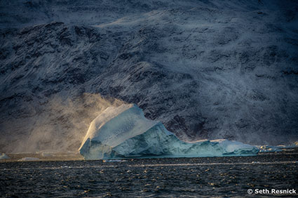
“When you look at a photograph that is printed, you are free of distraction, allowing you to really engage and experience all that it has to offer. The experience triggers an emotional response very different from simply seeing an image for a fleeting moment on a screen. The print is a finished product that engages the viewer. People want to move closer and even touch a print. Viewing a print encourages the viewer to travel into the frame imagining the experience of being in that place.” – Seth Resnick

“The fine print is much more than a mere reproduction of an image.  It is the culmination of the inspiration and vision of the photographer.  It is the clearest, most direct, and most powerful form of the image and has the ability to move beyond words, ideas, and concepts to touch and move the viewer in the most direct and immediate way.  In its highest form, the fine print can be a transparent vehicle, boldly communicating with whispers and suggestions of worlds previously unseen and unknown.  No other form of the image can convey as powerfully the subtleties, the presence, and the luminosity which exists in the fine print.” – Christopher Burkett

“Something happens between a novel and its reader, which is similar to the process of developing photographs, the way they did it before the digital age. The photograph, as it was printed in the darkroom, became visible bit by bit. As you read your way through a novel, the same chemical process takes place.” – Patrick Modiano

“I consider it essential that the photographer should do his own printing and enlarging. The final effect of the finished print depends so much on these operations.” – Bill Brandt

“I set myself up in opposition to the thing that I’m going to photograph and I try and find a place to stand so that when the image is made, a visual resonance is engaged between me and the subject. I can then take that image and amplify it in any number of different directions as I take it into the print-making process. And then, when the print is seen by someone else, whether I’m there or not, hopefully, what I’ve put into that piece will initiate another situation of resonance between the print and the viewer. That’s what’s really important to me.” – Craig Stevens

Explore The Essential Collection Of Creativity Quotes here.
View The Essential Collection Of Creativity Videos here
Discover more quotes in my social networks.

Easily Select Edges In Your Images Using Photoshop’s Contour Masks

04-ld

03.6-contour

A complex contour mask – made one minute.

Digital imaging offers the ability to define complex contours efficiently and precisely, enabling users to affect an image in very specific areas. What was once extremely tedious and challenging is now quick and easy. Once you learn a few essential selection and masking techniques, few contours will elude your grasp.

Before I continue, let me caution you against always defining contours precisely. Remember, contours in continuous tone images are often quite soft. What’s more, many times, photographers simply need to define broad areas to work in with smooth transitions into surrounding areas. Just because you can define contours precisely, doesn’t mean you should. But it’s highly advantageous to have the option of doing so when you need to.

Besides defining an area by hand, either with a selection or brush tool, there are a number of more efficient and precise ways to isolate contours; the Magic Wand Tool, the Magnetic Lasso Tool, the Color Range feature, and deriving a contour mask from a contrast mask. Try these first.

Keep in mind that all of these techniques use contrast within an image to isolate a contour. Contrast in any one component of color can be used – luminosity (light and dark), hue (warm and cool), or saturation (intense or desaturated). If contrast helps define a contour then you can accentuate the contrast of any one component of color within an image to make it easier to define a contour, using an adjustment layer. Once the contour has been defined, you can throw away the adjustment layer that was only intended to be used to make selection easier.

The Magic Wand, found in the Tool Bar, is ideal for selections of broad areas of color. Two check boxes give you control over how the Magic Wand tool behaves; Tolerance (which defines the range of related values away from the sampled color that will be included in the selection – based on 256 levels) and Contiguous (which limits a selection to areas of similar color that abut one another). In the same location in Tools, the Quick Selection Tool offers fewer controls but does an even more intelligent job. Try it before you move on to other options. Many times it does a surprisingly quick good job with little or no fuss.

The Magnetic Lasso, also found in the Tool Bar, tool can be used for slightly more difficult contours. Using it, you can add an extra degree of discrimination manually. The tool will define the majority of the contour for you, if there is adequate contrast between it and surrounding areas. While the default settings often provide excellent results, Width (the distance from the path drawn where contours will be detected), Edge Contrast (the amount of contrast required for a contour to be detected), and Frequency (the number of points placed while defining the contour) can be used to modify the sensitivity of the tool. Drawing a contour too quickly will reduce the accuracy of the tool. While defining the contour, if points are placed that are undesirable you can hit the Delete key to eliminate previously placed points, one at a time. When using Lasso and Marquee tools, practice drawing selections in closed loops. If you define only part of a contour and then let go, a straight line will snap between your start and finish points. All selection tools can be used multiple times to define a selection and can be used in combination with one another; hold the Shift key to add to and the Option/Alt key to subtract from an existing selection.

The Color Range feature, found under the Select menu, is very useful for defining complex contours involving multiple areas. Color Range has predefined settings to automatically detect Reds, Greens, Blues, Cyans, Magentas, Yellows, Highlights, Midtones, and Shadows. In addition, it has a Sampled Colors feature that can be used to define a custom range of colors that can be increased or decreased by using the Add to Sample (+) and Subtract from Sample (-) droppers. Selections can be expanded and contracted using the Fuzziness and Range sliders for Sampled Colors, Shadows, Midtones, and Highlights but not predefined hues.  The selections Color Range makes are often more sophisticated than the previous tools mentioned, defining areas not just with black and white but also shades of gray.

Contrast masks can be turned into contrast masks, for the most challenging selections with very fine detail and/or transparency. Based on the luminance values of individual channels (R,G, or B), a contrast mask can be used to define a contour by accentuating it’s contrast so dramatically that all shades of gray are eliminated leaving only black and white values. Duplicate the channel with the best contrast in the area you wish to isolate. Or, load it as a selection by dragging it to the selection icon in the Channels palette and then create a layer mask. Then, accentuate the contrast of the alphachannel or layer mask, using Curves. When accentuating contrast, pay particular attention to using increased contrast to define the contour you are concerned with. Avoid the temptation to use contrast to drive broad areas to white or black, if doing so will adversely affect defining the contour precisely. On occasion, you may want to select a specific area of an alphachannel or layer mask to accentuate contrast locally. Where unwanted values remain, select and fill or use a brush to paint an area with the appropriate value (black or white).

Using these tools and strategies few contours will elude your definition. You’ll be able to define very complex contours efficiently and precisely.

Read more about Selections & Masks.
Learn more in my digital photography and digital printing workshops.
Photoshop’s Contrast Masks Help You Isolate Highlights Or Shadows

01-lakedistrict

RGB image

RedChannel

Red Channel

GreenChannel

Green channel

BlueChannel

Blue channel

The relationship between highlights and shadows is a critical aspect of any image. Photographers have been trained to become highly sensitized to these relationships. Today, photographers have more control and greater precision than ever before over these key visual elements, using the digital darkroom. In Photoshop, the type of adjustment chosen will provide very specific control. The specificity of an adjustment can be further refined by using a mask. One type of mask yields extreme precision and is derived directly from the light and dark relationships within an image, a luminance or contrast mask.

A contrast mask will allow you to target a specific range of tones without affecting the others; highlights, shadows, and even midtones. In the analog darkroom it’s quite challenging and time consuming to make contrast masks; in the digital darkroom it’s quite easy to quickly make contrast masks. And, you can refine or modify them infinitely and indefinitely.

Here’s how to do it.

Load a channel as a selection and with that selection still active create a layer mask. The quickest way to do this is to go to the Channels palette and while holding the Command key click on a channel – R, G, B or RGB. This will create a selection based on the luminance (light and dark) values of the channel you choose.

With so many choices before you, which channel should you choose? Choose the channel that is light in the areas you want to adjust and dark in the areas you don’t want affected. When in doubt, load the RGB master channel as this will give you a selection based on luminance. If you choose an individual channel (R, G, or B) related hues will become lighter than others and complementary hues darker than others – i.e. in  the red channel reds will be very light while cyans will be very dark.

The active selection outline will appear complex; a dotted line will appear at all 50% gray values, but the whole image will be affected to varying degrees based on the density of the values used to make the selection. As values grow darker the affect reduces; as values grow lighter the affect increases. Remember this mantra, “Black conceals; white reveals.” You can turn a selection into a mask in one of two ways, make an adjustment layer (Layer: New Adjustment Layer)(the selection automatically becomes an adjustment layer mask) or make a layer mask (Layer: Layer Mask: Reveal Selection).

As a mask is comprised of shades of gray its lightness and contrast can be adjusted. Very often, contrast masks can be improved by having their contrast adjusted. Use Curves for the greatest precision in contrast adjustment. Here are a few strategies for doing this. Increase the contrast of a mask and its lightest areas will allow more of an effect to show through while its darkest areas will allow less of an effect to show through. Darken the mask and it will allow less of a correction through. Lighten the mask and it will allow more of an effect through. In special cases, you may want to raise the black point when applying Curves to a mask; this will allow some adjustment to be applied to the deepest values with increasing intensity in the highlights. Conversely, you could lower the white point to reduce the effect in highlights or you could simply reduce the opacity of the adjustment layer.

Would you like to target the shadows instead of the highlights? Invert the mask (Image > Adjustments > Invert or Command I) to reverse the relationship between highlights and shadows; black becomes white and white becomes black.

03.5-redinverted

Mask inverted

Contrast masks add the ability to target highlights and shadows to any color adjustment tool that does not already provide this function and to all filters.

Question whether you need a contrast mask when making image adjustments with Curves, which provides the ability to target specific ranges of tone without the use of a mask. If the adjustment you want to make to a specific region of tones in an image is extreme and you want to substantially reduce the affect on adjacent tones, then, and only then consider using a contrast mask in combination with Curves. Guard against introducing posterization when doing this.

Classically, photographers use a contrast mask when darkening very bright highlights or lightening very dark shadows. For these types of corrections, where industrial strength methods are required, consider using the blend modes Multiply (for highlights) or Screen (for shadows) in combination with a contrast mask to reduce the affect on the opposite end of the tonal scale and prevent loss of detail.

Today, photographers have additional opportunities to enhance color images using contrast masks. In addition to affecting the lightness (luminosity) of highlights or shadows, you can affect their hue and/or saturation. Compare these three solutions; an image with lightened highlights; an image with warmed highlights; and an image with saturated highlights. All three versions will appear more luminous or filled with light, but the qualities of light in each one will differ. After you’ve tried this, try making opposite moves in the shadows. Once you’ve done these experiments, you’ll start seeing new potential in every color image.

04-ld

Highlight lightened

05-ld

Highlight warmed

06-ld

Highlight saturated

Never have we had so much control over the quality of light within our images. Imagine the possibilities. Better yet, experience them. A world of possibilities for image enhancement will unfold before you.

Read more about Selections & Masks.
Learn more in my digital photography and digital printing workshops.
The Essential Photoshop Masking Key Commands

MaskKeyCommands

There are at least two good reasons to become more familiar with Photoshop’s key commands related to masking. First, while many of these functions can be accessed through menu items, not all of them can; these features are essentially hidden to users who don’t know the key commands. Second, key commands that make masking and selections easier and faster.

Here’s a list of the most important Photoshop key commands related to masking.

Option click displays a mask in black and white.

Shift click disables a mask.

Option Shift click displays a mask in red at 50% opacity.

Double click on a mask displays options for changing the color and opacity of mask.

Command click loads a mask as a selection.

Shift Command I click loads an inverted selection.

Shift Command click adds to an existing selection. (gradients add at 50% then 10% increments)

Drag and drop to move a mask from one layer to another.

Option drag and drop to copy a mask from one layer to another.

Delete fills a mask with the Background color.

Option Delete fills with the Foreground color.

Control click on a mask to bring up a contextual menu of options …

      Disable Layer Mask

      Delete Layer Mask

      Apply Layer Mask

      Add Layer Mask to Selection

      Subtract Layer Mask From Selection

      Intersect Layer Mask With Selection

      Layer Mask Options …

As masks are often painted, brush key command are useful too.

Numbers change brush opacity. (1=10%, 2=20%, 3=30%, etc)

X to reverses foreground and background colors.

[ makes a brush smaller.

] makes a brush larger.

Shift [ makes a brush softer.

Shift ] makes a brush harder.


Read more about Selections & Masks.
Learn more in my digital photography and digital printing workshops.
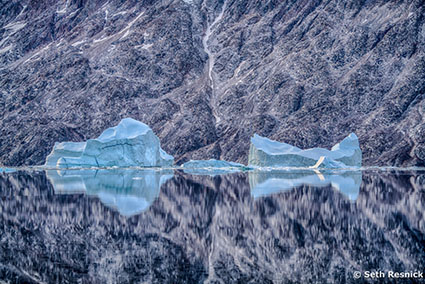
What In The World Is Detail Frequency ?

refraction73_MG_1171

High frequency

refraction74_20100809__ICEjokulsarlon_0148

Medium Frequency

refraction6420080816_iceland_reykjanes_0496

Low Frequency

Frequency is a term that’s being used more and more. That’s because new tools offer you more control over frequency than ever before. Noise reduction, sharpening, and HDR all offer unprecedented control over the look and feel of detail in our images. Frequency is used to describe the amount of detail packed into a given area of an image. This is measured by the amount of tonal variation between rows or columns of pixels. Imagine measuring an image with a line that passes across it (horizontally from left to right or vertically from top to bottom). The mean or average tonal value along lines can be charted and then compared to values from other measurement lines, especially those nearest to each other.

Insights Members can login to read the full article.
Email:
or Sign up

3 Things Creative Sharpening Can Do For Your Images

Refraction LXIX 2

Of the three stages in a sound sharpening workflow – capture sharpening, creative sharpening, and output sharpening – creative sharpening is the stage that has the most impact. The goal of creative sharpening is to give an image a specific look and feel. There are at least three things creative sharpening can do for your images.

One, creative sharpening can prioritize; it can direct attention to specific areas of an image.

Two, creative sharpening can enhance; qualitative aspects of images like texture and line, can be amplified to produce stronger responses.

Three, creative sharpening can be used to accentuate different qualities of light; a great deal of detail is carried by the luminosity component of color and changing it changes the overall appearance of light within the image.

Used consistently creative sharpening can produce a distinctive style that is more easily recognizable to viewers. (Remember, sharpening is a way to enhance details and it may also be used with its counterpart blurring to make effects appear even stronger by comparison.)


Insights Members can login to read the full article.
Email:
or Sign up

Creative Image Sharpening – Double Pass Versus Hybrid

1_Sharpen_No

Before sharpening

2_Double_USM

Unsharp Mask only

3_Hybrid_USMHighPass

Unsharp Mask and High Pass filters combined

Different sharpening techniques make the world look different. A world of difference can be seen between the thin hard line of Unsharp Mask and the broad feathered line of High Pass Sharpening.

Can you choose a combination of both? Yes, you can! You can choose the texture of one, the halo of another, and the line of yet another, applying them either globally or selectively. You can customize the look and feel of detail in any image or image area with astonishing precision and flexibility.


Insights Members can login to read the full article.
Email:
or Sign up

The Advantages Of Sharpening With Photoshop’s Layers

1_sharp_refraction_LXXIII1 copy

2_sharpenedlayerstack copy

Layers have Blend Modes and can be masked

3_layerstyle copy

Double click a layer to activate its Blend If sliders  

There are many reasons to use layers when sharpening your digital images.

How do you do this? Simply duplicate the Background layer and sharpen the new layer.

Eliminate Saturation Shifts
Layers can be used to eliminate saturation shifts. Change the Blend Mode of a sharpening layer from Normal to Luminosity. Color noise will also be reduced this way.


Insights Members can login to read the full article.
Email:
or Sign up

36 Great Quotes On Looking

Quotes_Looking
Enjoy this collection of quotes on Looking.
“All of us are watchers – of television, of time clocks, of traffic on the freeway – but few are observers. Everyone is looking, not many are seeing.” – Peter M. Leschak
“We do a lot of looking: we look through lenses, telescopes, television tubes… Our looking is perfected every day, but we see less and less.” – Frederick Franck
“Seeing, in the finest and broadest sense, means using your senses, your intellect, and your emotions. It means encountering your subject matter with your whole being. It means looking beyond the labels of things and discovering the remarkable world around you.” – Freeman Patterson
“Joy in looking and comprehending is nature’s most beautiful gift.” – Albert Einstein
“All of the top achievers I know are life-long learners… Looking for new skills, insights, and ideas. If they’re not learning, they’re not growing … not moving toward excellence.” – Denis Waitley
“Thinking is more interesting than knowing, but less interesting than looking” – Johann Wolfgang von Goethe
“We learn more by looking for the answer to a question and not finding it than we do from learning the answer itself.” – Lloyd Alexander
“Poetry surrounds us everywhere, but putting it on paper is, alas, not so easy as looking at it.” – Vincent van Gogh
Read More