.

Photoshop’s Match Color May Change The Way You See

2_Source

Source

3_Target

Target

 9_4Blended

Final Effect

MatchColor

Photoshop’s Match Color


Little explored and capable of opening up whole new frontiers in color adjustment, Photoshop’s Match Color is a tool every user should be aware of – even if it’s only to know what’s possible.

There are three primary reasons to consider using Match Color: one, to match two colors exactly; two, to remove strong color casts; and three, to creatively apply the color in one image to another.

Match Colors Precisely

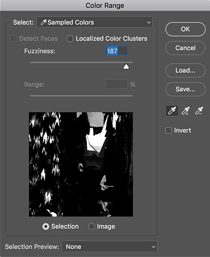
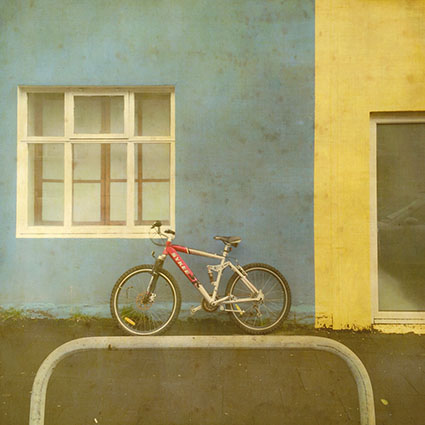
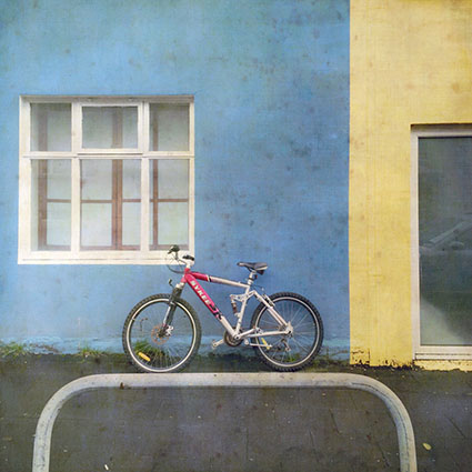
When a precise color match is critical, for instance when matching the same products in two images, Match Color is hard to beat. And, in terms of easy of use, using it beats placing sample points and moving sliders to make the targets match. You can create statistics from and apply the effect to either an entire image or only a portion of an image using selections.

Remove Strong Color Casts

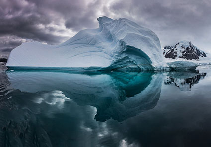
Match Color does an exceptional job of removing strong color casts. One of the primary reasons it was developed and most common uses for it is to remove the strong color cast in underwater images. It does an amazing job at revealing the complex color relationships below the color cast. Here, you don’t even need a source image. Just check Neutralize. If the effect is too strong you could use the Fade slider, but I recommend you apply the effect to a duplicate layer and use the Opacity slider of the layer or if you want to reduce the effect selectively, use a layer mask. Using this feature on images that don’t contain strong color casts often produces pleasing results too.

Create Complex Color Changes

This is where it really gets interesting. What if you took colors from a candy store and applied them to the sky? What if you took colors from a sunset and applied them to a landscape? What if … I know, I sound like a kid. You’ll feel like a kid when you use Match Color. It seems like anything is possible. When you first view the results, you’ll do a double or triple take. You have to see it to believe it.

The math is complicated, very complicated. The tool’s interface is simple and easy to use. Learning how and when to use it is deliciously challenging. With practice you can develop an intuitive feel for the direction color relationships will move in and start to think predictively when using Match Color, but the final effect it generates is usually so complex you have to see it to believe it.


4_Source2Target

Normal

5_Source2TargetNeutralize

Neutralize


Taming The Beast

Match Color samples the colors from one image and applies the resulting statistics to another image; all three elements of color Hue, Saturation, and Luminosity are taken into account in both the source and the target images. To do this a minimum of two files must be open at one time, a source and a target. Once saved, you can load these statistics in the future to any image, as long as it is in RGB. Match Color only works in RGB color mode. Not available as either a non-destructive adjustment layer or a Smart Filter, Match Color must be applied permanently to a layer, so consider applying it to a duplicate or composite merged layer.

You have limited controls over the results. The Neutralize check box; try it, you might like it – a lot. The Luminance slider; be careful of the image’s dynamic range when using it. The Color Intensity slider; in addition to saturation it also control how much variety in hue is generated – higher settings produces more of both. The Fade slider; it’s reduction of the effect is slightly different than applying the full effect to a layer and then reducing its Opacity, but the former cannot be localized so I prefer the latter. One check box, Neutralize, and three sliders give you some controls over the results.

You can either use all the colors in an image or only colors within a selection in a source image to create statistics from; after making a selection in the source image go to the target image and in the Match Color dialog box check Use Selection in Source to Calculate Colors.


6_SourceSelection

One portion of source selected

7_SelectionTarget

Another portion of source selected


Alternately, you can modify the calculation by selecting a portion of the target image; after making a selection in the target image, apply Match Color and check Use Selection in Target to Calculate Adjustment. If you’d like to apply that effect to the entire image instead of just a portion of it, instead of applying the effect, check Save Statistics, then press Cancel, and when you reapply Match Color check Load Statistics.


8_2Sources

Two sources applied consecutively


You can even apply several statistic sets progressively to the same layer to create still different effects.


 MatchColor_Layers

Effect layered over original

BlendModes

Layer Blend Modes give more control

LayerStyle

Layer Style gives you still more control


You can use the many power of layers to control how the new colors blend with the old. Reduce the layer’s Opacity to restore some of the original color; add a layer mask to do this selectively. Use the layer’s blend mode to control how the new colors mix with the original colors; in particular try the blend modes Color and Hue, which will use the new hues with the original luminosities. Use the layer’s Blend If sliders to remove the effect from shadows and/or highlights; alternately, use a luminosity mask. Applying Match Color to a new layer gives you a safety net (You can always return to the original color.), allows you to easily compare more variations, and gives you more control.

One of the strategies that really makes this technique shine is to first create an interesting color foundation with Match Color and layer options and then refine the colors further with additional color adjustment tools.

Controlling the effect with more any precision is challenging. You can change the colors of either the source or the target images before creating and /or applying the statistics. Use any tool in Photoshop. The question is how? (Here’s one tip. Inverting colors before sampling them often generates interesting results.) Doing this involves a lot of trial and error. Yet, these color experiments can sometimes be profitable. Once in a while, they lead to real breakthroughs. At a bare minimum, they’ll encourage you to think more flexibly about color.

Match Color is an exotic color adjustment tool that can be a real game changer. Try it and you’ll see and think about color in new ways. What could be more exciting?


Read more color adjustment resources here.

Learn more in my digital photography and digital printing workshops.

Use Adobe Lens Profiles To Improve Your Image Quality

LensProfiles_Profile_425
Do you wish you could improve the quality of the images your lenses deliver after exposure? You can, using software. Adobe’s Lens Corrections feature uses a digital image file’s EXIF metadata about camera and lens to automate cures for standard lens distortions, including geometric distortion, chromatic aberration, and vignetting.


Insights Members can login to read the full article.
Email:
or Sign up

What In The World Are Raw Files?

RAWvsJPEG
Your digital camera can produce two types of files – Raw and JPEG.
One can be seen instantly, because it is already processed – JPEG. The other, needs to be processed to be seen – Raw.
Few people have actually seen what an unprocessed Raw file looks like. To be seen properly Raw files need to be rendered or changed. What you see on your camera’s LCD is a JPEG produced on the fly by your camera. What you see in programs like Adobe Lightroom or Bridge are previews made with their default renderings.
Raw files are curious things. They contain color, but not a color image – yet.


Insights Members can login to read the full article.
Email:
or Sign up

66 Great Quotes On Risk

Quotes_Risk
Enjoy this collection of quotes on Risk.
“You cannot swim for new horizons until you have courage to lose sight of the shore.” ― William Faulkner
“One does not discover new lands without consenting to lose sight of the shore for a very long time.” — Andre Gide
“Only those who will risk going too far can possibly find out how far one can go.” – T. S. Eliot
“So we shall let the reader answer this question for himself: who is the happier man, he who has braved the storm of life and lived or he who has stayed securely on shore and merely existed?” ― Hunter S. Thompson
“A ship in harbor is safe, but that is not what ships are for.” – John A. Shedd
“I believe that one of life’s greatest risks is never daring to risk.” – Oprah Winfrey
“The biggest risk is not taking any risk… In a world that changing really quickly, the only strategy that is guaranteed to fail is not taking risks.” – Mark Zuckerberg
Read More

The Most Amazing Wildlife Experience I’ve Ever Had

1Humpbacks_

On our DPD (Digital Photo Destinations) 2018 Fly Antarctica Cruise The Polar Circle voyage, we’d spotted many humpback whales, from a distance. But late in the trip, we came face to face with them. Having seen, far in the distance, a whale breach high in the air, we moved our zodiacs closer to explore them further and found three whales relaxing and playing together.  We watched curiously as they spouted water into the air, made low rumbling noise as they exhaled, flapped their fins, rushed each other, and spun pirouettes to avoid collision at the last moment. Often, they would dive, leaving whirlpools behind them, as they disappeared from our sight. We’d continue searching for them with anticipation. We’d glimpse the flash of a white fin under water and then lose sight of them until a dorsal fin or two or three, and sometimes a tail, broke the surface once again Surprised to see where they would surface next, we were never disappointed, as they continued to return again and again.

Gradually the whales grew more curious about us and turned their attentions to us, coating us in spray (the slightly oily whale breathe smelling like old krill), waving their fins in the air, poking their noses above the surface and sometimes their eyes.  At one point, two whales, side-by-side, having just created a wet cloud that drifted onto us, lowered their noses just below the surface of the water and blew enormous bubbles. It was clear they were playing with us now.  They began rushing us, drawing closer and closer to the surface of the water, and finally one twirled its massive body, lifting its fin out of the water, inches away from our boat. It’s wake rocked us, but it didn’t touch us. I was so focussed on making photographs to bring home to my family that I failed to realized that if I had just extended my arm, I would have been able to touch the whale and he or she could have touched me.

In the end, it was us who left them, as we were called to return to the ship, which none of us wanted to do. It was one of the finest wildlife experiences of my life.

Learn more about my Antarctica photography workshops.
Download our ebook Antarctica Two Visions.
2Humpbacks_ 3Humpbacks_  5Humpbacks_  7Humpbacks_ 8Humpbacks_ 9Humpbacks_  11Humpbacks_   14Humpbacks_ 15Humpbacks_

Benjamin Grant: "Overview: A New Perspective of Earth" | Talks at Google


“Inspired by the “Overview Effect” – a sensation that astronauts experience when given the opportunity to look down and view the Earth as a whole – the breathtaking, high definition satellite photographs in OVERVIEW offer a new way to look at the landscape that humans have shaped. Benjamin Grant, creator of the Instagram project Daily Overview from which the book is inspired, discusses how the project and book came about.”
Follow the Daily Overview on Instagram here.
Find the book Overview here.

The Top 20 Photography Books That Influenced Me

Influential Books of John Paul Caponigro

“Enjoy this collection of photographic books that have influenced me during some of my most formative years.


Megaliths by Paul Caponigro

#1

Paul Caponigro – Megaliths

Watching the production of this project from start to finish had a profound effect on me. The book was the culmination of decades of work on so many levels.

Alfred Stieglitz

#2

Alfred Stieglitz – Portrait Of Georgia O’Keefe

These portraits and nudes set the highest standards for me. Deep complex emotional connection. The variety of Stieglitz’ printing was eye opening. Meeting O’Keefe was interesting; I still wonder what it was like for her as an older woman to produce a book on her younger self.

Eliot Porter's Nature's Chaos

#3

Eliot Porter – Nature’s Chaos

Fortunate to see my mother design many of Porter’s books, this one confirmed my feeling that he saw a deeper order in nature before we more fully understood complexity in the sciences.

Christopher Burkett's Intimations Of Paradise

#4

Christopher Burkett – Intimations Of Paradise

Formerly a Gnostic monk, Burkett renounced his vows of poverty so that he could afford film and continue to faithfully transcribe The Book Of Nature. There are so many ways to live life in a sacred way

Dune / Edward Weston And Brett Weston

#5

Edward & Brett Weston – Dune

Dune / Edward Weston And Brett Weston collects works, many never before printed, by father and son showing how similar and how different each artist’s vision was. Working with Kurt Markus to produce this book was eye-opening.

Ansel Adams / The Making Of 40 Photographs

#6

Ansel Adams – The Making Of 40 Photographs

It’s wonderful to read how an artist works and even better to see them in action; I was lucky to do both. I do wish Adams wrote more about why he made each image and what it meant to him.

Jerry Uelsmann's Process & Perception

#7

Jerry Uelsmann – Process & Perception

It demonstrates how process changes perception – and the process you engage is a personal choice. The inside is just as important as the outside.

Edward Burtynsky's Manufactured Landscapes

#7

Edward Burtynsky – Manufactured Landscapes

While Eliot Porter didn’t want to beautify trash through art Burtynsky turns an unflinching eye towards industrial impacts on land crafting a complex statement on land use and ultimately identity.

Minor White Manifestations Of The Spirit

#8

Minor White – Manifestations Of The Spirit

No other photographer is as articulate about the inner experience of making art. His essay on equivalence is seminal.

Wynn Bullock's Revelations

#9

Wynn Bullock – Revelations

Bullock’s marriage of science/physics and art
became as much a philosophical statement as a celebration of beauty.

Kenro Izu's Sacred Places

#10

Kenro Izu – Sacred Places

Izu tries to photograph the spirit of ancient sacred places. When he talks about atmosphere he means more than weather.

Chris Rainier's Keepers Of The Spirit

#11

Chris Rainier – Keepers Of The Spirit

If Edward Curtis met Joseph Campbell you’d get Rainier’s survey of spirituality in world cultures.

Sebastiao Salgado's An Uncertain Grace

#12

Sebastiao Salgado – An Uncertain Grace

Salgado sets the bar high by bringing out the dignity within his subjects no matter how undignified their circumstances.

oyce Tenneson's Transformations

#13

Joyce Tenneson – Transformations

Tenneson’s images remind me of what Pierre Teilhard de Chardin said, “We are not human beings having a spiritual experience; we are spiritual beings having a human experience.”

Arnold Newman's One Mind's Eye

#14

Arnold Newman – One Mind’s Eye

Beautifully constructed portraits from the father of environmental portraiture.

Harry Callahan

#15

Harry Callahan

The rest of his wrestlessly inventive work intrigued me but his deeply honest extended portrait of his wife set a standard I hope for in all others.

Sugimoto

#16

Sugimoto

It’s minimalism that isnt shallow or evasive; the collection reinforces the concept, creating a context for itself. It asks so many questions? Enough? Not enough? Do all the world’s oceans look the same? Or is it just one ocean? Is it the camera or the artist who makes them look the same? Is it the way we look? How is it that by looking at them long enough I begin to see myself?

 Richard Misrach's The Sky Book

#17

Richard Misrach – The Sky Book

Pleasant as it is this minimalism ordinarily wouldn’t be enough for me. But then he adds the titles of time and places in many languages with a history. Together they grow stronger and placed within his life work as one of many Desert Cantos they grow stringer still. Rebecca Solnit’s accompanying essay is excellent. I learned a lot from looking at this – about art and myself.

Witkin

#18

Witkin

I find Joel Peter Witkin’s work profoundly challenging. I can’t say I love it; I can’t say I hate it. I can say it continually crosses back and forth between self-indulgently expressing his individual perversions and courageously looking unflinchingly into a universal heart of darkness.

Michael Kenna's Night Work

#19

Michael Kenna – Night Work

Kenna’s elegant minimalism is laced with a quiet spirituality that comes less from tradition and more from being in the moment, growing most emotional when he’s in the dark.

Huntington Witherill's Orchestrating Icons

#20

Huntington Witherill – Orchestrating Icons

It’s musical for its flowing compositions and exquisite tonalities. Extraordinary separation in extreme highlights and shadows, no one prints quite like him in.


Find out more about my influences here.