7 Things To Look For In Great Prints & Great Artists Who Make Exceptions

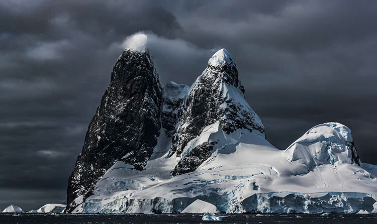
Classic prints exhibit sharp focus, extended depth of field, high dynamic range, pronounced contrast, and idealized color.

Reduced dynamic range, often with greatly reduced saturation, sometimes with reduced sharpness, occasionally with vignetting, and infrequently material process artifacts, printed on matte surfaces at small scales classically connotes historic photographic processes.
Half of the battle is knowing how to do something. The other half is knowing what to do. So when it comes to making fine photographic prints, it helps to know what to look for. A combination of elements (and their relationships with one another) is often evaluated when assessing print quality. When you depart from these standards you call attention to those elements, for better (intentional) or worse (accidental). Stack up too many exceptions and technique becomes a deal-breaker. Stack up enough well-crafted elements and technique becomes a deal maker. Speaking very broadly, you could say the goal is to clearly reproduce detail and minimize distractions from it. Let me get more specific.
1 Focussed
The default stance of a photograph is for everything to be in focus; critical focus is achieved (focal plane placed on the most important subject), depth of field is deep (aperture stopped down), motion blur is non-existent (high shutter speed). Blur is seen as an unfortunate product of poor tools and/or technique.
Exceptions
When exceptions are made, to work they need to appear obvious, deliberate, and be repeated in more than one image. Motion blur (from the subject or the camera) may be used to enhance gesture. (See Ernst Haas or Alexey Titarenko.) Selective focus may be used to direct attention away from less important elements toward more important elements. (See Keith Carter.) Soft focus may be used to reduce distracting detail and/or create impressionistic effects. (See Julia Margaret Cameron or Edward Steichen.)
2 Sharp
Sharpening (analog and digital) can be used to enhance focus by making lines and textures more pronounced. Push sharpening too far and an image begins to look graphic rather than photographic. Contours (bright halos and dark lines) may be accentuated unnaturally. Noise may become apparent. Texture may become overly crisp or even brittle.
Exceptions
So how crisp is too crip? That’s a matter of style, which follows intention. There’s a great gulf between Richard Avedon’s (extremely sharp) and Joyce Tenneson’s (soft) photographs. Both use more or less than standard sharpness expressively.
3 Low Noise
Noise is typically minimized. It can be reduced during capture (Use lower ISOs.), editing (Avoid aggressive contrast and/or sharpening.), or output (Use fine printer resolution and ink limits appropriate for the substrate used.).
Different types of images will present different limits. Noise becomes more apparent in smooth subjects and is often hidden in highly textured subjects. You may even elect to reduce noise during post-processing more in smooth areas than textured areas. A lot of noise becomes distracting. A little noise isn’t bad; it often makes an image appear sharper.
Exceptions
Photographers like Sheila Metzner and (early) Michael Kenna have used extreme noise to emphasize medium and create compelling atmospheres.
4 Gradation
Gradation, or the ability to reproduce smooth tonal transitions continuously without posterization, is prized. Harsh tonal transitions quickly make an image appear graphic and sometimes even abstract, reducing the illusion of volume /space and calling attention to contours.
Exceptions
Photographers who have been successful with high contrast photography, like Anton Corbijn and Mario Giacomelli, take it to an extreme.


