Alumnus Sam Krisch – The Creative Curator

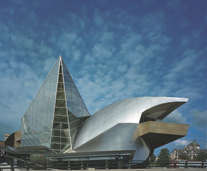
TMA - Exterior 4 copy

Image courtesy of Taubman Museum

This is a guest post by Sam Krisch, a John Paul Caponigro Next Step Alumnus who lives and works in Roanoke, Virginia. He has curated an exhibition entitled Paul Caponigro and John Paul Caponigro: Generations which will be showing at the Taubman Museum of Art through March 28, 2015. An exhibition of his work Sam Krisch: Elements will open at Virginia Tech’s Center for the Arts on December 5, 2014.

             About 18 months ago I was asked to join the staff of the Taubman Museum of Art in Roanoke, Virginia as an adjunct curator of photography.  The position was part-time and my job was to act as a proposer and organizer of exhibitions and to meet with others in the curatorial staff to discuss and plan our future programs.  The Taubman Museum opened in 2008 and was a successor to several art museums in Roanoke, a small railroad heritage city in the Blue Ridge Mountains of Virginia. The facility consists of nine galleries, an exploratory gallery for children, a theatre and an auditorium. It shows all kinds of art including painting, sculpture, ceramics, decorative arts, film, folk art and photography. In recent years it has exhibited works by Dorothea Lange, Edward Burtynsky, Alan Cohen, Civil Rights Photographers of the 1960s, Roanoke Times Photojournalists and several local photographic artists. The notes for one of its current exhibitions “Beg, Borrow and Steal” states that photography “plays a significant role in much of the work, which is represented in the exhibition by artists John Baldessari, Barbara Kruger, Sherrie Levine, Robert Longo, Richard Prince, David Salle, and Cindy Sherman; all of whom are using manipulated photographic images to create dense collages or appropriating stereotypical portraits in humorous ways.”
           It has been a valuable experience. I have learned that curating is a basic skill that all artists need to use in evaluating their work. We need to examine our artistic influences, create collections and bodies of work, see their evolution over time. Peer review also is vital in artistic growth and again is another data point in the personal curating process. Professional curating is an extension of this skill.
generations (4 of 9)
The Speed Curators
For the past several years I have taught workshops in digital creativity. We use mobile phones as a basis for this practice, but we always start with an exercise in “speed curating.”This is valuable because people start to learn the elements that attract their eye and verbalize those aspects. Recently, I have had the pleasure of participating in leading continuing education programs for art teachers at the Taubman Museum. Some of it has been adapted from my mobile photography courses, but the speed curating exercise is a vital part of the day.
The exercise begins with about 200 5”x 5”of my iPhone prints spread out on tables in the library. I tell the group “I am setting a timer for 6 minutes. During this time you can look BUT YOU MAY NOT touch the images. Don’t touch. Your assignment will be to choose between 6-8 images that work together and that you will present as if you are a gallery or museum curator. After that you will have 6 minutes to collect your images and then we will take them in the next room.”
It is always interesting to see the personalities at play. Some aggressively grab images and others hang back only to be disappointed that some of their favorites have already been taken. They have to either rethink their collections or find similar images. This mimics a curator’s dilemma of sometimes not being able to get all the works he or she wants and having to substitute work.

In the board room we talk about why we have chosen our images. The art teachers are used to talking about their own work as well as the work of their students. Each has a different idea and a different style. Some strictly look for artistic elements such as composition, contrast, color and form. Others use the images to tell a personal story or struggle that they are working through. Some even use song lyrics or musical references. All bring their own creative views to the collections. The act of rejecting and culling is as valuable as the act of inclusion. The same is true whether curating personal work, a personal collection of other artists, or for an institution.

Campbell Gunn, a fellow alumnus of John Paul Caponigro’s workshops, has created a portable collection of curated work. He finds photographers that he admires and organizes them in a collection on his iPad. Campbell says: “I simply create a dropbox master folder with subfolders for each photographer I am interested in and then as I find images that I think are instructive for my own visual reference library I copy them across. Then I have a Lightroom catalog that I use as a database which then syncs with an iPad app called PhotoMgrPro. The theme is developing ‘visual literacy’ or a ‘pattern language’. As with all languages, if you have a basic vocabulary and understand grammar, you can combine words or phrases to create new sentences (or in this case images) – without falling into the trap of being derivative or repetitive. It helps you find your own voice by understanding what it is in others voices that resonates most.”It is important to note that you should only copy low res images for this collection, keep them for your private use, and don’t copy images from books. Copying images from books is against the law in some countries.
generations (1 of 9)
From Two Generationsto “Generations
When I started curating I had a number of ideas for photography exhibitions and busily contacted artists and curators from other institutions to attempt to work up presentations for our curating committee. My projects were competing with space and scheduling of other exhibitions in other media. The Taubman Museum keeps variety and balance in its programming and even within each medium is careful not to overdo one type of painting or one type of photography. For example, a fine documentary photography exhibition that may of been available to us was discouraged by the committee because of recent documentary exhibitions. The committee was interested in the Paul Caponigro and John Paul Caponigro exhibition that had shown several times in other institutions and encouraged me to explore this work.
I was delighted because not only has the Caponigros’work strongly influenced my own,  but John Paul is my mentor and friend and there was a comfort level that was valuable in planning this exhibition. The Caponigros were very gracious in making their personal collections available to us and sent us a list of the works that had been exhibited.
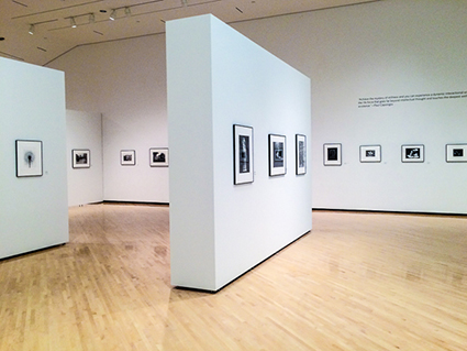
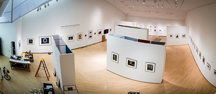
We found a slot in our gallery schedule that worked and it was one of our larger galleries. Our Deputy Director of Exhibitions and I walked into the gallery and realized that we could have a very sterile show. It is a large room with almost 200 feet of wall space and is an average of 40 feet wide. I saw a long row of father on one wall and a long row of son on the other. The room would have very little flow, very little interest. We needed more work, we needed a better design.
_53A2042
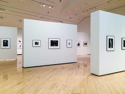
With help from the artists and our Exhibitions staff we came up for a design for the gallery that included temporary interior walls to add interest and variety to the presentation. The walls allow for a dialogue between the two artists. Some of the interior walls have images by father and son that are related, others have a single artist in direct contrast with the other.
generations (7 of 9)
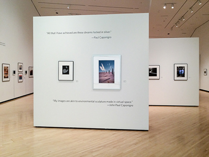
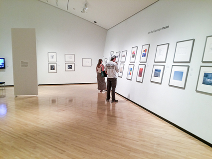
I am a fan of John Paul’s book Process and he had prepared some of the images in that book to form a framed presentation that was ready to display. We thought that it would be very useful for educators to have JP’s thoughts and illustrations on his show in its own separate section. Although the images were set, it became a challenge to provide text within our guidelines for display. Our solution was to take quotes from the book—under fifty words a piece—and let the images and text guide the viewer through that part of the exhibition.
           With the addition of the Process materials we had a show that embraced both the artists and the artistic process, the two generations of vision and work, and the generation of ideas.  We also designed the exhibition in a way that would help slow people down during their walk through the gallery and stimulate discussion—perhaps even argument—about the merits of each artist’s work and their use of two of photography’s main technologies. It has become an illustration of photography’s history, the creative process, and for many their first exposure to two major artists.
generations (3 of 9)
Find out more about Sam Krisch here.
Find more Alumni Success Stories here.

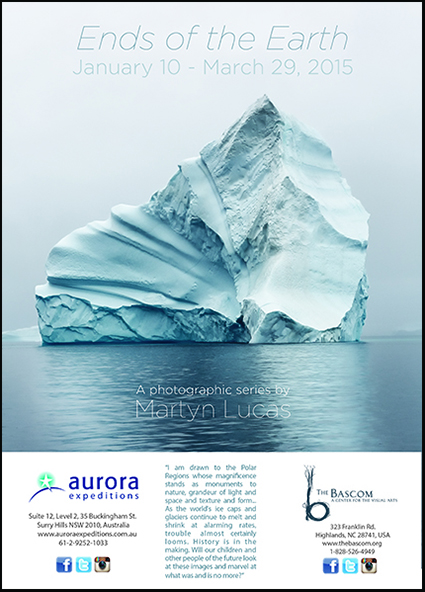
Alumnus Martyn Lucas' Exhibit Ends Of The Earth

martyn_lucas
 
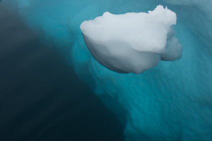
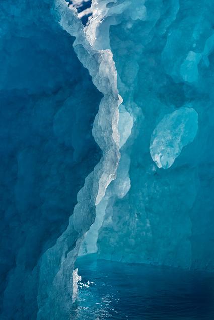
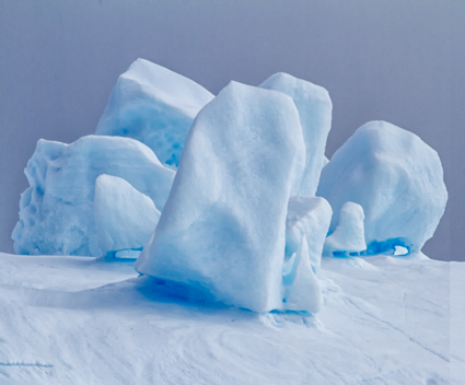
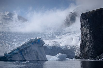
“Ends of the Earth is a dramatic, photographic voyage of the world’s ice caps and glaciers that depicts the magnificent beauty of the frozen landscape in large format color images.
Martyn Lucas grew up in England and was first introduced to photography by his father, a photographer who taught him composition, contrast, and how to perfectly capture a landscape.  Lucas’ natural talent for landscape photography has led him all over the world, seeing and preserving each new place through the lens of a camera.
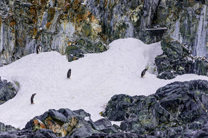
Inspired by the Polar Regions, Lucas has quite literally travelled to the Ends of the Earth to photograph the world’s ice caps and glaciers.  These photographs, each breathtakingly beautiful, leave the viewer stunned as they are given the rare opportunity to see the vastness of Antarctica: the coldest, driest, and windiest place on Earth.  Carefully photographing the urgency of global warming and the ice melting at alarming rates, Lucas has been able to present the unseen dilemmas of the world’s climate system.
Like viewing something out of a dream, this haunting exhibition promises to deliver the extreme beauty and silence of the frozen tundra, as seen through Martyn Lucas’ artistic vision.  Each work complements the others when viewed as a whole, and yet each is a distinct work of art on its own.
The artwork of this incredible photographer is nothing short of captivating, revealing the massive size of the ice and the strong current and movement of the icy water.  Viewers are welcome to come celebrate this incredible exhibition January 10, 2015 for the opening of Ends of the Earth, located in the Bunzl Gallery.  Visitors of The Bascom also invited to Martyn Lucas’ Artist Talk and Reception Saturday, March 21, 2015 from 5 to 7 pm at The Bascom.  Experience the wonder of Martyn Lucas’ Polar Regions photography through this breathtaking assemblage of photographs. ”
For more information, please contact The Bascom at 828.526.4949 or visit www.thebascom.org.
Find out more about this exhibit here.
Find out more about Martyn Lucas here.
Read more Alumni Success Stories here.
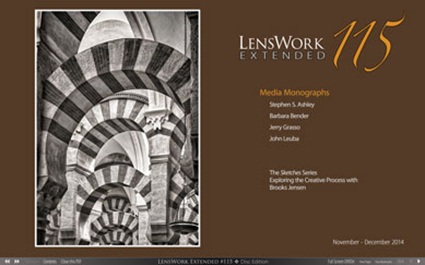
Alumnus Jerry Grasso Featured In LensWork Magazine

LensWorkGrasso

Alumni Jerry Grasso’s photographs are featured in the current issue of LensWork magazine. It’s a dream come true for him. Congratulations Jerry!

“One of my “bucket list” items was to be published in what I consider to be one of the most prestigious magazines dedicated to the promotion of fine art photography in the world today: LensWork Magazine. I have been a subscriber since 2004. In fact, I credit the podcasts of editor Brooks Jensen as one of the early influences on my artistic training. There are so many great, brief articles related to photography; more than enough food for thought.

I am humbled and honored to say that my series, “Moorish Influences”, has been accepted and will appear in the December issue #115 of LensWork. My interview and images will also appear on the Extended Edition dvd. And, one of my images even made the cover of the issue!

This series is an exploration of the progression of the impact the Moors had on Spanish architecture from 711AD to 1492AD. This impact can best be described as ordered repletions, radiating structures, and rhythmic metric patterns. These designs captured in my work are based in spirituality. The Islamic view of the world in general emphasizes and symbolizes the infinite nature of the one God. For them, there was an infinite pattern of forms that extend beyond the world and symbolizes the infinite essence of God.

I would like to thank John Paul for his training, guidance and support over the years. Also, I would like to thank my fellow Next Steppers for their encouragement and artistic suggestions that have helped me solidify my goals and techniques.

My dedicated perseverance and determination continues to sustain my passion and my vision. I look forward to my continued growth as I explore new projects and experiment with new visions. And thanks for indulging me in my moment of success!”

Order your copy here.

View Jerry’s statement here.

Find out more about Jerry Grasso here.

Alumnus Sam Krisch's New Exhibit Elements

Krisch_425

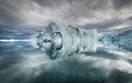
Disko Bay #4, 2013

Sam Krisch’s new exhibit Elements opens at Virginia Tech in Blackburg, Virginia Friday, December 5, 2014 (5-7 pm) and runs through Sunday, February 1, 2015.
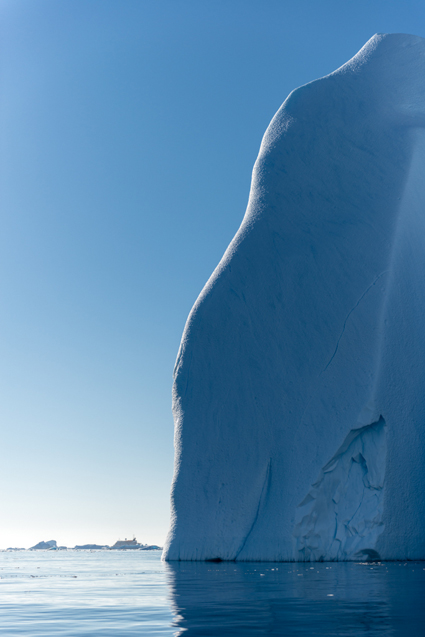
“The sheer power and splendor of nature in far-away places is the subject of Sam Krisch’s photographic practice. Over the last five years, Krisch has journeyed to remote locations ranging from the Mohave Desert to Antarctica to capture stunning images of ice formations, the raw force of turbulent waters, and empty expanses of desert landscapes. This exhibition presents a selection of the artist’s digital photographs created between 2013 and 2014, in which his approach to composition verges on the abstract, taking the work beyond documentation into a world of pristine, yet daunting, beauty. These are gorgeous, even idyllic landscapes, tinged nonetheless with the terrifying knowledge that these worlds are slipping away in an irreversible trajectory caused by human forces. Krisch lives and works in Roanoke. He is the adjunct curator of photography at the Taubman Museum of Art.”
Find out more about the exhibit Elements here.
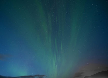
Find out more about Sam Krisch here.
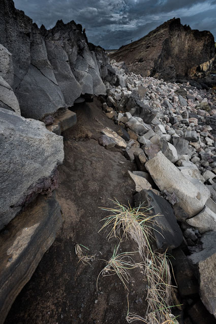
Alumnus Olaf Willoughby – Visual Conversations

Willoughby_VisualConverstions
By Olaf Willoughby
“A Visual Conversation sets up a rhythm, a pattern of communicating in which images fit with one another, with a chosen text, a piece of music or artwork of any kind. It helps develop our voice and vision.
Working through a series of Visual Conversations, each becomes a stepping stone which exercises the creative muscles and takes us beyond our regular shooting routines.
Visual Conversations work so well because they are based on the centuries old principle of ‘call and response’. A tradition of improvised exchange evident in everything from Hindu spiritual chants to modern day blues/gospel and jazz. From Japanese Renga linked poetry circles to folded paper stories.
How does this work in practice? I select an image which resonates, share it with you and ask you to shoot an image which rhymes, fits or starts a conversation with the original. Pretty straightforward, although there are systematic approaches to doing this. And still more ways of building that into a dialogue.
Now what if I select a painting by Rothko, or a poem by Edgar Allen Poe or Roberta Flack singing, ‘The first time ever I saw your face’? It’s a little more difficult. It requires more intense study and understanding of the original work of art to interpret it photographically. It stretches our minds to think about art in new ways.
Or how about if we develop the conversation into a narrative through storytelling? There are multiple permutations leading into other exercises…. I’m sure you get the idea. Add into this group discussion and feedback and it becomes an exciting learning experience. Each call and response takes us out of our routine and asks us to think differently about our photography.
But that’s not all. What makes this special is that your creativity can be extended beyond assignments into the process itself. As you’d expect, some Conversations involve working solo but others take ‘the road less travelled’ and involve working together on shared projects.
There is a spectrum of co-operation in the arts. Whilst some prefer to write books alone in coffee shops, others operate in collectives. Some partner up at different stages in the production process (choreographer/dancer, author/editor) and some of the most famous simply collaborate. Think Lennon & McCartney, Picasso & Braque. Look around. Every movie, play, symphony, rock ballad, even architectural space and garden involves artists working together. Yet collaboration is rare in photography. There are examples like Bernd & Hilla Becher or today, the Starn Twins but they are few and far between.
Occasionally we catch a glimpse of the collaborative spirit in photo workshops. At the end of the day, participants gather to share their solo work and you can feel the buzz in the air as people are amazed at the different ways of seeing and shooting, even though they were often at the same location.
Sharing projects captures that buzz and helps us let go of the need to control. We both give and receive in creative decision making and come to see our own work in a different light.
I’ve experienced the benefits of Visual Conversations and collaborative projects first hand. They are fun but clearing the creative blocks arising from routine ways of working can be challenging.Expect to be jolted. But also expect to benefit from taking a different approach to your photography and returning to your personal work refreshed and enhanced.
I’ve been fortunate to collaborate with Eileen McCarney Muldoon, a talented photographic artist in Jamestown, Rhode Island. We’ve captured that creative buzz and put it into a workshop. We’d be delighted if you would check it out. Even better, the course includes complimentary access to Leica equipment.
Plus a guest appearance during the week from a world renowned digital artist. I’ll leave you to guess who that might be!”

For more information contact: olafwilloughby@gmail.com or emmimageloft@gmail.com

Alumnus Michael Quinn On Being Discovered


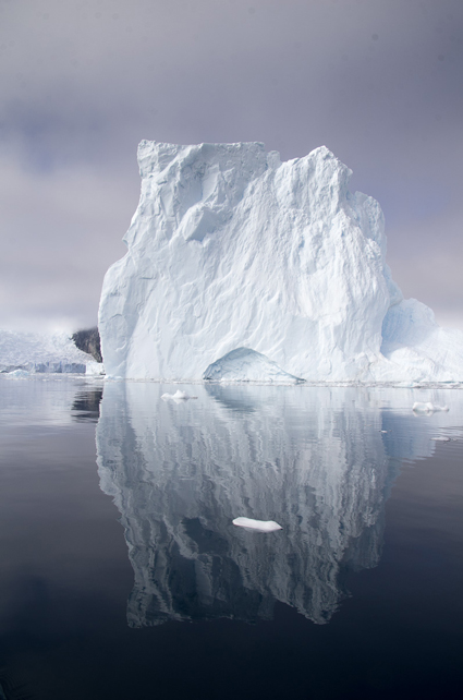
Recently I got “Discovered”. I awoke one morning to 3 emails all from strangers. The Huffington Post, UK SWNS and the UK Hot Spot Media. They were all wanting the work that I had published on the Adobe Behance website called “Greenland Reflections”. I had published several images from my trip to Greenland in 2012 as I was preparing for my return trip in 2013. I wanted to see what was working and what was missing so that I could more fully flush out a body of work. Well a blogger found me and posted my work on My Modern Met that got noticed.
This would not have happened if not for two key events. Since I began this journey in 2010 I have been working extremely hard on my vision and my mechanics. John Paul has been there on so many occasions to feed my imagination. To coach me and then to set me on my own path. There has been a lot of help freely given by the Next Step group over the years. In person, from the website and over emails. The group is so diverse in their own visions and mechanics that it allowed me to dream. To dream bigger than I ever thought I could.
The second event is sharing. You have to share your work to some degree to get noticed. I’m using Behance, Google+, Facebook and more recently Dropr. I generally only post images on Google+ and then post a link to that on my Facebook feed. You need to put your work out there for people to find. There is of course the downside to sharing as well. But you have to just take the risk and get yourself out there.
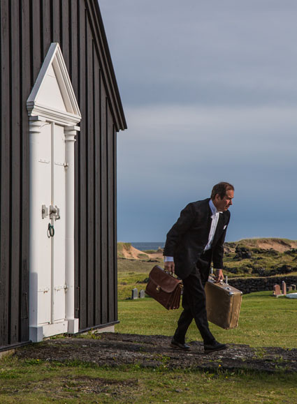
I have been trying to write something to accompany the images that I post. It generally has to have a theme that the image pairs well with. I think that sharing your thoughts along with your vision makes the work somehow more personal, more intimate, more intriguing. I think that it allows the audience to connect with me on some level.
In summary – Dream big, really Big. Then work hard to get there. Then allow your work to be seen. Allow yourself to be known.
Learn more about Michael and see more of his work here.

Alumni Ken Carl´s Exhibit: Joy Possible


American Premiere of Ken Carl´s Photography Exhibit: Joy Possible With Special Guest Jo McGowan, Executive Director of the Latika Roy Foundation.
“In India people with disabilities, who constitute almost four to eight percent of the population are still fighting to get equal access to healthcare, education, employment and inclusion in society. Despite the magnitude of the issue, both awareness of and scientific information on disability issues are lacking.”
Award-winning freelance photographer Ken Carl will be displaying various photographs from a spiritually-altering trip to India where he was sent to capture the essence of the Latika Roy Foundation, a resource center for children and young adults with special needs. Calumet Photographic, 1111 N. Cherry Ave., will host the display from May 9 to June 2, 2013, and all images will be printed by fotoflōt.
Through an opportunity with Momenta, an international journalistic based organization focused on creating unique opportunities for photographers and non-governmental organizations throughout the world, Carl’s goal was to expand his knowledge and horizon, capturing a glimpse of life in a part of the world with which he wasn’t familiar. In the end, Carl obtained much more of this venture.
Regardless of Carl’s years of experience and expertise, the project came with challenges. “After two days I just felt a sense of failure and it was really hard,” said Carl. Going through the initial photographs, Carl didn’t feel as though he was capturing what was necessary. “I thought, ‘I’ve been given this amazing opportunity and I can’t get an image out of it.’”
With that, Carl took advantage of the days he had left. Along with integrating himself even more at the foundation, he asked for permission from the executive director of Latika Roy Jo McGowan to visit students at home and photograph them along with their families.
During his visits, Carl was able to capture nothing short of amazingly true images that exhibited the struggles and realities of families with their special needs children.
“These children have disabilities yet that fact is not a barrier to being a positive light,” said Carl. “The human spirit can never be disabled.”
Two years later, with photographs full of color, emotion and joy, Carl is ready to give people outside of India insight into the school in Dehradun and bring awareness of those with special needs.
“This trip brought and heightened awareness in my photography,” he said. “I want to share the message that joy is possible through sharing, caring and treating each other well.”
Dates of Exhibition: May 9, 2013 – June 2, 2013
Reception: May 9, 2013 from 6:30 p.m. – 9 p.m.
Location: Calumet Photographic Chicago, 1111 North Cherry Ave.
Information on the event can also be found on Facebook.

Images That Work & Why – Participant’s Antarctica 2013

Feedback on work produced during a workshop is an important part of each learning experience. Useful feedback usually starts with identifying core strengths before a discussion about how to improve (no matter how successful images are) and identifying possible next steps.
Here’s a collection of participant images from our Antarctica Crossing The Circle 2013 Voyage and a quick note about each image’s core strengths.

Ginette Vachon presents peak action in a way that elicits empathy

Cathrine Spikkerud enlivens an other-worldy stage with quiet understated action

Nancy Leigh animates an already dramatic stage with an energetic gesture

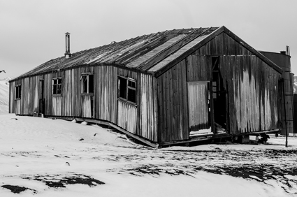
Marilynn Nance uses rhythm and perspective to make an historic building even more interesting

Robert Pettit use repetition to create a play between balance and imbalance

Fusako Hara explores the transitions between realism and abstraction

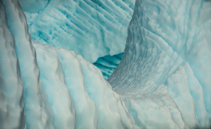
Benoit Feron uses line and texture to reveal natural processes

Jodie Willard uses opaque layers a strongly felt sense of space through design

Karin Pettit use transparent layers to portray depth

Norm Larson uses abstraction to portray not just an external reality but also to suggest an internal state

Celie Placzek uses number and proximity to suggest community

Jim Brewster uses negative space to highlight important figures amid chaos

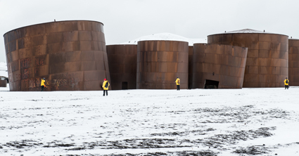
Dennis Lenehan uses mass and volume to create dramatic contrasts

Geir Morten Skeie employs a delicate palette to create a transcendant mood for a monolithic structure

Joelle Rokovich expresses contrasts in scale to express size and distance with a minimalist efficiency
Find out about our 2014 Fly Antarctica Sail Across The Circle Voyage here.
Only 9 spaces are left.

More Highlights From Iceland 2012


Here are a few more alumni images from Digital Photo Destinations / Focus On Nature’s 2012 Iceland Adventure.
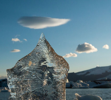
Seth Resnick and I had a great time with a great group of people in Iceland last week. We visited old favorites (Seljalandsfoss, Skogafoss, Jokulsarlon, Rekjanes) and some new favorites (Snaefellsnes, Landmanalaugar). 4-Wheel drives to the highlands, Zodiac cruises, and glacier walks took it up a notch. Every one of us learned a lot and improved our photography.
We’re now planning a northern lights, super-jeep, and ice cave adventure.
Be the first to hear about our March 2013 Iceland workshop.
Email jpc@digitalphotodestinations.com.

Yves Perrault

Charlotte Bailey Rush

Duane Miller

Kathy Beal

David Cho Yee Young

Graham Smith

Richard Moreau

Olaf Willoughby

Carla DeDominicis

Michael J Quinn

Michael McGinnis