Jeff Fox – A Self Publishing Experience

Jeff-Fox Alumni front-cover
Alumni Jeff Fox recently published his first book. He shares his experience with self-publishing here  …
Self-publishing a book: My adventure so far
In June 2008, I took my first workshop with JP,  “Illuminating Creativity.” It so inspired me that six months later I began work on my first book. Published in April 2009, Yankee Stadium: The Final Game is a photographic essay, with commentary, on the passing of The House That Ruth Built. (As I write, the original Yankee Stadium is in the process of being dismantled and replaced by a public park.)
The book is sold on Amazon and Barnes & Noble. It has also been featured on several blogs that cover the Yankees, as well as in USA Today Sports Weekly.
In the hope of informing other would-be authors, I share below some of my experiences and what I’ve learned from them so far.
The project was driven by one of my passions: A lifelong Yankee fan (I’d been going to Yankee games since 1962), on September 21, 2008, I set out for the final game ever played at the Stadium, intent on capturing and preserving the experience for all time. There was no conscious intention to produce a book, although I can’t say the idea wasn’t floating around somewhere in the back of my mind. Armed with my Nikon D300 and a couple of lenses, I tried to capture the feeling of being in the neighborhood on that historic day, as well as at a variety of locations within the Stadium itself—in and under the stands, plus on the field before, during, and after the game.
A couple of months later, I decided to turn the photos into a book, using a print-on-demand service called Blurb.com. The nice thing about this service is that you can download free software with templates that make laying out a book so easy that you can do it in a matter of a few days. The problem with such services, I soon learned, is that they are too expensive (at least for photographic books) to be able to sell books profitably on the open market. However, Blurb.com proved a wonderful tool for prototyping my book and, just a couple of weeks after I started, I had a bound book to show people. There is a huge difference between describing a book, or even sketching one out, and having one that people can hold and flip through.
If you’re interested in producing a relatively small number of copies of a book, no more than a dozen or two, to showcase your work or for colleagues, friends, and relatives, a service like Blurb (or Lulu) is all you need. But after I got raves from a number of people who saw my protype, my goal quickly became selling thousands of books in the marketplace. With the baseball season a few short months away, there really wasn’t much time to get an agent and find a publisher. So I formed my own publishing business (Veridico Publishing LLC). And, after some research, I decided on a more economical way to print: A commercial printer using a four-color press.
Conventional printing is economical, but driving down the cost per copy can require a significant up-front investment. Which you means you’d better have some cash on hand and be confident that you can eventually sell all, or at least most, of what you print. (Printing abroad is generally cheaper, but I decided to print my book in the United States.)
I’ll spare you all the gritty details of designing the book and getting it ready to print. Suffice it to say that the process was laborious, often maddeningly frustrating, and seemingly endless. But with the help of a professional designer I knew, I had everything ready for the printer in about seven weeks. (It also helped that I’m a professional editor.) Only after the printing was underway did I learn that what I had just been through was not the toughest part of publishing a book. Neither was getting the book listed on Amazon (Among other things, I had to buy an ISBN number and bar code; set a retail price; buy domain names for my own web site; and file as a business in a couple of states).
The toughest part of publishing a book, basic as it may seem, is making your best customers aware that the book exists. Amazon helped; it can do a lot to promote your book, though you must give up a chunk of your royalties in return. The essential problem in marketing is that, for an unknown author, traditional advertising is unprofitable. You have to sell a lot of books that way just to break even.
That leaves a number of other ways of getting the word out; I’ve tried the following: Street distribution of postcards (didn’t seem to be very effective); getting press and blog coverage (very effective, but requires that you or your book be newsworthy); book signings (small bookstores and public libraries worked well; large-chain bookstores haven’t yet); specialty stores (souvenir stands near Yankee Stadium have been so-so); blogging (my own blog, YankeesGadfly, has directed traffic to my web site and increased my visibility to search engines; Twitter (my tweets  have been very effective at getting traffic for my site); Google Adwords (buying ads on Google has provided millions of ad impressions online very cheaply, though it’s not yet clear how many have turned into sales). I’ve also publicized the book on Facebook.
My next effort is to offer the book at a sports memorabilia show. I’m also considering street vending in NYC at opportune locations. To market a book, you must be resourceful and endlessly creative.
So far, I’ve sold a fair number of books, though I’m not yet in the black. (Not only must revenues cover  printing costs, but there are other overhead items, such as shipping, legal, web hosting, etc.) But I’ve learned a lot. And, should I produce another book or two, I believe this will be a profitable business, as well as a lot of fun.
If any JP alumni would like to get in touch with me, drop me a line at:  jf@pipeline.com

Alumni Success Stories

successstories
This space is for you!
If you’re an alumn of my workshops/seminars …
I want to hear your success stories!
And I want to share them with the world!
Got a new book?
Featured in a magazine?
Won a contest?
Have a new exhibit?
Landed a new assignment?
Print made it in a prestigious collection?
Experienced a great travel adventure?
Took a great workshop?
Used great tools?
Learned something valuable?
Tell us about your discoveries here!
How do you submit material?
Send me your ready to post text as an RTF file.
Include full urls for relevant links …
i.e. http://www.johnpaulcaponigro.com/workshops.
Include at least one image – 425 pixels wide, sRGB, 8 bit, JPEG setting 6-9.
Email me at johnpaulcaponigro@hotmail.com.
That’s it!
I’ll post it!

John Paul Caponigro's Next Step Alumni Group Exhibit Book


For over 10 years I’ve been mentoring a select group of individuals. Their progress has been thrilling to watch. It’s been a true privilege to be a part of their growth. July 7 their first Group Exhibit will be unveiled at the Maine Media Workshops. (link)
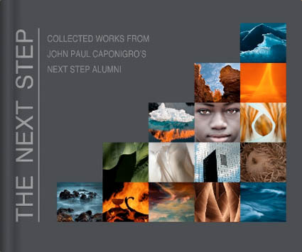
The members have produced a Group Blurb book to accompany the exhibit. The book includes images and statements from all 24 artists currently featured in the Group Exhibit.
You can preview and purchase the book here.
See the Next Step Exhibit at the Maine Media Workshops July 7 – 30.
Find out more about my workshops here.
Find individual member’s websites and Blurb books by clicking More.
Read More

Facebook Group – John Paul Caponigro Alumni


I started a Facebook Group for my workshop and seminar alumni.
If you’re one of my alumni you can use this group to …
Network – Connect and stay in touch.
Learn – Exchange information.
Promote – Grow an audience for your projects.
I use Facebook to stay in touch with people. I let them know what I’m doing. I find out what they’re doing.
My hope is that this group will be useful to you to … Read More

Olaf Willoughby – Alumni Success Story


Olaf Willoughby is one of my workshop alumns with an amazing success story. It’s a testament to how one man with focus can succeed personally and make a significant contribution in a short time.

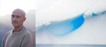
“It all started with the mesmerising impact of a photographic expedition with Michael Reichmann and John Paul Caponigro. Antarctica was even more dramatic than I had expected. Glowing pink light at sunset. The vivid blue depths of the ice. Drifting sculpted icebergs. It was almost like a fairytale.
But the reality is different. Antarctica is under threat. Apart from the impact of climate change; the accords on land exploitation, whaling and tourism are all on a course of seemingly irreversible change for the worse.
This contrast between splendour and sadness led me beyond a photographic portfolio to produce a 48 page colour book, a work of environmental advocacy. “Antarctica, A Sense of Place”. The images and text contrast the natural beauty with the dark detail of the dangers facing Antarctica.
I produced the book within 6 months of the trip but I was still only halfway. John Cage said he didn’t consider his music complete until someone had heard it and similarly I needed marketing to create awareness and demand.
The World Wildlife Fund endorsed both the book and the images, using them in its web and print marketing activity. They also distributed over 5000 copies of the ebook on CD to help raise money for environmental causes. I have also blogged for the International Polar Year and their web site has featured the images. Additionally an article on the trip appeared in the UK’s most popular photographic magazine, Amateur Photographer, who also gave the book a very favourable review. A selection of images were exhibited at the ‘White Worlds’ exhibition at Nature In Art in the UK, Summer 2008. Prints have also been sold to support corporate environmental marketing programmes.
Through the WWF I have managed to create a good level of awareness, far higher than I might have managed on my own. I am going again in Jan 09 with John Paul and am currently planning the second edition.
JP’s workshops bring together a wonderful collection of like minded artists, rich with different talents. There are many benefits but, for me, the one outstanding lesson has been the expansion of the way I ‘see’ images, both provoking me to push harder and allowing me greater freedom to express my vision.”
Olaf Willoughby is a photographer, writer and researcher who lives with his wife Monique in London, UK. Creator: the WIT test of individualists and team players used in market research. Author: photography & travel books and articles. Values: the need to connect, environmental advocacy. Interests: the rhythms of data, images and words fuse into a long term fascination with creativity and pattern detection.
Check out a recent feature on Ag magazine here.
Find Olaf’s book here.
Learn more at olafwilloughby.com.
Stay tuned for stories from our upcoming January 2009 voyage to Antarctica.

Enjoy my Antarctica galleries, book, and statements.
Learn more about my workshops here.
Early registrants get discounts at home.
Members get discounts abroad.

2009 Workshops Announced


My 2009 workshop schedule is live. My field workshops emphasize creative approaches to exposure. My lab workshops emphasize creative approaches to post-processing. All of the exercises are designed to help you find and refine your unique authentic voice. There are four international destinations – Antarctica, South America, Namibia, and Iceland. There are two field workshop in Maine. All lab workshops are held in my private studio / gallery. Early registrants get 15% off. Space is limited.
Check out the full schedule here.
Check out specific workshops here.
Check out what past alumns have said about their experiences here.
See alumni work on this blog. Click the Alumni under Categories.

Cheryl Medow – Consistent Style


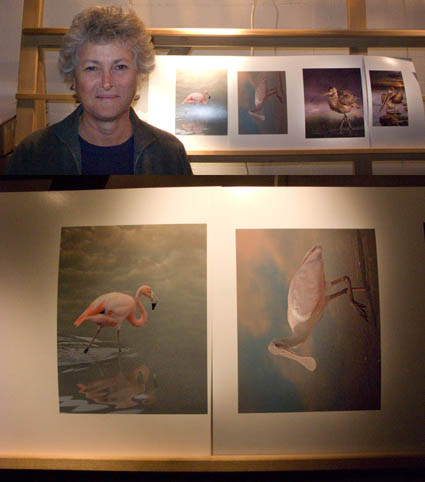
Cheryl Medow creates wildlife composites. She’s attending the Fine Art of Digital Printing workshop (Caponigro and Holbert at Brooks sponsored by Epson). Yesterday, some of them looked like photocomposites (surreal) and some looked like paintings (graphic). Today, after a long discussion about the most successful components in separate images and the intent she wants to communicate, they all look like they’re made by the same person who has a cohesive message. Some of the keys to unlocking her style included keeping shadow and highlight detail extremely full (none of them pure black or white, sometimes with significant color). In addition to keeping luminosity contrast low, she did the same with hue contrast, glazing the different colors in her images with a single color. Both create a more softly modulated color palette. Cheryl had to reconsider what she had learned about traditional photographs to find her own personal style. Her first step was to find the words to describe the new qualities she found through exploration (trial and error) and now wanted to repeat. The next step is to ask why. She’s got a lot of ideas, but she’s still working on it. That’s great. That’s when work starts to get really interesting.
Check out Cheryl Medow’s work here.
Check out the Fine Art of Digital Printing workshops here.
Check out my Fine Digital Print workshop series here.

Ken Carl – Extreme Low Light Shooting


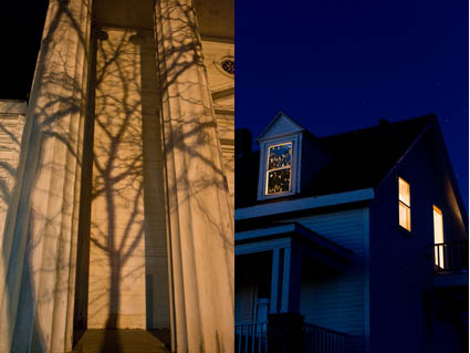
Ken Carl has attended every one of my Fall Foliage workshops. Over the years, he’s turned pro. Just when I think he’s done, he keeps coming back for more. After a long day of shooting past sunset at Pemaquid Point, Ken walked up the streets of Damariscotta while the rest of the group was being seated for dinner – and got some great shots. After dark? Hand held? ISO 8000? Really? And it’s actually useful, with surprisingly little noise by traditional standards. You’ve got to try it to believe it. The LCD on the back of the camera actually shows you more than you can see at that moment. Add a tripod to the equation and you’ll see even more. Today’s cameras can capture more than you can see at any one moment in time. With a little experimentation, you’ll find hours of new possibilities at the beginning and ends of the day. This weekend we tested shooting in many extreme lighting situations. Participants are seeing in new ways. I’m seeing in new ways. I recommend frequently testing new techniques to expand your repetoire and your vision.
Check out Ken Carl’s work here.
Check out my workshops here.

Kevin Ames – Perfectly Imperfect


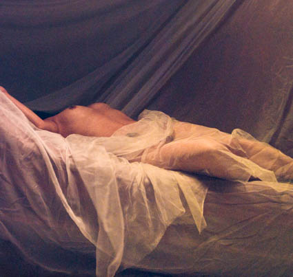
Kevin Ames found that perfect wasn’t and imperfect was, while he was a special guest during a special session of my Fine Digital Print workshops this week. After years of doing top notch commercial photography, to get the most expressive results from a developing body of work, he first had to follow the lead of a very happy accident. Replicating the look and feel of a color crossed, soft focus, grainy original from pristine originals challenged him to be clear about every move he made. Ultimately, he found that rather than going back to lesser tools to distress his images he had much more flexibility and freedom when simulating the look using high quality originals. The results became perfectly imperfect. In the end, given the subject matter and his treatment of it, a perfectly lit, perfectly processed original was just too perfect – and far less emotive. It wasn’t easy to go in the opposite direction years of good habits had taken him. He had to give himself permission to do so – and was encouraged unanimously by the other participants to pursue his unconventional results. Even then, it took repeating the results with several images to get the final confirmation he needed. The results were undeniably strong.
Here’s what Kevin shared about his experience. “Breaking rules is part of being artistic. This odalisk was made during the very early days of digital portraiture with a three chip camera the when given enough light was really quite good. I broke the flash sync socket at the beginning of the shoot forcing me to use the
modeling lights in the soft box as the sole and dim source of illumination. That camera shot at ISO 40 and the exposures were quite long adding a lot of noise to the image.  During portfolio reviews at
John Paul’s Digital Print II workshop last spring it was the pick of my work by the group. I added it to my print portfolio for last week’s workshop and again it was the unanimous favorite of my submissions.
Understand that at the beginning of the workshop it was not the direction that I thought I wanted to follow. The breakthrough came when it was printed out to a large scale–forty by forty inches. Up
close it looks impressionistic. From ten feet it becomes painterly. Using the odalisque as a touchstone I am adding grain, noise and color washes to current high resolution work that is very sharp and well
lit. Printed larger than life the figures take on a whole new aspect. I can control the size of the grain in the subsequent photographs as part of the visual vocabulary. When the body of work is finished this
touchstone image will be the one that doesn’t truly fit. Breaking the rule of “noise free is better” has led me to seeing my work in a whole new way–all due to collaborating with the participants of the
workshop and of course John Paul’s guidance.”
Tell him what you think! Comment here!
Check out Kevin’s website here.
Check out my Fine Digital Print workshops here.