The Problems With Calling Them B&W Photographs
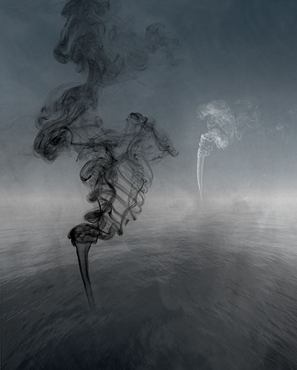
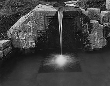
Suffusion VIII
You may not think there’s a problem. You may think you know the difference. It’s obvious right? But is it? Do you? After a lifetime spent in the arts, I find photographers’ ability to describe color woefully limited, and this is never truer than when describing “black-and-white” images.

Most antique processes are black and white, right? Certainly, silver gelatin is black and white. But what if you tone it? Is a platinum print black and white or brown and white? Is a cyanotype black and white or blue and white? What about hand-tinted photographs? They were black and white but then they became colorful again, but it’s a different kind of color, isn’t it? And if only a little color is added is it still black and white? At what point does an image become black and white?

The problem is that having only two terms – color and black and white – for a wide array of color palettes limits not only our communication but more importantly our perception and thinking.


Insights Members can login to read the full article.
Email:
or Sign up

Why Black & White And Color Images Don’t Mix

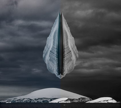
Revelation XXVI


Can you effectively present a project or body of work that contains both black-and-white and color images? It rarely works, but in rare cases it can.

The problem is that color and black-and-white images appear to be from different times or even different worlds and sometimes both. They’re so different from one another that presenting them together breaks the continuity of the larger story being told (Even a collection of separate poems creates a larger story, albeit with a much looser narrative and context than an essay.) and it undermines the suspension of disbelief required to imagine that a small two-dimensional image accurately represents our much larger three-dimensional world. Viewers end up paying more attention to the way the images are presented and our attention is deflected away from their content. We spend time and effort trying to figure out a pattern between images that are color and images that are black-and-white and the reasons why they’re different from one another, which is wasted if there aren’t any. “It looks better.” isn’t a strong enough reason to break continuity and suspension of disbelief. If there is no reason that contributes to the content of the series, then it’s a few small wins for individuals but a big loss for the team, and we leave the work feeling confused and frustrated. (“I don’t get. Is it me?”) For these reasons it’s best not to mix color and black-and-white images. Instead, present them separately.


Insights Members can login to read the full article.
Email:
or Sign up

Optic 2018 | Myth, Magic, and Mojo | Keith Carter


“At B&H’s Optic 2018, photographer Keith Carter talks about myths, magic, and mojo. He believes that the best way to elevate your photography is to tell the truth as you know it through your photos, and he stresses that there are great lessons to be learned by revisiting history. We can learn a lot about how to shoot well – even in this digital age – by studying classic photos that pre-date digital photography.”
Find out more about Keith Carter here.
Read our conversation here.
Read quotes by Keith Carter here.
View 12 Great Photographs By Keith Carter here.
 

Bernice Abbott Documenting Science


“Berenice Abbott’s Documenting Science was a partnership with MIT for use in school textbooks. Its subject and design elements are as timeless as nature and science themselves.”
View 12 Great Photographs By Bernice Abbot.
Read Great Quotes By Photographer Bernice Abbot.

View more 12 Great Photographs collections here.

Explore The Essential Collection Of Quotes By Photographers.
Explore The Essential Collection Of Documentaries On Photographers.

5 Photographers With Signature B&W Styles

BWphotographers_425

You can learn a lot just by looking at great photographs.
Want to learn more about black and white images?
Start by studying these five photographers.

010_Steiglitz
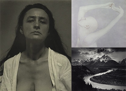
Alfred Stieglitz explored the softer sensibility of platinum with muted blacks, very full highlights, and a surprising range of tints.
View 12 Great Photographs By Alfred Stieglitz here.

02_adams
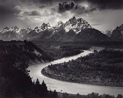
Ansel Adams epitomized the modern sensibility with deep blacks, bright whites, and a full smooth range of tones in between.
View 12 Great Photographs By Ansel Adams here.

01_BrettWeston
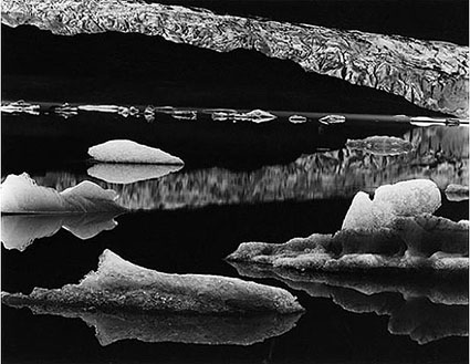
Brett Weston moved modern photography towards abstraction with extreme contrast often eliminating shadow and sometimes highlight detail.
View 12 Great Photographs By Brett Weston here.

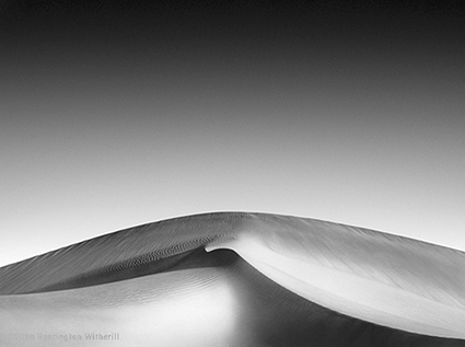
01_Witherill
Huntington Witherill advances the classic modern sensibility into the contemporary by achieving extreme separation in even the deepest blacks and the brightest whites, often side-by-side.
View 12 Great Photographs By Huntington Witherill here.

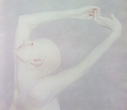
10_Tenneson
Joyce Tenneson has explored many high key black and white palettes over her career – neutral in her early years, semi-neutral tints mid-career, and more recently gold-leafed.
View 12 Great Photographs By Joyce Tenneson here.
View more 12 Great Photographs Collections here.


Read more in my Black & White lessons.
Learn more in my digital photography and digital printing workshops.