Paul Strand / Under The Dark Cloth – Documentary
This documentary illuminates the history of master photographer Paul Strand.
View more Videos On Photographers here.
Read conversations with photographers here.
This documentary illuminates the history of master photographer Paul Strand.
View more Videos On Photographers here.
Read conversations with photographers here.
Suffusion XV, Skogafoss, Iceland, 2012
To find what I was looking for, it took three visits to this waterfall.
On the first visit, I made conventional postcards surveying the site with a curious eye: cliffs, grass, moss, waterfall, pool, river, rock, vapor, rainbow, sun, clouds, rain, tourists, and horses. The images I made were competent – and nothing more.
On the second visit, I identified my primary focus – the fast-moving complex patterns the water made as it fell in waves through the air. Images that isolated these patterns contained a number of qualities that I was excited about, both something related to what I had been developing in other images and something new. I had found what I was looking for. But, when I evaluated the images I made and developed the material further (enhancing the patterns by combining them and adding new elements), it became clear that I needed more material to make a complete statement. During development, I made notes and sketches to chart my progress and refine my ideas.
On the third visit, I walked up to the waterfall and stood in front of it, silently watching for new patterns and making exposures for the better part of an hour. I was thrilled to be immersed in a magical moment, completely focused and undisturbed. At the end of this session, my good friend and colleague Arthur Meyerson asked, “Did you get anything?” “Yes,” I responded, “I got a body of work.”
With so many wonderful possibilities out there, why would you return to the same well more than once? Let me count the reasons.
1 You’ll get to spend more time with your favorite people, places, or things.
Passion energizes.
2 You’ll have an opportunity to make the images that almost worked or that you missed.
Make a list to learn from your mistakes and create a working plan.
3 You’ll have an opportunity to improve your images.
Practice makes perfect.
4 You’ll learn more about a place.
By increasing your understanding of the places you photograph, your photographs will become more interesting.
5 You’ll see changes in the place.
Time reveals new things, changing subjects and changing us.
6 You’ll see new things.
Having first found the images that come to you naturally, you’ll later find yourself challenged to look for other kinds of images, which will stimulate your creativity and increase your visual versatility.
7 You’ll learn more about yourself. You’ll be called to identify your habits, changes, strengths and weaknesses, hopes and purpose.
Just because we see new things doesn’t mean we will see in new ways. In fact, it’s often during times when we are engaged by a great deal of new information that we fall back on our habits. When we see the same things again, we are challenged to see in new ways and/or deepen the ways we see them.
Questions
What things would be most valuable for you to revisit?
How many new ways can you imagine approaching a subject?
What do you hope to accomplish when you revisit them?
What can you learn about yourself when you return – preferences, tendencies, habits, core strengths, areas for improvement, etc.?
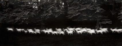
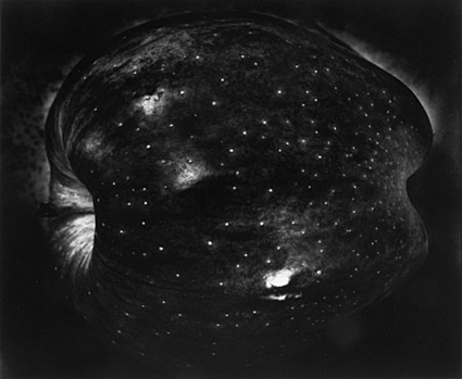
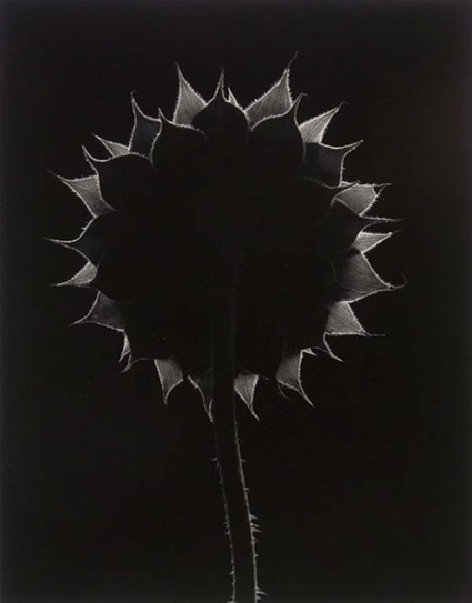
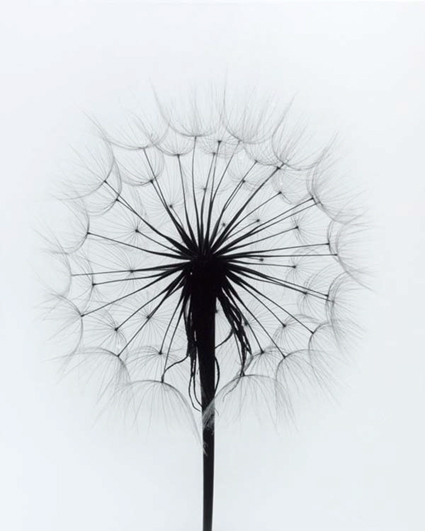
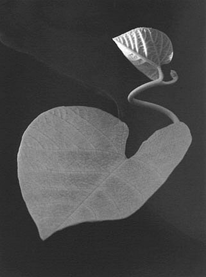
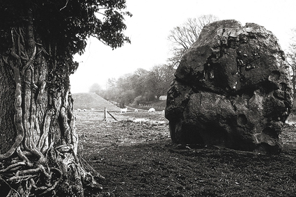
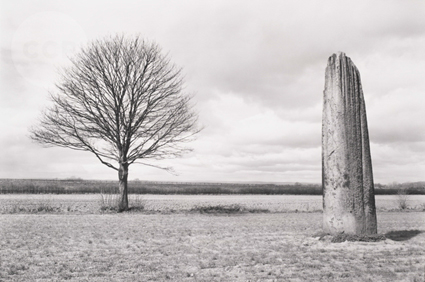
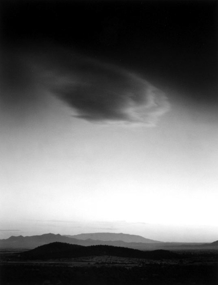
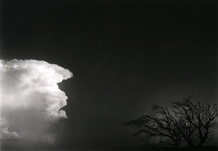
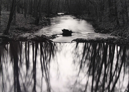
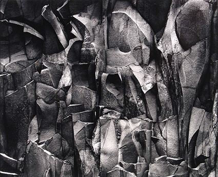
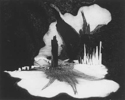
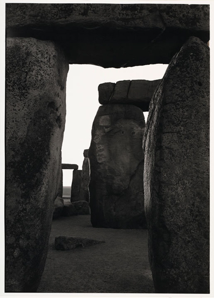
This is a selection of my picks of my father’s top 12 images.
This doesn’t reflect sales, publication, or web views.
It simply reflects my opinion.
It’s challenging to choose so few images – but it’s insightful.
Try it with your own images or artists’ work that influences you.
Kim Weston shares insights from his life in the arts steeped in the history of black and white photography.
Read more in my black and white resources.
Learn more in my Black & White Mastery digital printing workshop.
John Sexton shares insights from his distinguished career in black and white photography.
View more in my conversation with John Sexton.
Read more in my black and white resources.
Learn more in my Black & White Mastery digital printing workshop.
Dan Steinhardt and Tony Corbell discuss their black and white workflows from input to output.
Read more in my black and white resources.
Learn more in my Black & White Mastery digital printing workshop.
“In this episode of The Complete Picture Julieanne demonstrates the best way to convert images to Black and White in Lightroom as well as how to save presets to increase your productivity. Click here to download the presets discussed in the video. Note: although this video was recorded in Lightroom, the same techniques are available in Adobe Camera Raw in Photoshop CS6.”
Read more with my B&W ebooks.
View more in my DVD B&W Mastery.
Learn more in my B&W Digital Printing workshop.
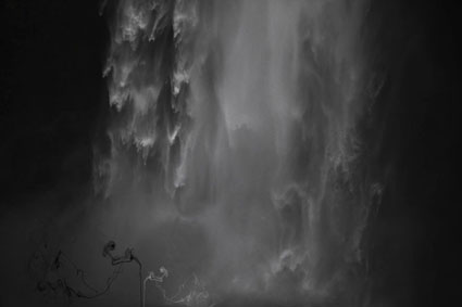
I’m having a great time printing this series of images!
At first glance, they look like classic black and white images. In reality, they’re full color captures of a near neutral subject, processed and printed as color images. The trace amounts of color from the original subject make a very subtle but meaningful addition to the final image and print.
The trace amounts of color in the image are so subtle, I wasn’t sure which color management options would yield the best printed results; shadow detail, gradation, neutrality and graybalance all play major roles.
To get the final prints today, I tested multiple printer color management routes (Photoshop, Printer, Printer Adv B&W)(my ImagePrint tests are pending). Using Printer color management for color offered the results I was looking for – not Photoshop, which clipped deep shadow detail and not Printer Adv B&W which rendered warm grays by default and cool toning solutions added more cool toning to the highlights than the shadows making the prints look like they carried a faint color cross).
They’re really touchy images. I found out how touchy when I went from 4×6 proofs to 11×14 prints, which when enlarged looked slightly lighter and lower contrast. A contrast curve for enlargement solved this.
At larger scale the noise became an issue, which I’m sleeping on. On the one hand, the subject is made of particles of water, which you can see when you are there. On the other hand it looks distracting to people who don’t know this. Water blurs with motion but the motion is frozen in these very fast exposures. I polled other people around me (including my father). Then I settled on an unexpected solution. I let some of the noise come through only in the areas of greatest focus, drawing slightly more attention to them. (Some noise can makes images appear sharper.)
There was a another surprise. I tested the images on glossy paper (Epson Exhibition Fine Art Paper). The extra depth in the blacks made another improvement in the image, so much so that it was worth the trade off for the soft surface of the matte paper. I made a similar test with a related series, Fumo, and didn’t make this choice. But here it was clear. This is the first time I’ve made my final prints on glossy paper.
I made these images while scouting my 2011 Focus On Nature workshop with Ragnar Th Sigurdsson and Arthur Meyerson. Arthur and I, two colorists who love the colors black gray and white and talk about them as colors.
I’m looking forward to returning to Iceland (and this waterfall) this August to lead a workshops again for Focus On Nature with +Einar Erlendsson , +Ragnar Th. Sigurdsson and +seth resnick . +Arthur Meyerson Arthur Meyerson will join us at the end of our Iceland workshop for our Arctic Voyage workshop/cruise from Longyearben to Greenland and finally back to Iceland.
We have a few more spaces left our Iceland workshop.
There’s one space left in our Greenland workshop.
There are a two more spaces in my Fine Digital Print Advanced workshop.
Learn more in my digital photography and digital printing workshops.
John Sexton and I speak at length about the uniqueness of the black-and-white palette and the importance of materials.
Read our extended conversation here.
Read his quick Q&A here.
Read his favorite quotes here.
Find out more about John Sexton here.
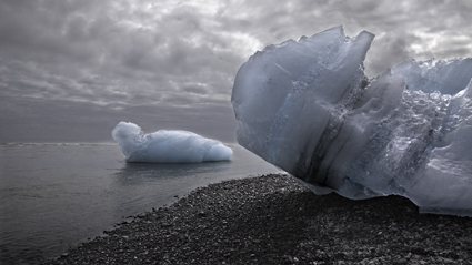
Colorless black-and-white images are beautiful, but sometimes it’s nice to add a little bit of tone. By adding color to your b&w photos, you can enhance their expressive qualities.
These days, you can add color to your black-and-white digital images in virtually unlimited ways. Sure, the choices before you can be dizzying. Fortunately the techniques are simple, and the experimentation process for determining which tone qualities work with specific images is easy and fun. Here are five go-to ways for bringing color back into monochrome images in Adobe Photoshop.
1 Colorize With Hue/Saturation
2 Split Tone With Curves
3 Restore A Percentage Of Original Color
4 Add Color By Hand
5 Selectively Tone With Masks
For all the details visit PopPhoto.com.
Read more in my Black & White lessons.
Learn more in my digital photography and digital printing workshops.