Saturation Is An Essential Key To The Success Of Your Images
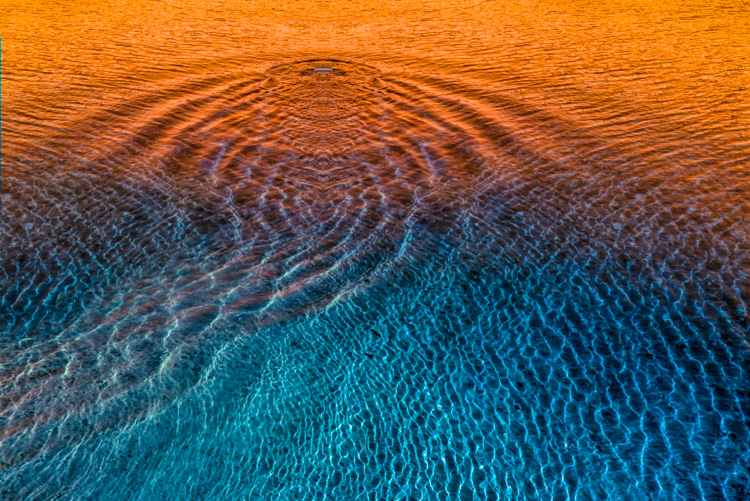
One of the most distinctive features of a visual artist’s use of color is their use of saturation. When you think of Ansel Adams’ photographs, you think of neutral images rather than highly saturated ones. When you think of Matisse’s paintings, you think of supersaturated images rather than neutral ones. Think of your use of saturation as an essential element that will help you define your own signature style.
One of three elements of color (luminosity, hue, and saturation), saturation can give your images specific qualities of energy and light. Here are five things you can do with saturation: one, increase energy and impact; two, add complexity by revealing hidden hues; three, restore life to listless hues; four, calm colors that are distracting; or five, produce softer semi-neutral and pastel palettes.
Read more about Saturation here.
Together, Adobe Lightroom and Photoshop offer an impressive, almost overwhelming, array of possibilities for controlling saturation. Do three things before you choose a tool to adjust saturation with. First, understand and develop your eye for saturation. Second, adopt a consistent strategy for exploring the possibilities it offers your images. Third, understand the differences between the tools, both how they function and the effects they produce.
Know What To Look For
Knowing what to look for will help you choose a direction, a tool, and how far to go with it. It will also help you evaluate the results you produce – and quite possibly improve them further.


