What In The World Is Color Psychology ?
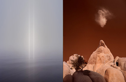
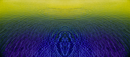
Flypaper Textures Autumn Painterly Collection Texture for artwork and photography from Flypaper Textures
Color psychology is the study of how color affects human behavior. It’s a long-standing, field used in art, design, marketing, sports, medicine, and much more.

Despite its long history and widespread use, there’s a lot more to discover about how color affects people scientifically. Here’s are a few facts that have been scientifically proven.

We see certain colors more quickly than others.

Warm colors are stimulating and cool colors are calming.

A red room feels 10 degrees warmer, while a blue room feels 10 degrees cooler.

Colors can enhance the effectiveness of placebos.

The presence of green speeds healing.

Athletes perform better in certain colors and get penalized more in others.

Clearly, the responses to color are at once physical, psychological, and social, so identifying the strongest contributor(s) to a response(s) is no easy matter. The more social the response, the more likely it is to vary between individuals. Socially, color psychology has many layers – universal, cultural, regional, communal, individual. And then there’s time. Age (as well as gender) can also influence how a person perceives and interacts with color. An era or a moment can become important factors too. It’s complicated but it’s fascinating!
Color affects body, mind, and emotions. Color can be used by physicians to promote physical and psychological health, by businesses to brand identities and influence purchasing decisions, by political movements to propagate values and ideas, and by artists to communicate aesthetics and emotions. Color is a powerful communication tool that can be used to influence perception, mood, and action.

Considering the psychological dimensions of color consciously will give you a greater awareness of the phenomenon of color and improve your ability to communicate with it. Remember, there are shared responses to color and you have your own individual responses to color. Being able to tell the difference can be insightful. This mindfulness is something every visual artist will benefit from.
How will you use color?

Read more on Color Psychology here.
Learn more in my digital printing and digital photography workshops.

The Weight Of Color


1

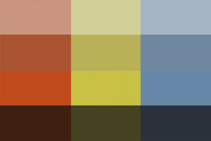
Images with lighter palettes tend to be brighter and less saturated (though driving colors towards white desaturates them), while those with heavy palettes tend to be darker and more saturated (though driving colors towards black desaturates them).


2

Brighter less saturated colors seem lighter, while darker more saturated colors seem heavier.


3

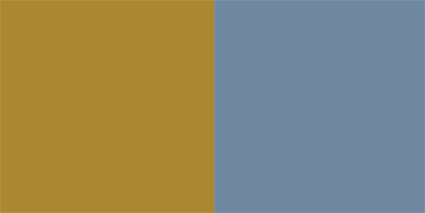
Colors can be matched or contrasted by weight to control visual dynamics. Here yellow and blue are matched in weight.


Many psychological attributes have been assigned to color, such as temperature. It’s so natural to think of color having temperature that we often don’t think about how this is an associative meaning rather than a physical fact. Physically a blue fire is much hotter than a red fire. Nonetheless, red is universally (in all cultures and periods of history) considered the warmest color and blue the coolest color. It’s quite likely that this comes from our experiences with fire (generally red, orange, and yellow) and water (typically blue in large quantities). You might think the ascription of temperature to color is particularly strong for photographers who assign white balances to their images based on the color temperature of the light a photograph was made from to reproduce color accurately. But, it’s equally strong with painters and designers who use temperature associations to create expressive color schemes.
One other useful psychological attribution to color is weight. Does yellow feel lighter than green? Does purple feel heavier than orange? Most people would say yes. Of course, our response depends on the specific variation of each broad color family. You can make a green seem lighter than yellow if you make it brighter, either with luminosity or saturation or both.

So how can you use this information? Here are four ways.

1            You can strengthen comparisons or contrasts between two image areas by making their relative weights appear more or less similar.

2            You can also set the tone for an entire image. Set a brighter airier tone by using lighter colors. Set a darker earthier tone by using heavier colors.

3            You can attract the eye more strongly to specific areas. Once a predominantly light or heavy palette has been set, you can accent it dramatically with smaller accents of contrastingly weighty colors.

4            You can create comparatively lighter and heavier palettes for specific areas of an image, such as a lighter color scheme for higher areas and a heavier color scheme for lower areas.

It’s useful to note that weight is also associated with gravity and thus vertical location.

That the word ‘light’ can be used to describe both the appearance and the mass of an image speaks volumes. Psychologically, color has weight. With only a little practice and more sensitivity, you can use this to make your images more effective.

Exercise
Sensitize yourself to the weight of color by matching the weight of colors.
1               Create two or more colors. Match the weight of two colors from the same color family, such as blue.
2               Create two or more colors. Match the weight of two colors from different color families, such as blue and yellow.

Read more Color Theory.
Learn more in my digital photography and digital printing workshops.

The Temperature of Color – Warm or Cool

An essential quality of color is temperature. Temperature can be used to attain a color balance. Temperature can be used to enhance spatial relationships within an image. Temperature can be used to elicit psychological responses within the viewer. Understanding and exploring the dynamics of temperature in color can benefit any visual artist.

There are physical characteristics of color linked to temperature. The color temperature of light (Kelvin degrees) is determined by measuring a black body radiator (an object heated so that it emits light). As the physical temperature of the object rises, color transitions from red (long wavelengths – low energy) to blue (short wavelengths – high energy) through ROYGBIV (red, orange, yellow, green, blue, indigo, violet). When it comes to light sources, physically, blue is warmer than red.

There are also psychological qualities of color linked to temperature. Psychologically, blue is cooler than red. These associative qualities of color with regard to temperature are almost universally accepted. This is due in large part to our physical environment – water is blue, plants are green, sunshine is yellow, fire is red.

Using the qualities of one sense (touch) to describe the qualities of another (sight) can be a tenuous affair and may lead to ambiguity and confusion. The more precise a language is the more useful it is. The language of HSL (hue, saturation, luminosity) is a very precise language. When using the language of HSL, hue values mark a position measured in degrees on a color wheel. A circle has 360 degrees, so the scale is 0 – 359.

Read More

Luscher Color Test


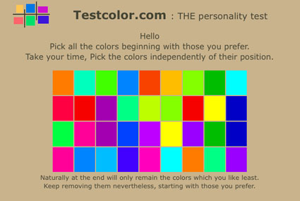
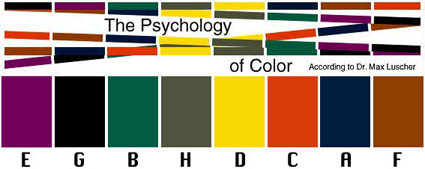
The Luscher Color Test was devised by psychologict Max Luscher in 1969. It’s effectiveness has been known in advertising and industry (automotive and fashion) for years. Now you can gain some pracitalc insight into color psychology with this well-known color test – online.
It’s uncanny what this test can reveal (consistently), but remember it’s just a starting point. What’s far more revealing is your unique living relationship with color, which is revealed over time and in a variety of contexts under many influences. Awareness is the key. Use this as food for thought for developing insight into your relationship with color.
Take the test here.
What did the test reveal for you?
Comment here!
Read more on Color Psychology here.
Learn more in my digital printing and digital photography workshops.