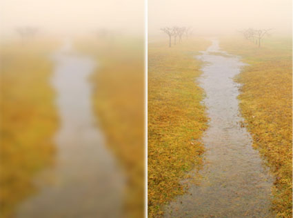
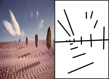
4 Ways To Divide The Frame


The four most important lines of any image are the ones that are often least recognized consciously – the frame. Second only to these are the lines that divide the frame, creating frames within the frame. Becoming more aware of how the frame can be used and how it can be divided will help you make more successful compositions.
There are many ways the frame can be divided. You can divide the frame horizontally, vertically, or diagonally; in each case the layers included define the virtual space presented. Different areas in an image can be divided differently. You can divide the frame (or a frame within the frame) multiple times; the more times the frame is divided the more packed and dynamic it becomes, progressively growing more design oriented and finally being reduced to pure texture. Each operation has significant consequences.
One of the most significant results of dividing the frame is the creation of specific proportions. (The combination of the individual aspect ratios of each element creates a new unified aspect ratio.) Much has been made of the ‘rule of thirds’. Dividing the frame into three parts (left/center/right or up/middle/down) is a simple and often useful strategy for making images more directed, by prioritizing one element over another, and dynamic, through imbalance. Too little has been made of other ratios. What of fourths, fifths, sixths, sevenths, or eighths? No musician would be content to only divide an octave into halves and thirds. Every proportion produces particular effects, which are further modified by placement (high/low or left/right) and content. Rather than a rule to be adhered to, proportion is a force to be explored expressively.
When it comes to controlling the division of the frame in your images, you have more options available to you than you might think. You can crop, retouch, distort, or composite. These four operations can be used in combination with one another. For instance, you may decide to first crop an image and then distort it to a standardized aspect ratio. Or, while maintaining a frame of the same aspect ratio, you might increase the scale of a selected area only and in the process crop a portion of it. Many other permutations are possible.
If you find these many new possibilities dizzying, you get it. The only way to understand this intuitively is to explore your options. The development of new possibilities encourages us to ask new questions and develop new habits. For what effect are you dividing the frame? To that end, how many different ways can you think of dividing the frame? My advice? Develop the habit of exploring your options before settling on final solutions, ones that help you create your strongest statements.
Read more at Digital Photo Pro.
See my related post Exploring The Expressive Possibilities Of Aspect Ratio.
Learn more in my digital photography and digital printing workshops.

Better Photographic Composition – Beyond The Rule Of Thirds – David Brommer


In this B&H Event Space seminar, David Brommer covers the basic concepts of composition as established by the masters of the Renaissance. Commencing with the classic rule of thirds and leaping into theories of color and balance, David touches upon a range of topics, including image construction, positive and negative space, as well as other advanced composition.
Find more B&H Event Space videos here.
Learn more in my digital photography and digital printing workshops.
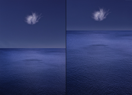
Dividing The Frame Expressively


A majority of landscapes include the horizon line. (It would be fair to say I’m obsessed with the horizon.) How the frame is divided (creating an aspect ratio within an aspect ratio) by this line speaks volumes. It directs the gaze up or down. It also creates an expressive ratio. Every proportion has a particular psychological inflection.

The ‘rule of thirds’ is an effective way of encouraging people to make images more directed, by prioritizing one element over another, and dynamic, through imbalance. But overlooking the power of other proportions is limiting, if not simplistic and insensitive. So too, is avoiding the middle or balance. Proportion is a visual force to be applied, rather than a rule to be adhered to.

There are a number of ways to achieve a desired effect; distort, crop, copy, or combine are four. Each method brings other effects with it.

How many ways can you think of dividing the frame for effect in your images?

Learn more in my digital photography and digital printing workshops.
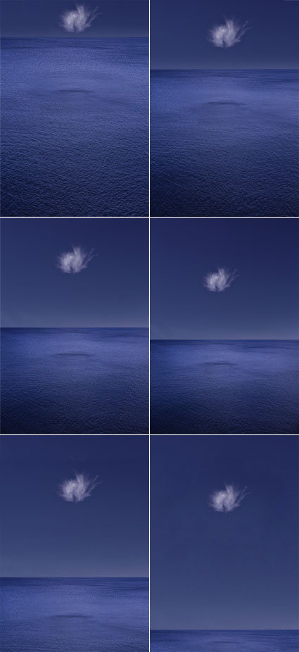
Exploring The Expressive Possibilities Of Aspect Ratio

Distortions of the same image explore aspect ratio expressively

The proportion of an image’s frame is a fundamental part of its statement.
Unlike many documentary photographers who keep the proportion of their image frames constant to reduce their presence and suggest that their images haven’t been altered, I do the opposite for precisely the opposite reason, to more clearly highlight that my images have been altered by me. The question of whether an image has or has not been altered is a misleading question. Every image, whether documentary or artistic, has been altered, but to different degrees, in different ways, and for different reasons. Questions of method, extent, and intent are more revealing and interesting.
I use the proportion of the frame expressively. Because different proportions each add something different, I don’t standardize, I customize the proportions of my images. I distort the frame, crop the frame, and/or extend the frame through compositing and sometimes retouching, before settling on a final solution that creates the strongest statement.
How do you use aspect ratio in your images?
Read more on Digital Photo Pro.
Learn more in my digital photography and digital printing workshops.
Huntington Witherill – 3 Video Conversations

.
.

Discover Huntington’s favorite quotes here.
Read Huntington’s short Q&A here.
Read our extended conversation here.
Visit the artist’s website here.

Defocus


It’s easy to lose sight of the forest for the trees.
We’re capable of seeing a lot of detail. Sometimes detail is distracting. Eliminating it can help us see fundamentals more clearly.
Here’s a quick way to make sure the foundations of your compositions are strong.
1    Frame an image.
2    Defocus the camera. Defocus enough to lose sight
of the details (line and texture) but not the broader com- position (light and dark, color, shape).
3    Refine the composition. Move the camera or zoom.
4 Refocus.
5 Expose.
Images that contain well-rendered detail without a solid compositional structure often appear cluttered and confusing. Develop the habit of slowing down and taking the time to make sure your compositions are as strong as they can be.
Find more online resources here.
Learn more in my digital photography workshops.

Composition – New Column on Luminous Landscape


“How do you define something? One classic strategy is to let the dictionary define it for you. The Oxford English Dictionary defines composition in the following ways …
… the act of combining; forming relationships (between things); synthesis; reasoning from the universal to the particular; combining arithmetical factors, ratios, forces, elements to produce a compound; chemical combination; combining words and sentences to produce a literary work; combining sounds to produce a musical work; settling differences or an agreement; arrangement; constitution of mind and/or body or both; a creation shared by individual parts; union; aggregate; mixture; structure; design …
This paraphrases a more than one page definition. Reproducing the full version would be tedious. But I recommend you take a glance at the full definition to get a sense of how wide ranging the many definitions contained in this one entry are, which are used by many disciplines yet still related.
For the visual artist we could settle on a working definition, a simple statement that could be useful. Composition is the act of combining graphic elements to create a visual structure or it’s the product generated by this act. That suffices. That’s useful. But, while it’s useful to settle this, it would also be useful not to settle this issue definitively. The tension set up by continuing to consider all of the ambiguities, contradictions, connections, and unanswered questions will lead to some marvelous insights. For this very reason, I recommend you settle on your own working definition. And then continue to refine it. Because, rather than settling it definitively, by continuing to work with the question you’ll benefit even more …”
“You can see the fundamental structures present and visual dynamics at work in your images by reducing the wealth of information found in photographs. You can use Photoshop to do this in countless ways. Here are a few …”
Read more on Luminous Landscape. Click here.
Learn more about composition in my field workshops.
6/12-15 – Along the Waterline
8/9-15 – Iceland
10/16-19 – Fall Foliage