Collectors Alert – Sign Up & Get A Free eBook

Members of my newsletter Collectors Alert get a free ebook.
The next issue goes out early morning Monday, July 9.
Sign up for Collectors Alert free.

Members of my newsletter Collectors Alert get a free ebook.
The next issue goes out early morning Monday, July 9.
Sign up for Collectors Alert free.
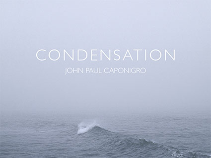
It’s not the most dramatic wave; it’s rather small in comparison to the enormous waves you find in the Pacific ocean. The ocean waters aren’t glassy smooth; the wave line isn’t fully continuous; the surrounding waves aren’t perfectly scalloped; and the foam in the foreground serves only as accents, indicating a previous passage, rather than forming a clear and present pattern. It’s not illuminated by the clearest light nor does it glow from within. Still, there’s an intensely quiet presence about this image (Condensation X), deceptively calm on the surface but potentially turbulent below, with an air of mystery (Where is it coming from and going to? What surrounds it?) that makes it powerfully expressive in a complex and unique way. It’s not obvious but it is rewarding. You might say it’s a sleeper, something you might not pay close attention to at first but the more you look at it the more it grows on you.
Being sensitive to times when less is more and more is less will help you get it just right. In today’s constantly competitive culture, it’s hard not to over achieve. But sometimes, that’s exactly what you need to do. Sometimes what you really need is to get it just right – and nothing more.
I like to do my very best. I like to try to do it better every time. Sometimes I try too hard and do too much. I’ve wasted hours, days even, trying to perfect something only to find out that along the way the life had gone out of it. I’ve found that things that I thought were distractions were really things that made something richer and more complex, after removing them. I’ve come to the realization that what I thought were flaws made something perfectly imperfect. This is not to say that I don’t still try to make things as good as I can and even to up my game. It is to say that the answers I’m looking for transcend technical perfection and sometimes are better for less of it.
In the world of photography it’s easy to lose sight of the big picture for all of the details. We have an extensive list of physical characteristics to evaluate the quality of photographs – focus, depth of field, frozen motion (or extreme motion blur, but nothing in between), low noise, detail in highlights and shadows, contrast, credible color casts, believable levels of saturation, no lens artifacts, the list goes on – yet we are much more challenged to describe the quality of photographs on the levels of perception and content, which are more important. There are times when technical perfection can be distracting or worse a cover up for what’s lacking. Photographer Ansel Adams remarked that, “There’s nothing worse than a sharp image of a fuzzy concept.”
It’s a matter of appropriate means. You don’t want to create dynamic images to portray quiet, tender moments. You don’t want to retouch portraits of victims of war, famine, or pestilence. You don’t want to reenact the truth to make it picture perfect.
There are many times when things seem more authentic if they’re not perfect.
Besides, the more perfect your presentation becomes the more attention you call to the delivery. When you want to call more attention to the content perfect presentation may not be perfect for the purpose. Make your delivery effective. Sometimes it’s more effective to deliver just enough, not more, not less. It’s part of getting it just right.
Questions
What isn’t good enough? How do you know?
What is good enough? How do you know?
What is too much?
What is perfectly imperfect?
Find out more about this image here.
View more related images here.
Read more The Stories Behind The Photographs here.
Condensation III, Rockland, Maine, 2001
One second it was there and the next it wasn’t and in a few seconds even the ripples it created were gone. It was there in this shot, but I took it out. What was it? I’ll leave that to your imagination. It’s more interesting that way. In moments like this our minds run wild. Our still childlike imagination takes over and plays. Stone? Fish? Bird? Snake? Squid? Sea monster? Mermaid? Diver? Now things are getting interesting! In the end, maybe this image really isn’t one thing. Maybe it’s become many. And maybe that’s more interesting. I know what it was when I made the picture – and that’s a limitation I’ve had to challenge myself to overcome to see more in this picture. When people try to solve the mystery together the image becomes even more interesting, to both them and me. We all want to bring more to our creations – and we don’t have to do all that work by ourselves. Part of that ‘more’ is what other people bring to it.
Everybody loves a mystery. Director J J Abrams’ love of mysteries is evident in his many television shows and movies and his mastery of mysteries is evident by their widespread success. He knows some mysteries are best left unsolved. “To be continued” … In his TED talk The Mystery Box and he wisely states “Ultimately the mystery box is all of us.”
How many great inventions have been repurposed for uses than they were originally intended for? Gunpowder was first born as an elixir of immortality. The rat poison Warfarin became a blood thinner. A telephone conversation recorder became a musical record player. Viagra was invented to cure heart disease but had an unexpected side effect of making other things hard. And what can’t you do with duct tape? The inventions that survived adapted. The ones that thrived left room for their users to bring about unexpected evolution. They grew stronger with user participation and innovation. You can’t guarantee that this will occur but you can hope it will and you can leave room for it to happen both in your plans and your creations.
There’s always a balancing act between holding to your original course and modifying it after weighing viewers’ responses. Consider putting your creations to the test with a select audience before releasing them to wider audiences. If you do, seek enough feedback from a variety of relevant sources and weigh it appropriately.
There’s a fine line between leaving too little room for the viewer (when what’s produced is uni-dimensional and predictable) and leaving too much (when not enough is brought to the picture and what’s created seems uncommitted). Find it and you’ll find uncommon success and new opportunities for growth.
Questions
How many ways can you leave room for user participation?
How many ways can you stimulate user participation?
Where is the line between too little room for the viewer and too much?
How much or how little does something need to resolve for it to be complete?
When is it best to switch gears based on user feedback?
Find out more about this image here.
View more related images here.
Read more The Stories Behind The Images here.
Condensation II, Rockland, Maine, 2001
Were it not for the massive stones of the breakwater that cuts into the ocean for fully one mile before ending at a lighthouse that guards the entrance to the harbor of Rockland, Maine, you’d feel like you were walking on water as you make your way across it. At sunrise and sunset, you’re surrounded on all sides by aqueous color, unless there’s fog and then you can hardly see. Then, as you walk the stones out into the sea, there comes a point when you can’t see where you’ve come from or where you’re going to. It’s disorienting – and magical. You could be anywhere. You could be nowhere. You could end up in either place.
Sometimes the less you can see, the more interesting it becomes. Then, imagination takes over. It’s clinically proven that when people are subjected to minimal sensory input (such as floating in an isolation chamber) for long periods of time, they begin hallucinating – the inside comes out. Creatives often ask how they can leave room for the viewer, encouraging interactivity and participation, rather than spelling it all out, breeding passivity and detachment, knowing that doing so often creates more powerful and personal experiences for them. There is such a thing as ‘too much’. You want to give people enough to enchant them, but not enough to dispel the magic. This leads to the question, “How much room can you leave for the viewer without losing your message?”
Simplicity works for so many reasons. With fewer elements in play attention is concentrated on what remains. There’s more is riding on what’s left. There are no distractions. Ordinarily, this leaves fewer doubts as to what to focus on. Here, in this image, as there is only vapor and water and the suggestion of a horizon, what is taken for granted and often goes unseen comes forward – light and how it fills the air. Strip things down far enough and you can see what ordinarily is invisible.
This image takes my impulse to strip things down to their essentials to its extreme. It presents an experience of space and light, simultaneously empty and full, that is profoundly simple but not simplistic. It asks more questions than it answers. It takes questions like, “How much can you do with how little?” and “How distilled can you make an experience?” and goes further to “How little does it take to make a representational image?” and “What are the foundations for our understanding of reality?” A chain reaction is started and more questions arise.
In so many ways, not just because of the frames they put on the world, images are always leaving things out. They work best when they do this with purpose. They work best when they leave only the essentials and leave out the rest. Sometimes, more can be said with less. Sometimes some things can only be said with less.
Questions
When is more less?
When is less more?
How can you do the most with the least?
When does simple become simplistic?
Find out more about this image here.
View more related images here.
Read more The Stories Behind The Images here.

My Annual Open Studio Exhibit is now open – July 31 – August 1 only
Gallery talks are at 2 pm.
Over 100 new images and 3 new books.
All prints are 25% off current price this weekend only.
If you’d can’t attend but would like to inquire about purchases contact us here.
All photographs are about light. The great majority of photographs record light as a way of describing objects in space. A few photographs are more about spaces they represent than the objects within those spaces. Still fewer photographs are about light itself.
Time, space, light. All the things this work is about are ultimately missing from the final product – the print. Put it in a dark room and there will still be no light. Touch it and you’ll find it’s flat. Consider it for an extended time; you’ll change but it won’t. Curiously, these conspicuous absences within the print make what’s missing more intensely felt. How does absence make something more clearly experienced? Perhaps it’s that the gap between representation and reality gives us pause and begs us to more carefully reconsider the world around us and the experiences we have in it, at first as a way of verification but later as a way of celebration. Read More

You’re invited! Come visit my annual open studio event July 31 – August 1 from 10-5. Gallery talks are at 2.
It’s been one of my most prolific years to date. Producing more than one hundred new images, four bodies of work, in progress for ten years, have been brought to completion. The results are surprising, even for me.
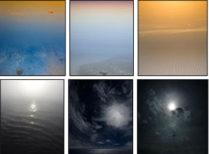
Three new books featuring this work have been released – Reflection, Condensation, and Correspondence – which you can preview and purchase online.
Also on hand will be my playful iPhone photo sketches, some of which are featured in my column on the Huffington Post. I’ll even take, process, and transmit some during my daily artist’s talks at 2 pm.
Come enjoy prints, books, web galleries, performances and conversations during this very special event.
Click here for more information including directions, previews, reviews, statements, audio, video, and press kit.