Need To Know Tips & Techniques Cropping Your Photos In Photoshop


A crop can make a good photograph great. There’s an art to cropping that every photographer would be wise to master. Here are seven things to consider.
Align
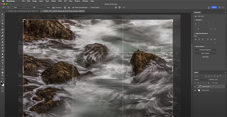
Horizon tipping? Level it, which will crop edges a little or a lot, depending on how tilted it was. Similarly, it’s best to keep other significant horizontals and verticals parallel to the frame. Perspective correction will distort elements within the frame unequally to do just this and crop edges unequally. (In these situations, plan to crop and shoot a little more than you need.) If, on the other hand, you’re trying to create an imbalanced topsy-turvy effect to add dynamism, tilt them substantially. A lot looks deliberate. A little looks sloppy.


Distraction

Original

Edges Darkened

Edges Retouched
So you don’t want to crop your image. What other alternatives could you consider to minimize distractions? Here are four.
Color - LHS
Contrast is an eye-catcher. So, if you don’t want elements to catch the eye, reduce their contrast. There are three types of contrast; luminosity, hue, and saturation. Depending on the situation, you may need to use one, two, or all three. Take your clues from the overall image and the immediate surroundings of the elements you’d like to direct attention away from. Rather than sleight of hand, it’s sleight of eye.
Blur
One of the strongest ways to deflect attention from an element is to blur it. The more you blur it, the less focus it will demand. Blur it enough, and it will disappear into its surrounding field of color. Take care to manage transitions between blurred and sharp areas convincingly (as if the blur happened in camera rather than in post-production); if they aren’t handled well, the blur will stand out as artificial and attract attention rather than reduce it.
Distort

The four most important lines of any image are the ones that are often least recognized consciously – the frame. Second only to these are the lines that divide the frame, creating frames within the frame. Becoming more aware of how the frame can be used and how it can be divided will help you make more successful compositions.
There are many ways the frame can be divided. You can divide the frame horizontally, vertically, or diagonally; in each case the layers included define the virtual space presented. Different areas in an image can be divided differently. You can divide the frame (or a frame within the frame) multiple times; the more times the frame is divided the more packed and dynamic it becomes, progressively growing more design oriented and finally being reduced to pure texture. Each operation has significant consequences.
One of the most significant results of dividing the frame is the creation of specific proportions. (The combination of the individual aspect ratios of each element creates a new unified aspect ratio.) Much has been made of the ‘rule of thirds’. Dividing the frame into three parts (left/center/right or up/middle/down) is a simple and often useful strategy for making images more directed, by prioritizing one element over another, and dynamic, through imbalance. Too little has been made of other ratios. What of fourths, fifths, sixths, sevenths, or eighths? No musician would be content to only divide an octave into halves and thirds. Every proportion produces particular effects, which are further modified by placement (high/low or left/right) and content. Rather than a rule to be adhered to, proportion is a force to be explored expressively.
When it comes to controlling the division of the frame in your images, you have more options available to you than you might think. You can crop, retouch, distort, or composite. These four operations can be used in combination with one another. For instance, you may decide to first crop an image and then distort it to a standardized aspect ratio. Or, while maintaining a frame of the same aspect ratio, you might increase the scale of a selected area only and in the process crop a portion of it. Many other permutations are possible.
If you find these many new possibilities dizzying, you get it. The only way to understand this intuitively is to explore your options. The development of new possibilities encourages us to ask new questions and develop new habits. For what effect are you dividing the frame? To that end, how many different ways can you think of dividing the frame? My advice? Develop the habit of exploring your options before settling on final solutions, ones that help you create your strongest statements.
Read more at Digital Photo Pro.
See my related post Exploring The Expressive Possibilities Of Aspect Ratio.
Learn more in my digital photography and digital printing workshops.