Choose A Wide Gamut Editing Space

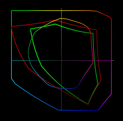
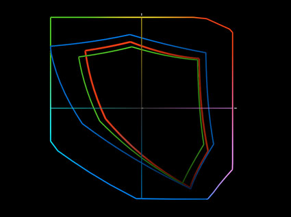
Today’s inksets can exceed the gamut of even the best monitors in yellows, oranges, and blues. Epson UltraChrome HDR ink on Epson Exhibition Fiber is plotted against sRGB, Adobe RGB (1998) and ProPhoto.

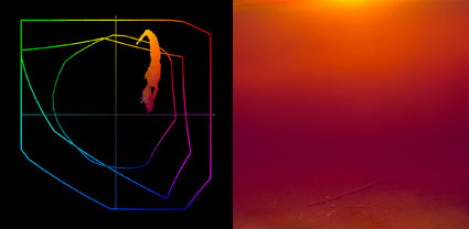
The gamut of this image and the print made from it exceeds the gamut of Adobe RGB (1998) and the monitor. You have to make a print to see the most saturated color possible.


Choose a wide gamut editing space to make the best prints possible. If a file’s color space is smaller than the printer’s color space, you won’t be able to realize the full saturation your printer is capable of.

Today’s inksets exceed the gamut of all but one of the standard editing spaces (sRGB, Colormatch, and Adobe RGB (1998)), making ProPhoto the best choice for creating files in. Since ProPhoto exceeds the gamut of human vision, it’s unlikely that you’ll ever need a wider gamut editing space than ProPhoto. If you create your files in ProPhoto you’ll be well-positioned to take advantage of future advances in printer and media technology. So, choose ProPhoto.

How do you do this?

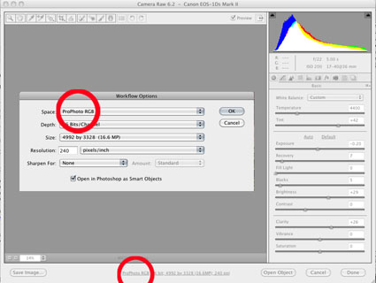
1         If you’re converting a Raw file, choose ProPhoto in the Raw converter’s interface.

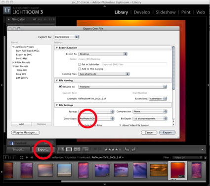
2         If you’re exporting a file from Lightroom, choose ProPhoto.

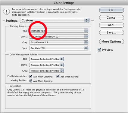
3         If you’re creating a new file in Photoshop, set ProPhoto as your default color space.

4         If you’re scanning an image, choose ProPhoto in the scanner’s interface.

Read More

Editing Spaces Compared

Four standard device-neutral RGB editing spaces compared
sRGB – red; Colormatch – green; Adobe RGB – blue; ProPhoto – full color


From small to large, standard RGB editing spaces include sRGB, Colormatch, Adobe RGB (1998), and ProPhoto. Only ProPhoto RGB can contain as much or more color as your camera can capture. This is why I recommend ProPhoto RGB as my first choice of these editing spaces. ProPhoto RGB has the widest gamut.

The term gamut is used to describe the total capacity of a color space. Wider gamut color spaces are capable of containing more saturated color than smaller gamut color spaces. ICC profiles are used to describe color spaces. ICC profiles can be graphed as XY chromaticity diagrams, which can be used to compare the gamuts of color spaces. On the center, axis are neutral colors. As you move away from the center color becomes more saturated. A larger area indicates a greater ability to hold more saturated data. The contour defining that area marks the gamut boundary, the limit of saturation that color space is capable of holding.

Capture your images in wide-gamut color (Raw) and edit them in wide-gamut color (ProPhoto RGB). Convert only copies of your master files into smaller gamut spaces for output-specific uses. Converting images from wider gamut spaces to smaller gamut spaces reduces saturation. Converting images in smaller gamut spaces to wider gamut spaces doesn’t increase saturation.

Why? Think of a bucket full of water. If the water is color, then the bucket that holds it is the editing space. If you pour water from a big bucket into a small bucket, some of the water will be lost. Pouring the smaller volume of water back into the larger bucket won’t make the total volume of water larger; it will be the same amount of water sitting in a larger bucket. Start wide and stay wide.


Read more on Color Management here.

Read more on digital Printing here.

Learn more in my digital photography and digital printing workshops.