How To Use An Image’s Frame Effectively & Expressively

The four most important lines of any image are the ones that are often least recognized consciously – the frame. Part of learning to make successful compositions is learning to become more conscious of the frame and how to use the forces it exerts on your images for desired effects. 

Watch The Movement of the Eyes Within the Frame

Whether visible or invisible, every line creates vectors of force that encourage the eyes first to move along it and second to bounce off it. The eyes search the frame in a consistent fashion and these tendencies influence our experiences of all compositions, no matter how diverse. The general tendency is for the eyes to move within the frame from left to right and top to bottom and then to return and repeat this process. The eyes quickly scan the frame itself (determining the limits of what’s included and by extension what’s not) before they scan what’s within the frame. On their first pass, rather than scanning each line of the frame precisely, the eyes quickly average the competing forces of the four vectors in a single sweeping gesture. Afterward, given time for a more careful examination of an image, the eyes may trace and retrace each line of the frame more precisely, until their quest for information is better fulfilled by other paths.

When it comes to motion one must always consider momentum, gravity, and resistance. Some motions, like falling (within the frame think top to bottom and left to right), are easier to get started and harder to stop than others, such as climbing (within the frame think bottom to top and right to left). Once a motion is started it tends to persist until stronger forces modify it. Place one or more barriers in the path of motion and it will shift and sometimes even reverse. Individual compositions work with these tendencies, whether subtly or dramatically, reinforcing, modifying, or working against them.
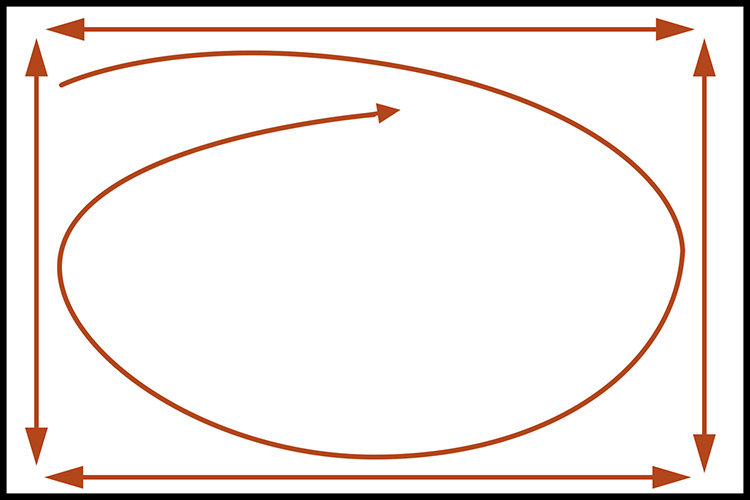
The motion of the eye within the frame
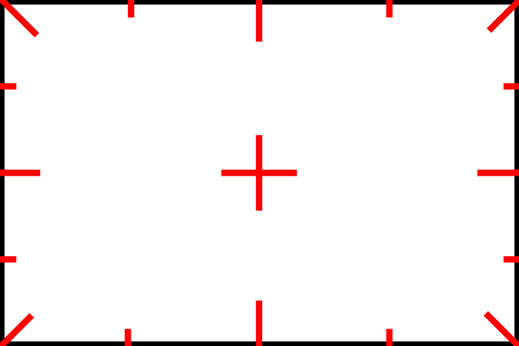
Powerpoints on and in the frame


Scan the Frame Consciously

Always be conscious of the frame. Scan it. Consciously move your eyes around the entire frame. Anything that touches the frame exerts a stronger influence on a composition. (This is particularly true if it touches a power point, like a corner or the middle of a border.) If information that is not important touches the frame it becomes even more distracting. To make a composition stronger, frame it in a way that only important information touches the frame.

By emphasizing more important elements and deemphasizing less important elements (or eliminating them entirely) you make images stronger. Before exposure, you have an opportunity to make the composition stronger through reframing. After exposure, you have an opportunity to make a composition stronger through cropping (this eliminates other image information that may or may not be significant) and/or retouching (this includes the image information surrounding the flaws).

Use Proximity to the Frame

Frame loose or tight? How you place elements relative to the border of the frame can have a profound impact on any composition. 


Insights Members can login to read the full article.
Email:
or Sign up

4 Ways To Crop Your Images – Crop, Distort, Retouch

Deciding what’s in the frame and what’s out is a critical decision that can make or break an image. You can look at it very simply. What is an image of? What is an image not of? And how does what’s left over support or distract from the essence of an image?

In the past we had two simple options; one, use the frame to crop; two, crop when printing or post-processing. Now we have two more options to think about; three, distort; four, retouch. Each of these offers different possibilities and becoming familiar with them all will help you choose.

It’s a new mindset. Once you learn to see in these new ways, you’ll find you’ll make images that you previously passed by, leaving them unmade or even unnoticed. As a result, you’ll make many more successful images.

Classic crops eliminate the most information

Crop

You’ve got choices. Choose wisely.

One – Crop Before Exposure

Use the frame to eliminate distracting information around a subject(s). Take extra care with image information that touches the frame, as it will draw extra attention. If part of an object is eliminated by the frame make sure what’s left looks deliberate - just a sliver lopped off or a sliver left over seems careless. Once you’ve made your exposure, you’re committed. You can crop more but you can’t uncrop. When in doubt, shoot both tight and loose.

Two – Crop After Exposure

Shoot loose (more than you need) and you’ll preserve your ability to refine a composition during post-processing, testing, and comparing many variations, even over extended periods of time, before settling on a final solution. Doing this will take more time but you will gain precision.

Distorted to fill the frame

Distort

Distorting photographs is widely practiced. But most photographers tend to think of their limited use of distortion as having produced no distortion. In fact, every lens distorts in its own way, some more than others, like wide-angle lenses. Lens profiles are designed to correct for lens distortion during post-processing by ‘undistorting’.

Many people think they aren’t distorting their photographs when in fact they are doing it on most of their images in multiple ways, first by using a lens, second by using a lens profile, and sometimes third by creating panoramas. Why are these practices more acceptable than using distortion and retouching as a part of your cropping practices? In the end, it’s your choice.

You can push one or more sides of an image outside its frame and achieve similar results to cropping. What’s different here is that the proportions of the objects and spaces left within the frame will change, typically getting taller or wider, usually only a little but potentially a lot.

You’ve got options. Test them before you settle on your final solution.

One - Transform

Use Photoshop’s Edit > Transform to distort an image uniformly. To move an entire side, hold the Shift key to move one side without moving the others.  And/or, to move one corner independently, press the Command key before moving a corner point.

(To do this an image’s Background Layer needs to be a Smart Object or a duplicate layer.)

Two - Content-Aware Scale

Use Photoshop’s Edit > Content-Aware Scale to distort an image non-uniformly – smooth areas will expand or contract more than textured areas. Pull the areas you wish to crop outside the frame. Hold the Shift key while you’re doing this if you wish to change one side more than another and the image’s aspect ratio with it.

(Do this on a duplicate layer. Content-Aware Scale doesn’t work on a Smart Object.)

Three - Warp

Want more localized control? Try Warp. (Edit>Transform>Warp) Warp gives you a grid to adjust more points with. It adds the ability to modify the position of elements not just with the edges but also the insides of the frame. Do this on a duplicate layer or duplicate Smart Object. Warp works on Smart Objects but since it is not a filter so you can’t get the future flexibility of a Smart Filter.

Four - Liquify

You can use the Liquify filter to distort small portions of an image. For instance, moving something in the middle of the edge of a frame off frame without moving the corners. To do this,  go to Filter>Liquify, start with the first tool Forward Warp and use the brush to get the effect you desire. It’s worth exploring the other brushes too as Liquify is a powerful distortion tool.

Distorted to fill the frame

Distorted version with aspect ratio changed afterward

Preserve Or Adjust Aspect Ratio

Both cropping and distortion may or may not change an image’s aspect ratio (the proportions of the frame). Cropping can be set to preserve a set aspect ratio but this puts limits on what’s possible as at least two edges, if not all, are adjusted together. if you adjust one edge separately from the others you’ll change the aspect ratio, for better or worse. But if a specific aspect ratio is important to you (either because the original creates consistency between images or because a new ratio is more expressive), after cropping you can distort the entire frame to the aspect ratio of your choice.


Insights Members can login to read the full article.
Email:
or Sign up

See What You’re Missing – 2 Ways To Non-Destructive Crops

We’re responsible for everything that’s in the frame. We’re also responsible for everything that’s not in the frame. Deciding what’s in the frame and what’s out is a critical decision that can make or break an image. Framing and cropping are critical. If you miss a key element during framing you’re out of luck. However, if you overcrop you’re not, if you crop non-destructively and you remember to reconsider your crop from time to time. After you crop, you forget what you’re missing. It’s out of sight and out of mind. But it doesn’t have to be.

Lightroom and Photoshop’s crop tools allow you to see the image information you’re missing Here’s how …

In Lightroom, highlight an image and tap R. You’ll see the areas eliminated with a darker overlay. You never lose image information when you use Lightroom. It couldn’t be easier. What’s hard is remembering to do it.

Photoshop also makes almost as easy. First you have to open an image. Then press C (or click on the crop tool). Then click on the Crop tool control handles and you’ll see the missing information, again under a darker overlay. When you use Photoshop, be careful. Unlike in Lightroom, you can eliminate image areas permanently. Here are two ways. One, check the Crop tool’s option Delete Cropped Pixels. Two, flatten the file or merge other layers with the Background layer. You may think this has happened when you first look at a file that has been cropped in Photoshop as when you first click on the crop handles you won’t see the larger canvas but simply drag the right corner of the window out and you’ll see the bigger canvas.

Why would you need to reconsider your crop? To make future improvements as your vision evolves. In the analog darkroom photographers never (almost) cut their negative’s or transparencies. They masked them during printing. This means every time them made new prints they reconsidered their crops. Sometimes, after their seeing matured, they changed their minds – significantly. I’ve witnessed the greats reviewing their top images. One day, Arnold Newman adjusted his crop on his portrait of igor Stravinksy. Another day, my father reconsidered his crop for Running White Deer, making subtle but significant shifts in their final compositions.  Those two images are both dramatically influenced by the way they’re cropped. If the masters do it, you may want to consider doing it too.

Small changes can make big differences. But you won’t think to make them if you don’t see what you’re missing. So make it a habit to reconsider your crops from time to time. It only takes a few moments and if you do, perhaps even your best images will improve.

Read more in my Creative Composition resources.

Learn more in my digital photography and digital printing workshops.

How To Control The Proportion Of Your Images’ Frames Expressively


The proportion of an image’s frame (or aspect ratio) is a fundamental part of the statement it makes. Aspect ratio influences the way both the photographer and their audiences see images. Many photographers choose particular camera formats (35mm, 645, 2¼, 6x17, 4x5) because they reinforce particular ways of seeing. For instance, square formats emphasize neither vertical nor horizontal motions and reinforce the geometries framed within them, while panoramic formats encourage the eye to sweep across images in long strokes, typically but not exclusively horizontally.

Of course, all images can be cropped. Through elimination, an image’s aspect ratio is modified. Reasons for cropping an image can vary; one reason is to eliminate unessential image areas; another reason is to change the proportion of the frame.

There are photographers who prefer to standardize the aspect ratio of their images. Many documentary photographers crop none of their images to indicate the objective stance they attempt to approach their subjects with, signaling a host of other related practices, and above all that they have intervened in and interpreted the events their images portrayed as little as possible. Other photographers standardize the aspect ratio of their images to draw attention away from the proportion of the frame to other aspects of their images. Repetition typically deflects attention from an image element, while variation draws attention to itself. Still, other photographers standardize the proportion of their images to make matting and framing easier and more economical. Some do it simply out of habit. No matter what type of photographer you are and what your standard practice is, I recommend you explore your options. (To gain the maximum benefit from your explorations, draw some conclusions from the results of your experiments.) Careful cropping can make your images stronger.

There’s an art to cropping; it can clarify and energize a majority of images and even substantially modify the content of a few. At one time or another, most photographers adopt this practice – some elevate it to an art.

With Lightroom, Adobe Camera Raw, and Photoshop you can non-destructively crop your images so that pixels are hidden rather than eliminated. This is now the default behavior of these softwares. Later, if you wish to change the crop of an image you can reuse the Crop tool to reclaim these hidden pixels and make modifications without having to reprocess the original Raw file they were derived from.

Few photographers explore distorting their images to change aspect ratio. In large part, this is because distortion is a practice so new that not enough time has elapsed for it to become a habitual part of our tradition. In some cases, the practice of distortion is discouraged; it is not appropriate for the creation of forensic or documentary images. In a few cases, it is encouraged; many portrait photographers squeeze their images horizontally making their subjects look thinner, a transformation as little as 5-10% is often undetectable to the casual observer but nonetheless highly flattering to the subject, some think it takes off the ten pounds the camera adds on. Whether you are influenced by the force of habit or respect for tradition, remember that both lead to learned behaviors, which can be modified. Distortion offers extraordinary expressive opportunities. You owe it to yourself and your images to explore this option. Whether you choose to do this often or infrequently, a little or a lot, is something only you and time can tell.


Insights Members can login to read the full article.
Email:
or Sign up

4 Ways To Divide Your Images’ Frames Expressively

Dividing The Frame

The four most important lines of any image are the ones that are often least recognized consciously – the frame.  Second only to these are the lines that divide the frame, creating frames within the frame. Becoming more aware of how the frame can be used and how it can be divided will help you make more successful compositions.

There are many ways the frame can be divided. You can divide the frame horizontally, vertically, or diagonally; in each case the layers included define the virtual space presented. Different areas in an image can be divided differently. You can divide the frame (or a frame within the frame) multiple times; the more times the frame is divided the more packed and dynamic it becomes, progressively growing more design-oriented and finally being reduced to pure texture. Each operation has significant consequences.

One of the most significant results of dividing the frame is the creation of specific proportions. (The combination of the individual aspect ratios of each element creates a new unified aspect ratio.) Much has been made of the ‘rule of thirds’. Dividing the frame into three parts (left/center/right or up/middle/down) is a simple and often useful strategy for making images more directed, by prioritizing one element over another, and dynamic, through imbalance. Too little has been made of other ratios. What of fourths, fifths, sixths, sevenths, or eighths? No musician would be content to only divide an octave into halves and thirds. Every proportion produces particular effects, which are further modified by placement (high/low or left/right) and content. Rather than a rule to be adhered to, proportion is a force to be explored expressively.

When it comes to controlling the division of the frame in your images, you have more options available to you than you might think. You can crop, distort, retouch, or composite.

Before and after cropping

Crop

Cropping, either through placing the frame during exposure or by eliminating framed information during post-processing, which changes the aspect ratio, has been the most traditional way of dividing the frame.

Before and after distortion


Insights Members can login to read the full article.
Email:
or Sign up

PHOTOGRAPH – Issue 2


There’s lots of inspiration in Issue 2 of PHOTOGRAPH magazine, which includes featured portfolios and interviews with Martin Bailey, Andy Biggs, and Chris Orwig, as well as articles from David duChemin, Nicole S. Young, John Paul Caponigro, Martin Bailey, Al Smith, Jay Goodrich, Piet Van den Eynde, Younes Bounhar, Kevin Clark, and Chris Orwig.
My Creative Composition article discusses using the frame creatively, perhaps the most essential skill in photography.
Purchase it here – $8 single issue or $24 quarterly subscription.