Rendering Intents Compared
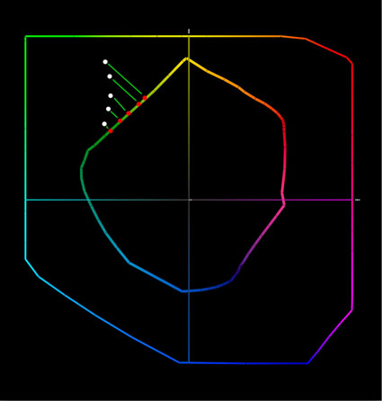
gamut clipping
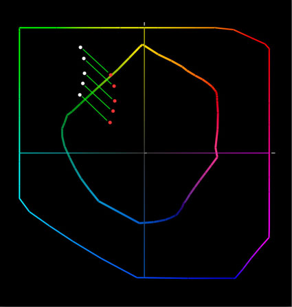
gamut compression
Your choice of rendering intent tells a color management system how to handle color conversions between different color spaces. This is particularly important when converting colors from a wider-gamut color space (such as an editing space like ProPhoto) to a smaller-gamut color space (like a printer color space). You’ll get different results, even when using the same ICC profile, depending on the rendering intent you choose for a color conversion. You have four choices; perceptual, relative colorimetric, absolute colorimetric, and saturation.
What’s the difference between these four rendering intents?
Perceptual
Use a perceptual rendering intent for printing images with highly saturated colors. Watch it carefully. To deliver very saturated colors, it may lighten an image or shift the hue of specific colors. Both side-effects can be compensated for with output-specific adjustments.
Relative Colorimetric
Use a relative colorimetric rendering intent for printing images where the luminosity structure is most important. You may get slightly less saturated colors but brightness values will be most stable with this rendering intent. This makes it the ideal choice for near-neutral and black and white images.
Absolute Colorimetric
Use an absolute colorimetric rendering intent for making a proof of one device on another, like making a proof of an offset press on an inkjet printer. It’s not useful for making the best inkjet print; it will limit the results the printer delivers. Note, you can’t simulate a printer with a greater gamut than the device you’re printing on, only one with a smaller gamut.
Saturation
Use a saturation rendering intent for eye-catching graphics where color impact is more important than color accuracy , like pie charts. It will so much saturation it will distort continuous tone images in an adverse way.
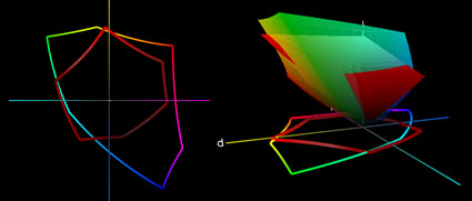
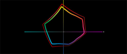
Here’s the color geek explanation.


