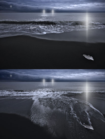
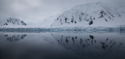
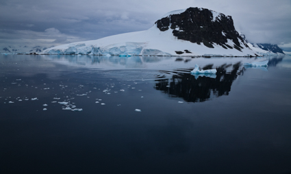
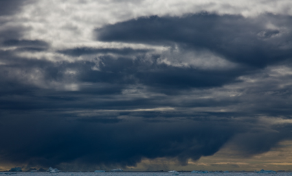
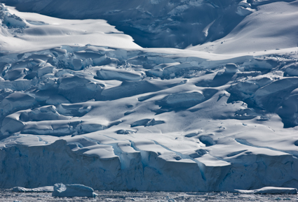
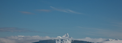
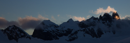
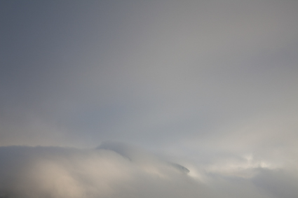
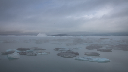
New Image – Refraction LXXVII


I issue quantum editions of select images from my series Refraction; the viewer can choose how many and which versions they would like created for them.
To date most of these editions offer variations in the number and position of the lights within them. In this image, variations in states of the background are presented.
Changing states and different rates of change are important themes in all of my work.
I find reversal to be the most rewarding creative strategy. Whether it succeeds or fails, I always learn something valuable from trying it.
Read my ebooks Reversal and Breaking the Rules.
See more new 2011 images here, here, here, and here.
The exposures for this image were made in Iceland.
Learn about my Iceland digital photography workshops here.

Things That Make Images Weaker

bad
During reviews in my workshops we discuss what keeps some images from working better and how they could be improved.
Here’s a list we compiled during my recent Iceland workshop.
Avoid these thing and make your images stronger.
Lack of Focus (Not Deliberate)
Limited Depth of Field (Not Deliberate)
Motion Blur (Not Deliberate)
Chromatic Aberation
Noise (Not Deliberate)
Posterization (Not Deliberate)
Lack of Shadow and/or Highlight Detail (Not Deliberate)
Color Contrast Between Elements Not Strong Enough
Low Contrast Light
Cropping Seems Accidental Rather Than Deliberate
Distracting Elements on the Frame
Almost Centered (Neither Centered Nor Significantly Off Center)
Too Many Competing Lines
Shapes Merge Becoming Unclear
Shapes Rendered Without Volume (Not Deliberate)
Too Busy (Complexity Lacks Structure)
Simple Subjects With No Counterpoint
Secondary Elements Distract From Primary Elements
Image Enhancements Call Attention To Themselves
Text Competing for Attention
Text Creates Unintended Commentary
Graphics (Text/Images) Not Integrated Into Image
Cliches
Insincerity
What else would you add to this list?
Find out about my digital photography workshops here.

Things That Make Images Stronger

good
During reviews in my workshops we discuss images made in terms of what makes them strong and how they could be made stronger.
Here’s a list we compiled during my recent Iceland workshop.
You can use any one or more than one in combination to make your images stronger.
Form
Simplicity
Structured Complexity
Gesture
Leading Lines
Interesting Shape
Clean Shape
Deliberately Incomplete Shape
Clear Figure Ground Relationships
Overlapping Planes
Strong Recession (leading lines, overlapping planes, figure ground, color)
Texture
Pattern
Structured Fields
Minimalist Fields
Selective Focus
Archetypal or Evocative Proportion
Contrast
Clean Frame
Spaciously Placed from Frame
Touching the Frame
Cropped by Frame
Palette
Color Interest
Light
Luminosity Contrast
Hue Contrast
Saturation Contrast
Content
Significant Detail
Shows Subject’s Process
Shows Media Process
Clear Stage, Actor, Secondary Character
Action
Decisive Moment
Story
Unresolved Tension
Mystery Left to Be Solved
Emotion
Emotion of Subject
Personal Emotion
Emotional Interaction
Color Mood
Atmospheric Mood
What would you add to this list?
Find out about my digital photography workshops here.
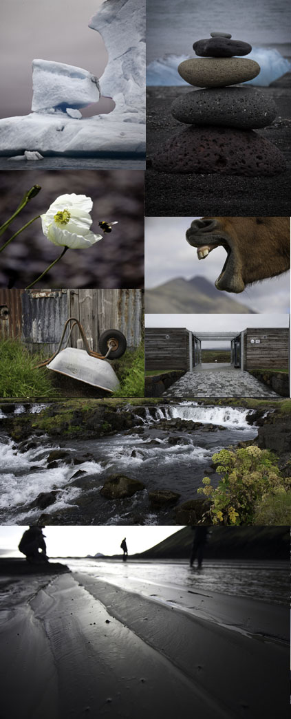
Iceland 2010 – Participant Images Second Reviews

Iceland2010_reviews2
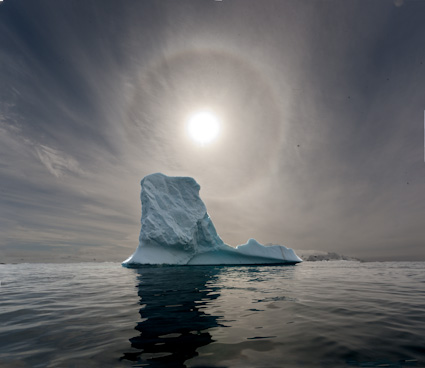
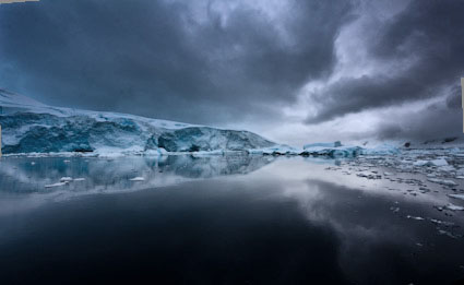
We do lightning fast reviews of participant’s images in my digital photography workshops.
We discuss what works and why and what doesn’t and why not.
It’s wonderful to see how different the images are, made by individuals in the same situations using the same tools.
A lot of learning happens by simply sharing images and spontaneous responses.
Here’s a sampling of this week’s first selects during my Iceland 2010 workshop.
Reserve your space in my 2011 Iceland workshop here.
Find out about my digital photography workshops here.

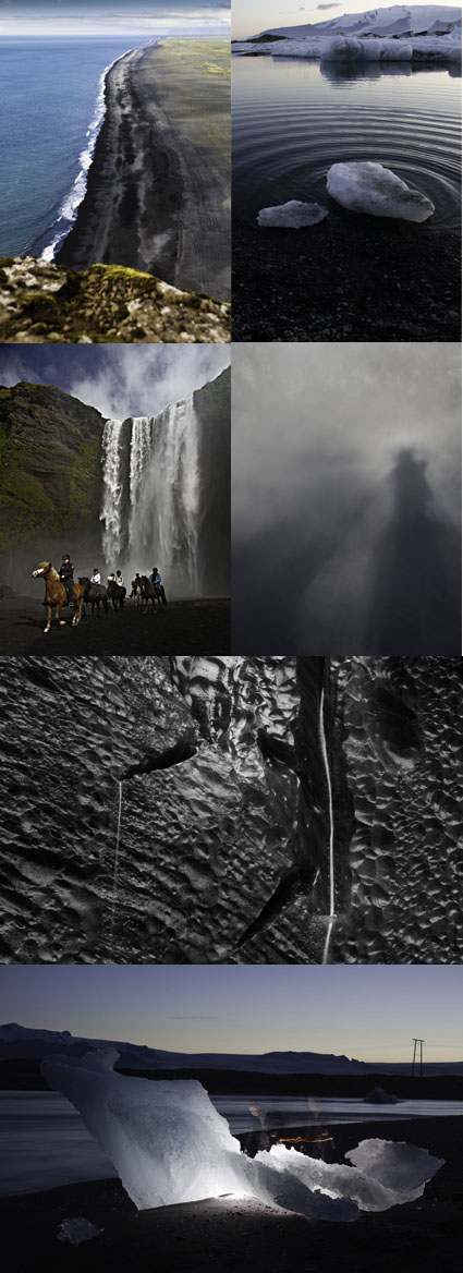
Iceland 2010 – Workshop Participant Images First Selects

Iceland2010_reviews1
We do lightning fast reviews of participant’s images in my digital photography workshops.
We discuss what works and why and what doesn’t and why not.
It’s wonderful to see how different the images are, made by individuals in the same situations using the same tools.
A lot of learning happens by simply sharing images and spontaneous responses.
Here’s a sampling of this week’s first selects during my Iceland 2010 workshop.
Reserve your space in my 2011 Iceland workshop here.
Find out about my digital photography workshops here.

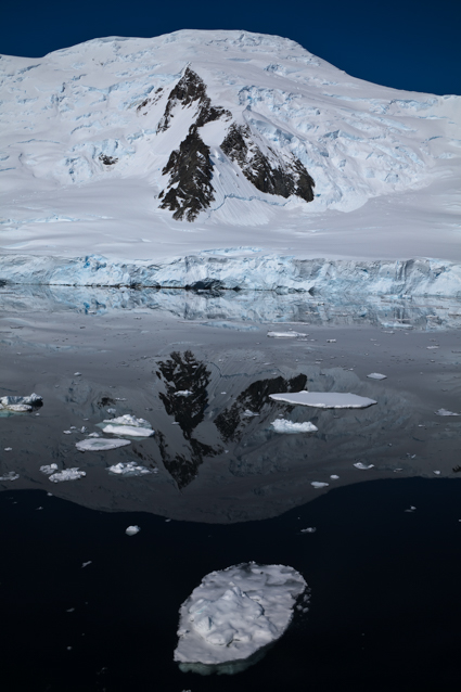
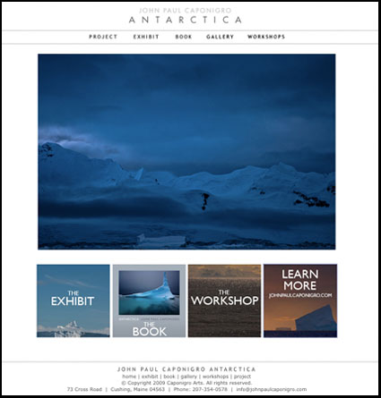
New Website! – JohnPaulCaponigro-Antarctica.com

jpc-antarctica
Last night during an inspiring evening at Photoshop World’s Fine Art of Digital panel I announced my new website johnpaulcaponigro-antarctica.com. It’s got information on my project including …
an upcoming workshop
a traveling exhibit
a book
4 different galleries.
There’s much more to come!
A blog.
Important facts on the region
Google maps
An Antarctica alumni group exhibit
Stay tuned to my blog and my free enews Insights for new announcements.
Get a full list of Photoshop World cobloggers here …
Read More