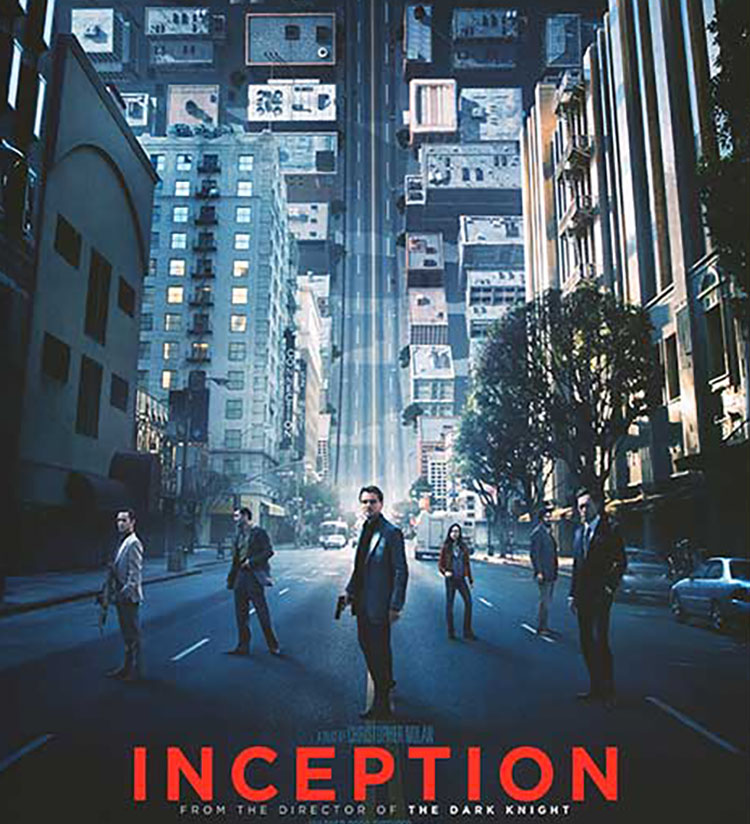
How To Decode Color In Christopher Nolan’s Amazing Movie Inception

Consider how you can use color as a code to move viewers between images and/or sets of images. Christopher Nolan’s masterful use of color in his movie Inception will inspire you to new heights.
Inception moves between five levels of reality; waking, three levels of dream, and limbo, a plane of infinite subconscious that can be entered by traveling through the deepest dream level. The differences between each dream level’s color palette help viewers distinguish where characters are as they move between layers. Color becomes more than pleasing; it becomes content, a code to be decoded.
In the highest waking and lowest dreaming layers there is no consistent color palette; they have not been designed by the dream architect Ariadne. The three dream layers that have been designed have consistent palettes.
 Dream layer one’s rainy exteriors are dominated by grays, dark blues, and blacks.
 Dream layer two’s urban interiors are composed of warm oranges and browns.
 Dream layer three’s snowy exteriors are rendered with bright whites and grays.
Understanding the use of color in Inception helps viewers orient and better understand this complex movie.
How many ways could you apply this principle in your images?
Find more Color Theory inspiration from the movies here.
Learn more in my digital photography and digital printing workshops.

