What’s New in Lightroom’s Big June 2022 Update
Find out more from Colin Smith at Photoshop Cafe.
Learn more in my digital photography and digital printing workshops.
Find out more from Colin Smith at Photoshop Cafe.
Learn more in my digital photography and digital printing workshops.

Did you ever wish you could get more out of a slider in Lightroom (or Adobe Camera Raw)?
Here’s how to go beyond the maximum amount a slider allows.
Use Create New Mask and make a Gradient or Brush … outside the image area. Click the gradient outside the border and drag away from it. Or, click the brush outside the border and check the Invert box. Then use one or more sliders to go beyond their maximums.
You can do this as many times as you like. 150%, 200%, 300%, 400%, 500% … there’s no limit.
This is faster and more uniform (less uneven) than brushing the entire frame.
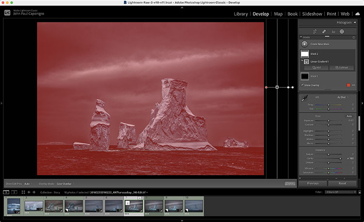
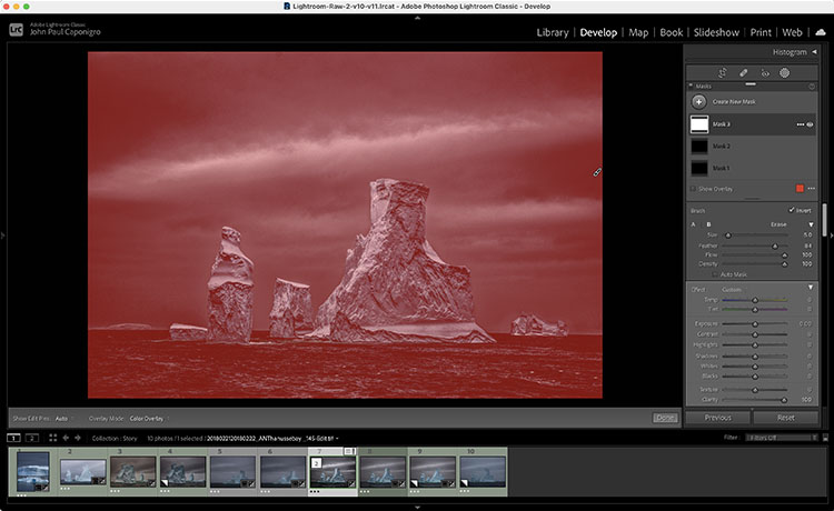
This only works with the sliders available in the Masking panel.
If you want to do this with sliders that aren’t in the Masking panel, open the file in Photoshop and apply the Camera Raw filter.
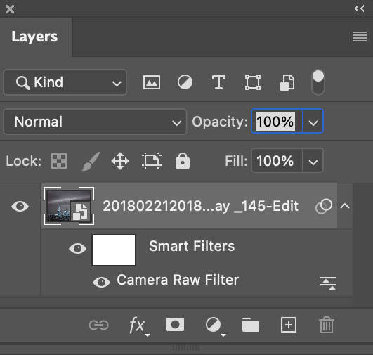
But wait, there’s more. You can apply this principle selectively too. If you’re in Lightroom or Camera Raw use a brush to add more. If you’re in Photoshop, use a Camera Raw smart filter with a mask. There are no limits.
Find more resources on Raw processing here.
Learn more in my digital photography workshops.
.
Adobe released the October 2021 Update to Lightroom Classic. This video will walk you through what’s new.
“Discover how easy it is to make local adjustments to your photographs using Lightroom and Adobe Camera Raw’s new Masking panel and tools including: Select Subject, Select Sky, Radial and Linear Gradients, Brush, Color and Luminance Range Masking and more!”
View more on Julianne Kost’s blog.
Learn more in my digital photography and digital printing workshops.

Deciding what’s in the frame and what’s out is a critical decision that can make or break an image. You can look at it very simply. What is an image of? What is an image not of? And how does what’s left over support or distract from the essence of an image?
In the past we had two simple options; one, use the frame to crop; two, crop when printing or post-processing. Now we have two more options to think about; three, distort; four, retouch. Each of these offers different possibilities and becoming familiar with them all will help you choose.
It’s a new mindset. Once you learn to see in these new ways, you’ll find you’ll make images that you previously passed by, leaving them unmade or even unnoticed. As a result, you’ll make many more successful images.

Classic crops eliminate the most information
Crop
You’ve got choices. Choose wisely.
One – Crop Before Exposure
Use the frame to eliminate distracting information around a subject(s). Take extra care with image information that touches the frame, as it will draw extra attention. If part of an object is eliminated by the frame make sure what’s left looks deliberate - just a sliver lopped off or a sliver left over seems careless. Once you’ve made your exposure, you’re committed. You can crop more but you can’t uncrop. When in doubt, shoot both tight and loose.
Two – Crop After Exposure
Shoot loose (more than you need) and you’ll preserve your ability to refine a composition during post-processing, testing, and comparing many variations, even over extended periods of time, before settling on a final solution. Doing this will take more time but you will gain precision.

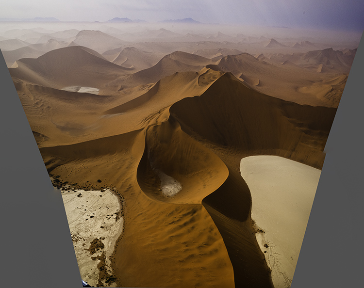
Distorted to fill the frame
Distort
Distorting photographs is widely practiced. But most photographers tend to think of their limited use of distortion as having produced no distortion. In fact, every lens distorts in its own way, some more than others, like wide-angle lenses. Lens profiles are designed to correct for lens distortion during post-processing by ‘undistorting’.
Many people think they aren’t distorting their photographs when in fact they are doing it on most of their images in multiple ways, first by using a lens, second by using a lens profile, and sometimes third by creating panoramas. Why are these practices more acceptable than using distortion and retouching as a part of your cropping practices? In the end, it’s your choice.
You can push one or more sides of an image outside its frame and achieve similar results to cropping. What’s different here is that the proportions of the objects and spaces left within the frame will change, typically getting taller or wider, usually only a little but potentially a lot.
You’ve got options. Test them before you settle on your final solution.
One - Transform
Use Photoshop’s Edit > Transform to distort an image uniformly. To move an entire side, hold the Shift key to move one side without moving the others. And/or, to move one corner independently, press the Command key before moving a corner point.
(To do this an image’s Background Layer needs to be a Smart Object or a duplicate layer.)
Two - Content-Aware Scale
Use Photoshop’s Edit > Content-Aware Scale to distort an image non-uniformly – smooth areas will expand or contract more than textured areas. Pull the areas you wish to crop outside the frame. Hold the Shift key while you’re doing this if you wish to change one side more than another and the image’s aspect ratio with it.
(Do this on a duplicate layer. Content-Aware Scale doesn’t work on a Smart Object.)
Three - Warp
Want more localized control? Try Warp. (Edit>Transform>Warp) Warp gives you a grid to adjust more points with. It adds the ability to modify the position of elements not just with the edges but also the insides of the frame. Do this on a duplicate layer or duplicate Smart Object. Warp works on Smart Objects but since it is not a filter so you can’t get the future flexibility of a Smart Filter.
Four - Liquify
You can use the Liquify filter to distort small portions of an image. For instance, moving something in the middle of the edge of a frame off frame without moving the corners. To do this, go to Filter>Liquify, start with the first tool Forward Warp and use the brush to get the effect you desire. It’s worth exploring the other brushes too as Liquify is a powerful distortion tool.

Distorted to fill the frame
Distorted version with aspect ratio changed afterward

Preserve Or Adjust Aspect Ratio
Both cropping and distortion may or may not change an image’s aspect ratio (the proportions of the frame). Cropping can be set to preserve a set aspect ratio but this puts limits on what’s possible as at least two edges, if not all, are adjusted together. if you adjust one edge separately from the others you’ll change the aspect ratio, for better or worse. But if a specific aspect ratio is important to you (either because the original creates consistency between images or because a new ratio is more expressive), after cropping you can distort the entire frame to the aspect ratio of your choice.

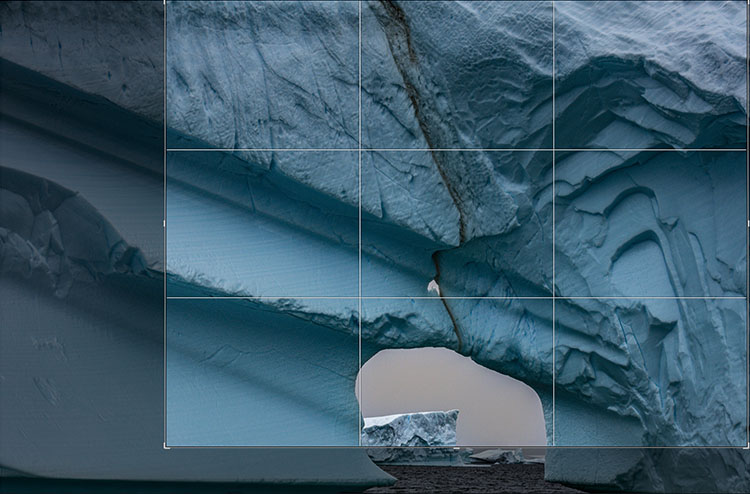
We’re responsible for everything that’s in the frame. We’re also responsible for everything that’s not in the frame. Deciding what’s in the frame and what’s out is a critical decision that can make or break an image. Framing and cropping are critical. If you miss a key element during framing you’re out of luck. However, if you overcrop you’re not, if you crop non-destructively and you remember to reconsider your crop from time to time. After you crop, you forget what you’re missing. It’s out of sight and out of mind. But it doesn’t have to be.
Lightroom and Photoshop’s crop tools allow you to see the image information you’re missing Here’s how …
In Lightroom, highlight an image and tap R. You’ll see the areas eliminated with a darker overlay. You never lose image information when you use Lightroom. It couldn’t be easier. What’s hard is remembering to do it.
Photoshop also makes almost as easy. First you have to open an image. Then press C (or click on the crop tool). Then click on the Crop tool control handles and you’ll see the missing information, again under a darker overlay. When you use Photoshop, be careful. Unlike in Lightroom, you can eliminate image areas permanently. Here are two ways. One, check the Crop tool’s option Delete Cropped Pixels. Two, flatten the file or merge other layers with the Background layer. You may think this has happened when you first look at a file that has been cropped in Photoshop as when you first click on the crop handles you won’t see the larger canvas but simply drag the right corner of the window out and you’ll see the bigger canvas.
Why would you need to reconsider your crop? To make future improvements as your vision evolves. In the analog darkroom photographers never (almost) cut their negative’s or transparencies. They masked them during printing. This means every time them made new prints they reconsidered their crops. Sometimes, after their seeing matured, they changed their minds – significantly. I’ve witnessed the greats reviewing their top images. One day, Arnold Newman adjusted his crop on his portrait of igor Stravinksy. Another day, my father reconsidered his crop for Running White Deer, making subtle but significant shifts in their final compositions. Those two images are both dramatically influenced by the way they’re cropped. If the masters do it, you may want to consider doing it too.
Small changes can make big differences. But you won’t think to make them if you don’t see what you’re missing. So make it a habit to reconsider your crops from time to time. It only takes a few moments and if you do, perhaps even your best images will improve.
Read more in my Creative Composition resources.
Learn more in my digital photography and digital printing workshops.

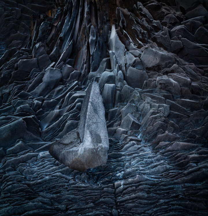
You want your photographs to glow - right? So what’s better than one kind of glow? How about three?
You can get there by not succumbing to the classic temptations to clip shadows and/or highlights to produce a more obviously dramatic but a less lively, nuanced, and expressive tonal scale. Instead, hold the full dynamic range with a real black and white and also create gorgeous separation in the values nearest to them.
So many times we give the lion’s share of the contrast to the midtones. Midtone contrast is really important. But that doesn’t mean we have to sacrifice the light in highlights by making them too hot to look at comfortably or in shadows making them so dark they turn to murky mud. You can hold separation in these extreme ends of the tonal scale and produce beautiful qualities of light that complement not just contrast. Here’s how.
Let’s say you’re not interested in compositing or adding FX or inserting text or painting on your photographs. Do you still need Photoshop? Short answer – yes. If so, why?
One Big Reason, Look No Further
One reason alone ends the discussion for me. The single biggest reason is precise localized tone control or dodging and burning with Curves. Nothing but Curves offers as precise control. It can add a special glow into all areas of an image, any one area, and treat different areas differently. I can’t think of anything more useful than that.
But can’t you do something similar in Lightroom (LR) or Adobe Camera Raw’s (ACR) using the six Basics sliders (Exposure, Contrast, Highlights, Shadows, Whites, Blacks), in combination with the Adjustment Brush, Graduated Filter, or Radial Filter, even in combination with Color, Luminance, or Depth Range Masks? If close is good enough, yes. If you want to make your images really shine, no.
Is it hard to do in Photoshop? No. It’s easy.
1 Open your image in Photoshop.
2 Make a selection.
3 Make a Curves adjustment layer.
4 Double click on the layer mask and slide Feather to the right.
5 Repeat if you want to make a different adjustment to another area of an image.
6 Save your file, when you’re done.
If you only use Photoshop to do this one thing, most of your images will improve. I can’t say I use this with every image I process, but it’s close. I can say the number of images I don’t want to do this for is very small. It’s a simple thing really, and I look forward to the day we can do it in Lightroom and Camera Raw.
Go Ahead, Look Further, And Find More Reasons
Want to go a little further? Let’s revisit the question, “Why do you need Photoshop?” Every time Adobe’s Raw processor(s) become more fully featured it is worth asking. Or, you might rephrase it as, “What can Photoshop help me do that Lightroom / Camera Raw can’t do as well?”
Here are five reasons.
1 Fine Retouching
2 Precise Masking
3 Advanced Color Adjustment
4 Creative Sharpening
5 Plug-Ins
Let me go into a little more detail for each one.
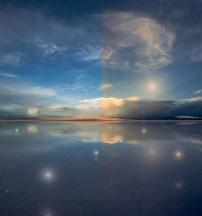
There was a time when color crosses were thought of as poor form, as so many were struggling to remove color casts consistently and accurately while managing the inaccuracies inherent in analog color photographic media. When you saw these kinds of effects, it was hard to ascertain whether the artist was not in control of their craft or insensitive to color or whether they deliberately deviated from the norm. But over time color effects like these have become celebrated both because their differences catch the eye, standing out amid a sea of images, and for their expressive capabilities. What used to require time-consuming chemical processing became quicker and easier digitally. Now there’s a new tool that makes it even easier and allows you to make these kinds of color choices more intuitively - Color Grading.
What Is It
Color Grading is the new Split Toning in Adobe Lightroom’s Develop and Photoshop’s Camera Raw processors. Color Grading offers major improvements including global, control, midtone control, blending sliders, luminance sliders, and the addition of color wheels for a more intuitive interface.
It’s Backwardly Compatible
Don’t panic. All of the Split Toning adjustments you’ve made with previous versions will be compatible with this improved tool if you choose to update files processed with older versions. The sliders will automatically be set new settings that generate the same results. All new controls (midtone, global, luminance) will be set to zero. Blending will be set to 100. You can also make the new tool behave like the old tool by setting Blending to 100 and moving only the hue and saturation of shadows and highlights.
How To Use It
Accessed by clicking the five circles to the right of word Adjust at the top of the panel, you can choose the way you view the Color Grading tool. It’s likely you’ll spend a majority of your time in the first panel (3-Way), which condenses into one panel the next three panels (Shadows, Midtones, Highlights). The larger view of these separate panels offers only one additional feature, the ability to use the Custom Colors swatches to apply preselected colors or sample colors within an image. The fifth and final panel Global adds color to all values equally, for finishing touches rather than the grand effect.
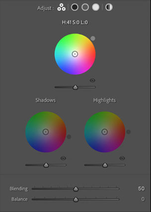
Color Wheels
The most eye-catching part of the new interface may present the biggest learning curve for those who have not used color wheels before but once you try it a few times you’ll find it’s incredibly intuitive.
Move the circle from the center of the color wheel towards the color you want to add, increasing saturation the further away from the center you go, and you’ll see the Hue and Saturation sliders move as you do. Rather than rendering them useless, they become fine control. The second circle on the edge of the wheel moves Hue only and is redundant but perhaps more intuitive to use. The Luminance slider affects brightness for the tonal range you’ve selected, but you’ve got to ask yourself why you wouldn’t use the more precise Tone sliders in the Basic panel. The Luminance slider is fine for some occasions, (It’s great for quickly lifting blacks or lowering whites so they’ll show color effects in ways that pure black and pure whites will not.) but don’t trade convenience for exceptional results.
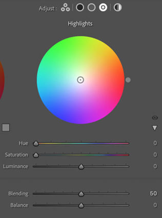
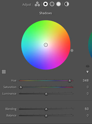
Balance & Blending
The Balance and Blending sliders both control how the color you add fades into surrounding luminance values. What’s the difference? Balance places the middle of the transition while Blending affects how short or long it is. Blending sets whether the transition is short (Set low it affects fewer surrounding values thought the transitions it makes are still smooth.) or long (Set to 100 it’s capable of affecting all values but not equally.) Be careful setting both Balance and Blending high; you can create curious color cross-over effects.
You’ll find that the Blending setting will affect the saturation of your color choice significantly. A higher Blending setting with less saturated color allows more of the image to be affected less intensely. A lower Blending setting with a more saturated color affects less of the image more strongly.
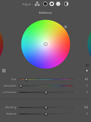
Midtone Control
One of the game-changing features of Color Grading is the ability to add a third color into the midtones, one that is different from the color added into the shadows and different from the color added into the highlights.
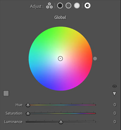
Global Control
You might think it strange to add Global Control to a tool designed to affect select levels of luminosity, but once you try it you’ll find it very useful, often as your last stop in this panel. The addition of an overall color effect frequently helps unify the disparate effects added into shadows, midtones, and/or highlights.
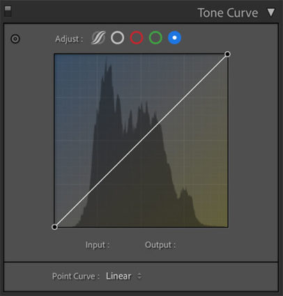
Curves
Color Grading’s interface is much more intuitive and direct than Tone Curve’s. Nevertheless, with a little more work, you can get very similar and even identical effects to Color Grading by using Tone Curve’s Red, Green, and Blue Point Curve feature, which allows you to add color into shadows, midtones, and highlights and control the blend of these effects into one another. I tend to use the Curve for its precision and often further refine Color Grading effects with it; the two are not mutually exclusive. But, you can get even stronger effects with Tone Curve than you can with Color Grading. So if you find yourself using these kinds of Color Grading effects frequently, you owe it to yourself to also see what you can also do with the Tone Curve panel.
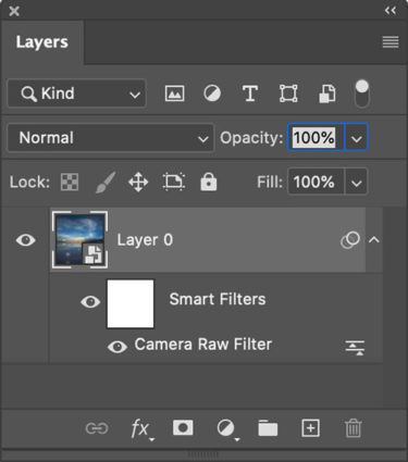
Use Photoshop's smart filters to apply Raw adjustments locally
Apply It Locally
Color Grading is a global effect, that is it will affect all shadows, midtones, and highlights equally – unless you apply it as a Camera Raw smart filter in Photoshop. If you do this, you can mask the Color Grading effect to apply it to any portion of an image in any percentage you choose and away from other portions.
Color Strategies
Before you apply Color Grading make your Basic adjustments first, setting black and white points, brightness, midtone contrast and white balance. How you set these things will change the subsequent settings you use in Color Grading. There are always exceptions but, usually, you’ll want to clear any color casts as a more neutral base will show Color Grading effects with fewer color influences and you can do more with less. Black and white images show Color Grading effects most quickly and even a tiny bit of color can produce significant differences.
Here are five strategies for applying Color Grading.