Why Neutrality In Your Images Is So Important

Constellation_XIX_425

Achieving neutrality in your images is so important. Few things are as important. Why?
Here are four reasons.

1 – The color in your images will appear more believable.

Casts make colors seem false. This is true for memory colors like fire engine red, sky blue, and grass green, particularly true for flesh tones (Are you feeling a little bit green today?), but nowhere more true than with neutrals. There can be some debate about which blue is sky blue. On which day? At what time? But there’s very little debate about what gray is truly neutral. Sure those neutral grays can vary in brightness but not hue or saturation. Make the neutrals in your images truly neutral, and you’ll make the other colors in your images more believable.

2 – The colors in your images will look more saturated.

When you remove color casts you can see the colors beneath them more clearly. The color beneath appears purer. This effect won’t be as strong as if you had increased their saturation. It will be subtler but more convincing. Oversaturated colors often appear false and you’ll have to work the saturation of your colors twice as hard if they contain color casts. Clean color is a great foundation to add saturation to. You can get the best of both worlds.

3 – Your images will appear more three-dimensional.

Without casts, the colors in your images will have more contrast.

They’ll have more luminosity contrast. When they’re not unified by a color cast, luminosity or brightness values will become more distinct.
They’ll have more hue contrast. Often shadows will appear cooler while highlights appear warmer, making them appear even more different than they already are.

They’ll have more saturation contrast. When neutrals are neutral, you’ll get maximum contrast between them and the more saturated colors in your image.

Add these three kinds of color contrast together, and you’ll see a dramatic difference in your images. The illusions of three-dimensional depth and volume in our two-dimensional images will be significantly amplified.

Once again, these effects will be powerfully felt but not obvious. Clean colors won’t call attention to themselves because they seem natural, unlike imbalanced images that you’ll need to over-process to get similar effects.

4 – You’ll have the best color foundations to make black-and-white conversions from.

It sounds strange when you first hear it but color matters even when you’re going to remove it. The maximum hue and saturation separation created by achieving neutrality gives you more control over how dark or light to make hues during conversions to black and white.

5 – You’ll know color management is working.

Neutrals are one of the first things to look for when you’re checking your color management for printing, whether it’s evaluating a viewing light, examining a profile, a rendering intent, or a media setting. You not only look for neutral midtones but also neutrals throughout the entire tonal scale (gray balance). If you’ve achieved both your color management is working correctly. If not, check your system.
I’m sure you’ll find a few more reasons why neutrality in your images is so important.

Achieving neutrality in your images isn’t something you do for all of your images. There are many exceptions. Nevertheless, being able to achieve neutrality in your images is a critically important skill. When you know how and why to achieve neutrality all of your color choices become more sensitive, deliberate, and meaningful.

Read more on Color Adjustment here.
Learn more in my digital printing and digital photography workshops.

4 Ways To Achieve Neutrality In Your Images

Antarctica XLII
There are many ways to achieve neutrality in your images. The results they offer are not same. You need to know the differences so you can make better choices and get solutions that are right for you and your images. Explore them and you’ll be more likely to make better choices for your images in the future. Keep exploring them and you’ll open up a world of possibilities within your images.
WB

Antarctica XLII

Lightroom & Camera Raw White Balance Dropper and Sliders
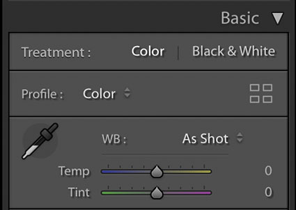
The simplest way to achieve neutrality is to correctly set white balance during Raw conversion with Lightroom or Camera Raw. Click on the eyedropper tool and click on a target area within the image. It’s that simple.

What’s not so simple is identifying a good target. This will be easy if you photographed a color checker within the image or in a separate exposure at the same time, but few do. If you’re like most photographers, you’ll have to identify a good target visually, introducing a margin of error equal to your discernment. Usually, the best choices are midtones. This tool also works well with highlights, but they’re more likely to carry color casts that you won’t see at first glance.

After you click on a target, the results can be refined further with the Temperature (blue to yellow) and Tint (green to magenta) sliders.

Remember, you can use Camera Raw as a filter in Photoshop too.
17_MatchColor
Antarctica XLII

Normal blend mode

Color blend mode

Antarctica XLII
Match Color
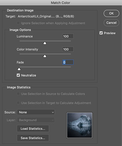
Match Color is Photoshop’s often unfound and overlooked feature that offers such sophisticated results when neutralizing colors that it’s often surprising. Not all colors will be affected equally – and that can be a good thing. Using Match Color is even easier than using Lightroom / Camera Raw’s white balance eye-dropper because you don’t need to click on a target. Simply check the box Neutralize – and leave all the other sliders and drop-down menus alone.


Insights Members can login to read the full article.
Email:
or Sign up

How To Master Saturation In Your Images

Saturation Is An Essential Key To The Success Of Your Images

One of the most distinctive features of a visual artist’s use of color is their use of saturation. When you think of Ansel Adams’ photographs, you think of neutral images rather than highly saturated ones. When you think of Matisse’s paintings, you think of supersaturated images rather than neutral ones. Think of your use of saturation as an essential element that will help you define your own signature style.
One of three elements of color (luminosity, hue, and saturation), saturation can give your images specific qualities of energy and light. Here are five things you can do with saturation: one, increase energy and impact; two, add complexity by revealing hidden hues; three, restore life to listless hues; four, calm colors that are distracting; or five, produce softer semi-neutral and pastel palettes.

Read more about Saturation here.

Together, Adobe Lightroom and Photoshop offer an impressive, almost overwhelming, array of possibilities for controlling saturation. Do three things before you choose a tool to adjust saturation with. First, understand and develop your eye for saturation. Second, adopt a consistent strategy for exploring the possibilities it offers your images. Third, understand the differences between the tools, both how they function and the effects they produce.

Know What To Look For

Knowing what to look for will help you choose a direction, a tool, and how far to go with it. It will also help you evaluate the results you produce – and quite possibly improve them further.


Insights Members can login to read the full article.
Email:
or Sign up